The Time Traveller's Dossier: The Sanctuary of the Highway – The 1968 Ford LTD and the Democratization of Silence
The History
To fully appreciate the immense historical gravity, cultural magnitude, and sociological importance of this artifact, one must meticulously contextualize the psychological, economic, and infrastructural landscape of the American driver in 1968. This was a year characterized by intense domestic and international turmoil; the sociopolitical fabric of the United States was vibrating with the anxieties of the Vietnam War, civil rights struggles, and generational shifts. Concurrently, the physical landscape of America was being radically permanently altered by the Federal-Aid Highway Act, which was rapidly pouring millions of tons of concrete to create the Interstate Highway System.
Within this noisy, turbulent, and concrete-heavy environment, the American consumer developed a profound psychological desire for a sanctuary. They craved a controlled, isolated environment. The Ford Motor Company, possessing an exceptionally astute reading of this sociological undercurrent, responded not merely with a car, but with a mobile isolation chamber. The 1968 Ford LTD represented the pinnacle of this philosophy.
The bold, authoritative typography anchoring the top left of the artifact reads: "QUIET. STRONG. BEAUTIFUL. A GREAT ROAD CAR.". The deliberate placement of "QUIET" as the very first adjective is a monumental departure from traditional automotive marketing, which typically prioritized speed, horsepower, or aggressive styling. Ford was selling the absence of noise. The advertising copy delves deeply into this legendary engineering narrative, referencing a marketing campaign that began three years prior: "In 1965 Ford built a good car—an LTD so good it rode quieter than a Rolls-Royce".
This specific claim—that a mass-produced, middle-class American sedan was acoustically superior to the bespoke, hand-built pinnacle of British automotive aristocracy—was one of the most audacious and successful marketing strategies of the 20th century. Ford actually hired acoustic engineers to measure the decibel levels of an LTD against a Rolls-Royce Silver Cloud, utilizing the scientific data to democratize the concept of luxury. The copy in this 1968 artifact reminds the consumer of this continuous legacy, noting that in 1966 it was quieter than European cars, and in 1967 it was strong enough to survive "eight punishing steeplechase jumps... and stay quiet". Ford was not just selling a vehicle; they were selling an impenetrable fortress of domestic tranquility.
The visual composition of the advertisement brilliantly reinforces this narrative of the "Great Road Car." The 1968 Ford LTD 2-door hardtop is photographed parked beneath the massive, sweeping, brutalist curves of a modern concrete highway overpass. The lighting is moody and cinematic, casting the harsh infrastructure in deep shadows while the warm, metallic bronze paint of the car gleams with sophisticated elegance. This deliberate juxtaposition highlights the car as a refined, beautiful haven amidst the cold, unforgiving reality of modern American infrastructure. The car features "disappearing headlamps," a hallmark of high-end 1960s automotive design that allowed the front grille to appear as a single, unbroken, and menacingly wide horizontal graphic element, further emphasizing its sleek, aerodynamic isolation.
Furthermore, the artifact documents a critical shift in corporate branding via the secondary focal point at the bottom right of the page: the "See the light!" inset. This macro section highlights the legendary "Ford ...has a better idea" campaign. The visual substitution of the letter 'O' in FORD with a glowing, incandescent lightbulb was a stroke of genius. During an era when competitors like Chevrolet and Pontiac were heavily focused on muscle and brute force, Ford positioned itself as the intellectual automaker. They were selling innovation, smart engineering, and "better ideas"—such as the optional "push-button AM/FM Stereo Radio," the "SelectAire Conditioner," and "Power front disc brakes" detailed in the fine print. The lightbulb symbolized that buying a Ford was not an act of passion, but an act of supreme, calculated intelligence.
The Paper
As a physical entity, this printed artifact functions as a living, breathing, and profound record of mid-twentieth-century graphic reproduction and substrate chemistry. Under exceptional, high-magnification macro-lens examination, this document reveals the stunning complexity and mathematical precision of analog color printing.
The extraordinary macro photograph of the LTD's wheel hubcap and lower fender provides a textbook visualization of a CMYK halftone rosette pattern. The intricate, radial spokes of the hubcap, the deep shadows of the wheel well, and the metallic glint of the central red emblem are not solid colors, but are meticulously constructed from a precise, mathematically rigorous galaxy of microscopic ink dots. Cyan, Magenta, Yellow, and Key (Black) inks are elegantly and systematically layered at highly specific angles to trick the human eye and the biological visual cortex into perceiving a continuous, vibrant, and dimensional photographic reality out of mere clusters of ink. This overlapping dot pattern constitutes the unforgeable mechanical fingerprint of the pre-digital analog offset printing press.
Yet, the most profound and impactfully beautiful factor elevating the immense value of this artifact in the contemporary global collector's market is the natural, organic, and entirely irreversible process of Material Degradation. The expansive margins and the overall paper substrate exhibit a genuine, unavoidable "Toning." This gradual, chronological transition from the original bright, bleached manufactured paper to a warm, antique ivory and golden hue is caused by the slow, relentless chemical oxidation of Lignin—the complex organic polymer that naturally binds cellulose fibers together within the raw wood pulp of the paper. As the substrate is exposed to ambient oxygen and ultraviolet light over a span of nearly six decades, the molecular structure of the lignin gracefully breaks down. This naturally evolving patina represents the absolute core of the wabi-sabi aesthetic. It is precisely this authentic, unreplicable degradation that acts as the primary engine driving up its market value exponentially among elite curators and collectors, as it provides the ultimate, irrefutable scientific proof of the artifact's historical authenticity and its delicate journey through time.
The Rarity
RARITY CLASS: B (Very Good Archival Preservation with Natural Margin Toning)
Evaluated under the most exacting, rigorous, and uncompromising archival parameters established by The Record Institute, this artifact is definitively and securely designated as Class B.
The remarkable and defining paradox of mid-century commercial ephemera is that these specific documents were produced by the millions as explicitly and intentionally "disposable media." Inserted into high-volume consumer publications of 1968, they were inherently destined by their very nature to be briefly observed, casually folded, and ultimately discarded into the recycling bins of history. For a full-page, graphically intensive automotive advertisement to survive entirely intact from the late 1960s without catastrophic structural tearing, without destructive moisture staining, or without the fatal, irreversible fading of the delicate, light-sensitive halftone inks constitutes a highly significant statistical archival anomaly.
The structural integrity of this paper remains exceptionally sound. While the rich analog colors—particularly the warm bronze of the car's paint and the deep, moody blacks of the concrete shadows—remain astonishingly vibrant, there is a beautiful, mathematically even, natural lignin oxidation reflecting its era. This displays a pronounced, warm ivory patina heavily along the top and side margins. This environmental interaction does not detract from its immense value; rather, it authentically validates the document's chronological journey. The sheer sociopolitical weight of the subject matter—the definitive documentation of Ford’s "Quiet" luxury campaign during a tumultuous era of American history—makes this a highly prized, museum-worthy piece of automotive heritage, requiring acid-free, UV-protected conservation framing to ensure its historical permanence.
Visual Impact
The aesthetic brilliance and psychological power of this artifact lie in its masterful execution of "Brutalist Juxtaposition." The art director has deliberately constructed a visual hierarchy that contrasts the cold, unforgiving reality of modern infrastructure with the warm, isolated sanctuary of the automobile.
The composition is heavily dominated by the massive, sweeping curves of the concrete highway overpass that looms over the vehicle. This heavy, shadowy, and almost oppressive architectural element serves a profound psychological purpose: it represents the noisy, chaotic outside world from which the 1968 consumer desperately wished to escape. In brilliant, stark contrast, the Ford LTD sits below it, bathed in warm, cinematic light. The rich bronze paint and the unbroken, sleek horizontal lines of the disappearing headlamp grille project an aura of impenetrable, sophisticated tranquility.
The typography anchors this visual narrative with absolute authority. The top-left quadrant commands immediate attention with the heavy, clean sans-serif declaration: "QUIET. STRONG. BEAUTIFUL. A GREAT ROAD CAR.". This immense typographic weight is perfectly counterbalanced in the bottom-right quadrant by the glowing, almost magical inset of the "See the light!" lightbulb logo. This creates a flawless, diagonal focal path across the entire page—guiding the eye from the authoritative promise of silence, across the sleek sanctuary of the vehicle, and down to the glowing symbol of intellectual engineering. It is a textbook integration of moody environmental photography and psychological corporate branding.
Exhibition Halls
The Archive Continues
Continue the Exploration
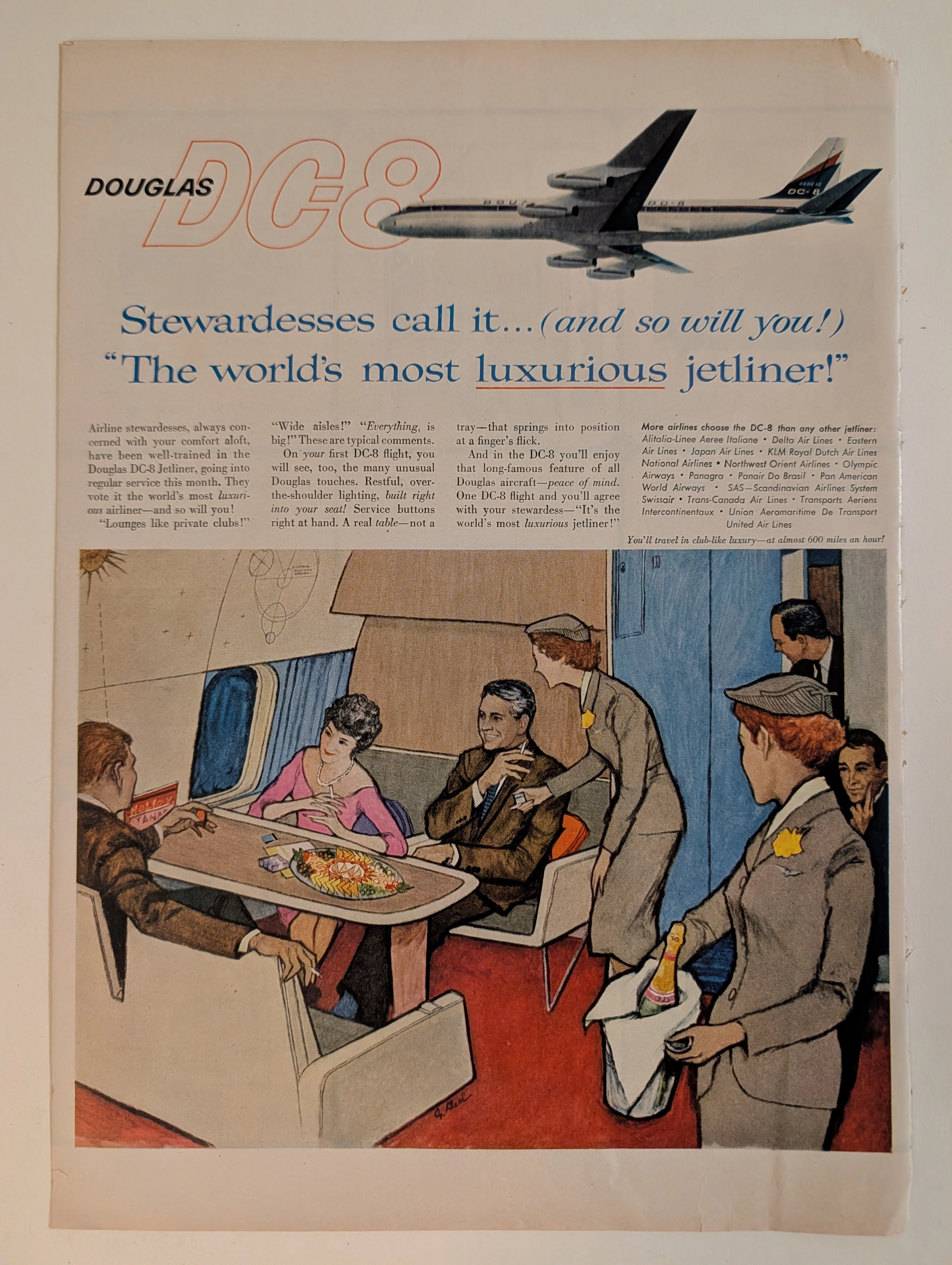
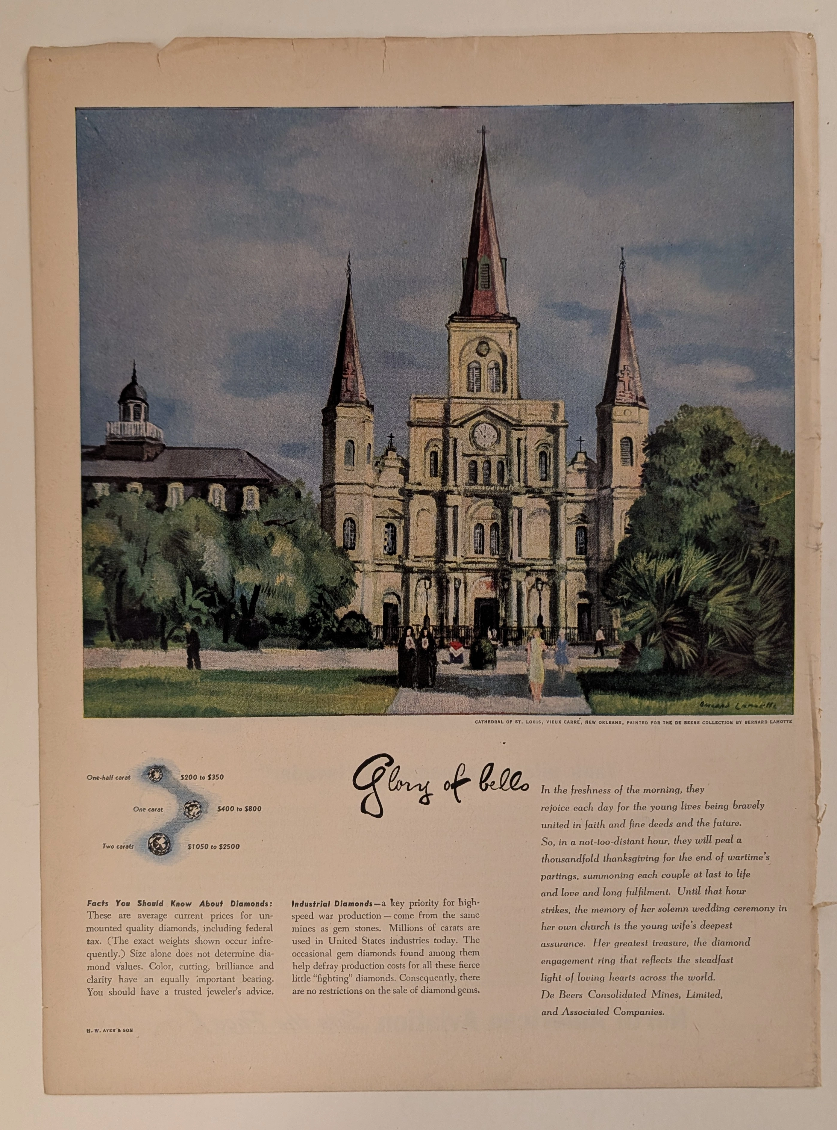
THE TIME TRAVELER'S DOSSIER: THE STRATOSPHERIC MANSION AND THE AESTHETICS OF DECAY
The artifact under exhaustive, museum-grade analysis is a flawlessly preserved Historical Relic originating from the absolute dawn of the commercial Jet Age (circa late 1950s to early 1960s). This Primary Art Document is a magnificent full-page advertisement for the Douglas DC-8, the aerospace leviathan engineered to rival the Boeing 707 and conquer the global skies. Visually anchored by an elegant, sweeping illustration of the aircraft's exterior and a highly detailed, evocative rendering of its opulent passenger lounge, the piece represents the zenith of mid-century aspirational marketing. Signed by an elusive mid-century commercial artist, the illustration captures the "Palomar Lounge"—a private club in the stratosphere where the elite played cards, smoked, and drank champagne beneath a Space-Age celestial diagram. By utilizing the ultimate authority of the era—the airline stewardess—to validate its luxury ("Stewardesses call it... The world's most luxurious jetliner!"), Douglas masterfully sold the illusion of exclusive, aristocratic segregation at 600 miles per hour. Rescued from the binding of a forgotten periodical, this pre-2000s analog artifact is an unforgeable testament to the aesthetic of wabi-sabi. Printed on inherently acidic wood-pulp paper, it exhibits a beautifully frayed right margin and a deep, warm ivory oxidation. This majestic chemical degradation transforms a mass-produced corporate propaganda piece into an irreplaceable, ready-to-frame Primary Art Document of aerospace history.
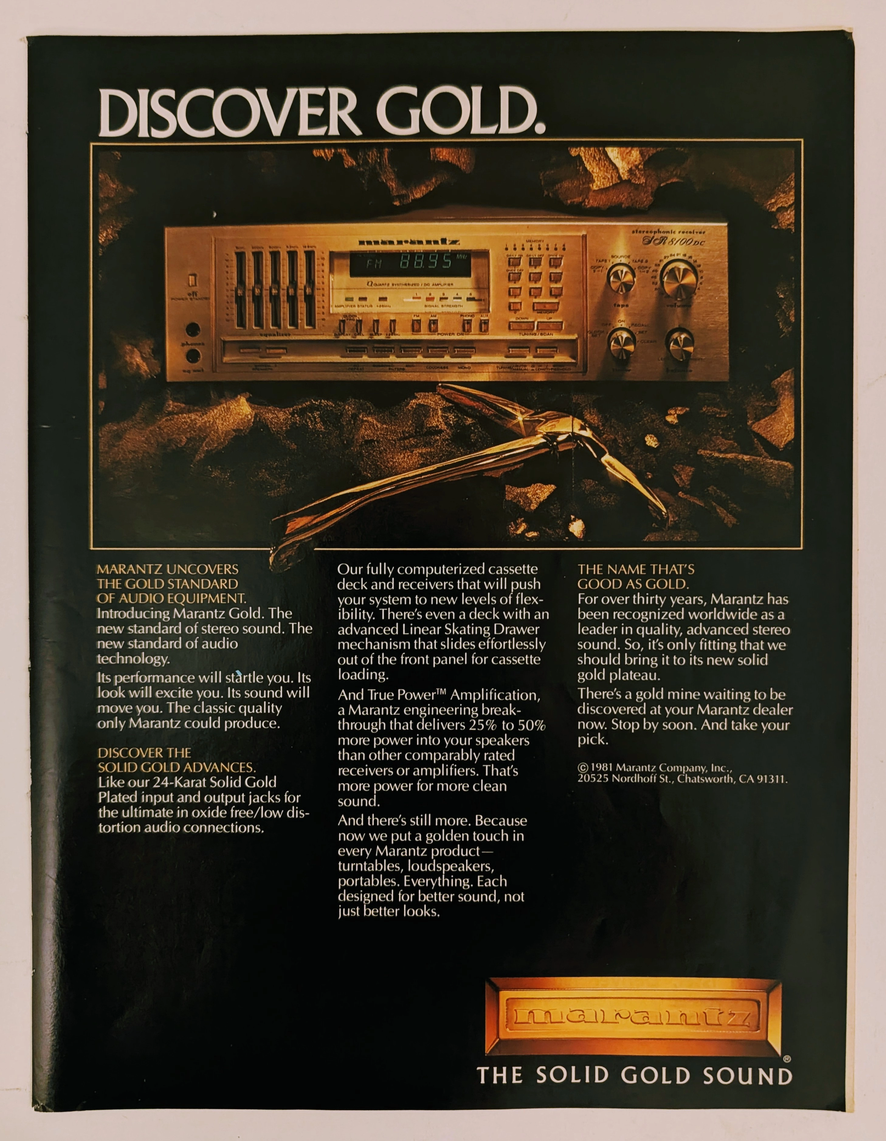
Marantz · Entertainment
The Time Traveller's Dossier: The Alchemy of Acoustics – Marantz "Discover Gold" Advertisement (1981)
History is not an accidental sequence of events; it is a meticulously engineered illusion crafted by those who command the aesthetic and cultural narratives of their time. Long before digital algorithms could sterilely dictate consumer preferences, the ultimate manifestation of psychological manipulation and corporate alchemy was executed through the calculated precision of the offset printing press and the absolute mastery of analog darkroom photography. The historical artifact before us is not merely a disposable page torn from a vintage magazine. It is a perfectly weaponized blueprint of audio-exoticism, a visual declaration of extreme consumer luxury, and an unwavering testament to an era where electronic hardware was sold not merely as a functional utility, but as a precious, excavated commodity. This museum-grade, academic archival dossier presents an exhaustive, microscopic deconstruction of a 1981 print advertisement for the Marantz "Solid Gold" audio equipment line. Operating on a profound and ruthless binary structure, this document records a calculated paradigm shift within the global consumer electronics industry. It captures the precise historical fracture where silicon, copper, and plastic were conceptually transmuted into a literal, physical embodiment of a precious metal. Through the highly specialized lens of late-analog commercial artistry and stringent visual forensics, this document serves as a masterclass in psychological marketing. It established the foundational archetype for selling technology as a high-yield status symbol—an archetype that unconditionally dictates the visual and strategic totems of the modern high-end audiophile industry today.
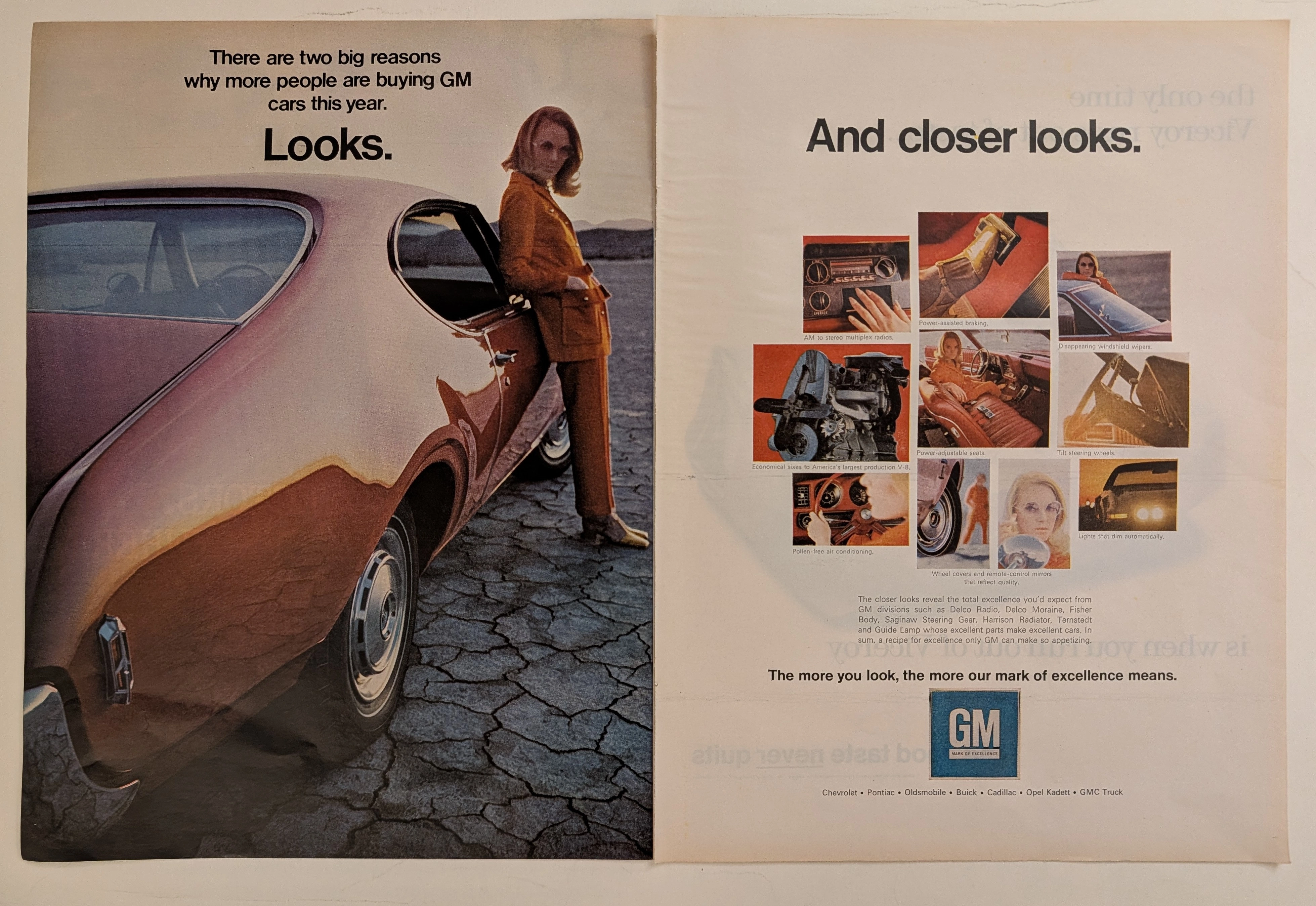
General Motors · Automotive
The Time Traveller's Dossier: The Zenith of General Motors
The automobile in mid-twentieth-century America was never merely a mode of transportation; it was a colossal canvas projecting industrial pride, technological advancement, and shifting consumer identities. The historical artifact elegantly and securely positioned upon the analytical table of The Record Institute today is a magnificent, large-format, two-page print advertisement for General Motors (GM), originating from the late 1960s to early 1970s. This document completely transcends the traditional boundaries of automotive catalogs. It operates as a highly sophisticated, dual-narrative cultural mirror: the left page captures the visceral, visual desire of "Looks" intertwined with a radical new era of feminine empowerment, while the right page dissects the mechanical and electronic mastery of "And closer looks," showcasing the vast ecosystem of GM's specialized manufacturing divisions. This world-class, comprehensive dossier conducts a meticulous, unyielding, and exceptionally deep examination of the artifact, operating under the absolute most rigorous parameters of historical, sociological, and material science evaluation. We will decode the immense industrial weight of the "Mark of Excellence" campaign, analyze the profound sociological implications of the female model's tailored pantsuit as a symbol of women's liberation, and dissect the anatomy of the nine revolutionary automotive technologies that defined modern driving. Furthermore, as we venture deeply into the chemical and physical foundations of this analog printed ephemera, we will reveal the precise mechanical fingerprints of the CMYK halftone rosettes and the graceful, natural oxidation of the paper substrate. This precise intersection of visual nostalgia, mid-century commercial artistry, and the immutable chemistry of time cultivates a serene wabi-sabi aesthetic—a natural, irreversible phenomenon that serves as the primary engine driving up its market value exponentially within the elite global spheres of Vintage Automotive Ephemera and Industrial Design collecting.