The Time Traveller's Dossier: The Ten-Dollar Titan – The Autolite Ford Indianapolis 500 Exhibition
The History
To fully appreciate the immense historical gravity and cultural magnitude of this artifact, one must meticulously contextualize the shifting paradigm of the American automotive industry and the legendary "Total Performance" era of the 1960s. During this period, the Ford Motor Company, under the aggressive leadership of Henry Ford II, initiated one of the most dominant corporate motorsport campaigns in global history. The directive was clear: dominate every major racing circuit on the planet, from the endurance crucible of Le Mans to the high-speed oval of the Indianapolis 500. This campaign was driven by the timeless industry adage: "Win on Sunday, sell on Monday."
A crucial, yet often overlooked, component of this global dominance was Autolite. Ford acquired the Autolite spark plug and ignition business in 1961 to ensure they had in-house control over the electrical lifelines of their high-performance engines. The distinct "Autolite Ford" logo became a ubiquitous symbol of reliability and power across international raceways. This specific advertisement brilliantly captures the essence of that corporate synergy. It features a stunning, aerodynamic open-wheel Indy car—bearing the number 23—undergoing swift maintenance by a dedicated pit crew.
The advertisement's copy is a masterstroke of psychological anchoring and economic contrast. The primary headline declares with absolute, pragmatic authority: "With a $50,000 racing car, they weren't about to scrimp on the ignition coil. So they got an Autolite coil. Almost a carbon copy of the one you buy. For under $10." This highly specific calculation serves a profound purpose. The text further breaks down the staggering costs: a $20,000 engine, a $2,000 fuel-injection system, contrasted against a sub-ten-dollar coil. By utilizing the "authority of numbers," the brand reassures the consumer of the machine's overwhelming capability while simultaneously making that elite technology accessible. It transfers the prestige, durability, and extreme stress-testing of the Indianapolis 500 directly to the average driver's station wagon or daily commuter. It is a promise that the heart of a champion beats within the engine of the common man.
The Paper
As a physical entity, this printed artifact functions as a living, breathing record of mid-twentieth-century graphic reproduction and substrate chemistry. Under exceptional macro-lens examination, this document reveals a fascinating application of analog printing technology harmonizing upon the canvas. The chaotic, sprawling background of the pit crew in motion is rendered with an intentional photographic blur, capturing the frantic kinetic energy of a mid-race pit stop.
However, squarely anchoring the foreground of the composition is the sharp, pristine aerodynamic nose of the race car. When examined closely, this specific section is revealed to be constructed from a precise, mathematically rigorous galaxy of halftone rosettes. This constitutes the mechanical fingerprint of the pre-digital analog offset printing press. Microscopic, varying sizes of Cyan, Magenta, Yellow, and Key (Black) ink dots are elegantly and systematically layered. In the context of the advertisement, this full-color, photorealistic halftone rendering captures the highly reflective sheen of the car's paintwork and the metallic gleam of the suspension components, orchestrating the human eye's perception of dimensional depth and blistering speed.
Yet, the most profound factor elevating the immense value of this artifact in the contemporary collector's market is the natural, organic process of Material Degradation. The expansive margins and the overall paper substrate exhibit a genuine, unavoidable, and entirely unforgeable "Toning." This gradual, graceful transition from the original bright manufactured paper to a warm, antique ivory hue is caused by the chemical oxidation of Lignin—the complex organic polymer that binds cellulose fibers together within the raw wood pulp of the paper. As the substrate is exposed to ambient oxygen and ultraviolet light over a span of decades, the molecular structure of the lignin gracefully breaks down. This accumulation of time, this naturally evolving patina, represents the absolute core of the wabi-sabi aesthetic. The profound appreciation for the beauty found in natural aging, impermanence, and the physical manifestation of history is an irreversible chemical reaction. It is precisely this authentic degradation that acts as the primary engine driving up its market value exponentially among elite collectors, as it provides the ultimate, irrefutable proof of the artifact's historical authenticity and its high-speed journey through time.
The Rarity
RARITY CLASS: S (Rare Crossover / Historic Motorsports Era)
Evaluated under the most exacting and rigorous archival parameters, this artifact is definitively designated as Class S.
The remarkable paradox of mid-century print advertising is that these documents were produced by the millions as explicitly "disposable media." They were inherently destined to be briefly observed in a magazine, read over morning coffee, and ultimately discarded into the recycling bins of history. Furthermore, automotive advertisements from the 1960s are highly susceptible to damage, often being torn out and pinned in garages, exposing them to grease, extreme temperature fluctuations, and fatal moisture. For a full-page advertisement celebrating the pinnacle of the Ford Total Performance era to survive intact without catastrophic structural tearing, destructive moisture staining, or fatal fading of the delicate halftone inks constitutes a highly significant statistical archival anomaly. The impeccable structural integrity of this paper, combined with the immense historical pedigree of the Autolite and Ford racing partnership, elevates the desirability of this document far beyond standard automotive collectors, making it a "Holy Grail" for historians of American motorsports. It is ardently sought after to ensure its historical permanence through museum-grade, acid-free conservation framing.
Visual Impact
The aesthetic brilliance of this artifact lies in its masterful execution of "Kinetic Contrast and Focal Depth." The art director has orchestrated a profound psychological landscape across the page. The background is a deliberate blur of visual noise—a frenetic, high-stakes moment where mechanics in red jackets rush to service the vehicle, their movements smeared across the film to emphasize the absolute premium placed on fractions of a second.
Yet, precisely in the foreground, thrusting out towards the reader, is the sharp, immaculate, and highly detailed nose of the race car, proudly bearing the number 23. This acts as a profound visual anchor. Despite the absolute chaos and speed surrounding it, the machine itself is a pillar of engineered perfection. The bright red and white livery demands attention, establishing a flawless hierarchy of visual information. The eye is instantly drawn to the massive air intake and the sleek bodylines before traveling up to the meticulously structured typography. This stark contrast delivers a highly potent subconscious message to the consumer: amidst the extreme, chaotic pressures of professional racing, Autolite components provide sharp, unwavering, and crystal-clear reliability.
Exhibition Halls
The Archive Continues
Continue the Exploration
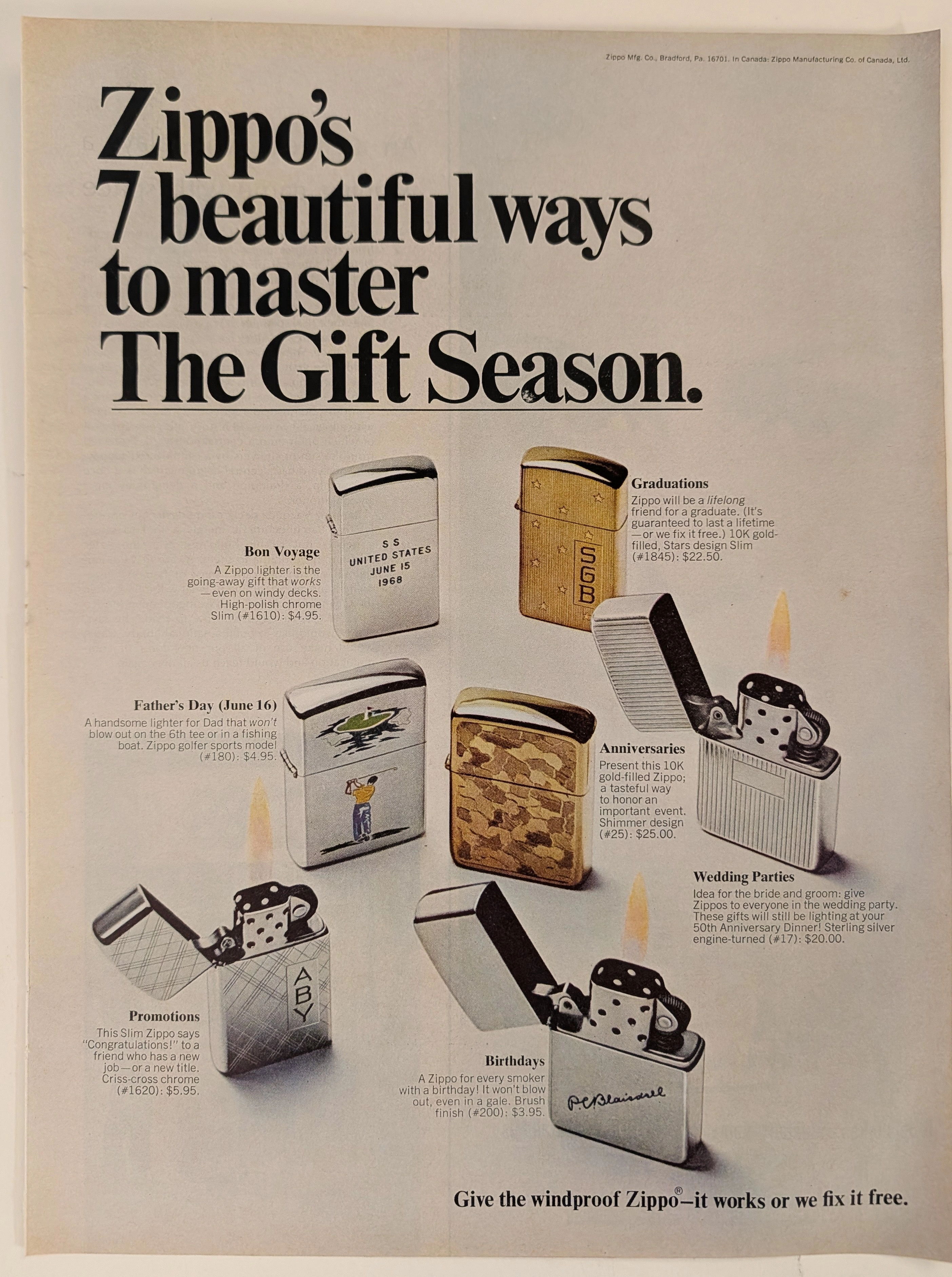
Zippo · Tobacco
The Time Traveller's Dossier: The Archive of the Immortal Flame – The 1968 Zippo "7 Beautiful Ways" Advertisement
The act of creating fire is a profound symbol of mankind's mastery over nature and the mechanical authority we hold over physical elements. The historical artifact elegantly placed upon the examination table of The Record Institute today is a full-page print advertisement for Zippo from 1968, presented under the campaign "7 beautiful ways to master The Gift Season." This document transcends conventional marketing; it is a flawless psychological projection of the mid-twentieth-century American Dream, encapsulated in metal and backed by a lifetime guarantee. This world-class archival dossier will conduct a meticulous and profound analysis of the artifact, operating under the most rigorous parameters of historical and material science evaluation. We will explore the brand's sophisticated market segmentation through seven occasion-specific lighter models, ranging from high-polish chrome to 10K gold-filled and Sterling Silver editions. Furthermore, we will delve into the magnitude of the legendary declaration, "it works or we fix it free," a promise that confidently challenges the passage of time. Advancing into the chemical foundations of this analog offset lithography, we will reveal the mechanical fingerprints of the halftone rosettes and the natural oxidation of the paper substrate. This precise intersection of metallurgical mechanics and the chemistry of time produces a serene wabi-sabi aesthetic—a phenomenon that serves as the primary engine driving up its market value exponentially within the elite global spheres of Vintage Tobacciana collecting.
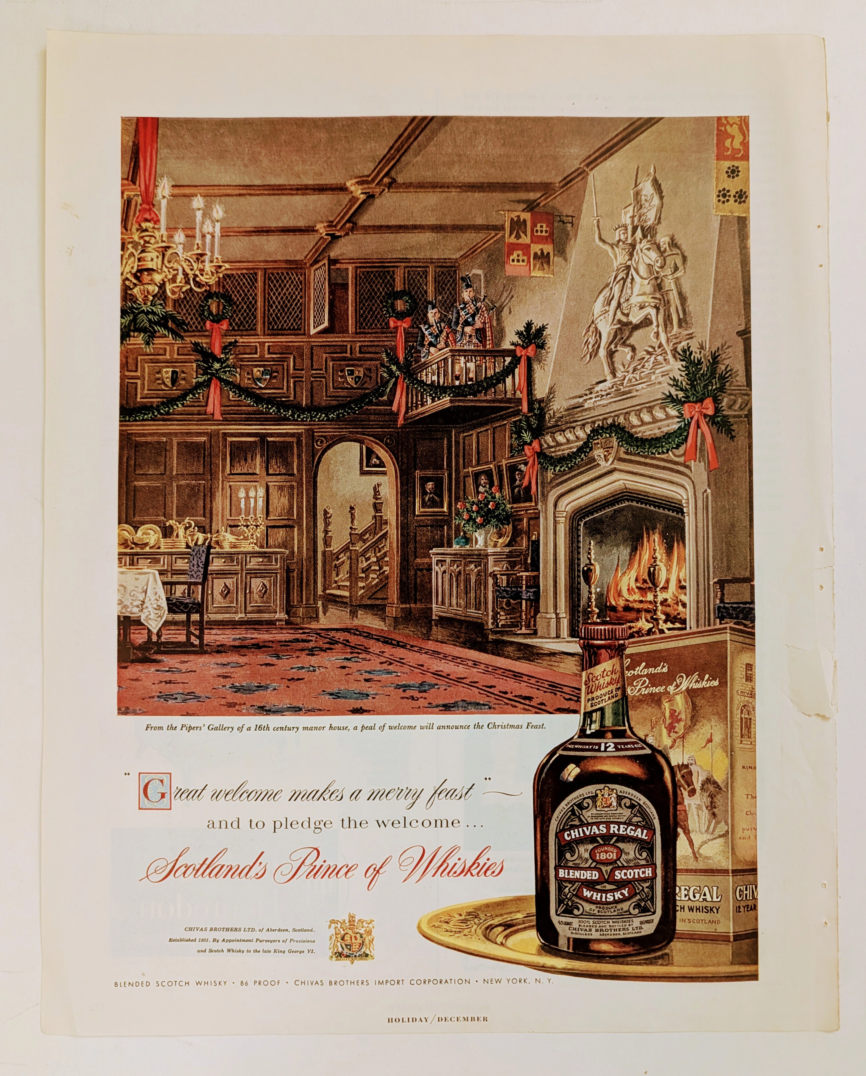
Chivas Regal · Beverage
The Time Traveller's Dossier: The Architecture of Aristocracy – Chivas Regal "Prince of Whiskies" Advertisement (Circa Mid-1950s)
analysis is a meticulously preserved, single magazine tear sheet representing a pinnacle era of mid-20th-century commercial illustration and brand positioning. Far removed from the realm of disposable consumer advertising, this artifact operates as a sophisticated sociological document. It captures a precise historical epoch where the global spirits industry—specifically the Scotch whisky sector—transitioned from marketing regional agricultural products to curating internationally recognized symbols of aristocratic heritage and refined lineage. Operating with absolute curatorial precision, this dossier deconstructs a circa mid-1950s advertisement for Chivas Regal 12-Year-Old Blended Scotch Whisky. By analyzing the intersection of classical illustration, the strategic deployment of British royal iconography, and the meticulous visual forensics of the analog printing process, this document illuminates the foundational strategies of modern heritage branding. It demonstrates how a brand gracefully orchestrated a narrative of ancient nobility and warmth to captivate the post-war American consumer, establishing an enduring standard for the premium spirits market that remains profoundly influential today.
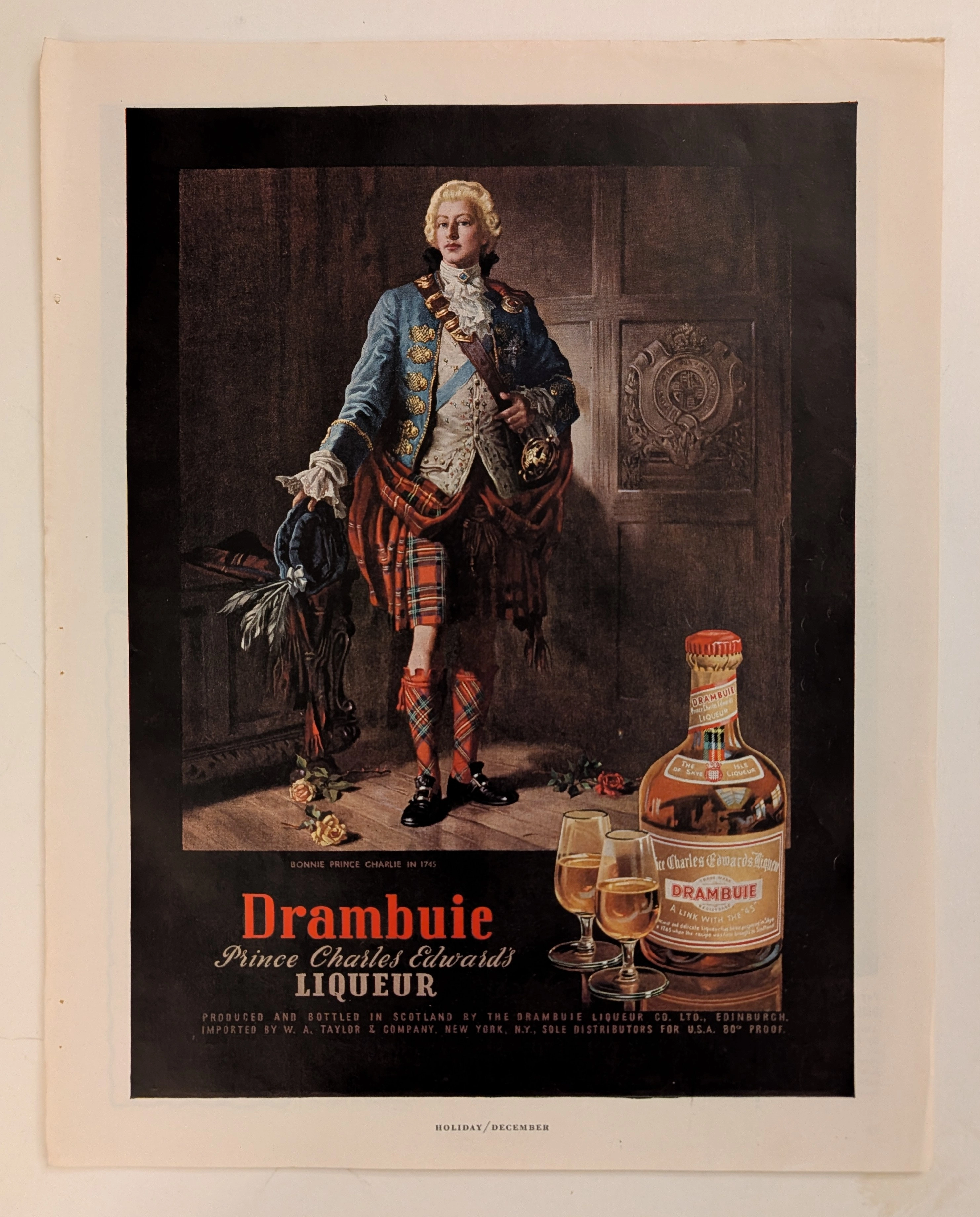
Drambuie · Beverage
The Time Traveller's Dossier: The Alchemy of Royal Rebellion – Drambuie "Bonnie Prince Charlie" Advertisement (Circa Mid-20th Century)
History is rarely an objective chronicle of facts; it is a malleable narrative, continually rewritten, romanticized, and ultimately weaponized by those seeking to legitimize their power or, in the modern era, their products. Long before digital algorithms could synthesize artificial heritage, the supreme manifestation of corporate alchemy was executed through the calculated precision of the four-color offset press and the appropriation of historical iconography. The artifact presented before us is not merely a vintage magazine tear sheet selling a Scottish liqueur. It is a masterclass in the commodification of myth, a visual distillation of romantic rebellion, and a foundational blueprint for what is now known as "Heritage Branding." This museum-grade, academic archival dossier presents an exhaustive, microscopic deconstruction of a mid-20th-century print advertisement for Drambuie Liqueur. Operating on a profound binary structure, this document records a calculated paradigm shift within the global spirits industry. It captures the precise historical fracture where a highly specific, geographically isolated alcoholic beverage was conceptually transmuted into a literal draught of royal rebellion and aristocratic romance. Through the highly specialized lens of late-analog commercial artistry and stringent visual forensics, this document serves as a masterclass in psychological marketing. It established the foundational archetype for linking the consumption of a physical product with the ingestion of an epic, historical fantasy—an archetype that unconditionally dictates the visual and strategic totems of the modern luxury spirits industry today.