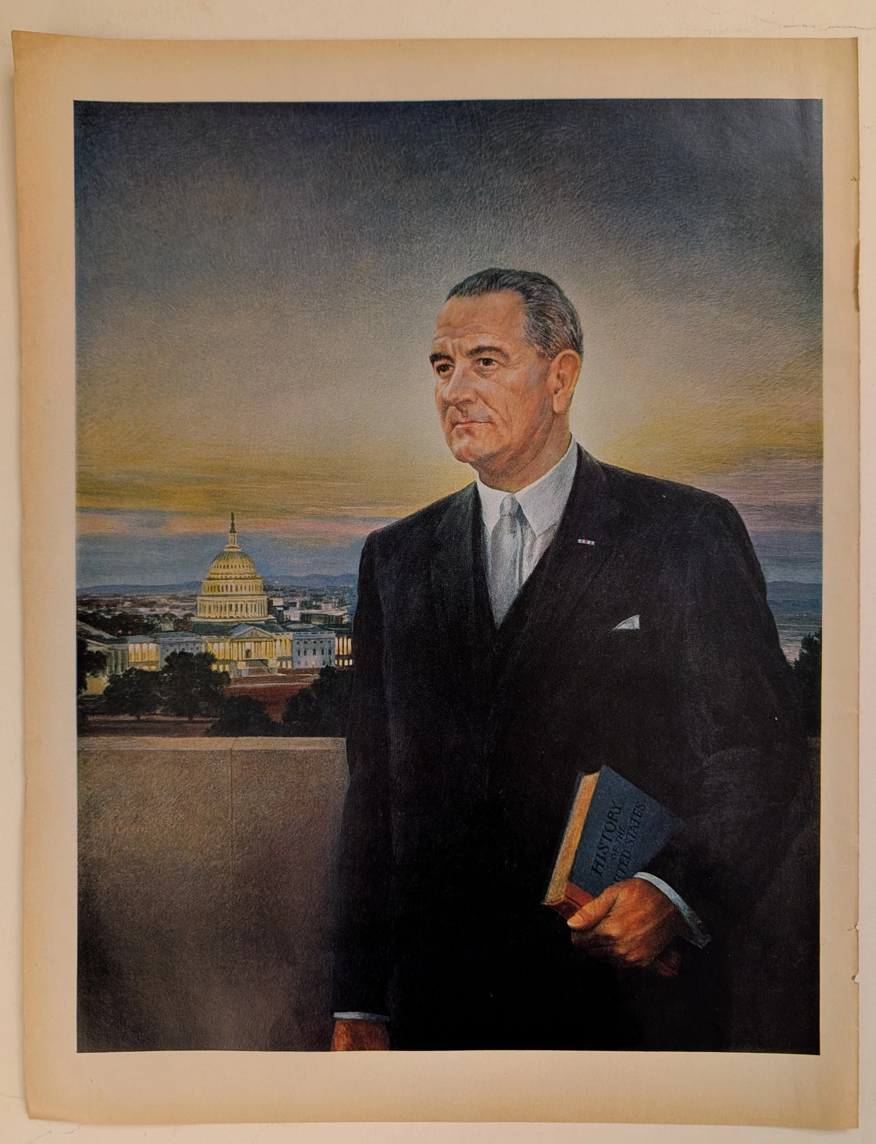
THE TIME TRAVELLER'S DOISSIER — THE WWII HOME FRONT AND THE AESTHETICS OF DESTRUCTION
The History
" THE HISTORY: World War II, The Tribunal of Rations, and the Soul of America "
Welcome to the inner sanctum of The Record, where we do not merely deal in paper; we act as the custodians of frozen time. The artifact you are staring at is not just an illustration; it is a mirror held up to humanity during its darkest, most defining hour of the 20th century. This is a monumental masterpiece titled "Norman Rockwell Visits a Ration Board" (published circa 1944), born from the brilliant mind and meticulous brush of America’s undisputed master of illustration, Norman Rockwell.
To truly absorb the visceral gravity of this piece, you must strap into our time machine and hurl yourself back to the suffocating tension of World War II. While American soldiers were bleeding into the soil of Europe and the sands of the Pacific, the "Home Front" was engaged in a quiet, desperate war of sacrifice. The United States government enacted draconian rationing policies. Gasoline, tires, sugar, meat, and shoes were severely restricted to fuel the war machine. The absolute arbiters of life, livelihood, and mobility in every town were the "Ration Boards"—ordinary citizens thrust into positions of god-like local authority.
Rockwell brilliantly chronicles a real event from his adopted hometown of Manchester, Vermont. He paints a quiet, tense room where six men and one woman sit stoically around a plain table. Looming over them in the background is a bust of Abraham Lincoln, a silent judge of their patriotic duty. The man standing on the far left, clutching his hat and pipe with a nervous, ingratiating smile? That is Norman Rockwell himself. The accompanying text humorously reveals that Rockwell attempted to use his immense celebrity to bribe the board, offering to paint their portraits in exchange for a coveted "B Card" (which granted extra gasoline). The unyielding, fiercely egalitarian New England board members stared him down and bluntly replied: "No, but if you don't [paint us well], we'll take away your A card."
This is Rockwell’s true genius. He uses his own humiliation to broadcast the most vital propaganda of the war: Absolute Equality. In that room, there are no celebrities, no titans of industry—only Americans bound by the same restrictions. This message is immortalized in the continuous "parade" of citizens forming a line across the bottom of the spread. From the wealthy dowager and the sharp-suited businessman to the mechanic hauling a massive rubber tire and the grandmother walking her dog, every single soul is forced to wait in the exact same line of deprivation. It is the most powerful, egalitarian snapshot of American endurance ever committed to paper.
(THE PAPER: The Beautiful Death — The Bloodstain of Time )
At The Record, our operational philosophy is absolute: we curate analog magazine pages and explicitly cut and sell them as individual, frame-ready sheets. We do this because the medium itself is dying, and its death is breathtaking. For this specific double-page spread, its historical magnitude is rivaled only by its physical "wounds."
Manufactured in the 1940s, this paper is composed of highly acidic wood pulp. It was born with a chemical death sentence. Observe the magnificent, massive water stain blooming aggressively across the lower quadrant, bleeding right through the parade of citizens. To an untrained eye, this is damage. To a master curator, this is a "Historical Scar." Over 80 years, the moisture reacted with the paper's inherent lignin and ambient oxygen, creating a deep rust-colored oxidation that looks remarkably like dried blood from the war era itself. This profound wabi-sabi—the beauty of imperfection and decay—reinforces the sheer fragility of this artifact. This paper is burning alive at a molecular level, and its organic decay makes it infinitely more valuable than a pristine digital reproduction.
(THE RARITY: Class S — A Survivor of the Incinerators)
During World War II, paper was a critical munition. Through nationwide "Paper Drives," millions of magazines were collected, shredded, and recycled into ammunition boxes and wartime packaging. The survival rate of a complete, intact double-page spread from 1944 is staggeringly low.
The fact that this specific sheet escaped the wartime shredders, survived eight decades of environmental hazards, and acquired such a dramatically beautiful, abstract water stain elevates its desirability to the stratosphere. Because it is a verified Norman Rockwell WWII masterwork combined with extreme physical scarcity, this piece undeniably commands a Rarity Class S designation. It has evolved from a mass-produced periodical into a singular piece of primary art. You are not buying a picture; you are preserving a dying breath of the 1940s.
Exhibition Halls
The Archive Continues
Continue the Exploration
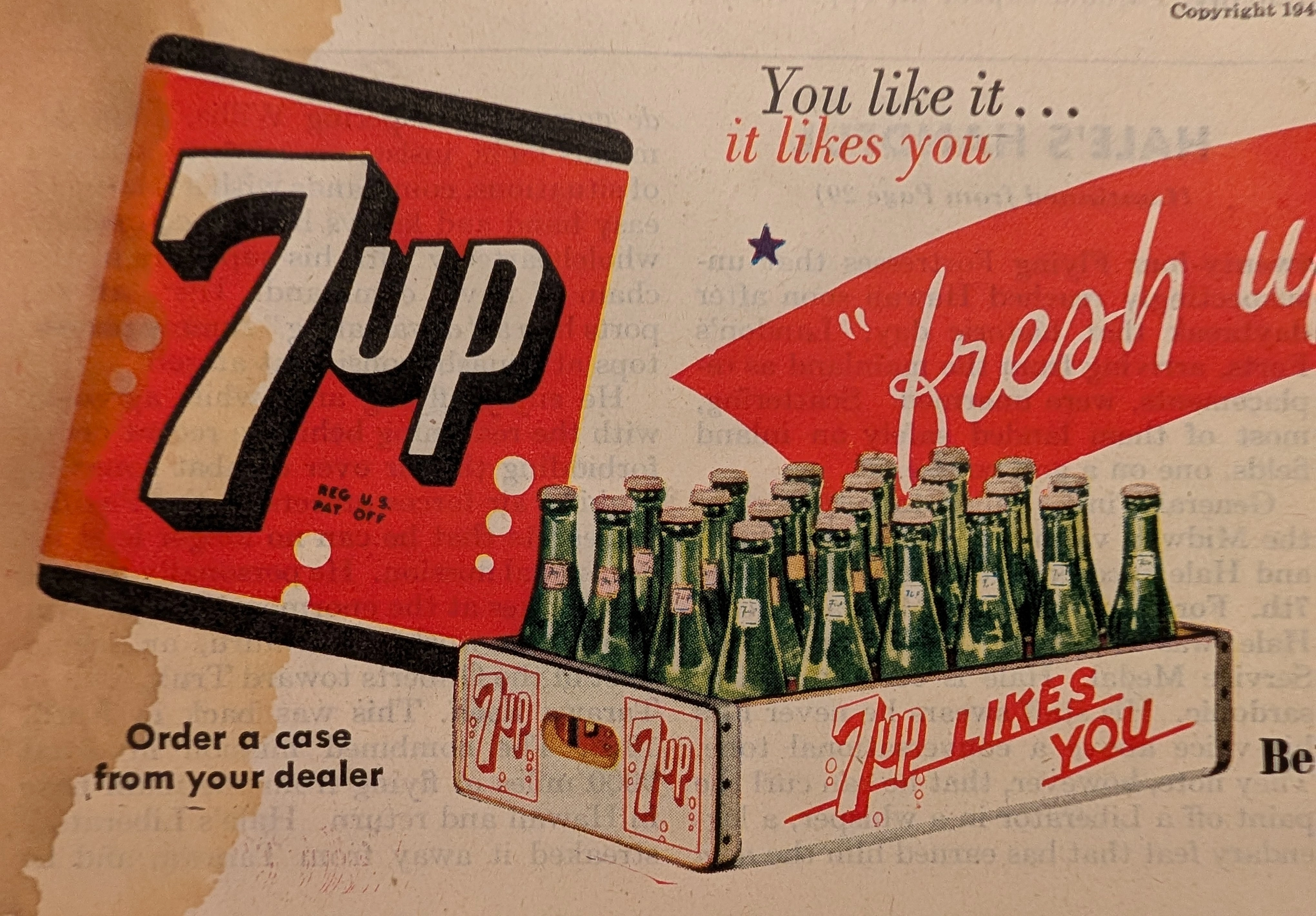
THE TIME TRAVELER'S DOSSIER: THE HOME FRONT SMILE AND THE 1944 PSYCHOLOGICAL WAR
This original 1944 7-Up advertisement cut page from The Saturday Evening Post is a vital piece of WWII Home Front ephemera. Beneath the wholesome mid-century illustrations lies a patriotic directive to support the war effort by adhering to rationing laws. The massive water stain and natural oxidation of the 80-year-old acidic paper highlight the beautiful aesthetic of decay, elevating this to a Class A primary art print.
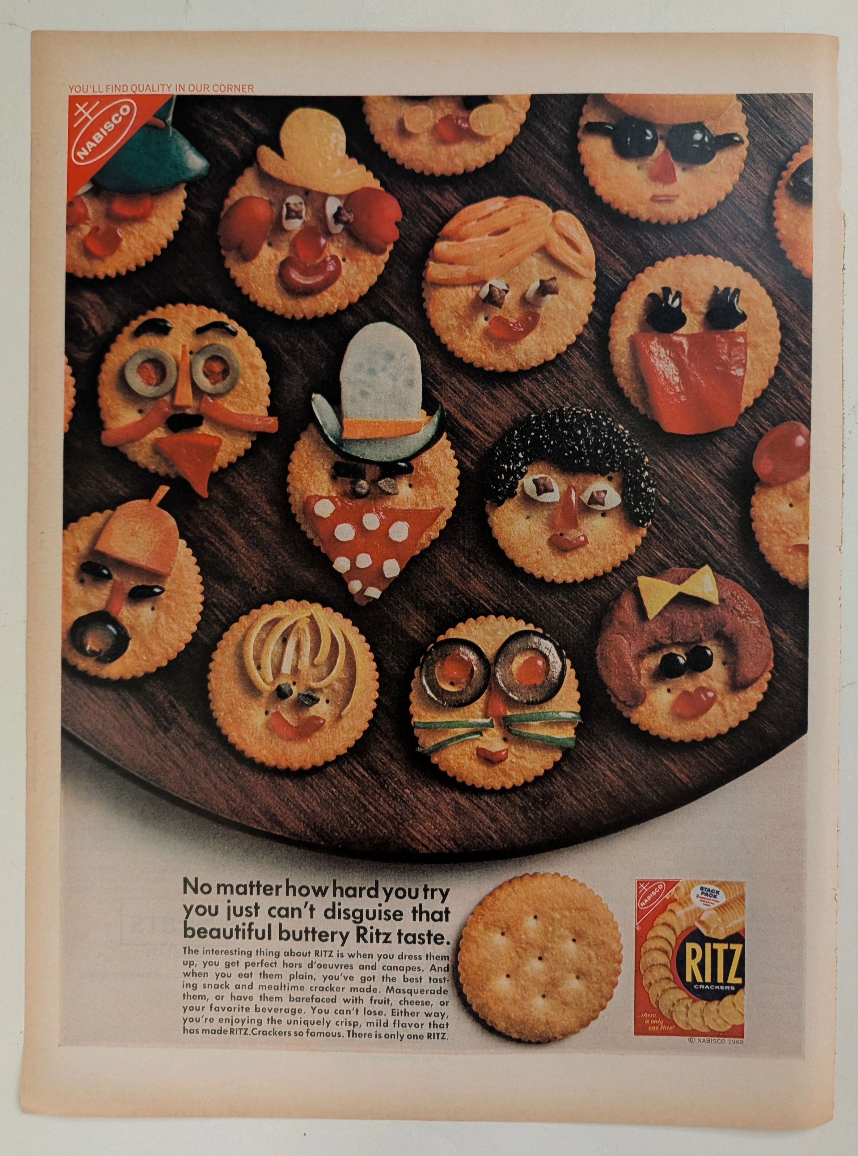
Ritz · Food
The Time Traveller's Dossier: The Masquerade of Quality – Nabisco's 1968 Ritz "Can't Disguise" Campaign and the Golden Age of Snack Branding
The evolution of the twentieth-century American pantry was fundamentally defined by the rise of standardized, nationally recognized "anchor" brands. The historical artifact elegantly positioned upon the analytical table of The Record Institute today is a striking full-page advertisement for Ritz Crackers, originating from 1968. This document represents a pivotal era in consumer psychology where snack foods were repositioned from simple staples to creative culinary canvases. By utilizing playful, anthropomorphic food art—crackers "disguised" as whimsical faces—Nabisco sought to reassure a burgeoning suburban middle class of the cracker's unmistakable "buttery" identity regardless of how it was "dressed up" for social gatherings. This comprehensive dossier conducts a meticulous examination of the artifact, operating under the absolute most rigorous parameters of historical and material science evaluation. We will decode the brilliant marketing psychology of the "Quality in Our Corner" slogan, analyze the profound sociopolitical impact of standardized grocery branding in the late 1960s, and dissect the mechanical fingerprints of the CMYK halftone rosettes captured in macro imagery. Finally, we will assess its archival rarity, exploring how the graceful, natural oxidation of the paper substrate serves as the primary engine driving up its market value exponentially within elite collection circles.
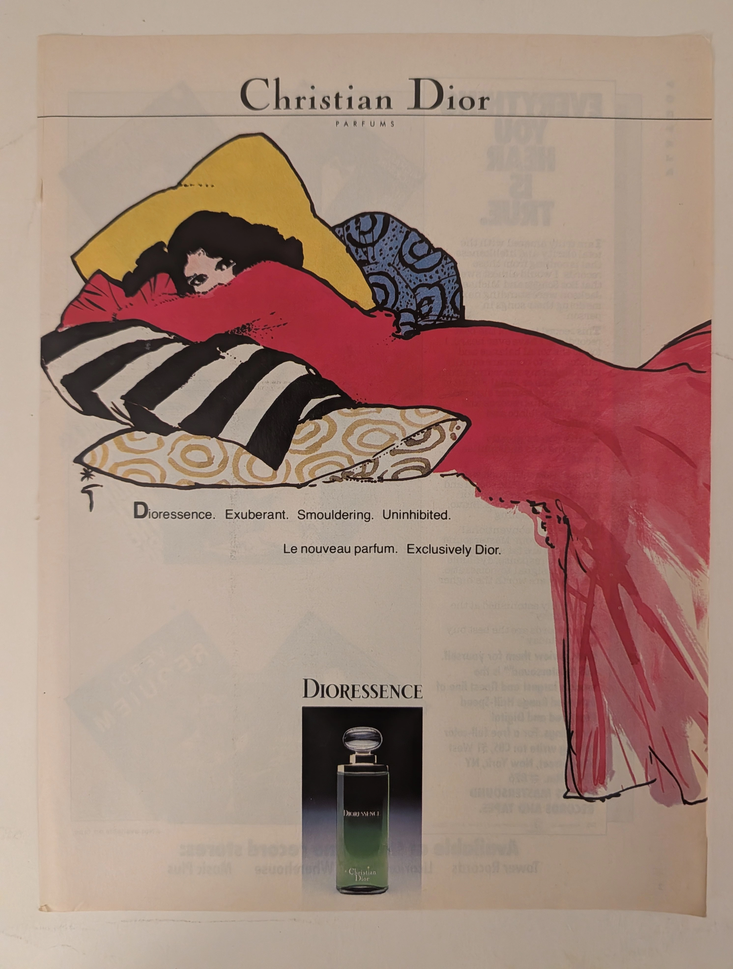
๋Joy De Jean Patou · Fashion
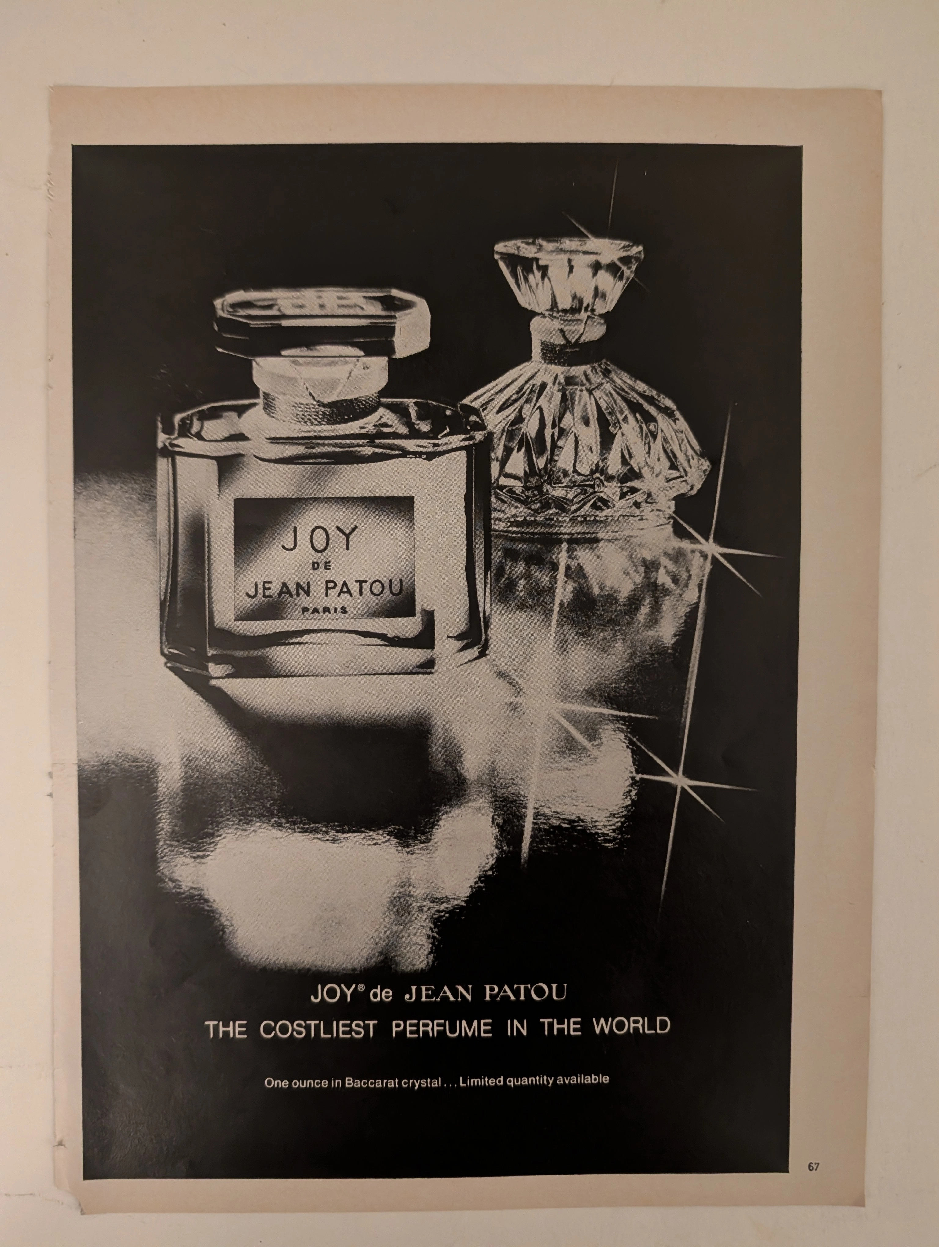
The Time Traveller's Dossier: The Semantics of Arrogance – JOY de Jean Patou Advertisement (Circa 1980s)
History is not written by the victors; it is printed by the industrialists. Long before digital algorithms began to sterilely dictate human consumption and virtual reality stripped away authentic tactile sensation, societal engineering and consumer psychology were executed through the calculated, mathematical geometry of the four-color offset press and the absolute mastery of analog darkroom photography. The historical artifact before us is not merely a disposable magazine tear sheet meant to peddle a fragrance. It is a perfectly weaponized blueprint of absolute capitalist supremacy, a visual declaration of class warfare, and an unwavering testament to an era of uncompromising, unapologetic ultra-luxury. This museum-grade, academic archival dossier presents an exhaustive deconstruction of a late-analog print advertisement for the legendary fragrance "JOY de Jean Patou," dating from the late 1970s to the early 1980s. Operating on a profound and ruthless binary structure, this document records a calculated paradigm shift within the global luxury goods industry. It captures the precise historical fracture where luxury transitioned conceptually from being a mere indicator of high-quality craftsmanship into a blatant, arrogant weapon of socioeconomic exclusion. Through the highly specialized lens of late-analog commercial artistry and stringent visual forensics, this document serves as a masterclass in psychological marketing. It established the foundational archetype for selling astronomically priced, exclusionary items—an archetype that unconditionally dictates the visual and strategic totems of modern ultra-luxury brands today.