The Time Traveller's Dossier: The Stroke of Seduction – 1970s Christian Dior "Dioressence" Advertisement
The History
To decode the sociological architecture embedded within this printed artifact, it is mandatory to contextualize the macroeconomic and cultural landscape of the 1970s. This era was defined by the sexual revolution, women's liberation, and a radical departure from the rigid domesticity of the 1950s. The fragrance industry, previously focused on selling delicate, floral "prettiness," had to aggressively recalibrate its public narrative. Perfume was no longer marketed merely as an accessory to attract a husband; it was repositioned as an invisible armor of personal empowerment and overt sensual expression.
Part 1: The Binary Shift: Restrained Elegance vs. Uninhibited Sensuality
The narrative architecture of this artifact is built upon a strict, uncompromising binary contrast against Dior's own history. Historically, the cultural consciousness linked Christian Dior with the "New Look" of 1947—cinched waists, full skirts, and a highly structured, almost rigid form of polite, aristocratic femininity. This advertisement violently obliterates that narrative. It executes a flawless cultural pivot by presenting a woman lounging fluidly, devoid of structural corsetry, wrapped in a loose, vibrant crimson gown. The message deliberately contrasts the old world of restrictive elegance with a new world of relaxed, aggressive sensuality. By conceptually transitioning the Dior woman from a stiff mannequin in a Parisian salon to a reclining, enigmatic siren in a private boudoir, the House of Dior successfully mapped its product onto the upward mobility and sexual liberation of the modern woman.
Part 2: The Liberation Discourse & The Semantics of Desire
Executing this binary shift required the invention of a highly specific vocabulary. The copywriting abandons traditional fragrance tropes of "floral" or "sweet" and instead adopts the aggressive, psychologically charged language of raw desire:
"Dioressence. Exuberant. Smouldering. Uninhibited."
The strategic deployment of these three exact adjectives functions as an early iteration of psychological lifestyle marketing. Positioning the fragrance as "smouldering" and "uninhibited" provided consumers with a logical, luxury-branded permission slip to embrace their own sexuality. It effectively neutralized any lingering societal objections to female assertiveness by cloaking it in the unquestionable authority of Parisian high fashion.
Part 3: The Sovereign Muse and the Reversed Male Gaze
The socioeconomic structure of the era saw the rise of the independent, self-purchasing female consumer. For a luxury perfume to succeed, it required her explicit approval, not her husband's. The illustration targets the intellectual vanity and confidence of this new demographic. The subject is reclining amidst a chaotic luxury of patterned pillows (stripes, animal prints, geometric gold), yet her gaze is direct, piercing, and entirely sovereign. She is not a passive object being observed; she is staring down the viewer. This conceptual boundary eradicated the line between the observer and the observed, placing the power entirely in the hands of the woman wearing Dioressence.
Part 4: Visual Semiotics: Fluidity vs. Geometry
The interplay between the illustration and the product photography functions as a precise semiotic indicator of the brand's absolute confidence, engineering consent through contrast:
The Fauvist Brushstroke: The use of bold, flat, unblended colors (the striking magenta/crimson dress against the stark yellow and patterned pillows) draws heavily from Fauvism. It signifies passion, heat, and emotion breaking free from restrictive lines.
The Monolithic Flacon: In stark contrast to the fluid, sweeping brushstrokes of the woman, the photograph of the Dioressence bottle at the bottom is rigid, architectural, and grounded in a dark, moody vignette. This visual juxtaposition anchors the wild fantasy of the illustration into a tangible, purchasable luxury object.
Part 5: Pop Culture Impact and Enduring Legacy
The visual language pioneered by this specific artist for Dior left an indelible, structural mark on global fashion pop culture. The aesthetic of the mysterious, illustrated fashion muse—conveyed through minimal lines and maximum color impact—became the foundational DNA for high-end fashion editorial. The unapologetic sensuality showcased here directly birthed the iconic, hyper-sexualized fragrance campaigns of the 1980s and 90s (from Calvin Klein's Obsession to Gucci's Tom Ford era).
In the modern commercial arena, the contemporary obsession with vintage haute couture illustrations operates on a cyclical return to this exact era. Today's luxury houses desperately try to manufacture the effortless, artistic soul that Dior achieved purely through analog ink and paint. This artifact is the foundational source code for modern, art-driven luxury marketing.
Artist Information
René Gruau (1909–2004): A legendary Italian-French fashion illustrator whose bold, fluid lines and striking use of color defined the visual identity of haute couture in the 20th century. Gruau shared a profound personal and professional friendship with Christian Dior, acting as the artistic visionary behind the House of Dior's most iconic fragrance campaigns (including Miss Dior, Eau Sauvage, and Dioressence). His signature—a distinctive capital "G" topped with a star, clearly visible on the left edge of this illustration—is a seal of absolute artistic royalty. Gruau's ability to distill the essence of a brand into a few masterful brushstrokes renders his work not merely advertising, but highly collectible fine art.
The Paper
As a physical entity, this tear sheet is an unrepeatable record of late-analog offset printing. The medium-weight coated magazine stock was engineered for mass distribution, yet its current state demands evaluation through the Japanese aesthetic philosophy of wabi-sabi (侘寂)—the recognition of beauty in impermanence and the natural progressio
Visual Forensics & Substrate Analysis:
Examining the extreme close-ups of this artifact reveals the mechanical heartbeat of the 1970s press. Under magnification, a fascinating duality emerges: the solid, aggressive blocks of color in the illustration exhibit the flat, continuous ink laydown of master-crafted lithography, while the photographic inset of the perfume bottle shatters into a precise, mathematical galaxy of CMYK halftone rosettes. The distinct grain of the offset process is aggressively visible in the dark background of the bottle inset. The margins exhibit authentic "toning"—a gradual, irreversible yellowing caused by the natural oxidation of lignin within the wood pulp. This organic degradation cannot be cloned by modern digital processes. The subtle fragility of the paper's edge and its evolving patina elevate the piece from a uniform industrial print to a singular, historically scarred artifact. The wabi-sabi nature of this page ensures that its aesthetic and historical value increases precisely because it is slowly returning to the earth.n of time.
The Rarity
Rarity Class: S (Superior / Museum Grade)
Within archival parameters, this artifact holds a definitive Class S designation. The paradox of mid-to-late century analog print ephemera lies in its initial mass production versus its extreme current scarcity. Magazines of the 1970s were quintessential disposable media, destined for the incinerator. The survival of this specific page—enduring half a century without yielding to destructive handling, severe moisture damage, or structural center creases—is an archival anomaly. More crucially, this is not a standard photograph; it is an original print of an illustration by René Gruau. Authentic, original tear sheets featuring Gruau's work for Dior are considered the "holy grail" of fashion ephemera. Finding a specimen that retains the absolute saturation of its vibrant crimson and yellow pigments, while bearing only the authentic hallmarks of wabi-sabi aging, is highly uncommon. Such pristine remnants are fiercely sought after by curators of fashion history for museum-grade conservation framing.
Visual Impact
The aesthetic authority of this piece lies in a masterclass of asymmetrical composition and negative space. The immediate focal point is the intense, kohl-rimmed eye of the subject, peeking out from the vibrant crimson fabric. This creates a powerful leading line, forcing the viewer's eye to travel down the sweeping, fluid lines of the dress, cascading directly into the bold typography and finally resting on the photographic reality of the perfume bottle. The artist strategically utilizes the stark, unprinted cream of the paper (negative space) to frame the explosion of color, projecting the subject forward from the two-dimensional plane. It is a highly calculated visual mechanism aimed at commanding absolute attention and evoking a physiological response of intrigue and desire.
Exhibition Halls
The Archive Continues
Continue the Exploration
Whirlpool · Technology
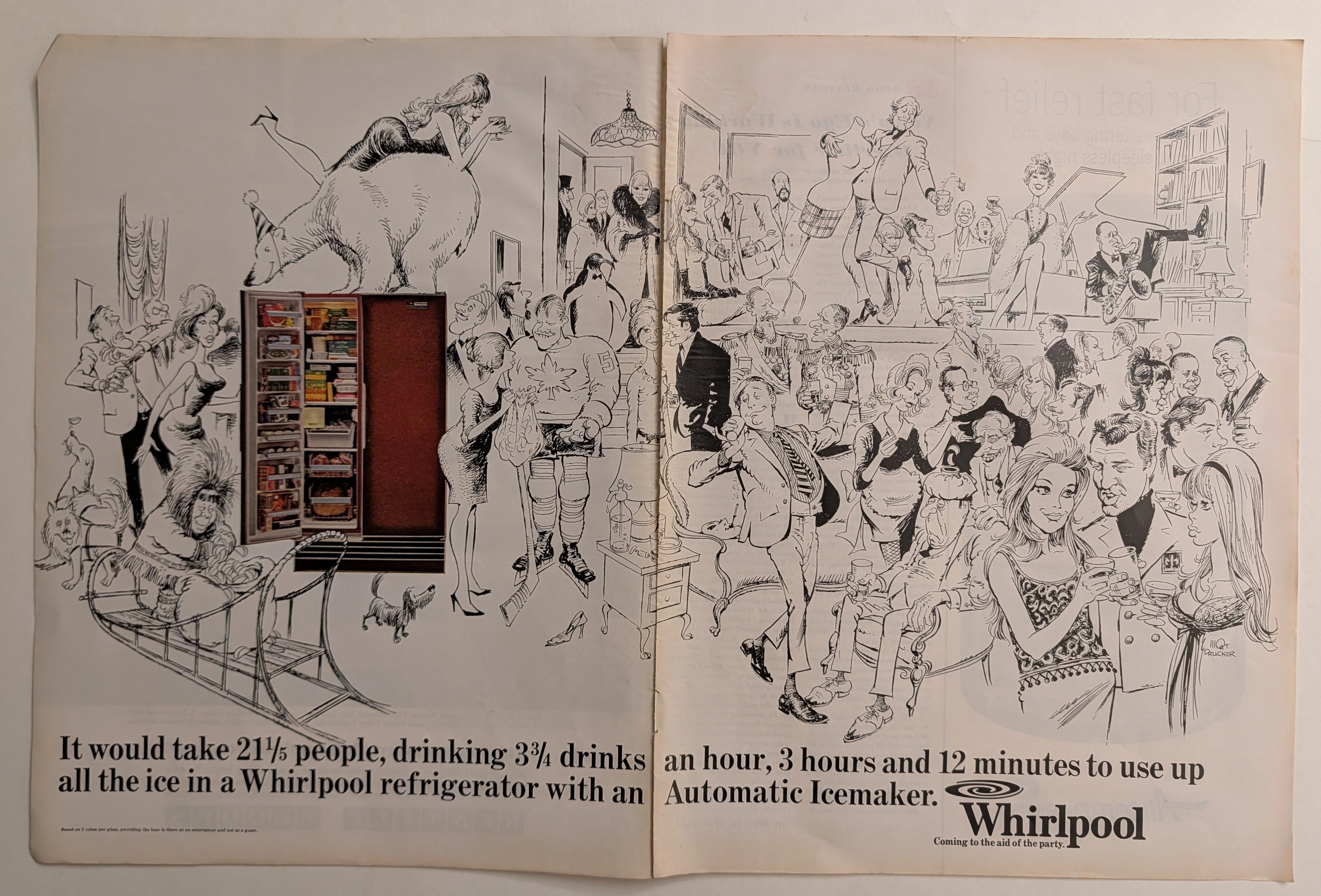
The Time Traveller's Dossier: The Sub-Zero Socialite – The Whirlpool Automatic Icemaker Exhibition by Mort Drucker
The evolution of the domestic appliance from a purely utilitarian instrument of labor into a central pillar of social entertainment and psychological comfort is one of the most fascinating sociological phenomena of mid-twentieth-century America. The historical artifact elegantly and securely positioned upon the analytical table of The Record Institute today is a majestic, large-format, two-page print advertisement for the Whirlpool Refrigerator with an Automatic Icemaker, originating from the cultural zenith of the 1960s. This document completely transcends the traditional boundaries of household goods marketing. It operates as a profound, sophisticated declaration of how technological innovation liberated the American middle class, transforming the private kitchen into a nexus of boundless hospitality, leisure, and social status. This world-class, comprehensive dossier will conduct a meticulous, unyielding, and deep examination of the artifact, operating under the absolute most rigorous parameters of historical, sociological, and material science evaluation. We will decode the brilliant, chaotic, and highly kinetic party scene birthed from the pen of legendary illustrator Mort Drucker, and analyze the dramatic visual juxtaposition of this monochromatic chaos against the highly structured, full-color reality of the Whirlpool refrigerator. Furthermore, as we venture into the chemical and physical foundations of this analog printed ephemera, we will reveal the mechanical fingerprints of the CMYK halftone rosettes and the graceful, natural oxidation of the paper substrate. This precise intersection of visual nostalgia, pop-art mastery, and the chemistry of time cultivates a serene wabi-sabi aesthetic—a natural, irreversible phenomenon that serves as the primary engine driving up its market value exponentially within the elite global spheres of Vintage Appliance Ephemera and Commercial Art collecting.
THE TIME TRAVELER'S DOSSIER: THE ILLUSION OF FRAGILITY AND THE ARCHITECTURE OF 60S BEAUTY
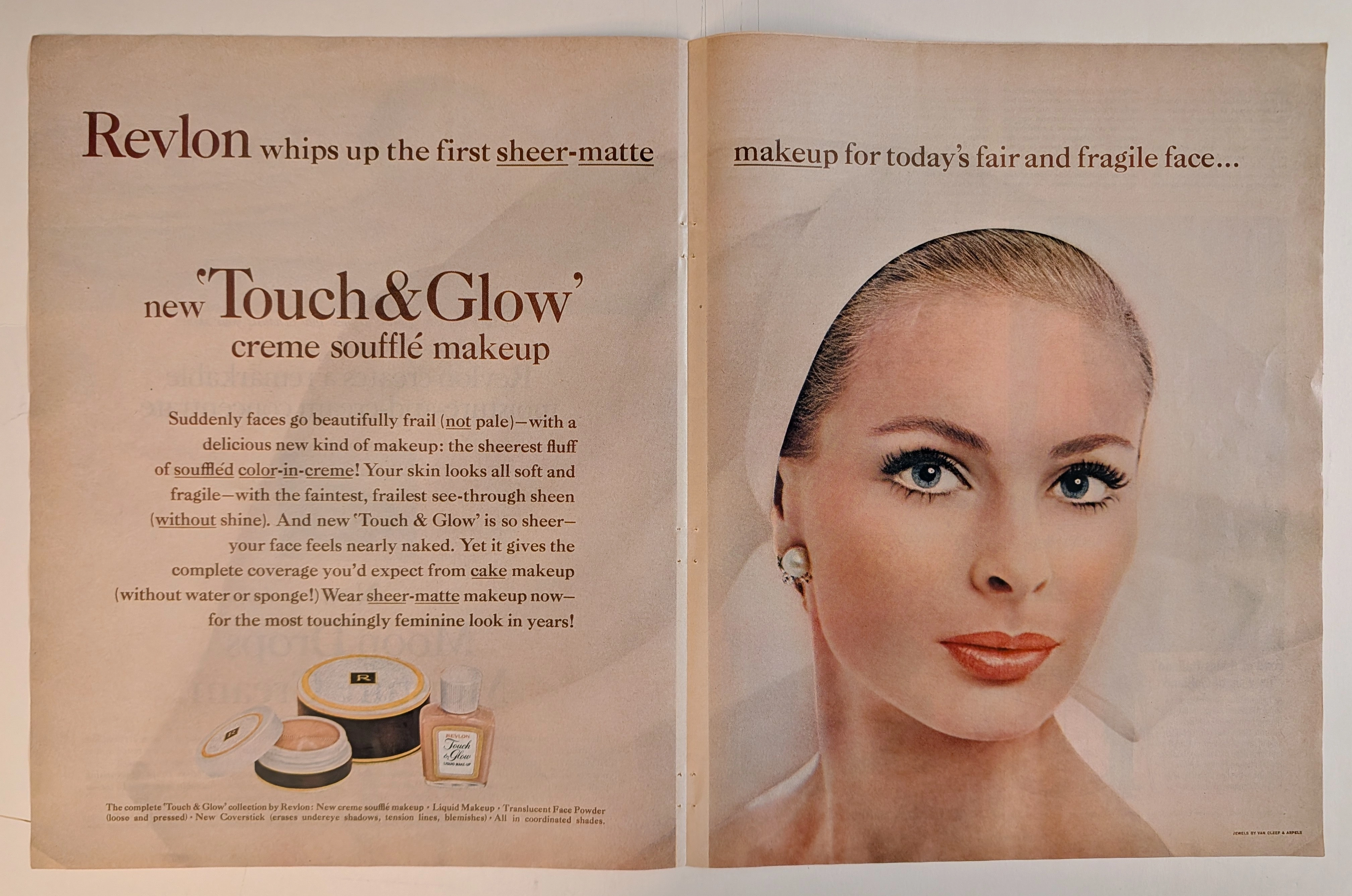
The artifact under rigorous, museum-grade analysis is a breathtaking, meticulously preserved Double-Page Historical Relic originating from the glamorous, highly engineered world of early 1960s American publishing. It features a sweeping, visually arresting advertisement for Revlon's "Touch & Glow" creme soufflé makeup. This Primary Art Document is not merely a cosmetic promotion; it is a profound sociological blueprint of mid-century feminine ideals. The ad's commanding copy, declaring makeup for "today's fair and fragile face," perfectly encapsulates the era's prescribed aesthetic: an aristocratic, porcelain delicacy juxtaposed with the striking, graphic eye makeup synonymous with the early 1960s. Crucially, this artifact documents the absolute genius of Charles Revson’s psychological marketing. By explicitly styling the model with "JEWELS BY VAN CLEEF & ARPELS" (as verified by the microscopic credit in the bottom right corner and the exquisite pearl/diamond earring), Revlon brilliantly anchored its accessible consumer cosmetics to the highest echelons of European haute joaillerie. Rescued from the binding of a forgotten periodical, this expansive double-page spread is printed on inherently acidic, mass-market wood-pulp paper. It is currently undergoing a slow, majestic chemical degradation. This natural oxidation—visible in the warm ivory patina and the delicate aging of the central seam—transforms a disposable commercial message into an irreplaceable, ready-to-frame Primary Art Document of mid-century beauty history.
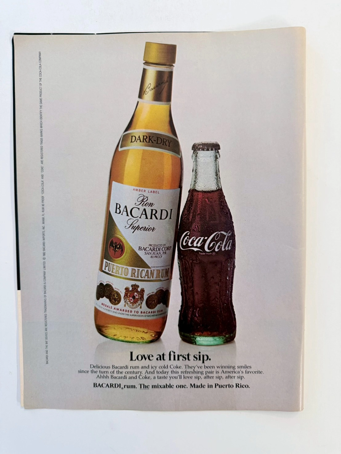
The Treaty of Two Empires: Deconstructing the 1982 Bacardi & Coca-Cola Vintage Ad (Class S)
Dive into the history of American consumerism with this museum-grade analysis of the iconic 1982 Bacardi and Coca-Cola co-branding advertisement. This Class S archival piece captures the definitive shift from the Golden Age of Illustration to 1980s commercial studio photography. Explore the geopolitical legacy of the "Cuba Libre" and the analog practical effects behind the immortal condensation on the Coca-Cola contour bottle.