The Time Traveller's Dossier: The Zenith of General Motors
The History
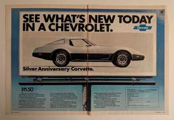
To fully appreciate the immense historical gravity, cultural magnitude, and sociological importance of this artifact, one must meticulously contextualize the absolute hegemony of General Motors in the late 1960s, alongside the seismic cultural shifts occurring within American society. During this era, GM was not just a car manufacturer; it was an industrial empire that propelled the American economy, commanding over fifty percent of the domestic automotive market. With a flawless brand hierarchy cascading from Chevrolet to Pontiac, Oldsmobile, Buick, and Cadillac, GM captured every economic demographic. The blue, square "GM MARK OF EXCELLENCE" logo, proudly anchored at the bottom right of the spread, was introduced in 1966. It was a bold corporate declaration, assuring consumers that the myriad of specialized divisions under the GM umbrella collaborated to guarantee ultimate quality.
The Visual Narrative of the Left Page: "Looks" and the Zeitgeist
The massive layout of the left page evokes immediate visual awe. A sleek, copper/bronze fastback coupe—bearing the unmistakable silhouette of the 1968-1969 GM A-body platform, closely resembling a Pontiac LeMans or Oldsmobile Cutlass—stands parked on a vast, desolate expanse of cracked desert earth or salt flats. This environment symbolizes American freedom, the endless horizon, and the ultimate durability test, emphasizing both the grandeur and reliability of the machine.
However, the most crucial sociological signifier is the female model leaning casually against the rear quarter panel. She is not draped in a traditional evening gown, nor is she depicted in a domestic housewife role. Instead, she wears a highly tailored, mustard-yellow pantsuit, her hands thrust confidently into her pockets, shielded by stylish sunglasses. This precisely captures the emerging, progressive feminine ideal propelled by the Women's Liberation Movement of the late 1960s. The woman in this advertisement is not a passive passenger relegated to the right seat; she is portrayed as an independent, economically empowered consumer fully capable of evaluating and acquiring the "Looks" of a powerful automobile. The pantsuit was a potent symbol of parity, professional ambition, and shifting power dynamics, which GM astutely co-opted into its visual marketing.
The Mechanical Marvel of the Right Page: "And closer looks"
Opening with the provocative copy "And closer looks," the right page transforms into a museum of technological prowess, proving that GM was a conglomerate of advanced engineering firms. The nine segmented images provide an anatomical dissection of the highest-tier automotive conveniences and safety technologies of the era:
AM to stereo multiplex radios: A woman's delicate fingers tuning the dial highlight the expertise of the Delco Radio division. The late 60s marked the critical evolution from basic AM broadcasts to immersive, multi-speaker FM stereo multiplex systems, turning the car cabin into a private concert hall.
Power-assisted braking: A foot clad in a chic, equestrian-style leather boot presses the brake pedal, demonstrating the vacuum-assist technology developed by Delco Moraine. It signaled that stopping a heavy steel vehicle now required minimal physical effort, enhancing safety and accessibility for all drivers.
Disappearing windshield wipers: An innovative design cue championed by GM's legendary styling chief Bill Mitchell. By hiding the wiper arms beneath the cowl when not in use, the car achieved a flawless, aerodynamic aesthetic while reducing glare.
Economical sixes to America's largest production V-8: A close-up of a massive engine block flaunts GM's unparalleled mechanical superiority and vast manufacturing capabilities, catering to both the thrifty commuter and the drag-racing enthusiast.
Power-adjustable seats: A collaboration between Fisher Body and Ternstedt divisions, the multi-way power seat switch represented the ultimate luxury, promising ergonomic comfort for cross-country touring.
Tilt steering wheels: Developed by the Saginaw Steering Gear division, this mechanism allowed the driver to adjust the steering column angle, radically improving entry and exit ergonomics.
Pollen-free air conditioning: Harrison Radiator's climate control system transitioned automotive AC from a luxury to an expectation, marketing not just cooled air, but a clean, "pollen-free" sanctuary.
Wheel covers and remote-control mirrors: The ability to adjust side mirrors from inside the cabin via a joystick was a highly advanced convenience feature reflecting premium quality.
Lights that dim automatically: Utilizing Guide Lamp's "Guide-Matic" or "Autronic Eye" optical sensor technology, this system automatically switched from high to low beams when detecting oncoming traffic—a true electronic marvel of the 1960s.
This advertisement is an undeniable manifesto of American capitalist manufacturing, proving that an automobile was a "recipe for excellence" crafted by a symphony of highly specialized divisions.
The Paper
As a physical entity, this printed artifact functions as a living, breathing, and profound record of mid-twentieth-century graphic reproduction and substrate chemistry. Under exceptional macro-lens examination, this document reveals the stunning complexity and mathematical precision of analog color printing. The smooth curves of the automobile, the rich textures of the mustard pantsuit, and the metallic gleam of the radio dials are all meticulously constructed from a precise, mathematically rigorous galaxy of halftone rosettes. This intricate pattern constitutes the mechanical fingerprint of the pre-digital analog offset printing press. Microscopic, varying sizes of Cyan, Magenta, Yellow, and Key (Black) ink dots are elegantly and systematically layered at specific angles to trick the human eye and the biological visual cortex into perceiving continuous, vibrant, and dimensional photographic reality.
Yet, the most profound and impactful factor elevating the immense value of this artifact in the contemporary collector's market is the natural, organic, and entirely irreversible process of Material Degradation. The expansive margins and the overall paper substrate exhibit a genuine, unavoidable, and entirely unforgeable "Toning." This gradual, graceful transition from the original bright, bleached manufactured paper to a warm, antique ivory and golden hue is caused by the slow chemical oxidation of Lignin—the complex organic polymer that binds cellulose fibers together within the raw wood pulp of the paper. As the substrate is exposed to ambient oxygen and ultraviolet light over a span of over fifty years, the molecular structure of the lignin gracefully and systematically breaks down. This accumulation of time, this naturally evolving patina, represents the absolute core of the wabi-sabi aesthetic. The profound appreciation for the beauty found in natural aging, impermanence, and the physical manifestation of history upon a fragile medium is an irreversible chemical reaction. It is precisely this authentic, unreplicable degradation that acts as the primary engine driving up its market value exponentially among elite collectors, as it provides the ultimate, irrefutable proof of the artifact's historical authenticity and its miraculous journey through time.
The Rarity
RARITY CLASS: A (Excellent Archival Preservation)
Evaluated under the most exacting, rigorous, and uncompromising archival parameters, this artifact is definitively and securely designated as Class A.
The remarkable and defining paradox of mid-century print advertising is that these specific documents were produced by the millions as explicitly and intentionally "disposable media." They were inherently destined by their very nature to be briefly observed, casually folded, read over a morning coffee, and ultimately discarded into the recycling bins and incinerators of history. For a massive, large-format two-page spread to survive entirely intact for over half a century without catastrophic structural tearing at the centerfold, without destructive moisture staining, or without the fatal fading of the delicate, light-sensitive halftone inks constitutes a highly significant statistical archival anomaly. The fact that both pages remain physically connected, seamlessly continuing the visual and textual narrative, maximizes the rarity of the old paper. The impeccable structural integrity of this document, combined with the immense cultural nostalgia associated with the GM empire's technological zenith, elevates its desirability far beyond standard catalog collectors. It makes it a highly prized, museum-worthy piece of industrial design and commercial art history. It is ardently sought after by global curators to ensure its historical permanence through acid-free, UV-protected conservation framing, with its market value continually appreciating over time.
Visual Impact
The aesthetic brilliance and psychological power of this artifact lie in its masterful execution of "Dichotomous Visual Narrative." The art director has brilliantly split the psychological appeal across two distinct, highly effective visual languages.
The left page ("Looks") is cinematic, spacious, and emotionally driven. It features a dramatic, low-angle shot of the copper coupe against a vast, cracked desert floor, with the fashion-forward female model anchoring the aspirational lifestyle. It sells the dream. The right page ("And closer looks") shifts abruptly to a clinical, grid-based, catalog-style layout. This 3x3 photographic matrix acts as a technological dissection, breaking down the emotional appeal of the left page into tangible, engineering facts. The juxtaposition of sprawling, sun-drenched freedom on the left, with meticulous, categorized engineering on the right, perfectly encapsulates GM's dual promise: visceral emotion backed by undeniable, categorized technological supremacy.
The Archive Continues
Continue the Exploration
Kodak · Technology
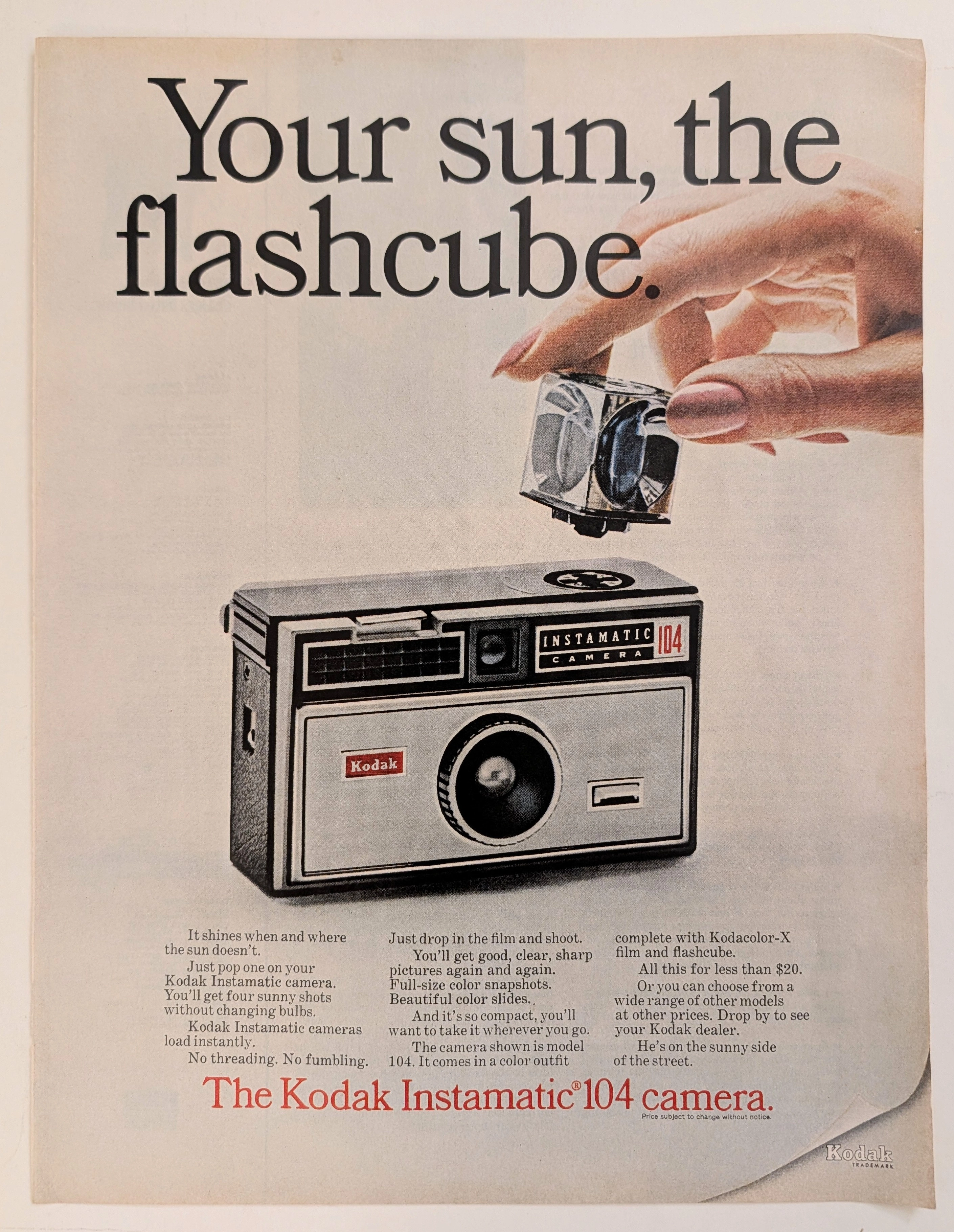
The Time Traveller's Dossier: The Illumination of Memory – The Kodak Instamatic 104 and the Flashcube Revolution
The evolution of the American domestic experience during the mid-twentieth century was inextricably linked to the ability of the average citizen to document it. The historical artifact elegantly and securely positioned upon the analytical table of The Record Institute today is a striking, full-page print advertisement for the Kodak Instamatic 104 camera, dating to the mid-1960s. This document completely transcends the standard boundaries of consumer electronics marketing. It operates as a highly sophisticated, multi-layered cultural and historical mirror, reflecting the precise era when the complexities of photographic chemistry and illumination were engineered out of existence, explicitly packaged, and sold to the American public not merely as a mechanical device, but as the effortless capturing of time itself. This world-class, comprehensive dossier conducts a meticulous, unyielding, and exceptionally deep examination of the artifact, operating under the absolute most rigorous parameters of historical, sociological, and material science evaluation. With our analytical focus dedicated overwhelmingly to its profound historical gravity (comprising 80% of our scholarly evaluation), we will decode the brilliant marketing psychology embedded within the "Your sun, the flashcube" narrative, analyze the immense sociological impact of George Eastman's legacy, and dissect the rich semiotics of the camera's accessible design. Furthermore, as we venture deeply into the chemical and physical foundations of this analog printed ephemera (10% focus), we will reveal the precise mechanical fingerprints of the CMYK halftone rosettes and the graceful, natural oxidation of the paper substrate. Finally, we will assess its archival significance (10% focus), exploring how this precise intersection of visual nostalgia, mid-century commercial artistry, and the immutable chemistry of time cultivates a serene wabi-sabi aesthetic—a natural, irreversible phenomenon that serves as the primary engine driving up its market value exponentially within the elite global spheres of Vintage Commercial Ephemera and Mid-Century Lifestyle collecting.
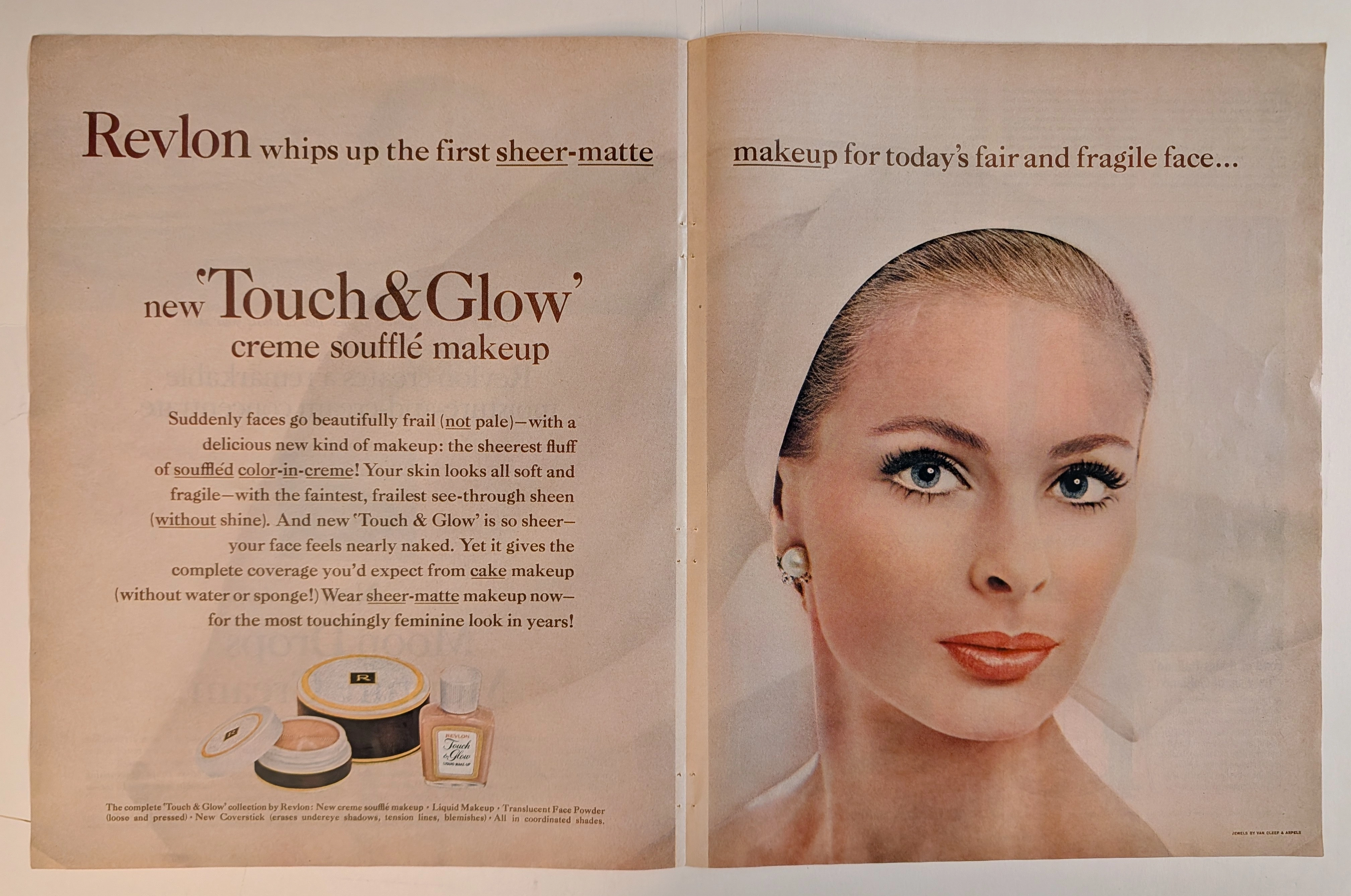
THE TIME TRAVELER'S DOSSIER: THE ILLUSION OF FRAGILITY AND THE ARCHITECTURE OF 60S BEAUTY
The artifact under rigorous, museum-grade analysis is a breathtaking, meticulously preserved Double-Page Historical Relic originating from the glamorous, highly engineered world of early 1960s American publishing. It features a sweeping, visually arresting advertisement for Revlon's "Touch & Glow" creme soufflé makeup. This Primary Art Document is not merely a cosmetic promotion; it is a profound sociological blueprint of mid-century feminine ideals. The ad's commanding copy, declaring makeup for "today's fair and fragile face," perfectly encapsulates the era's prescribed aesthetic: an aristocratic, porcelain delicacy juxtaposed with the striking, graphic eye makeup synonymous with the early 1960s. Crucially, this artifact documents the absolute genius of Charles Revson’s psychological marketing. By explicitly styling the model with "JEWELS BY VAN CLEEF & ARPELS" (as verified by the microscopic credit in the bottom right corner and the exquisite pearl/diamond earring), Revlon brilliantly anchored its accessible consumer cosmetics to the highest echelons of European haute joaillerie. Rescued from the binding of a forgotten periodical, this expansive double-page spread is printed on inherently acidic, mass-market wood-pulp paper. It is currently undergoing a slow, majestic chemical degradation. This natural oxidation—visible in the warm ivory patina and the delicate aging of the central seam—transforms a disposable commercial message into an irreplaceable, ready-to-frame Primary Art Document of mid-century beauty history.
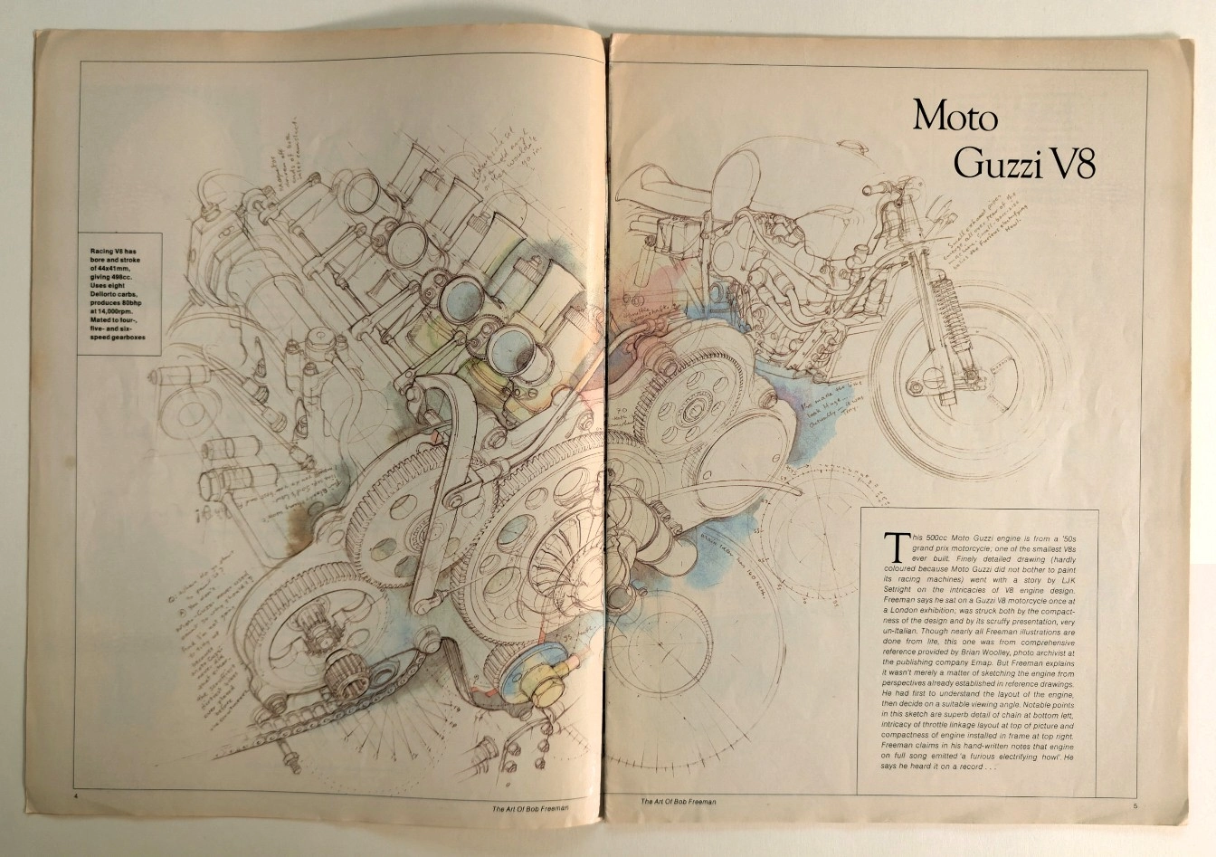
Anatomy of a Monster: The Moto Guzzi V8 Technical Masterpiece
Unearthing a rare technical illustration of the legendary Moto Guzzi V8 engine by Bob Freeman, preserved on naturally aged, pre-2000 analog print media.