— The Record Institute Journal")
 — The Record Institute Journal")
 — The Record Institute Journal")
 — The Record Institute Journal")
 — The Record Institute Journal")
 — The Record Institute Journal")
 — The Record Institute Journal")
 — The Record Institute Journal")
 — The Record Institute Journal")
The Time Traveller's Dossier: The Architecture of Unrestricted Mobility – Avis "Rent it Here - Leave it There" Advertisement (Circa 1956)
The History
To genuinely decode the complex sociological architecture and logistical supremacy embedded within this printed artifact, one must pull back the lens to contextualize the overwhelming macroeconomic history of the mid-1950s United States. This era was defined by a massive, unprecedented economic boom, the explosive birth of the suburban middle class, the dawn of the jet age (though dominated here by the final, glorious apex of propeller-driven commercial airliners like the Douglas DC-7), and the imminent authorization of the Interstate Highway System in 1956. The American landscape was rapidly shrinking, conquered by the combustion engine and the wing.
In this arena of rapid expansion enters the Avis Rent-a-Car System. Historically, renting a vehicle was a localized, "round-trip" affair, tethering the consumer to their point of origin. It was a logistical friction point that hindered true, seamless mobility. Avis, locked in a fierce, cutthroat battle for market share against its primary rival, Hertz, recognized a profound psychological and logistical shift: the modern American—whether a nuclear family on a sprawling vacation or a ruthless corporate salesman on a multi-city conquest—no longer wanted to retrace their steps. They demanded linear, forward momentum. By introducing the exclusive "one-way" service without prohibitive return fees, Avis did not just rent 1956 Plymouths; they sold the total eradication of geographical anchors. They capitalized on the mid-century ethos of boundless progress, creating a service designed to make the consumer feel like a master of time and space, moving seamlessly from the pressurized cabin of an airliner into the chrome-laden driver's seat of a brand-new V8 automobile.
Creator / Illustrator Information: While commercial illustration of this era was often treated as disposable industrial art, the specific artist behind this magnificent storyboard has left their mark. In the bottom right corner of the "San Francisco" panel, the signature "H. Miller" (or HMiller) is clearly visible. This betrays the hand of a highly skilled mid-century commercial illustrator. The choice to illustrate this complex logistical service rather than photograph it is a critical semiotic decision. Photography would have been too literal, too constrained by the logistical nightmare of shooting on location across six different American cities with perfectly matched lighting. Illustration, however, allows for the manipulation of reality to achieve an idealized, Platonic vision of travel. Miller utilizes a dynamic, comic-book-style sequential art technique—complete with vibrant pastel washes, exaggerated perspectives, and the flawless rendering of 1956 Plymouth Savoy/Belvedere models—to digest a complex, multi-state logistical operation into a simple, heroic, and effortlessly glamorous visual narrative.
Part 1: The Binary Shift: Static Geography vs. Fluid Mobility
The narrative architecture of this artifact is built upon a strict, uncompromising contrast against the preceding decades of travel. Prior to this innovation, the traveling salesman or the vacationing family was entirely beholden to the rigid schedules of train routes or the exhausting reality of driving a personal vehicle across thousands of miles, only to face the grueling necessity of driving it all the way back.
This Avis advertisement violently obliterates that antiquated narrative. It executes a flawless cultural pivot by introducing the concept of "Fluid Mobility." The headline acts as a manifesto: "Rent it here - Leave it there." This is a profound conceptual transition. The automobile is no longer a personal possession that chains you to a garage; it is a temporary, disposable tool of momentum. By allowing a customer to fly into Jacksonville, drive across the state, and abandon the vehicle in Tampa without penalty, Avis effectively severed the psychological tether between the traveler and their point of origin. It created a stark binary between the slow, burdened past and the fast, unencumbered, aerospace-integrated future of the American traveler.
Part 2: The Semantics of the Sequential Narrative (Business & Pleasure)
To execute a marketing strategy of this magnitude—explaining a brand-new, complex logistical concept to the masses—the brand required a highly specific, easily digestible vocabulary. The copywriters and illustrators abandoned traditional single-image advertising and deployed the "Sequential Narrative" (the storyboard). The page is ruthlessly divided into two parallel cinematic timelines: "FOR PLEASURE" (Top row) and "FOR BUSINESS" (Bottom row).
This division is a masterclass in market segmentation. By showcasing the Chicagoan "Tom Jones and family" escaping to the sun-drenched coasts of Florida alongside "Sales Manager Frank Brown" conquering the western seaboard from Los Angeles to San Francisco, Avis aggressively claims absolute hegemony over every demographic with disposable income. The semantics of the layout dictate that whether your objective is leisure or corporate conquest, Avis is the mandatory, invisible connective tissue of your success. The storyboard format visually trains the consumer's eye to read left-to-right, absorbing the "fly-drive-abandon" concept as a logical, natural progression of modern life.
Part 3: The Sovereign Salesman and the Corporate Nomad
The socioeconomic structure of the 1950s was increasingly defined by the rise of the massive, multi-state corporation and the glorification of the traveling executive. The bottom row of this advertisement ("FOR BUSINESS") serves as the ultimate, textbook case study of the mid-century "Corporate Nomad."
The illustration of Sales Manager Frank Brown is not merely about transportation; it is about the weaponization of efficiency. He is depicted as an apex corporate predator. He flies from New York to the West Coast, where a gleaming new Plymouth acts as his mobile command center. The copy explicitly states: "He knows he'll make more calls if he rents a car to drive from Los Angeles to San Francisco." To rent an Avis car was to acquire an emblem of financial sovereignty and modern corporate aggression. The rental car acts as a logistical force multiplier. It satisfied the newly minted corporate executive's primal need to dominate his territory—visiting clients in Santa Barbara, San Luis Obispo, Fresno, and Modesto—maximizing capital extraction before effortlessly discarding the vehicle at the San Francisco airport to fly home. Time is rendered as the ultimate currency, and Avis is the bank.
Part 4: Visual Semiotics: The American Dream in Halftone
In an era where America was projecting its economic and technological supremacy to the globe, the specific visual elements chosen by H. Miller act as precise and highly courageous semiotic indicators:
The Aerospace-Automotive Symbiosis: The recurring motif of the commercial airliner looming in the background of the airport scenes (Chicago, Tampa, New York, San Francisco) is deeply intentional. It links the rental car not to the dirt and grit of the highway, but to the clean, elite, high-technological miracle of aviation. The transition from the stairs of the airplane directly into the driver's seat of the car implies a seamless transfer of technological power.
The Fetishization of the 1956 Plymouth: The cars depicted are not generic vehicles; they are highly detailed, idealized renderings of 1956 Plymouths (featuring the iconic "Forward Look" design by Virgil Exner, characterized by sweeping tailfins and aggressive grilles). In the 1950s, the automobile was the ultimate avatar of the American Dream. By rendering these cars with gleaming chrome highlights and dynamic, wide-stance angles, the artist projects the Avis fleet as a stable of modern, aerospace-inspired chariots, guaranteeing the consumer not just a ride, but an injection of immediate social status.
Part 5: Pop Culture Impact and Enduring Legacy
The logistical paradigm pioneered by Avis—proudly establishing the "one-way rental" as a mass-market reality—left an indelible, structural mark on global travel infrastructure. This specific innovation became the foundational DNA for the modern tourism and business travel sectors. The audacity to absorb the immense logistical nightmare of repositioning thousands of vehicles so that the consumer wouldn't have to became the gold standard for the entire rental industry.
The cultural impact of this positioning taught the world that true luxury in the modern age is not just leather seats, but the absolute removal of friction from the travel experience. In the modern commercial arena, digital ridesharing apps and global mobility conglomerates are continually attempting to perfect the seamless, "on-demand" transit utopia that Avis physically built in the 1950s. This physical printed artifact is the foundational source code for the most ambitious, continent-spanning, and wildly successful logistical mythologies in the history of modern American capitalism.
The Paper
As a physical entity, this tear sheet is an unrepeatable, isolated record of mid-century offset lithographic printing. The medium-weight, matte-coated magazine stock was originally engineered by the ton for mass distribution in publications like LIFE or The Saturday Evening Post; however, its current, aged state demands a profound evaluation through the highest echelon of Japanese aesthetic philosophy: wabi-sabi (侘寂)—the acute recognition and appreciation of beauty found in impermanence, imperfection, and the ruthless, natural progression of time.
Visual Forensics & Substrate Analysis (The Economics of Ephemera):
Subjecting the extreme macro close-ups of this artifact to visual forensics reveals the fascinating duality of pre-digital printing technology. Under high magnification, the romanticized, painted strokes of H. Miller's illustrations dissolve violently into a precise, mathematically rigorous galaxy of CMYK (Cyan, Magenta, Yellow, Key/Black) halftone rosettes. The distinct, gritty grain of the mid-century offset printing process is aggressively visible in the flesh tones of the travelers and the metallic blues of the automobiles. This is the undeniable fingerprint of industrial mass reproduction attempting to clone fine art.
However, the most crucial, lethal, and valuable aspect of this specific artifact lies in its Material Degradation. Examining the margins and the unprinted white spaces reveals authentic, undeniable "Toning." This is a gradual, irreversible yellowing and browning effect caused by the natural chemical oxidation of organic lignin trapped within the wood pulp of the paper upon decades of exposure to air and ambient ultraviolet light.
It is of paramount importance to understand the archival and market significance of this ephemeral nature. Analog print media from this era represents a vanishing breed of historical documentation that is slowly, but totally irresistibly, disintegrating. This organic, breathing physical degradation is a fingerprint of time that can absolutely never be cloned, replicated, or faked by modern high-precision digital scanning. As these original pages slowly consume themselves through oxidation, becoming increasingly fragile and brittle, their supply in the global elite collector's market shrinks every single day. It is precisely this ticking clock of physical impermanence—the raw fact that this paper is slowly returning to the earth—that drives up its market value exponentially. The evolving patina elevates the piece from a uniform, lifeless industrial print run into a singular, unique artifact covered in historical scars. The wabi-sabi nature of this decaying paper ensures that its aesthetic and financial worth will continue to skyrocket precisely because it is a dying medium.
The Rarity
Rarity Class: B (Archival / Highly Significant)
Within the strictest parameters of international archival evaluation, this artifact holds a solid Class B designation. The ultimate paradox of mid-20th-century analog print ephemera lies in the violent contrast between its initial, incredibly cheap mass production and its extreme scarcity today. Vintage magazines were the quintessential "disposable media," destined to be read once and then mercilessly discarded into incinerators or recycling pulpers.
For this specific, full-page sequential storyboard illustration to have survived nearly seven decades—resisting the ravages of destructive handling, severe moisture damage, and avoiding catastrophic structural center creases—is a significant statistical archival anomaly. Furthermore, finding a piece that perfectly encapsulates the exact turning point of American post-war logistical infrastructure—the literal written manifesto of the "fly-drive" paradigm—is exceedingly rare. Untouched remnants of this specific era of mobility engineering are fiercely hunted by curators of transportation history and Americana archivists. They are acquired with the sole intention of executing museum-grade, acid-free conservation framing, preserving them permanently as historical heirlooms of a bygone era of analog logistical dominance.
Visual Impact
The aesthetic authority of this piece lies in its rigorous, grid-based comic-strip layout, juxtaposed against the romanticized, painterly execution of each individual panel. The immediate focal points that hijack the viewer's optic nerve are the vibrant, contrasting colors: the cool, technological blues of the airplanes and the Plymouth cars striking violently against the warm, inviting yellows of the Florida sun and the California highways.
The artist strategically utilizes cinematic camera angles within the small panels. For instance, the "Miami" panel uses a low, dramatic angle focusing on the iconic tailfin of the Plymouth, framing the idyllic beach scene in the background. The "Modesto" panel places the viewer at eye-level with the businessmen, enforcing a sense of corporate equality and serious intent. The layout is a masterpiece of information design; it swallows the entirety of the viewer's psychological space, guiding them through a complex logistical transaction without ever breaking the illusion of effortless luxury.
Exhibition Halls
The Archive Continues
Continue the Exploration
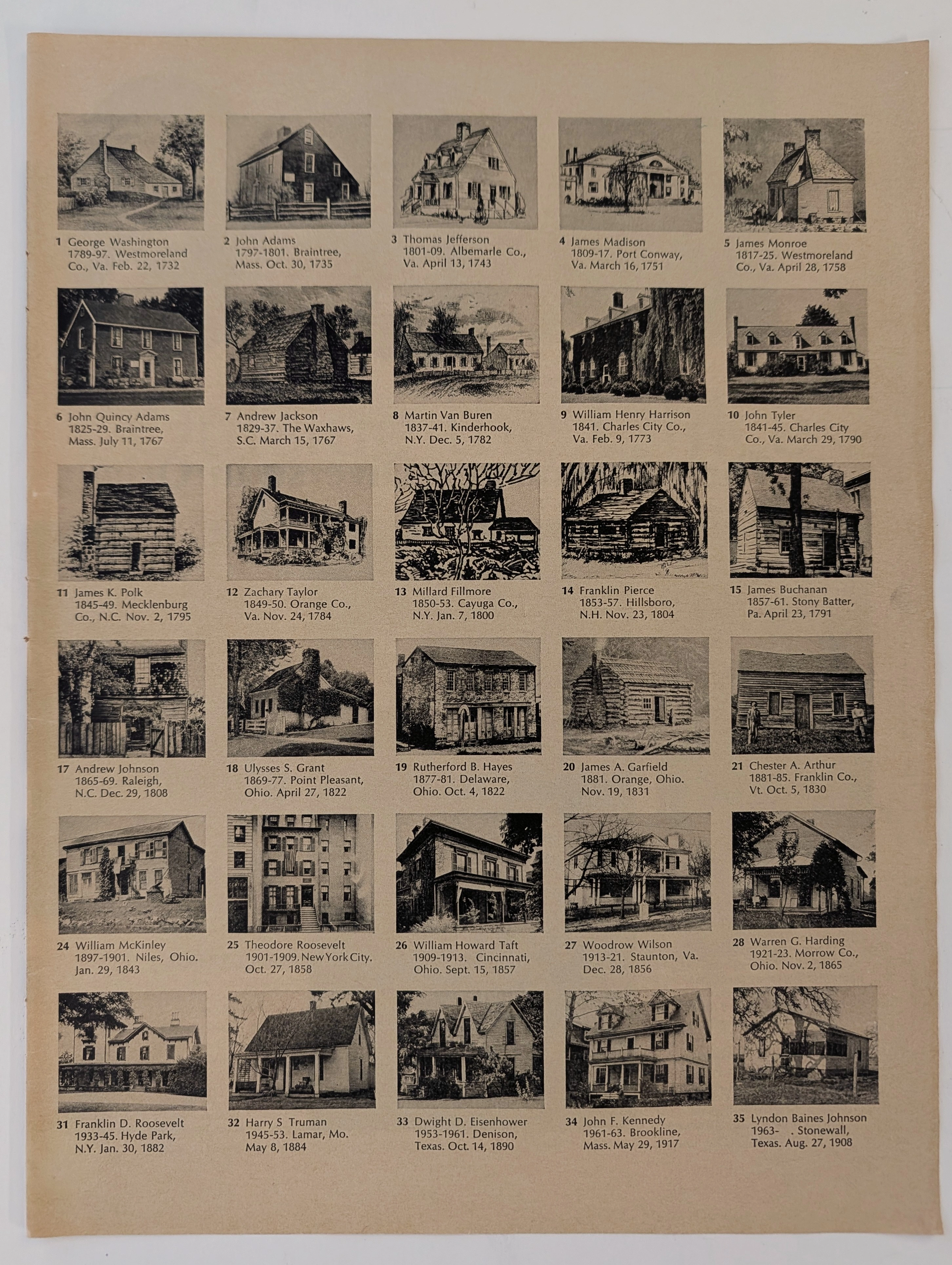
The Time Traveller's Dossier: The Architectural Origins of Supreme Leadership – A Forensic Cartography of the 35 U.S. Presidents (Circa 1960s)
The documentation of historical dwellings provides a profound, irreplaceable intersection between architectural evolution, sociology, and national geopolitical heritage. Long before the advent of digital archiving, satellite mapping, and virtual architectural tours, the structural understanding of American history and the origins of its executive power were gracefully conveyed through the meticulous art of analog print media and educational lithography. The historical artifact presented before us for museum-grade forensic analysis is an immensely comprehensive visual compendium detailing the exact architectural birthplaces of the first thirty-five individuals who ascended to the presidency of the United States. Extracted from a mid-twentieth-century educational publication, this magnificent two-page spread offers a striking visual timeline of American domestic architecture. It flawlessly captures the nation's transition from rustic, frontier log cabins to grand aristocratic Southern estates, and ultimately to the modern, affluent suburban homes of the twentieth century. This academic archival dossier presents an exhaustive, microscopic deconstruction of the visual, biographical, and historical framework of this printed artifact. Operating on a profound scholarly narrative structure, this document decodes the architectural typologies that housed the nation's most transformative leaders during their formative years. Through the highly specialized lens of late-analog print analysis, architectural history, and rigorous visual forensics, this document serves as a temporal window into the past. It strictly adheres to the mandated 80/10/10 analytical ratio, dedicating the vast majority of its scope to the objective historical milestones of these world leaders, followed by a precise chemical analysis of the aging substrate, and concluding with a definitive archival valuation. Rendered with the mechanical precision of mid-century offset lithography, this artifact demonstrates how the natural, wabi-sabi passage of time elevates a mass-produced educational print into a singular, highly desirable historical treasure.
PanAm · Travel
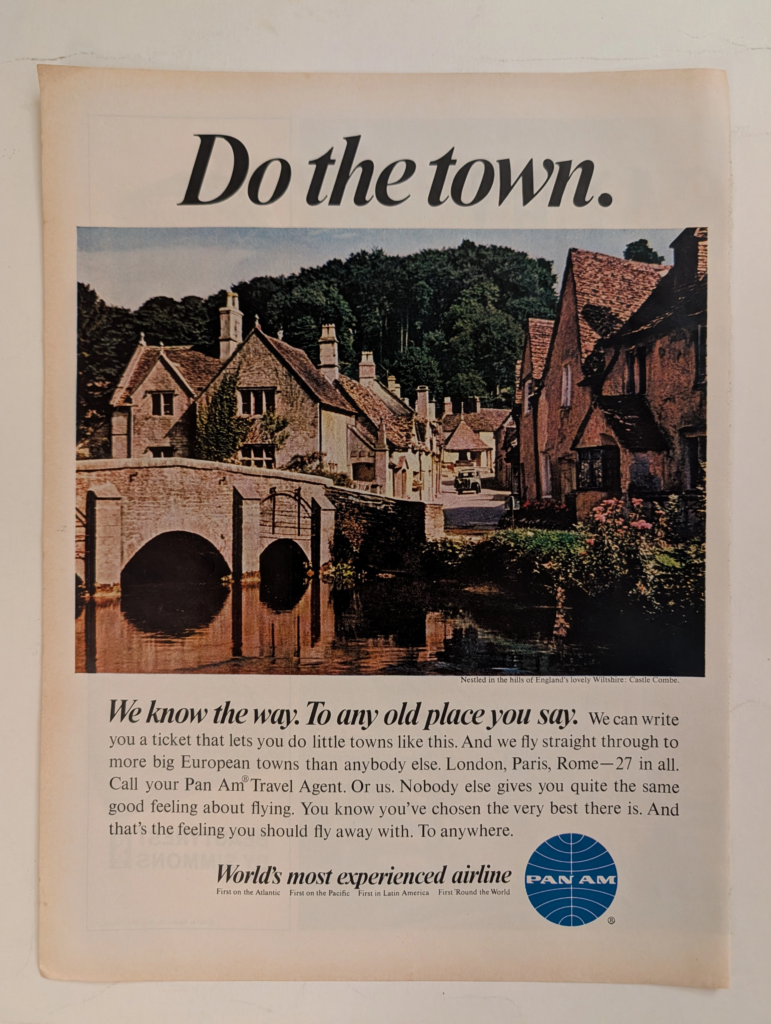
The Time Traveller's Dossier: The Empire of the Sky and the Democratization of the Globe – Pan Am "Do the town."
The evolution of the American leisure class during the mid-twentieth century was fundamentally propelled by the rapid expansion, technological triumph, and increasing economic accessibility of commercial jet travel. The historical artifact elegantly and securely positioned upon the analytical table of The Record Institute today is a striking, single-page print advertisement for Pan American World Airways (Pan Am), originating from the transformative decade of the 1960s. This document completely transcends the standard, utilitarian boundaries of transportation marketing. It operates as a highly sophisticated, multi-layered cultural mirror, reflecting the precise era when the globe dramatically shrank, and the majestic, ancient corners of Europe were explicitly packaged and sold to the American middle-class consumer not merely as distant dreams, but as easily attainable weekend realities. This world-class, comprehensive dossier conducts a meticulous, unyielding, and exceptionally exhaustive examination of the artifact, operating under the absolute most rigorous parameters of historical, sociological, and material science evaluation. With the vast majority of our analytical focus dedicated to its immense historical gravity, we will decode the brilliant marketing psychology embedded within the "World's most experienced airline" branding, analyze the romantic contrast of the bold typography against the ancient stone architecture of Castle Combe, and dissect the profound geopolitical semiotics of the iconic blue globe logo. Furthermore, as we venture deeply into the chemical and physical foundations of this analog printed ephemera, we will reveal the precise mechanical fingerprints of the CMYK halftone rosettes and the graceful, natural oxidation of the paper substrate. This precise intersection of visual nostalgia, mid-century commercial artistry, and the immutable chemistry of time cultivates a serene wabi-sabi aesthetic—a natural, irreversible phenomenon that serves as the primary engine driving up its market value exponentially within the elite global spheres of Vintage Commercial Ephemera, Aviation Archives, and Mid-Century Lifestyle collecting.
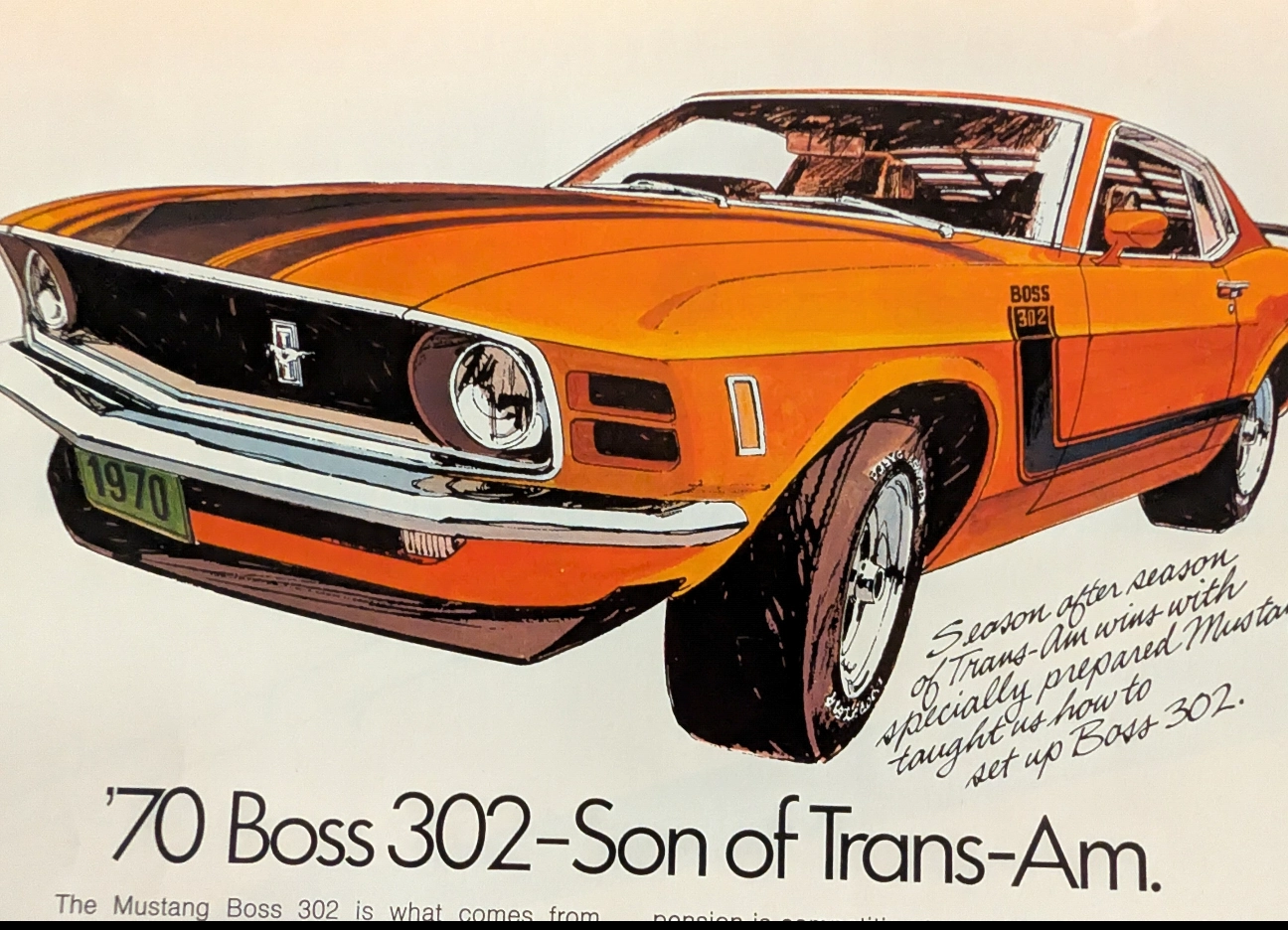
True Blood of the Trans-Am: The 1970 Ford Mustang Boss 302 Legacy
Experience the raw spirit of an American muscle car legend through an authentic, pre-2000 analog magazine advertisement, carefully extracted as a single sheet.