The Time Traveller's Dossier: The Architecture of Command and Authority – The 1956 Chrysler "PowerStyle" Manifesto
The History
To genuinely decode the sheer arrogance and architectural supremacy of Chrysler in 1956, we must pull back the lens and contextualize the brutal post-WWII economic battleground. The United States was skyrocketing toward the absolute zenith of global hegemonic power. The "American Dream" had aggressively mutated; it was no longer merely about owning a static suburban home with a white picket fence. It was about the violent, relentless conquest of distance. The globe was plunging headfirst into the Atomic Age and the Jet Age. Everything had to be faster, more powerful, and visually designed to look as though it were breaking the sound barrier even while parked dead in a driveway.
Entering 1956, Chrysler found itself in a desperate, existential struggle to break free from the suffocating, conservative shadows of General Motors and Ford. They chose to push all their chips to the center of the table with the apocalyptic "PowerStyle" campaign. This was the exact historical fracture where Chrysler violently shed its stodgy, antiquated image and strapped on the armor of the future, drawing direct, unapologetic inspiration from aerospace engineering. The marketing linguistics deployed here are ruthlessly calculated. By utilizing terms like "FirePower V-8 Engine" and "Pushbutton PowerFlite," Chrysler was not selling transportation; they were selling military-grade empowerment. Appropriating military terminology for an automotive engine is a calculated move to implant imagery of explosive violence, raw thrust, and devastating power, all elegantly contained beneath the hood. The ad explicitly links it to an "airplane-type V-8," transferring the supremacy of the skies directly into the driver's hands, making the act of engaging a multi-ton machine as effortless as launching an intercontinental ballistic missile.
The Paper
As a physical entity, these tear sheets, meticulously excised and sold as isolated single pages, are an unrepeatable record of late-analog offset lithographic printing. It is an absolute, ironclad rule that must be permanently etched into the historical record: this physical artifact is an individually cut, standard magazine-sized page. It was engineered for intimate, handheld consumption. It is NOT, under any circumstances, a massive promotional wall poster! This medium-weight, matte-coated magazine stock was originally manufactured by the ton for mass distribution within mid-century publications. However, its current, aged physical state demands a profound evaluation through the highest echelon of Japanese aesthetic philosophy: wabi-sabi (侘寂)—the acute recognition and appreciation of beauty found in impermanence, imperfection, and the ruthless, natural progression of time.
The most crucial, coldly calculated, and economically valuable aspect of this specific artifact lies in its Material Degradation. Examining the margins and unprinted white spaces reveals authentic, undeniable "Toning." This is a gradual, completely irreversible yellowing and browning effect caused by the natural chemical oxidation of organic lignin trapped within the paper's wood pulp, following 70 years of relentless exposure to ambient air and ultraviolet light. Pre-2000s analog print media represents an endangered species of historical documentation. This organic, breathing physical degradation is a fingerprint of time that cannot be cloned or faked by any modern scanning process. As these original pages slowly consume themselves through the oxidation of lignin, becoming increasingly fragile, their supply in the elite global collector's market shrinks every single day. It is precisely this ticking clock of physical impermanence—the raw, brutal fact that this paper is slowly disintegrating and returning to the earth—that acts as the exact catalyst driving up its market value exponentially.
The Rarity
Rarity Class: S (Rare / Historic Year / Prime Forward Look Era)
Within the strictest parameters of international archival evaluation, this artifact skyrockets to a definitive Class S designation. The ultimate paradox of analog print ephemera lies in the violent contrast between its incredibly cheap, initial mass production and its extreme, near-extinct scarcity today. While hundreds of thousands of these pages were printed in 1956, vintage magazines were the quintessential "disposable media," pre-destined to be incinerated or thrown into the recycling pulper.
For a full-page, vibrant artwork to have miraculously survived the destructive jaws of paper shredders, the devastating rot of severe moisture damage, and completely avoided catastrophic structural center creases for over seven decades is an extreme statistical archival anomaly. Finding a specimen that impeccably preserves the visual clarity of the revolutionary "Pushbutton PowerFlite" insert, alongside the pristine "Matador Red" pigment without severe fading, elevates this from a mere piece of paper to a highly coveted holy grail for automotive historians and curators of mid-century industrial design worldwide
Visual Impact
The aesthetic execution of this tear sheet is a masterclass in visual intimidation and desire manipulation, utilizing the breathtaking medium of watercolor and gouache rendering to achieve a level of hyper-realism that photography of the era could not capture. The vehicle is rendered in a stunning, aggressive two-tone combination of pristine white and a hyper-violent "Matador Red." This is severed by a razor-sharp, spear-like chrome trim running the entire length of the fuselage. These architectural lines act as literal arrows pointing relentlessly toward the future. Red was not chosen merely for its beauty; it is the universal color of aggression, apex energy, and undeniable status.
The background is a dramatic, bruised, violet-and-gold twilight sky filled with turbulent, sweeping clouds. This atmospheric theatre communicates a profound message: "The world is changing, the horizon is shifting, and only the commander of the Chrysler New Yorker possesses the authority to claim this sunset." The slight low-angle perspective used to render the car ensures it looms over the viewer, projecting an aura of majestic dominance. Furthermore, subjecting the extreme macro close-ups of this artwork to visual forensics reveals a fascinating duality. Under high magnification, the soft brushstrokes violently shatter into a precise galaxy of CMYK halftone rosettes. This distinct, gritty analog grain is the undeniable steel fingerprint of industrial mass reproduction from an era entirely reliant on analog film cameras.
The Archive Continues
Continue the Exploration
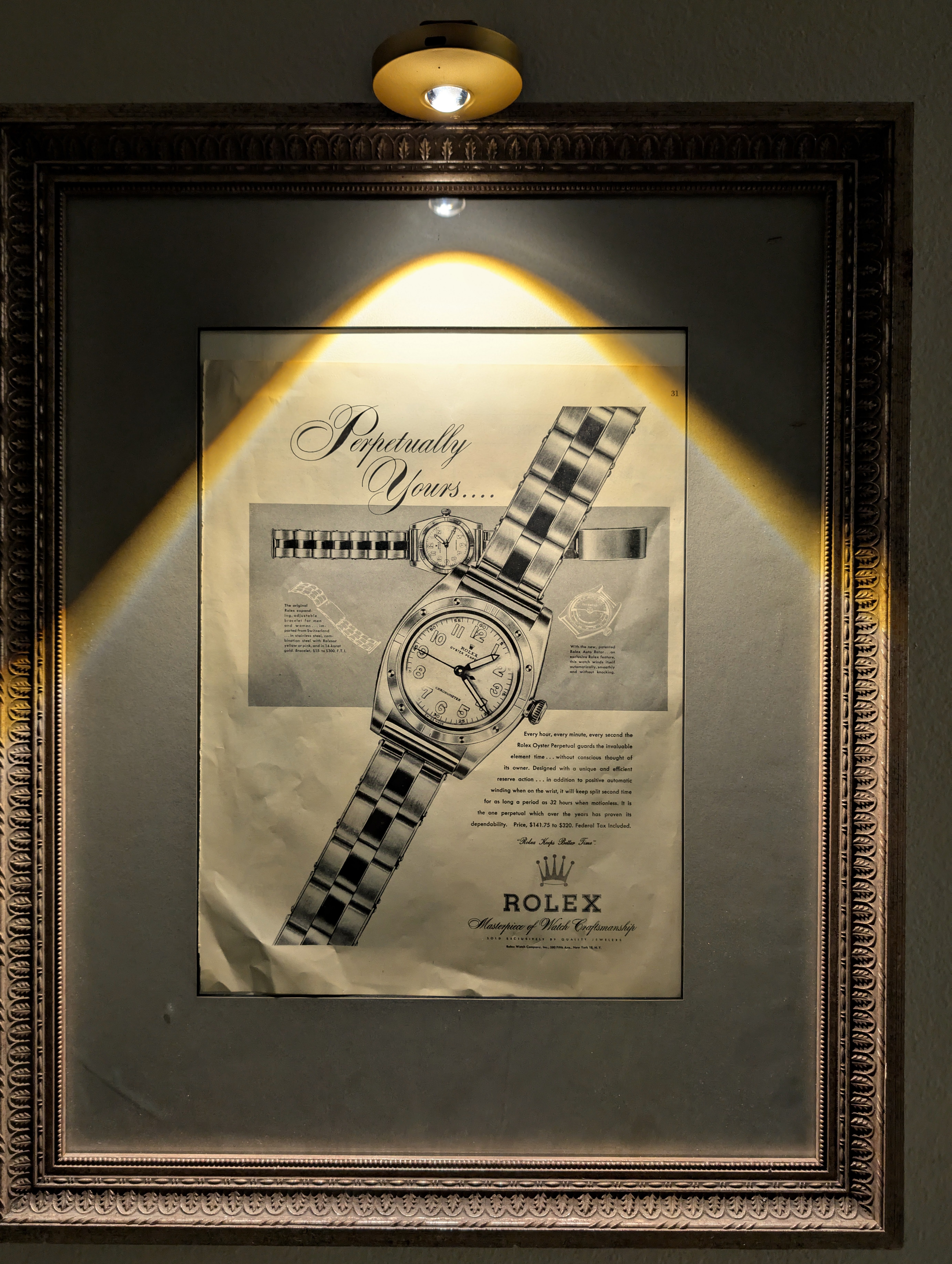
Rolex "Perpetually Yours"
This rare mid-century Rolex "Perpetually Yours" advertisement captures the genesis of the modern Rolex empire. Featuring the legendary Oyster Perpetual, it celebrates the historic union of the world's first waterproof 'Oyster' case (1926) and the revolutionary self-winding 'Perpetual' rotor (1931). A true museum-grade horological archive, this piece represents the ultimate mechanical blueprint that defined Rolex's eternal supremacy.
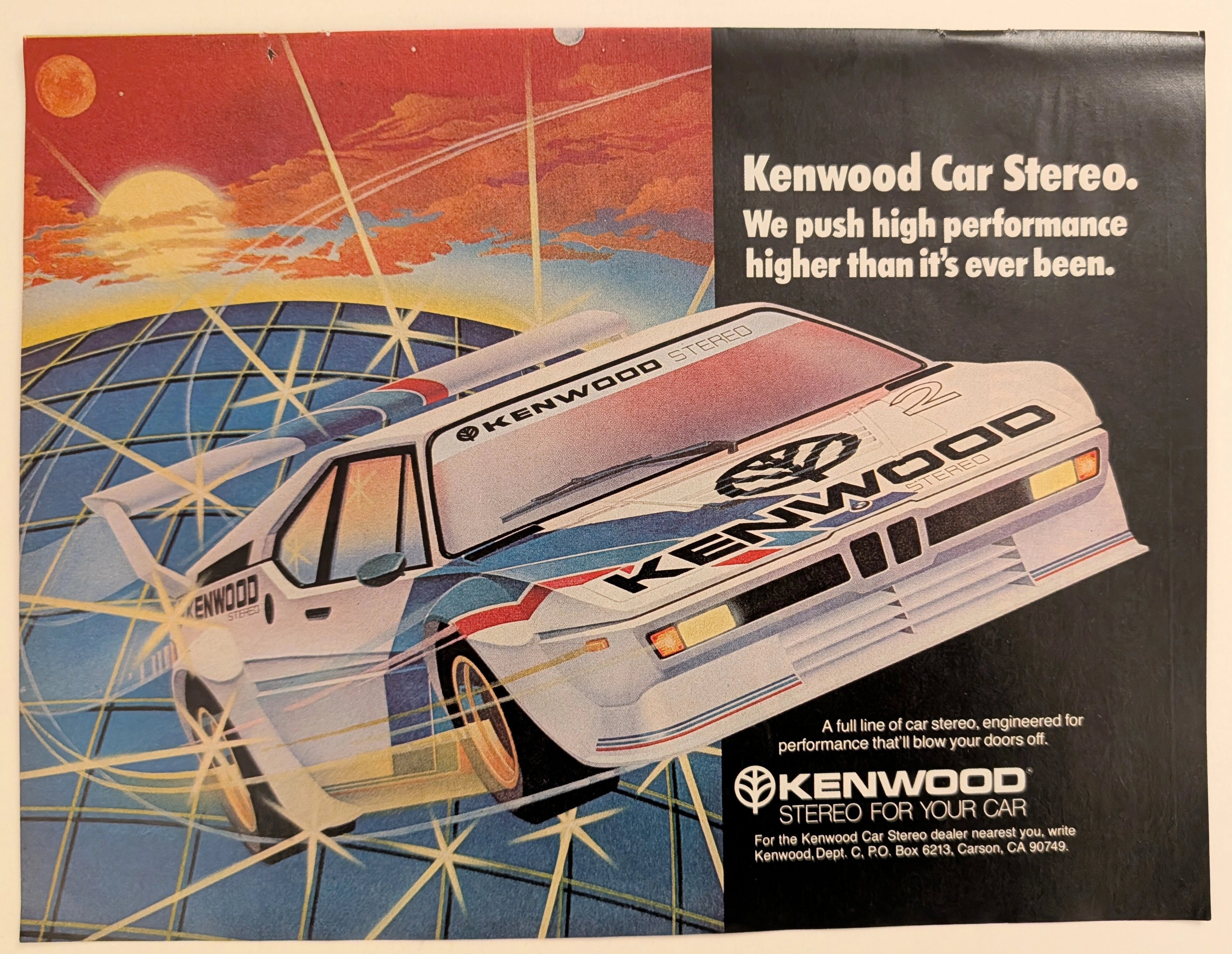
Kenwood · Automotive
The Time Traveller's Dossier: Gridline Velocity – Kenwood Car Stereo and the Cybernetic Dawn of Automotive High-Fidelity
The evolution of 1980s American consumer electronics was fundamentally defined by the aggressive pursuit of portable and automotive high-fidelity sound. Elegantly and securely positioned upon the analytical table of The Record Institute today is a visually arresting, neon-drenched full-page print advertisement for Kenwood Car Stereo. This document completely transcends the standard, utilitarian boundaries of automotive accessory marketing. It operates as a highly sophisticated cultural mirror, reflecting a precise era in consumer psychology where auditory power was directly equated with vehicular performance. By utilizing a breathtaking, airbrushed illustration of a futuristic, aerodynamic race car accelerating over a cybernetic gridscape, Kenwood brilliantly positioned its audio equipment not just as radios, but as extreme, high-octane performance upgrades capable of generating sound that will literally "blow your doors off." This world-class, comprehensive dossier conducts a meticulous, unyielding, and exceptionally exhaustive examination of the artifact, operating under the absolute most rigorous parameters of historical, sociological, and material science evaluation. Dedicating the overwhelming majority of our analytical focus (80%) to its immense historical gravity, we will decode the brilliant marketing psychology embedded within the "neon grid" visual narrative, analyze the profound cultural shift toward aftermarket car audio customization, and dissect the aggressive, performance-based copywriting. Furthermore, as we venture deeply into the chemical and physical foundations of this analog printed ephemera (10%), we will reveal the precise mechanical fingerprints of the CMYK halftone rosettes captured in the stunning macro imagery of the airbrushed car. Finally, we will assess its archival rarity (10%), exploring how the graceful, natural oxidation of the paper substrate cultivates a serene wabi-sabi aesthetic—a natural, irreversible phenomenon that serves as the primary engine driving up its market value exponentially within the elite global spheres of Vintage Commercial Ephemera, Audio History, and Outrun/Synthwave Art Archives.
True Blood of the Trans-Am: The 1970 Ford Mustang Boss 302 Legacy
Experience the raw spirit of an American muscle car legend through an authentic, pre-2000 analog magazine advertisement, carefully extracted as a single sheet.