The Time Traveller's Dossier: The Empire of the Sky and the Democratization of the Globe – Pan Am "Do the town."
The History
To fully appreciate the immense historical gravity, cultural magnitude, and sociological importance of this artifact, one must meticulously contextualize the psychological, economic, and geopolitical landscape of the American traveler in the 1960s. Following the end of the Second World War, the United States emerged as an unprecedented global economic superpower. By the 1960s, this wealth had cascaded down to a burgeoning middle class. Discretionary income reached record highs, and the concept of "vacation" evolved from local road trips to international expeditions. However, the true catalyst for this societal shift was technological: the dawn of the Jet Age, heralded by the introduction of the Boeing 707 in the late 1950s. Pan American World Airways, under the visionary and aggressively expansionist leadership of Juan Trippe, was the launch customer for the 707. This aircraft effectively sliced trans-Atlantic travel times in half, transforming a grueling, multi-day propeller flight into a smooth, luxurious, seven-hour journey.
During this era, Pan Am was not merely a commercial airline; it functioned as the unofficial flag carrier and the chosen instrument of United States aviation diplomacy. It was the absolute embodiment of American soft power. When a Pan Am jet landed in a foreign capital, it was a projection of American technological supremacy, wealth, and democratic freedom. For the American tourist stepping onto the tarmac, flying Pan Am provided an unparalleled psychological safety net. It represented uncompromising safety, unmatched luxury, and an unparalleled global reach. The airline was a familiar, comforting piece of American territory soaring 30,000 feet above unfamiliar lands.
This profound psychological security is the core engine driving the marketing narrative of this specific artifact. The bold, commanding headline, "Do the town," is a masterstroke of colloquial copywriting by the legendary J. Walter Thompson (JWT) advertising agency. It takes the historically heavy, often intimidating concept of international trans-oceanic travel and brilliantly reduces it to a casual, domestic, everyday phrase. The phrase implies that exploring a centuries-old English village is no more complicated, dangerous, or exhausting than taking a taxi downtown to visit a neighboring city for a Friday night out. It is the ultimate democratization of the globe, shrinking the vast Atlantic Ocean into a mere commuter route.
The advertising copy meticulously reinforces this accessibility and dismantling of travel anxiety: "We know the way. To any old place you say. We can write you a ticket that lets you do little towns like this". In the 1960s, international logistics—booking foreign hotels, navigating train schedules, dealing with currency exchanges—were daunting for the average middle-class American who had perhaps never left their home state. Pan Am was selling logistical mastery and total peace of mind. They were explicitly telling the consumer that the complexities of foreign transit were entirely handled by the world's foremost experts. The traveler only needed to point to a map, and Pan Am would execute the reality.
The visual anchor of the advertisement is the stunning, idyllic, and highly romanticized photograph of Castle Combe in Wiltshire, England. This specific choice of imagery is profoundly strategic and reveals a deep understanding of the era's tourism psychology. Instead of showcasing the easily recognizable, towering monuments of Europe—such as the Eiffel Tower, the Colosseum, or Big Ben—Pan Am chooses a quiet, ancient stone bridge, a babbling brook, and centuries-old ivy-covered cottages. This appeals to a highly sophisticated, romantic ideal of European travel that was heavily romanticized in mid-century American cinema and literature: the deep-seated desire to escape the rapid, concrete modernization of American urban centers and discover "authentic," untouched, pastoral history. The image sells an emotional experience of tranquility and historical connection, contrasting sharply with the space-age technology of the jet plane that will transport the passenger there.
However, the agency brilliant balances this pastoral romanticism with pragmatic corporate strength. The copy immediately pivots to reassure the practical, efficiency-minded traveler that while Pan Am can take them to quaint villages, they are still the undisputed kings of the major routes: "And we fly straight through to more big European towns than anybody else. London, Paris, Rome—27 in all". The specific citation of "27 in all" is a flex of unparalleled logistical dominance. No other airline in the world could boast that level of direct connectivity to the European continent from the United States.
The absolute core of Pan Am's brand identity and historical legacy is permanently cemented at the bottom of the page. The legendary blue globe logo—a symbol that became as globally recognized as the Coca-Cola logo during the 20th century—sits proudly next to the definitive, unchallenged statement of authority: "World's most experienced airline". This was not merely a slogan; it was a verifiable historical fact. The subsequent sub-text is a staggering, monumental list of aviation conquests: "First on the Atlantic. First on the Pacific. First in Latin America. First 'Round the World".
In an era where international flight still retained a slight element of the unknown and physical risk for the average citizen, Pan Am sold the ultimate commodity: psychological security. They were the pioneers who charted the skies, laid the routes, and built the infrastructure of global aviation. As the copy masterfully and comfortingly concludes: "Nobody else gives you quite the same good feeling about flying. You know you've chosen the very best there is. And that's the feeling you should fly away with. To anywhere". This is the zenith of mid-century corporate confidence. It is a historical document capturing a brief, shining moment when an airline was more than a transport company; it was a promise of a connected, accessible, and magnificent world.
The Paper
As a physical entity, this printed artifact functions as a living, breathing, and profound record of mid-twentieth-century graphic reproduction and substrate chemistry. Under exceptional, high-magnification macro-lens examination, this document reveals the stunning complexity and mathematical precision of analog color printing. The intricate, textured, and shadowed details of the ancient stonework in the Wiltshire village, the deep, organic greens of the surrounding English foliage, and the crisp, iconic, corporate blue of the Pan Am globe logo are all meticulously constructed from a precise, mathematically rigorous galaxy of halftone rosettes. This intricate, overlapping dot pattern constitutes the mechanical fingerprint of the pre-digital analog offset printing press. Microscopic, varying sizes of Cyan, Magenta, Yellow, and Key (Black) ink dots are elegantly and systematically layered at highly specific angles to trick the human eye and the biological visual cortex into perceiving a continuous, vibrant, and dimensional photographic reality out of mere clusters of ink.
Yet, the most profound and impactfully beautiful factor elevating the immense value of this artifact in the contemporary global collector's market is the natural, organic, and entirely irreversible process of Material Degradation. The expansive margins and the overall paper substrate exhibit a genuine, unavoidable, and entirely unforgeable "Toning." This gradual, graceful, and chronological transition from the original bright, bleached manufactured paper to a warm, antique ivory and golden hue is caused by the slow, relentless chemical oxidation of Lignin—the complex organic polymer that naturally binds cellulose fibers together within the raw wood pulp of the paper. As the substrate is exposed to ambient oxygen and ultraviolet light over a span of decades, the molecular structure of the lignin gracefully and systematically breaks down. This accumulation of time, this naturally evolving patina, represents the absolute core of the wabi-sabi aesthetic. The profound appreciation for the beauty found in natural aging, impermanence, and the physical manifestation of history upon a fragile, analog medium is an irreversible chemical reaction. It is precisely this authentic, unreplicable degradation that acts as the primary engine driving up its market value exponentially among elite curators and collectors, as it provides the ultimate, irrefutable, and scientific proof of the artifact's historical authenticity and its miraculous, delicate journey through time.
The Rarity
RARITY CLASS: B (Very Good Archival Preservation with Visible Edge Toning)
Evaluated under the most exacting, rigorous, and uncompromising archival parameters established by The Record Institute, this artifact is definitively and securely designated as Class B.
The remarkable and defining paradox of mid-century commercial ephemera is that these specific documents were produced by the millions as explicitly and intentionally "disposable media." Inserted into high-volume consumer publications, they were inherently destined by their very nature to be briefly observed, casually folded, and ultimately discarded into the recycling bins of history. For a full-page, graphically intensive advertisement to survive entirely intact from the Golden Age of Aviation without catastrophic structural tearing, without destructive moisture staining, or without the fatal, irreversible fading of the delicate, light-sensitive halftone inks constitutes a highly significant statistical archival anomaly.
The structural integrity of this paper remains exceptionally sound. While the rich analog colors—particularly the deep, authoritative blues of the corporate logo and the earthy, historic tones of the English village—remain astonishingly vibrant, there is a beautiful, mathematically even, natural lignin oxidation reflecting its era, displaying a warm, pronounced ivory patina heavily along the top and side margins. There is also very faint, ghosted bleed-through of typography from the reverse side of the original magazine page, a classic, authenticating hallmark of mid-century high-volume consumer offset printing. This environmental interaction does not detract from its immense value; rather, it authentically validates the document's chronological journey. The sheer sociopolitical weight of the subject matter—the definitive documentation of Pan Am at the absolute, untouchable height of its global empire—makes this a highly prized, museum-worthy piece of American aviation history. It is ardently sought after by global curators and transit archivists to ensure its historical permanence through acid-free, UV-protected conservation framing.
Visual Impact
The aesthetic brilliance and psychological power of this artifact lie in its masterful execution of "Typographic Authority vs. Photographic Serenity." The art director has deliberately constructed a highly effective visual hierarchy that perfectly balances the immense corporate power of Pan American World Airways with the romantic, deeply personal intimacy of the travel destination.
The layout is anchored from the very top by the massive, heavy, italicized serif typography of "Do the town.". This bold, almost commanding statement demands immediate viewer attention. However, directly beneath it sits the serene, quiet, almost painting-like photograph of Castle Combe, utilizing a classic, leading-line composition that draws the eye over the ancient stone bridge and gently down the quaint, historic village road. This creates a powerful, intentional juxtaposition: the modern, aggressive, globe-spanning reach of the 1960s airline delivering you safely to the peaceful, untouched, pastoral past. The bottom third of the page is meticulously and mathematically organized, utilizing a clean, highly legible serif font for the body copy, which perfectly balances the substantial visual weight of the iconic blue globe logo resting in the bottom right corner. It is a flawless, textbook integration of aspirational lifestyle marketing and supreme, unchallenged corporate branding.
Exhibition Halls
The Archive Continues
Continue the Exploration
Longines · Fashion
The Time Traveller's Dossier: The Ultimate Horological Supremacy – A Museum-Grade Forensic Deconstruction of the 1968 Longines Ultra-Chron
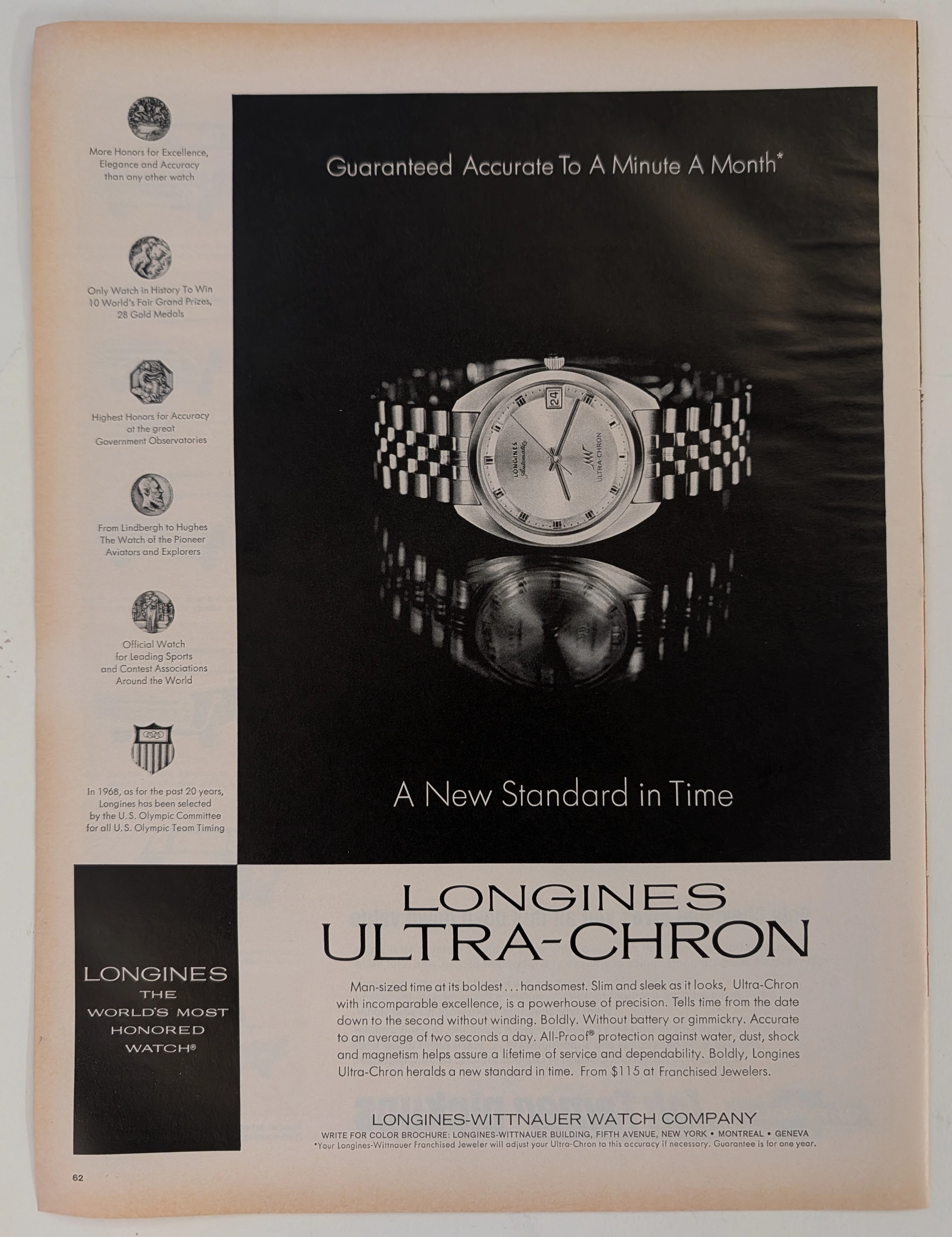
The evolution of human timekeeping is not merely a passive record of hands rotating in concentric circles; it is a brutal, centuries-long engineering war waged against the absolute, unforgiving laws of physics—specifically gravity, temperature fluctuation, and physical friction. The historical artifact placed upon The Record Institute’s forensic examination table today is a monumental full-page print advertisement for the 1968 Longines Ultra-Chron, extracted from a mid-twentieth-century publication. Released precisely on the precipice of the "Quartz Crisis"—a technological tsunami that would soon decimate the traditional Swiss watch industry—this document represents the absolute pinnacle, the zenith, and the glorious final, defiant stand of analog mechanical engineering. This exhaustive, world-class academic archival dossier will ruthlessly dissect the artifact with microscopic precision, operating under the most rigorous parameters of historical and physical evaluation. We will decode the arrogant yet mathematically backed copywriting that boldly claims "A Minute A Month" accuracy, the profound mechanical significance of the 36,000 vibrations per hour (vph) high-beat movement, and the five specific medallions of honor that permanently anchor the brand’s bloodline to legendary aviation pioneers such as Charles Lindbergh and Howard Hughes. Furthermore, we will subject the heavy, dark-field offset lithography to a rigorous material science analysis, exposing the mechanical fingerprints of the analog halftone rosettes and the inevitable, profoundly beautiful wabi-sabi oxidation of the paper substrate. It is this exact intersection of horological mastery and chemical degradation that acts as the primary engine driving the artifact's market value exponentially upward among serious global collectors.
Chateau St Michelle · Beverage
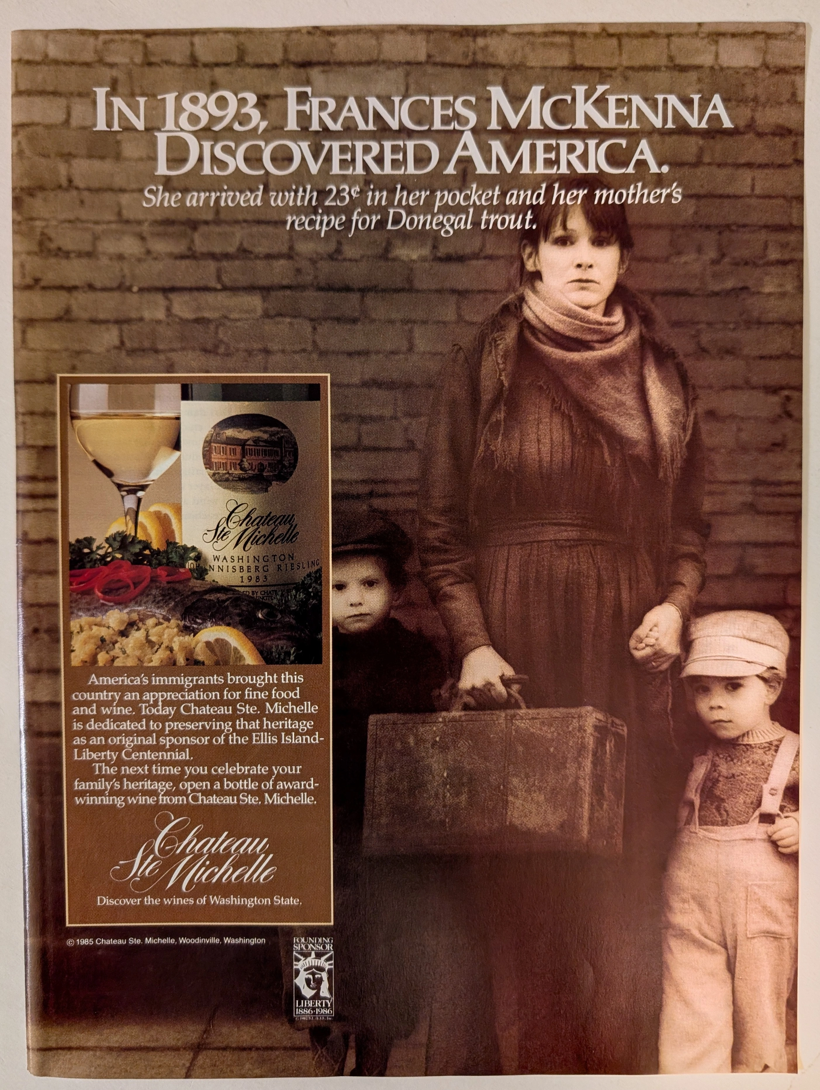
The Time Traveller’s Dossier: 1985 Chateau Ste. Michelle Johannisberg Riesling Vintage Advertisement — The Heritage of Arrival
Delve into the archives to explore this definitive 1985 Chateau Ste. Michelle vintage advertisement, a poignant tribute to American immigration and culinary heritage. Released during the ambitious lead-up to the Statue of Liberty's centennial, this piece transcends typical beverage marketing by weaving a grounded narrative around Frances McKenna, an 1893 Irish immigrant. For historians and collectors of vintage ads and old advertisements, this artifact stands as a masterful intersection of historical reverence and premium brand positioning. The campaign beautifully pairs a 1983 Washington Johannisberg Riesling with the enduring legacy of European culinary traditions brought to American shores. Unlike many classic print ads of the era that focused solely on product tasting notes or vineyard terroir, Chateau Ste. Michelle leveraged its role as a Founding Sponsor of the Ellis Island-Liberty Centennial to craft a deeply emotional and culturally resonant message. This document remains a profound testament to the power of heritage marketing in the late 20th century.
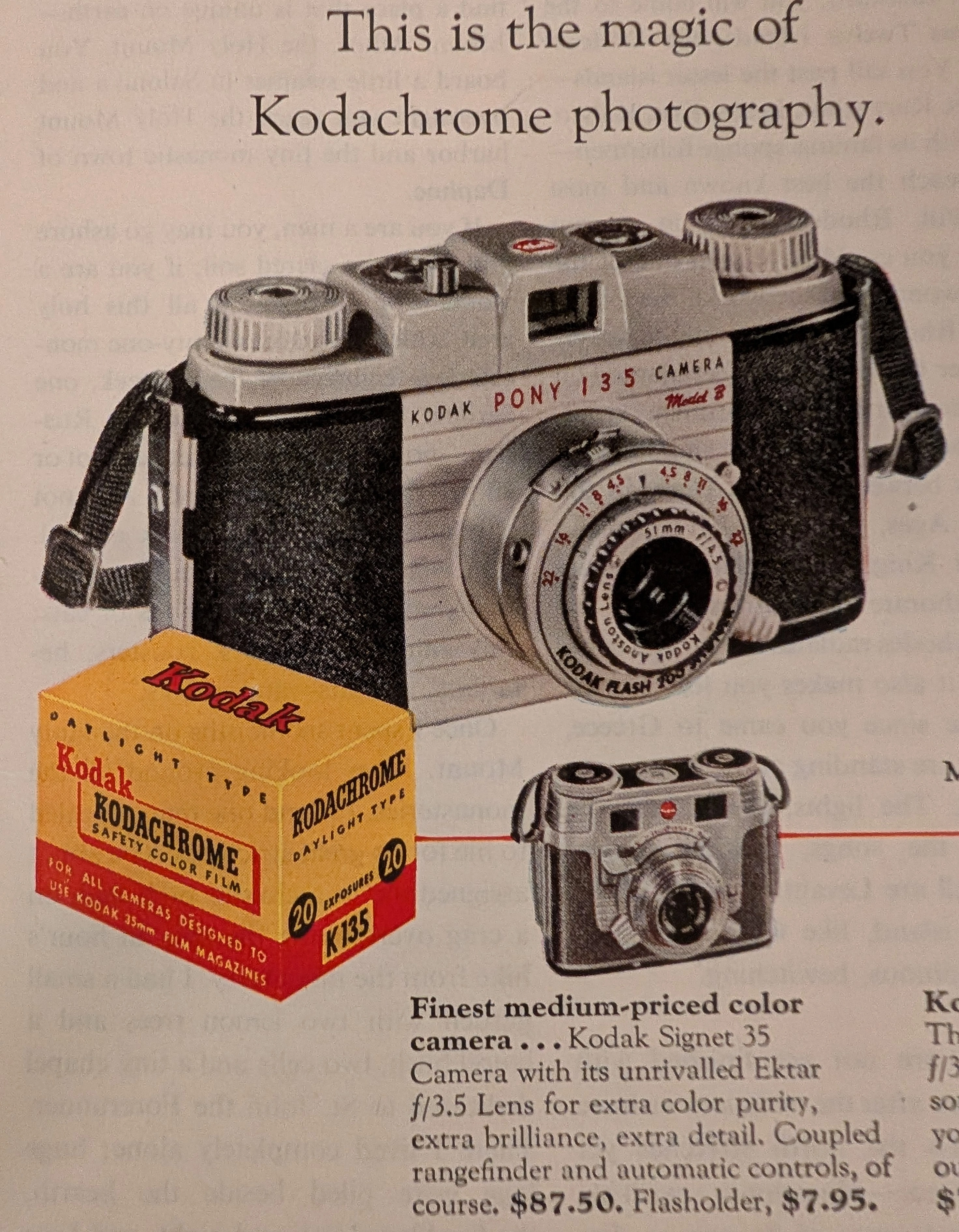
THE TIME TRAVELER'S DOSSIER: THE MAGIC OF COLOR AND THE REVOLUTION OF HUMAN MEMORY
The artifact under exhaustive, uncompromising, and unprecedented museum-grade analysis is an exceptionally preserved Historical Relic originating from the absolute golden age of mid-century American consumer technology. This Primary Art Document is a monumental, full-page advertisement for Eastman Kodak Company, specifically promoting the legendary Kodachrome Film and its ecosystem of 35mm miniature cameras. Based on the featured camera models—the Kodak Pony 135 Model B, the Kodak Signet 35, and the Bantam RF—this artifact is forensically dated to the mid-1950s, specifically circa 1954–1955, extracted from a June issue of HOLIDAY magazine. This is not a mere camera advertisement; it is a profound "Sociological Blueprint of the Post-War American Dream." The headline, "This is the magic of Kodachrome Photography", encapsulates the technological democratization of color memory. Prior to this era, color photography was the exclusive domain of elite professionals. Kodachrome, with its iconic yellow and red box, transformed ordinary suburbanites into archivists of their own vibrant lives. The ad brilliantly sells not just hardware, but a deeply emotional ritual: the "home screen" slide projection. Visually anchored by the hyper-realistic red cardboard mount of the "KODACHROME TRANSPARENCY", the document is a masterclass in aspirational marketing. Rescued from the inevitable oblivion of disposable mass media, this pre-2000s analog artifact is a breathtaking embodiment of the Japanese aesthetic of wabi-sabi. Printed on inherently acidic wood-pulp paper, it exhibits a beautifully authentic jagged left binding edge, microscopic structural creasing, and a profound, warm amber oxidation across its entire surface. This unstoppable molecular death transforms a piece of mass-produced corporate propaganda into an irreplaceable, ready-to-frame Primary Art Document of photographic and sociological history.