The Time Traveller's Dossier: The Zenith of the American Living Room – Admiral Rectangular Color TV
The History
To fully appreciate the immense historical gravity, cultural magnitude, and sociological importance of this artifact, one must meticulously contextualize the profound technological anxieties and aspirations of the American consumer during the 1960s. The transition from monochrome black-and-white television to full-color broadcasting was not merely a technological upgrade; it was a paradigm shift in how Americans consumed news, entertainment, and visual culture. However, early color television sets of the 1950s and early 1960s were plagued by significant engineering compromises. The cathode-ray tubes (CRTs) were massive, heavy, and crucially, they were round. To fit a round tube into a square wooden cabinet required immense amounts of wasted space, resulting in bulky, obtrusive pieces of hardware that dominated the living room and clashed with carefully curated mid-century interior design.
The bold headline of this artifact proudly announces the solution to this domestic crisis: "New Admiral big picture rectangular Color TV". The advent of the rectangular color tube was a monumental leap in glass manufacturing and electron-gun engineering. By creating a tube that matched the aspect ratio of the broadcast picture, manufacturers like Admiral could finally build slimmer, more elegant cabinets. The television no longer had to look like a piece of industrial laboratory equipment; it could finally be integrated as a piece of fine furniture.
This sociological demand for technology to masquerade as traditional décor is explicitly cataloged in the three models presented in the advertisement. Admiral offered "The KINGSTON" with "Early American styling," "The SCANDIA" featuring "smart Danish Modern styling, in genuine walnut veneers", and "The BELLFORTE" with heavy "Mediterranean Styling" and "Slideaway Door Panels." This reflects a fascinating period of consumer psychology: the internal technology was undeniably futuristic, but the external packaging had to provide the comforting, status-affirming aesthetic of Old World craftsmanship or sophisticated European modernism. The television set became the ultimate status symbol, the literal and figurative hearth of the modern suburban home.
Beyond the aesthetics of the cabinet, this artifact documents the intense competition to simplify the notoriously difficult process of tuning a color television. Early color sets required constant adjustment of hue, tint, and convergence. The advertisement directly addresses this consumer hesitation with the claim: "offers Easiest tuning ever!". To achieve this, Admiral highlights two specific, highly innovative features.
First is the "Hideaway Control Center". The illustration demonstrates a sleek, golden door that glides closed to hide the complex array of tuning dials. The copy emphasizes that "Your two most-used controls are in the open... Touch the upper tuning bar to change channels. Touch the lower one to turn set on or off, adjust volume." This "Touch-O-Matic Power Tuning" was an early form of motorized, push-button channel selection, a luxurious departure from the heavy, clanking rotary dials of previous decades. By hiding the secondary controls (tint, color, brightness), Admiral preserved the "fine-furniture beauty look" while shielding the user from technological intimidation.
The second, and arguably most iconic, feature documented in this artifact is the "Admiral Color Sonar, the full-function remote control". The macro-focus on the hand holding this device captures a revolution in human-machine interaction. The Sonar remote did not use infrared light like modern remotes; it used high-frequency ultrasonic sound waves. Pressing the buttons struck internal metallic rods, emitting specific high-frequency "chimes" that a microphone on the television would pick up and translate into commands. The advertisement promises "infinite control of color intensity and tint... from your easy chair." This remote control was the ultimate emblem of space-age leisure, completely divorcing the viewer from the physical necessity of interacting with the machine. It transformed television viewing from an active engagement into an entirely passive, uninterrupted experience of luxurious consumption.
The Paper
As a physical entity, this printed artifact functions as a living, breathing, and profound record of mid-twentieth-century graphic reproduction and substrate chemistry. Under exceptional macro-lens examination, this document reveals the stunning complexity and mathematical precision of analog color printing. The intricate, stylized details of the "Sonar" remote control held in the hand, the golden hues of the "Hideaway Control Center" illustrations, and the warm, rich tones of the "SCANDIA" walnut veneer are all meticulously constructed from a precise, mathematically rigorous galaxy of halftone rosettes. This intricate pattern constitutes the mechanical fingerprint of the pre-digital analog offset printing press. Microscopic, varying sizes of Cyan, Magenta, Yellow, and Key (Black) ink dots are elegantly and systematically layered at specific angles to trick the human eye and the biological visual cortex into perceiving continuous, vibrant, and dimensional photographic and illustrative reality.
Yet, the most profound and impactful factor elevating the immense value of this artifact in the contemporary collector's market is the natural, organic, and entirely irreversible process of Material Degradation. The expansive margins and the overall paper substrate exhibit a genuine, unavoidable, and entirely unforgeable "Toning." This gradual, graceful transition from the original bright, bleached manufactured paper to a warm, antique ivory and golden hue is caused by the slow chemical oxidation of Lignin—the complex organic polymer that binds cellulose fibers together within the raw wood pulp of the paper. As the substrate is exposed to ambient oxygen and ultraviolet light over a span of decades, the molecular structure of the lignin gracefully and systematically breaks down. This accumulation of time, this naturally evolving patina, represents the absolute core of the wabi-sabi aesthetic. The profound appreciation for the beauty found in natural aging, impermanence, and the physical manifestation of history upon a fragile medium is an irreversible chemical reaction. It is precisely this authentic, unreplicable degradation that acts as the primary engine driving up its market value exponentially among elite collectors, as it provides the ultimate, irrefutable proof of the artifact's historical authenticity and its miraculous journey through time.
The Rarity
RARITY CLASS: B (Very Good Archival Preservation with Minor Edge Wear)
Evaluated under the most exacting, rigorous, and uncompromising archival parameters, this artifact is definitively and securely designated as Class B.
The remarkable and defining paradox of mid-century commercial ephemera is that these specific documents were produced by the millions as explicitly and intentionally "disposable media." Inserted into consumer publications, they were inherently destined by their very nature to be briefly observed, folded, and ultimately discarded into the recycling bins of history. For a full-page, heavy-ink advertisement to survive entirely intact since the late 1960s without catastrophic structural tearing, without destructive moisture staining, or without the fatal fading of the delicate, light-sensitive halftone inks constitutes a highly significant statistical archival anomaly.
The structural integrity of this paper remains exceptionally sound. While the rich analog colors—particularly the blues of the television screens and the warm browns of the cabinetry—remain vibrant, there is a beautiful, mathematically even, natural lignin oxidation reflecting its era, displaying a warm ivory patina along the margins. This environmental interaction does not detract from its immense value; rather, it authenticates the document's journey. The sheer sociological weight of the subject matter—the documentation of ultrasonic remote controls and rectangular color tubes wrapped in Danish Modern cabinetry—makes this a highly prized, museum-worthy piece of American consumer history. It is ardently sought after by global curators and technology archivists to ensure its historical permanence through acid-free, UV-protected conservation framing.
Visual Impact
The aesthetic brilliance and psychological power of this artifact lie in its masterful execution of "Aspirational Integration." The art director has deliberately constructed a visual hierarchy that elevates the television from an appliance to the centerpiece of the modern home.
The layout is dominated by the large central image of "The KINGSTON" model, portraying an impossibly glamorous couple leaning in close, bathed in the glow of the color screen. This creates an immediate emotional connection, selling not just the hardware, but the intimate, shared experience of color entertainment. The supporting vignettes below—the Scandia and the Bellforte—function as a high-end furniture catalog, reassuring the consumer of their sophisticated taste.
The right column shifts the psychological tone from aesthetic aspiration to technological superiority. The precise, diagrammatic illustrations of the "Hideaway Control Center" and the close-up of the Sonar remote control appeal to the consumer's desire for effortless, space-age convenience. The bold, serif typography anchoring the bottom of the page—"Admiral Color"—serves as a definitive stamp of industrial authority, creating a flawless integration of lifestyle marketing and high-tech product education.
Exhibition Halls
The Archive Continues
Continue the Exploration
THE TIME TRAVELER'S DOSSIER: THE ARCHITECT OF CAPITALISM AND THE AESTHETICS OF RUIN
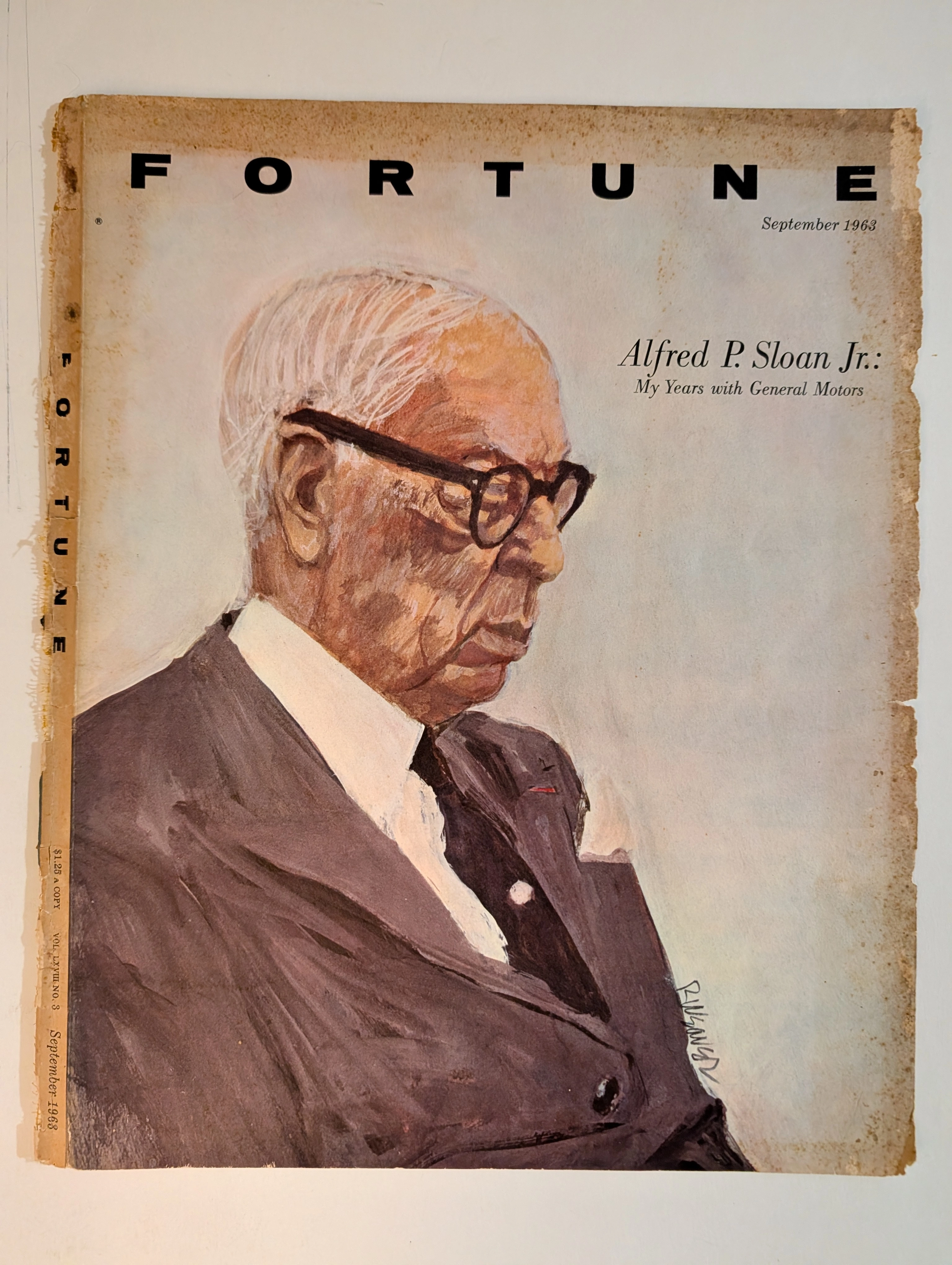
The artifact under rigorous, museum-grade analysis is a profoundly significant Historical Relic originating from the absolute zenith of American corporate ascendancy. This Primary Art Document is the front cover of FORTUNE magazine, explicitly dated September 1963. It features a majestic, expressive painted portrait of Alfred P. Sloan Jr., the legendary architect of the General Motors empire. Masterfully rendered by the acclaimed American illustrator Robert Weaver, whose signature is prominently visible, this artifact visually anchors the magazine's serialization of Sloan's definitive business memoir, My Years with General Motors. This text remains a foundational scripture of modern corporate management and decentralized organizational structure. Rescued from the ravages of time and preserved as a standalone Archival Artifact, the premium, heavy-stock analog paper of Fortune is undergoing a breathtaking process of chemical degradation. It exhibits severe edge fraying, jagged paper loss, and deep biological oxidation along its borders. This glorious decay transforms a mass-produced business periodical into an irreplaceable, ready-to-frame Primary Art Document—a testament to the fragile mortality of even the greatest capitalist empires.
THE TIME TRAVELER'S DOSSIER: THE DAWN OF ELEGANCE AND THE EXTINCT $1,500 HOLY GRAIL
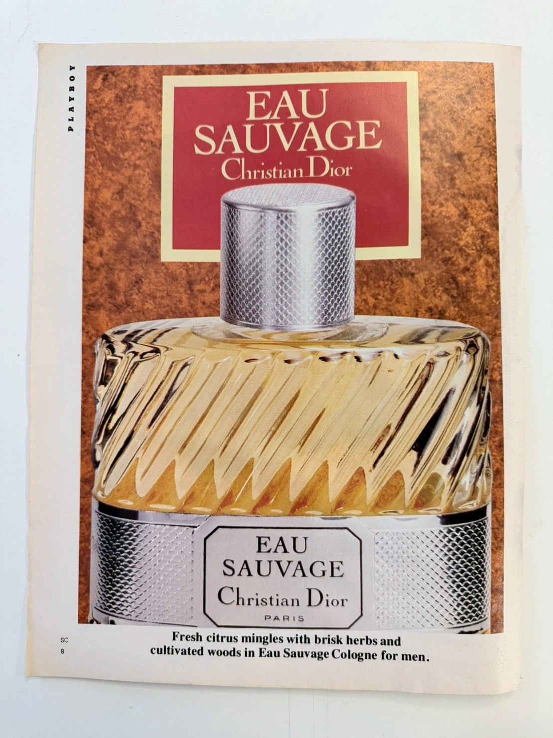
The artifact under museum-grade analysis is an exceptionally preserved Historical Relic originating from the golden age of analog publishing—a vintage issue of PLAYBOY magazine (circa late 1960s to 1970s). It features a striking, deeply sophisticated advertisement for one of the most revolutionary men's fragrances in modern human history: EAU SAUVAGE by Christian Dior. This Primary Art Document does not merely advertise a grooming product; it serves as a tangible historical marker of a monumental cultural paradigm shift. Prior to its introduction in 1966, men's fragrances were exclusively heavy, musky, and brutally spiced. Eau Sauvage, formulated by the legendary Master Perfumer Edmond Roudnitska, shattered this archaic mold by introducing Hedione (an airy, luminous synthetic jasmine compound) to men's perfumery, forever altering the trajectory of the global fragrance industry. Crucially, the original mid-century formulation and the specific ribbed-glass bottle design depicted in this artifact are permanently discontinued and lost to time. Modern reformulations driven by strict chemical regulations (such as the banning of natural oakmoss) have forever altered Roudnitska's original masterpiece. Consequently, surviving vintage bottles of this exact era have achieved mythical "Holy Grail" status, currently commanding astronomical prices of up to $1,500 USD in the global collector's market. This transforms the preserved advertisement from a commercial print into an invaluable piece of historical provenance—a birth certificate for an extinct luxury. Rescued from destruction and preserved as a standalone Archival Artifact, the inherently acidic, glossy paper stock of the mid-century era is undergoing a slow, breathtaking chemical degradation. This natural aging process (oxidation and lignin breakdown) transforms the mass-produced print into an irreplaceable, ready-to-frame Primary Art Document, embodying the ultimate aesthetic of analog impermanence.
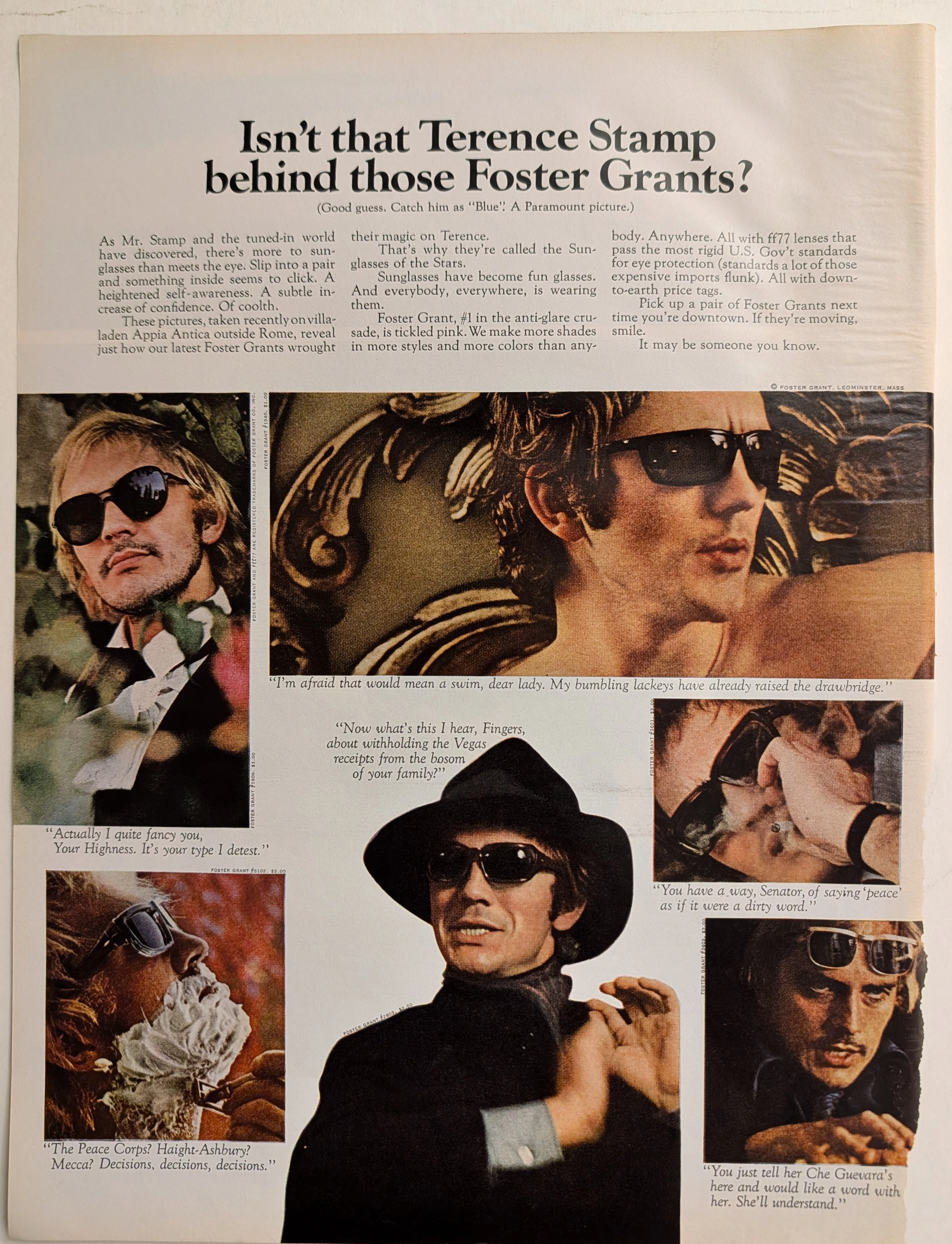
The Time Traveller's Dossier: The Sartorial Armor of Terence Stamp – A Foster Grant Exhibition
The metamorphosis of sunglasses from a purely utilitarian device designed to protect the human cornea into a profound instrument of psychological transformation and sartorial armor is one of the most fascinating narratives in the history of modern fashion. The historical artifact elegantly and securely positioned upon the analytical table of The Record Institute today is a majestic, large-format print advertisement for Foster Grant Sunglasses, featuring the internationally renowned British actor Terence Stamp, originating from approximately 1968. This document completely transcends the traditional boundaries of optical equipment marketing. It operates as a highly sophisticated, multi-layered cultural mirror, reflecting the exact moment when celebrity mystique, mass-market manufacturing, and the volatile sociopolitical crosscurrents of the late 1960s converged on a single printed page. This world-class, comprehensive dossier conducts a meticulous, unyielding, and exceptionally deep examination of the artifact, operating under the absolute most rigorous parameters of historical, sociological, and material science evaluation. We will decode the brilliant advertising strategy that successfully elevated injection-molded plastics to the realm of high fashion, analyze the complex biographical and cultural significance of Terence Stamp as the chosen emissary of this campaign, and dissect the rich, era-defining semiotics embedded within the six distinct personas he portrays. Furthermore, as we venture deeply into the chemical and physical foundations of this analog printed ephemera, we will reveal the precise mechanical fingerprints of the CMYK halftone rosettes and the graceful, natural oxidation of the paper substrate. This precise intersection of visual nostalgia, mid-century commercial artistry, and the immutable chemistry of time cultivates a serene wabi-sabi aesthetic—a natural, irreversible phenomenon that serves as the primary engine driving up its market value exponentially within the elite global spheres of Vintage Fashion Ephemera and Cinematic Memorabilia collecting.