THE TIME TRAVELER'S DOSSIER: THE ILLUSION OF FRAGILITY AND THE ARCHITECTURE OF 60S BEAUTY
The History
( THE HISTORY: Charles Revson's Psychology, the Feminine Ideal, and the Haute Joaillerie Alliance )
As the Chief Curator of The Record, I invite you to submerge your senses into the psychological battlefield of mid-century consumerism. The impeccably preserved Double-Page Historical Relic before you is not a mere cosmetic wallpaper. It is a calculated "Psychological Blueprint" engineered to define and control the parameters of feminine beauty in the early 1960s. This is a masterwork by Revlon, orchestrated by Charles Revson, the titan of the cosmetics industry who famously declared: "In the factory we make cosmetics; in the store we sell hope."
To decode the immense historical gravity of this Primary Art Document, we must analyze the sociological context of Mid-Century America. The sweeping headline—"Revlon whips up the first sheer-matte makeup for today's fair and fragile face..."—is a flawless encapsulation of the era's gendered expectations. In the early 60s, women were not necessarily marketed to look strong or pragmatic; the ultimate status symbol was to appear aristocratic, flawless, and as delicate as porcelain. The "fragile" aesthetic implied a life of luxury, shielded from harsh labor or the elements.
In terms of technological evolution in the beauty industry, this advertisement marks a critical turning point. The 1950s were dominated by heavy "cake makeup" (like Max Factor's Pan-Cake), which required water to apply and left a thick, mask-like finish. Revlon was selling the future: "Creme Soufflé Makeup." It promised a whipped, aerated texture that delivered full coverage without the stifling weight, achieving the coveted "Sheer-Matte" finish—a face that felt "nearly naked." Paired with the heavy, graphic black eyeliner and subdued lips that defined the dawn of the 1960s (pioneered by icons like Audrey Hepburn), this page perfectly archives a monumental shift in cosmetic fashion.
The Historical Masterstroke:
The truly priceless nature of this artifact lies hidden in a microscopic, yet infinitely powerful detail. Direct your focus to the small text in the bottom right corner: "JEWELS BY VAN CLEEF & ARPELS," and observe the magnificent pearl and diamond cluster earring adorning the model. This is no coincidence; it is a masterclass in Psychological Luxury Marketing.
Revlon was a mass-market brand accessible in local drugstores and department stores. But Charles Revson craved the aura of the aristocracy. By strategically partnering with Van Cleef & Arpels—a Parisian house of Haute Joaillerie whose pieces cost tens of thousands of dollars—Revlon brilliantly hijacked their prestige. When the image of a $2 Revlon makeup jar is placed directly alongside elite European diamonds, the consumer's brain subconsciously fuses the two levels of luxury. The woman buying "Touch & Glow" wasn't just buying foundation; she was purchasing the manufactured feeling of being a high-society woman wearing Van Cleef. This advertisement is a definitive historical record of how mid-century capitalism successfully elevated a democratic commodity into an aspirational luxury object.
( THE PAPER: The Aesthetics of Decay — The Center Seam of Time )
At The Record, we do not worship pristine modern reproductions; we revere the "Signatures of Time." This historical artifact is a Double-Page Spread, surgically rescued from the spine of a decaying periodical. The fashion magazines of this era were printed on high-speed presses using acidic wood-pulp paper. It was an inherently fragile medium, harboring a chemical death sentence.
The most beautiful physical attribute of this piece is its "Center Seam"—the vertical line bearing the original staple holes that once bound the magazine together. This is the ultimate proof of its authenticity as a Primary Art Document. Over the past 60 years, the lignin within the paper fibers has engaged in a relentless chemical war with ambient oxygen. This oxidation has birthed a stunning, warm ivory "patina" that radiates from the edges inward. The vintage halftone lithography dots making up the model's flawless face have settled permanently into the degrading, brittle pulp. This is the profound aesthetic of wabi-sabi—the Japanese philosophy of finding perfection in impermanence and decay. This paper is quietly burning itself alive at a molecular level, and it is this exact, irreversible death that transfigures it into immortal art.
( THE RARITY: Class A — The Survival of the Double-Page Spread )
While preserving a single vintage magazine page is challenging, rescuing a complete, intact Double-Page Spread without the imagery tearing, splitting at the seam, or being consumed by moisture is an archival triumph. The vast majority of 1960s fashion magazines were cut up for mood boards, thrown into the trash, or lost to environmental rot.
When you synthesize the sociological history of 1960s beauty standards, the brilliant cross-branding alliance with Van Cleef & Arpels, and the breathtaking physical condition of this decaying analog double-spread, this artifact undeniably commands a Rarity Class A designation. It has evolved far beyond commercial ephemera. It is a massive, highly coveted Historical Relic, demanding to be framed and exhibited by a curator who truly understands the heavy, beautiful weight of mid-century architectural glamour.
Exhibition Halls
The Archive Continues
Continue the Exploration
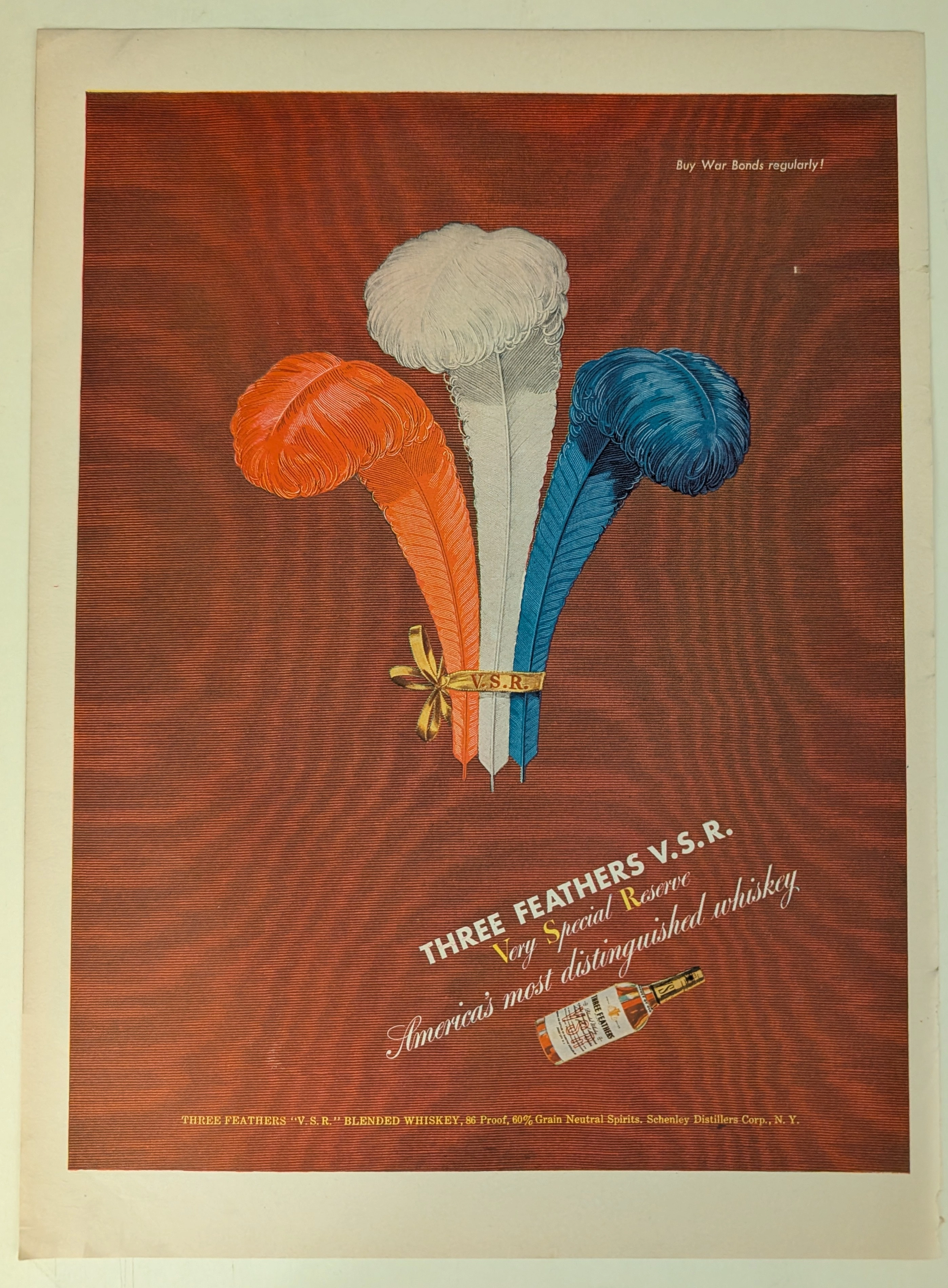
THE TIME TRAVELER'S DOSSIER: BLOOD CAPITALISM AND THE WEAPONIZATION OF WHISKEY
This impeccably preserved Historical Relic is a Primary Art Document from the brutal crucible of World War II, featuring a sweeping advertisement for THREE FEATHERS V.S.R. Blended Whiskey. It chronicles the ultimate mid-century psychological strategy of "Patriotic Capitalism." The artifact is forensically and definitively dated to the WWII era by the explicit, government-aligned directive in the upper right corner: "Buy War Bonds regularly!". Visually, the brand masterfully hijacked American nationalism by rendering its iconic three feathers in a vibrant Red, White, and Blue patriotic color scheme. Surviving the aggressive scrap paper drives of the 1940s, the acidic analog paper exhibits a profound integration of the deep crimson ink into its degrading fibers, perfectly encapsulating the analog aesthetic of wabi-sabi. This slow chemical death elevates this rescued wartime artifact to an irreplaceable Primary Art Document of Rarity Class A.
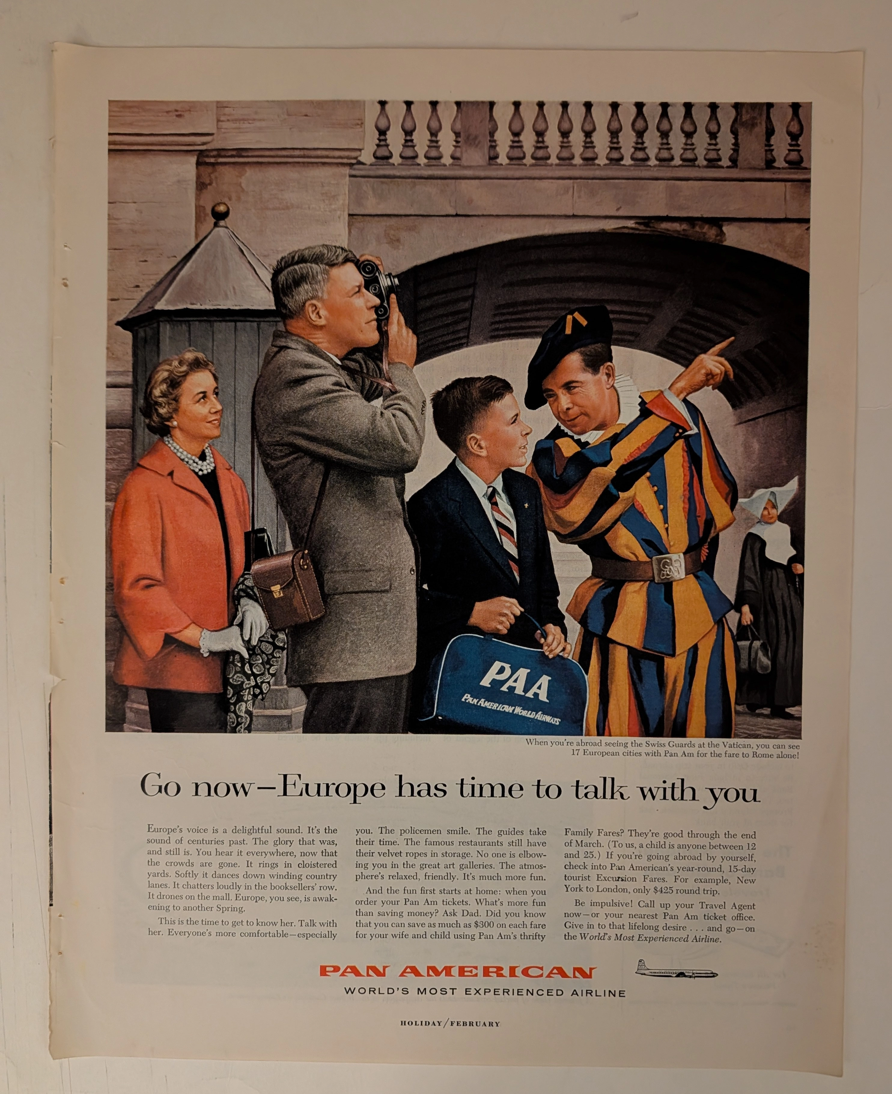
PAN AMERICAN WORLD AIRWAYS · Travel
THE TIME TRAVELER'S DOSSIER: PAN AM - THE ARCHITECTURE OF THE AMERICAN TOURIST
The artifact currently subjected to our uncompromising, museum-grade analysis is a profoundly preserved Historical Relic excavated from the zenith of mid-century American aviation prosperity. This Primary Art Document is a full-page magazine advertisement for Pan American World Airways. Functioning as a "Forensic Blueprint of the American Leisure Class Abroad," the document masterfully weaponizes European heritage and history to validate the affluent, off-season travel of post-war American consumers. Its historical context is irrefutably anchored by the microscopic silhouette of a Douglas DC-7B aircraft, placing this artifact squarely in the twilight of the propeller age, just before the dawn of the Boeing 707 jet era. Grounded by extreme macro details of the iconic PAA flight bag, the bold corporate typography, and the breathtaking wabi-sabi chemical degradation highlighted by its violently torn binding edge, this artifact commands an irreplaceable status, cementing its Rarity Class S designation as a masterpiece of corporate sociological engineering.
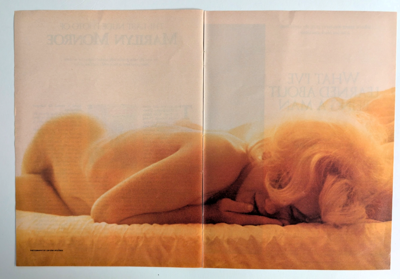
The Final Glimpse of a Legend: The History Behind Marilyn Monroe's Last Nude
Uncover the profound historical significance of the ultimate photograph of the 20th century's greatest pop culture icon, captured by Leif-Erik Nygårds just weeks before her tragic death.