THE TIME TRAVELER'S DOSSIER :THE BIRTH OF THE WIDE-TRACK
The History
[ PART I: THE BIRTH OF THE WIDE-TRACK ]
Welcome to the hushed, heavily guarded vaults of American industrial history. To merely glance at this document is a severe dereliction of curatorial duty; we must forensically interrogate its engineering and psychological intent. The year 1959 was "Year Zero" for Pontiac. Facing declining sales, General Motors executive Semon "Bunkie" Knudsen famously demanded that the brand shed its "grandma" image.
Direct your analytical focus to the lower right quadrant of the page. Here, the ad drops all poetic pretense and delivers a brutal, diagrammatic engineering flex: "THE ONLY CAR WITH WIDE-TRACK WHEELS." Pontiac literally pushed the wheels five inches further apart than conventional cars of the era. The text arrogantly explains the physics: "This widens the stance, not the car. Pontiac hugs tighter on curves and corners." This wasn't just a marketing slogan; it was a fundamental shift in chassis design that allowed Pontiac to dominate NASCAR and street performance for the next decade. The visual diagram, showing the conventional dotted lines inside the massive new track, is a piece of corporate propaganda designed to make every competitor's vehicle look instantly obsolete and dangerously unstable.
[ PART II: THE ILLUSION OF FITZPATRICK AND KAUFMAN ]
At The Record, our curatorial gaze penetrates down to the molecular level of the ink and the hidden hands that applied it. Examine the extreme macro crop of the car's teal flank.
Buried within the halftone dot matrix of the rainy reflections, you will find the clandestine, highly stylized signature of the artists (likely an intertwined "VK" for Van Kaufman or a variant of Fitz's mark). This signature represents the apex of commercial illustration. Art Fitzpatrick famously stated that he did not draw cars as they were; he drew them as people wanted them to be. He would cut apart photographs of the vehicles, stretch them, widen them, and lower the rooflines by inches to create an impossibly sleek, predatory silhouette. When you look at the split-grille and the delicate "Pontiac" script hovering in the steel mesh, you are not looking at a photograph of a car; you are looking at a masterfully engineered psychological weapon designed to trigger pure consumer lust.
[ PART III: THE CORPORATE HALLMARK — BODY BY FISHER ]
Direct your attention to the unassuming, microscopic text floating above the headline: "YOU GET THE SOLID QUALITY OF BODY BY FISHER".
This single line of text is a massive historical anchor. Fisher Body was the coachbuilding division of General Motors, an operation so powerful and prestigious that GM mandated its branding be explicitly featured on all their vehicles. In the 1950s, the "Body by Fisher" emblem was synonymous with heavy-gauge Detroit steel, rattling-free construction, and impenetrable safety. By placing this text underneath a scene of a dark, rain-swept city, Pontiac is sending a subconscious message of survival and protection. It tells the buyer: No matter how harsh the world outside gets, you are safe inside our steel
The Paper
The physical medium of this artifact is just as historically profound as the artwork it carries. At The Record, we maintain absolute, uncompromising reverence for the inevitable, tragic beauty of analog destruction.
This is a mass-market magazine print, explicitly designed by its publishers for immediate, disposable consumption. The highly acidic wood-pulp paper utilized in 1959 harbored a fatal chemical death sentence within its very fibers from the millisecond it rolled off the roaring offset printing presses.
Observe the surface of the paper itself. Over nearly seven decades, ambient oxygen and ultraviolet light have waged a relentless chemical war against the paper's inherent lignin. This irreversible oxidation process has birthed a magnificent, undeniable "patina." The once-sterile white borders have gracefully degraded into a warm, toasted Antique Ivory, while the typography softens into the porous fibers.
This is the profound aesthetic of wabi-sabi—the spiritual realization of finding absolute perfection in impermanence, flaw, and decay. This paper is quietly, literally burning itself alive at a molecular level. Its slow, majestic, and irreversible death is precisely what transfigures it from a disposable piece of 1950s corporate marketing into an immortal piece of Primary Art. As these original analog pages chemically disintegrate and vanish from existence year after year, their extreme physical scarcity skyrockets, driving their archival and historical market significance exponentially upward. No ultra-high-resolution digital scan can ever replicate the tactile fragility, the tragic history, or the distinct olfactory signature of this decaying 1959 pulp.
The Rarity
To understand the immense valuation of this artifact, one must comprehend the brutal reality of ephemera survival. The post-war era was defined by rapid consumption; magazines were read, left in waiting rooms, and immediately thrown into incinerators or landfills.
The statistical probability of a full-page, highly detailed 1959 Pontiac advertisement surviving nearly 70 years with its deeply saturated nighttime halftone colors perfectly intact, its delicate typography legible, and its "Wide-Track" historical data preserved is staggeringly low.
When you fuse this pristine physical preservation with the monumental historical shift of Pontiac's rebranding, the mythical artistic execution of Fitz and Van, the forensic evidence of mid-century lithography, and the breathtaking wabi-sabi degradation of its paper stock, this artifact unequivocally commands the prestigious Rarity Class A designation. It has evolved far beyond a disposable piece of vintage commercial advertising. It is a highly coveted Historical Relic, a museum-grade testament to Detroit's golden age of design, demanding to be framed and fiercely protected by an alpha curator who understands the heavy, irreplaceable weight of analog automotive history.
Visual Impact
he Visual Impact of this vertical canvas is a masterclass in atmospheric manipulation and geometric dominance. The architectural layout abandons the bright, sterile showrooms of typical 1950s advertising, plunging the viewer into a highly cinematic, neon-drenched, rain-slicked urban nightscape.
The background is a dark, impressionistic blur of city lights, rendering the environment chaotic and cold. However, the foreground is entirely conquered by the 1959 Pontiac. The vehicle is rendered as an impenetrable sanctuary of warmth, power, and high society. The headlights pierce the gloom, while the rain-slicked asphalt acts as a hyper-reflective mirror, doubling the visual weight of the car and anchoring it massively to the earth. To the right, a glamorous couple hurries through the rain, their physical vulnerability sharply contrasting with the serene, untouchable comfort of the couple inside the Pontiac. The car is not merely a mode of transport; it is a heavily armored luxury fortress moving through the night.
■ EXECUTIVE SUMMARY
The Archive Continues
Continue the Exploration
GE · Technology
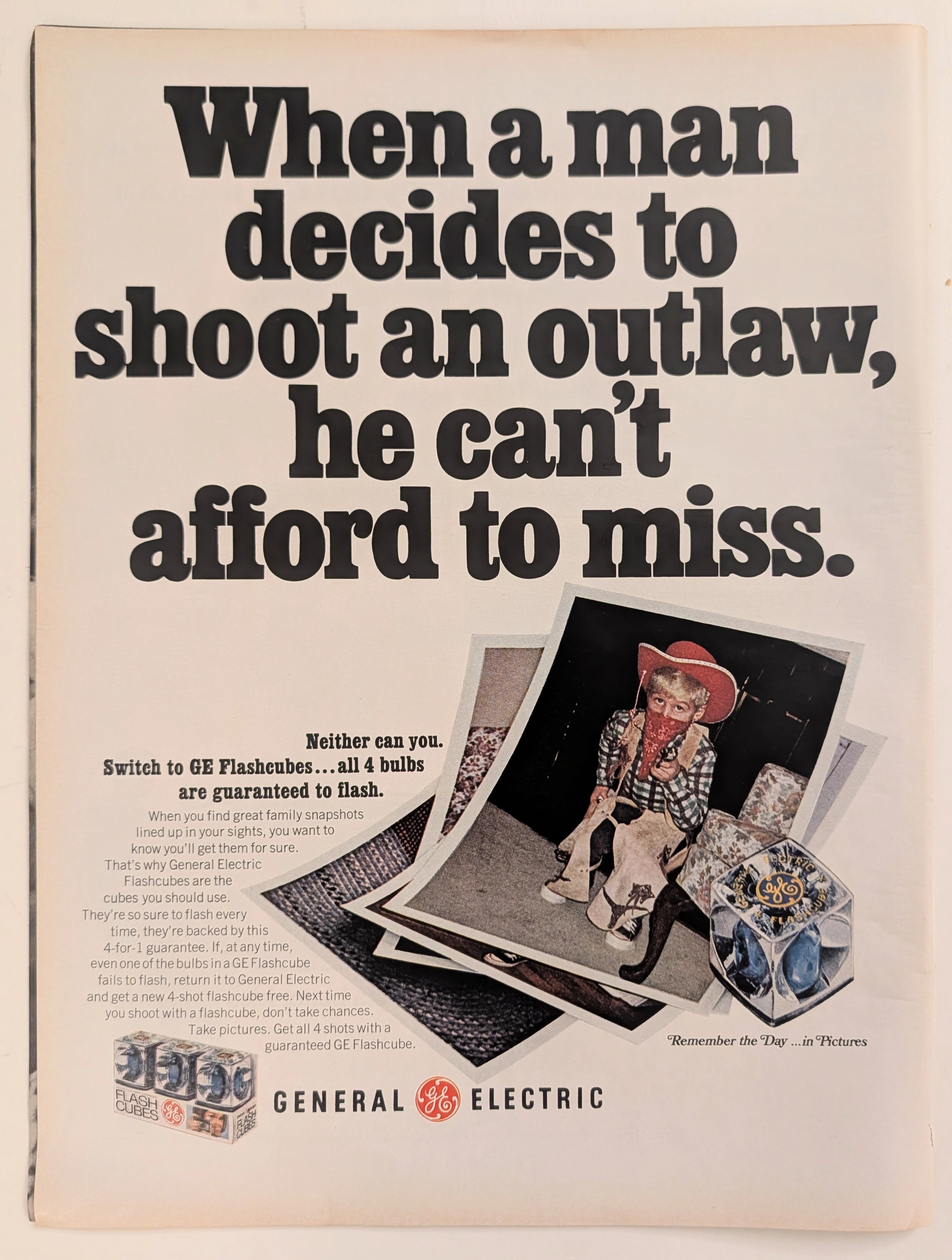
The Time Traveller's Dossier: Capturing the Outlaw – The General Electric Flashcube and the Democratization of Amateur Photography
The evolution of twentieth-century domestic life and the archiving of the American family unit was fundamentally defined by the rapid, uncompromising advancement of accessible consumer photography. The historical artifact elegantly and securely positioned upon the analytical table of The Record Institute today is a striking, narrative-driven full-page print advertisement for General Electric (GE) Flashcubes. This document completely transcends the standard, utilitarian boundaries of photographic equipment marketing. It operates as a highly sophisticated, multi-layered cultural mirror, reflecting a precise era in consumer psychology where the anxiety of "missing the moment" was aggressively addressed by industrial innovation. By utilizing the playful, universally recognizable motif of childhood dress-up—a young boy costumed as an Old West "outlaw"—GE sought to reassure the mid-century parent that their technological consistency would never fail the spontaneous archiving of family history. This world-class, comprehensive dossier conducts a meticulous, unyielding, and exceptionally exhaustive examination of the artifact, operating under the absolute most rigorous parameters of historical, sociological, and material science evaluation. Dedicating the overwhelming majority of our analytical focus to its immense historical gravity, we will decode the brilliant marketing psychology embedded within the "shoot an outlaw" double entendre, analyze the profound sociopolitical impact of the Flashcube's invention on consumer behavior, and dissect the economic realities of the "4-for-1 guarantee." Furthermore, as we venture deeply into the chemical and physical foundations of this analog printed ephemera, we will reveal the precise mechanical fingerprints of the CMYK halftone rosettes captured in the stunning macro imagery of the GE logo. Finally, we will assess its archival rarity, exploring how the graceful, natural oxidation of the paper substrate cultivates a serene wabi-sabi aesthetic—a natural, irreversible phenomenon that serves as the primary engine driving up its market value exponentially within the elite global spheres of Vintage Commercial Ephemera and Technology Archives.
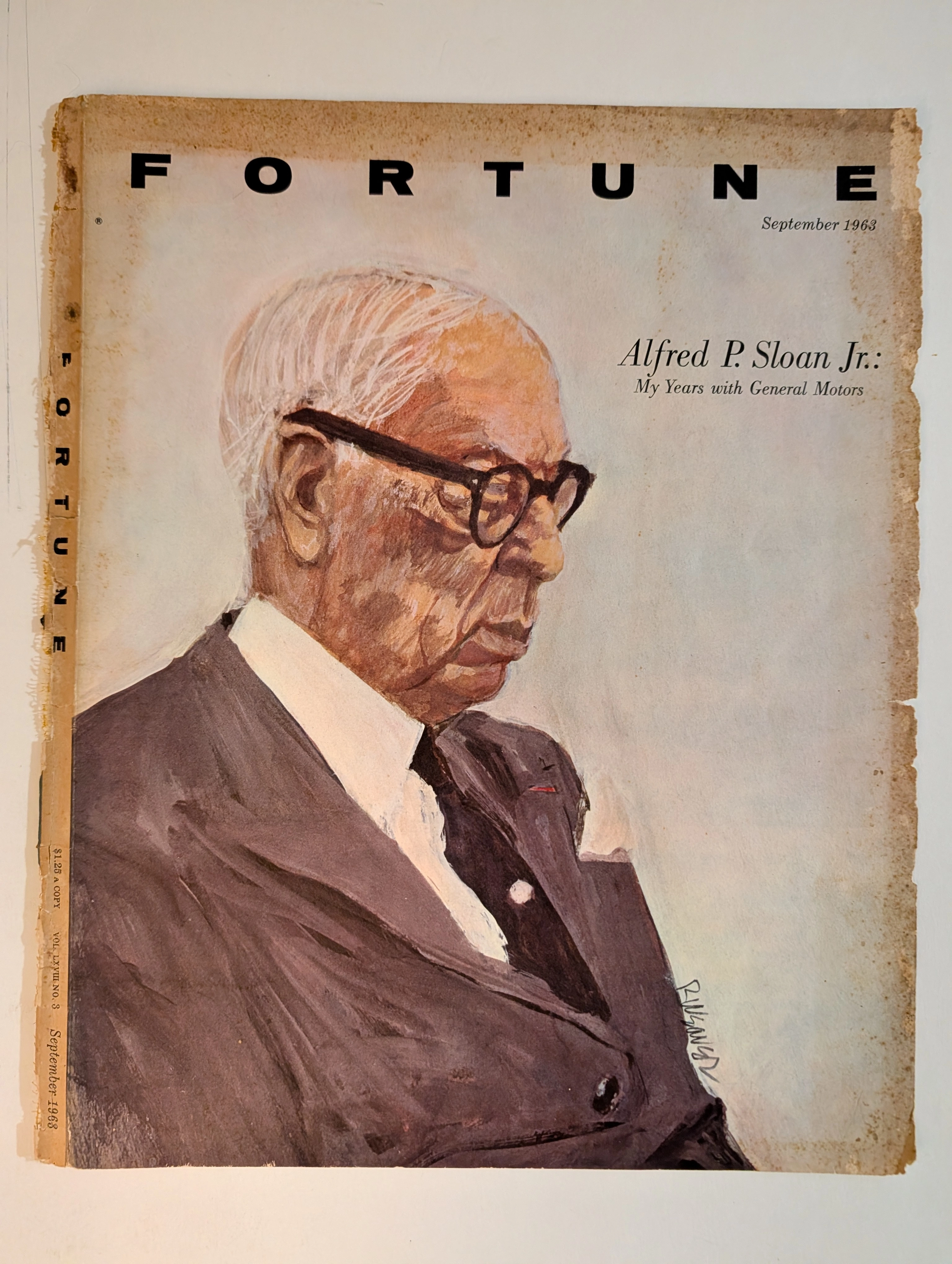
THE TIME TRAVELER'S DOSSIER: THE ARCHITECT OF CAPITALISM AND THE AESTHETICS OF RUIN
The artifact under rigorous, museum-grade analysis is a profoundly significant Historical Relic originating from the absolute zenith of American corporate ascendancy. This Primary Art Document is the front cover of FORTUNE magazine, explicitly dated September 1963. It features a majestic, expressive painted portrait of Alfred P. Sloan Jr., the legendary architect of the General Motors empire. Masterfully rendered by the acclaimed American illustrator Robert Weaver, whose signature is prominently visible, this artifact visually anchors the magazine's serialization of Sloan's definitive business memoir, My Years with General Motors. This text remains a foundational scripture of modern corporate management and decentralized organizational structure. Rescued from the ravages of time and preserved as a standalone Archival Artifact, the premium, heavy-stock analog paper of Fortune is undergoing a breathtaking process of chemical degradation. It exhibits severe edge fraying, jagged paper loss, and deep biological oxidation along its borders. This glorious decay transforms a mass-produced business periodical into an irreplaceable, ready-to-frame Primary Art Document—a testament to the fragile mortality of even the greatest capitalist empires.
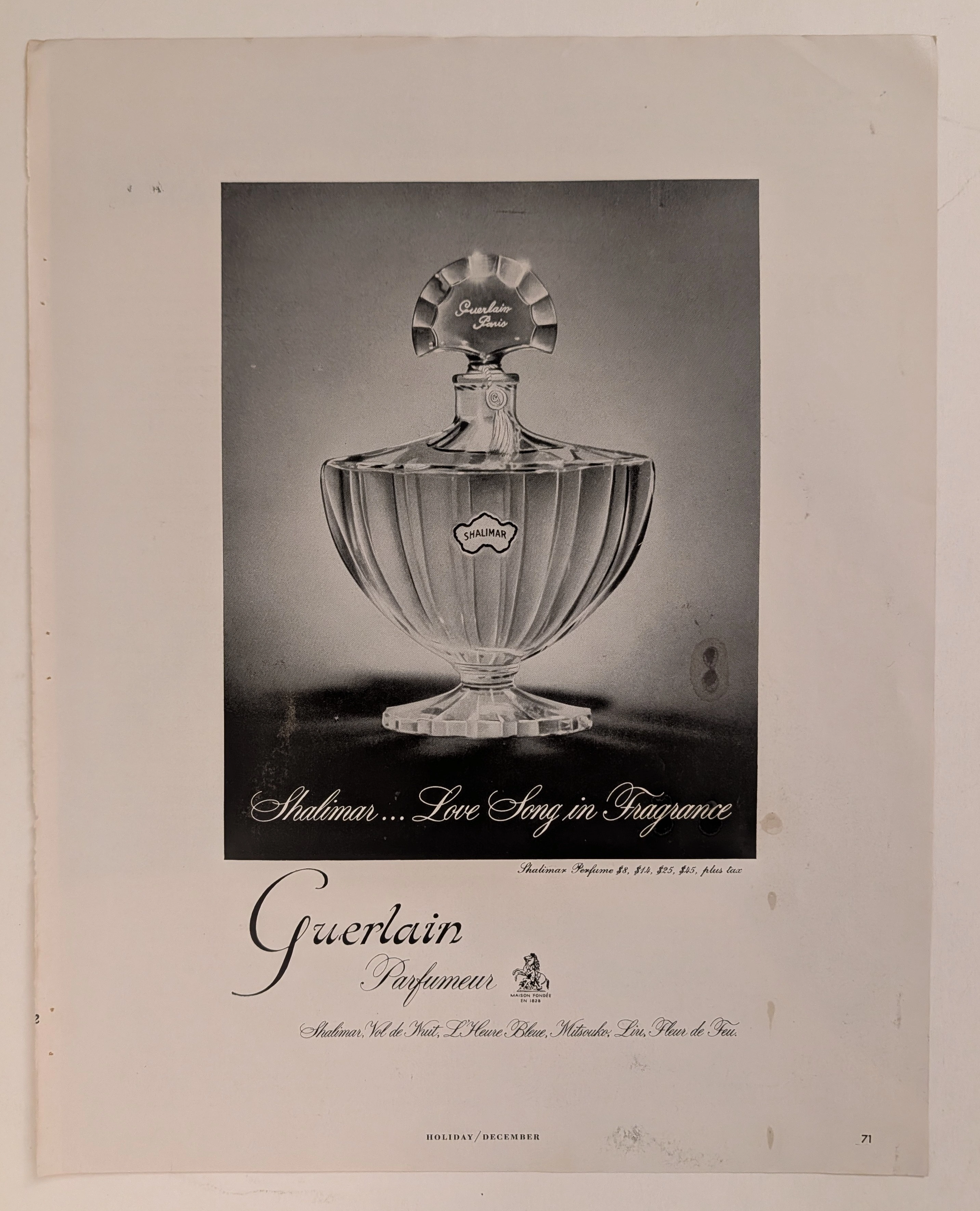
Guerlain · Fashion
The Time Traveller's Dossier: The Architecture of Desire – Guerlain "Shalimar" Advertisement (Circa Mid-20th Century)
History is not an accidental sequence of events; it is a meticulously engineered illusion crafted by those who command the aesthetic and cultural narratives of their time. Long before digital algorithms could sterilely dictate consumer preferences, the ultimate manifestation of psychological manipulation and corporate alchemy was executed through the calculated precision of the halftone printing press and the absolute mastery of analog darkroom photography. The historical artifact before us is not merely a disposable page torn from a vintage magazine. It is a perfectly weaponized blueprint of exoticism, a visual declaration of extreme luxury, and an unwavering testament to an era where fragrance was sold not as a cosmetic, but as an immortal "Love Song." This museum-grade, academic archival dossier presents an exhaustive, microscopic deconstruction of a mid-20th-century print advertisement for the legendary Guerlain "Shalimar" perfume. Operating on a profound and ruthless binary structure, this document records a calculated paradigm shift within the global luxury industry. It captures the precise historical fracture where a concoction of botanical extracts and synthetic molecules was conceptually transmuted into a literal, physical embodiment of a mythical Eastern romance. Through the highly specialized lens of late-analog commercial artistry and stringent visual forensics, this document serves as a masterclass in psychological marketing. It established the foundational archetype for selling intangible emotions at astronomical markups—an archetype that unconditionally dictates the visual and strategic totems of the modern haute parfumerie industry today.