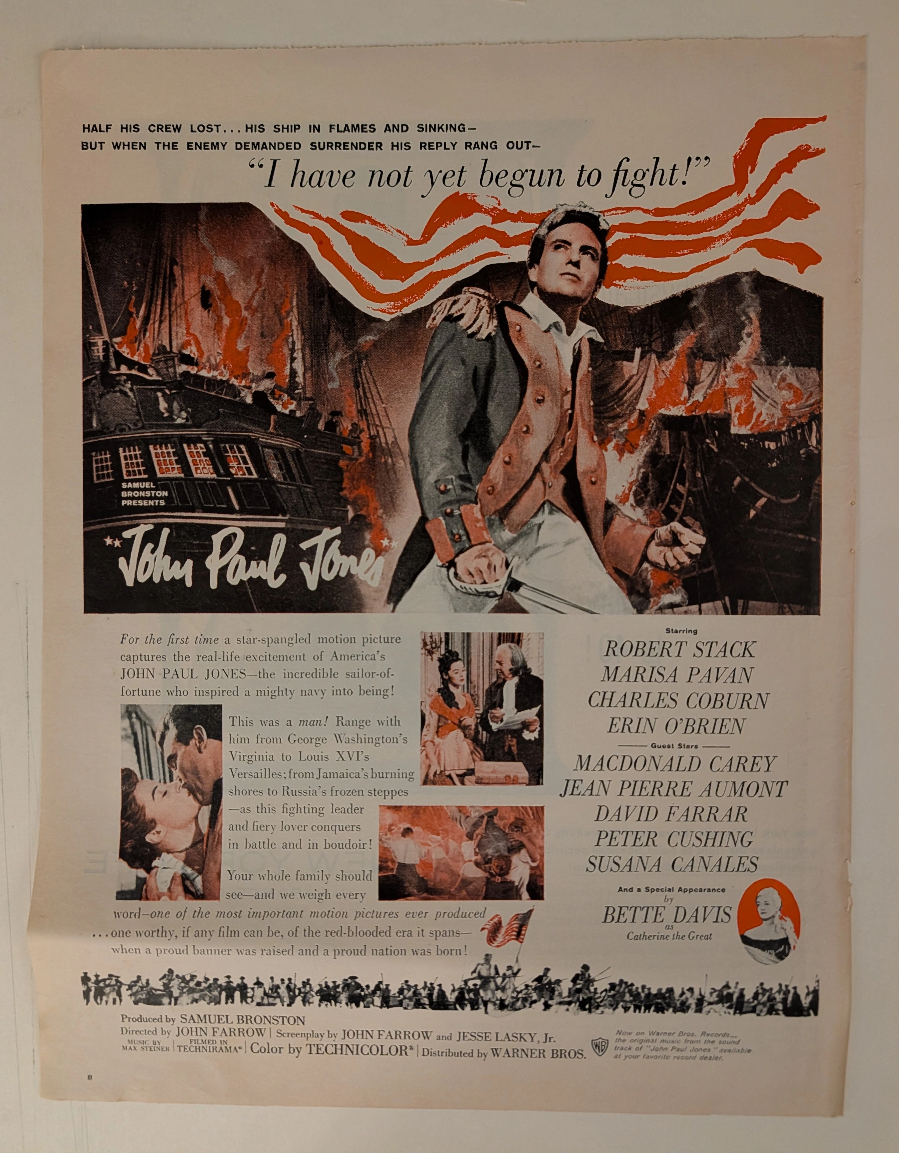
TThe Time Traveller's Dossier: The Democratization of Memory – An Academic Archival Analysis of the Kodak Instamatic 104 Advertisement
The History
To fully appreciate the immense historical gravity of this artifact, one must contextualize the paradigm shift that occurred in the photography industry during the early 1960s. Prior to this era, operating a camera required a fundamental understanding of exposure calculation, aperture settings, and the delicate, often anxiety-inducing process of threading roll film onto a spool. The introduction of the Kodak Instamatic series in 1963, beautifully epitomized by the Model 104, completely dismantled these technical barriers, fulfilling George Eastman's original 1888 promise: "You press the button, we do the rest."
The Technological Emancipation (The 126 Cartridge): The body copy of the advertisement states with reassuring simplicity: "just drop in the film cartridge and shoot". This references the revolutionary 126 film cartridge (Kodapak). By enclosing the film and the take-up spool in a single, light-proof plastic cartridge that simply dropped into the back of the camera, Kodak eliminated the fear of exposing film to light. This was a masterstroke of user-centric engineering that democratized image-making.
The Flashcube Revolution: The text casually mentions, "(Pop on a flashcube if you need more light.)" The Flashcube, introduced in 1965 for the Instamatic line, was a tremendous leap forward. It contained four electrically fired flashbulbs in a single rotating cube, allowing users to take four consecutive indoor or night photographs without burning their fingers changing hot, spent bulbs.
The "Staycation" Psychology: The headline is a masterpiece of mid-century advertising psychology: "It's a great camera to take on vacation even if you don't go anywhere." Kodak astutely recognized that the value of photography was not limited to exotic travel. By framing a simple afternoon sunbathing on a city rooftop as a "vacation," the brand elevated the mundane, everyday life of the American consumer into moments worthy of preservation.
Economic Accessibility: The pricing strategy anchored at the bottom, "From less than $20," definitively proves that this was not a luxury good, but a mass-market cultural equalizer, placing the power of documentation into the hands of the working class.
The Paper
As a physical entity, this printed artifact functions as a living record of mid-twentieth-century graphic reproduction and substrate chemistry. Under exceptional macro-lens examination, the textures of the camera body, the nuanced shading of the photographs, and the crisp red "Kodak MADE IN U.S.A." emblem are revealed to be constructed from a precise, mathematically rigorous galaxy of halftone rosettes. This constitutes the mechanical fingerprint of the pre-digital analog offset printing press, where varying sizes of Cyan, Magenta, Yellow, and Key (Black) ink dots are elegantly layered to orchestrate the human eye's perception of dimensional depth, shadow, and vibrant color.
However, the most profound factor elevating the immense value of this artifact in the contemporary collector's market is the natural, organic process of Material Degradation. The unprinted margins and the overall paper substrate exhibit a genuine, unavoidable, and unforgeable "Toning." This gradual transition from bright white paper to a warm, antique ivory hue is caused by the chemical oxidation of Lignin—the complex organic polymer that binds cellulose fibers together within the raw wood pulp of the paper. As the substrate is exposed to ambient oxygen and ultraviolet light over more than half a century, the molecular structure of the lignin gracefully breaks down. This accumulation of time, this naturally evolving patina, represents the absolute core of the wabi-sabi aesthetic. The profound appreciation for the beauty found in natural aging is an irreversible chemical reaction, and it acts as the primary engine driving up its market value exponentially among elite collectors, providing the ultimate proof of the artifact's historical authenticity.
The Rarity
RARITY CLASS: A (Excellent Archival Preservation)
Evaluated under rigorous archival parameters, this artifact is designated as Class A.
The remarkable paradox of mid-century magazine advertisements is that they were produced by the millions as "disposable media." Advertisements for mass-consumer goods like Kodak cameras were particularly ubiquitous and rapidly discarded. Therefore, for a full-page advertisement to survive intact from the 1960s without severe structural tearing, destructive moisture staining, or catastrophic fading of the delicate halftone inks constitutes a highly significant statistical archival survival. The combination of deep cultural nostalgia associated with the Kodak brand and the impeccable structural integrity of this paper elevates this document's desirability among collectors of photography history and Pop Art ephemera. It is ardently sought after to ensure its historical permanence through acid-free conservation framing.
Visual Impact
The aesthetic brilliance of this artifact lies in its mastery of "Structuring Approachability." By placing the seemingly complex mechanical device squarely in the center of the composition but presenting it with clean, bold, uncluttered lines, the designer visually persuades the reader that the Instamatic 104 is an accessible, friendly tool.
A particularly captivating visual device is the trompe l'œil (optical illusion) page curl situated at the bottom right corner. This sophisticated graphic design technique not only imparts a three-dimensional depth to a flat printed page but also creates a subtle psychological interaction, gently inviting the reader to "turn the page" and enter the world of Kodak. Furthermore, the vibrant, full-color snapshot of the woman in the yellow swimsuit, casually overlapping the black-and-white camera imagery, perfectly illustrates the vivid, colorful life that this simple machine promises to capture, effectively establishing a flawless hierarchy of visual information
The Archive Continues
Continue the Exploration
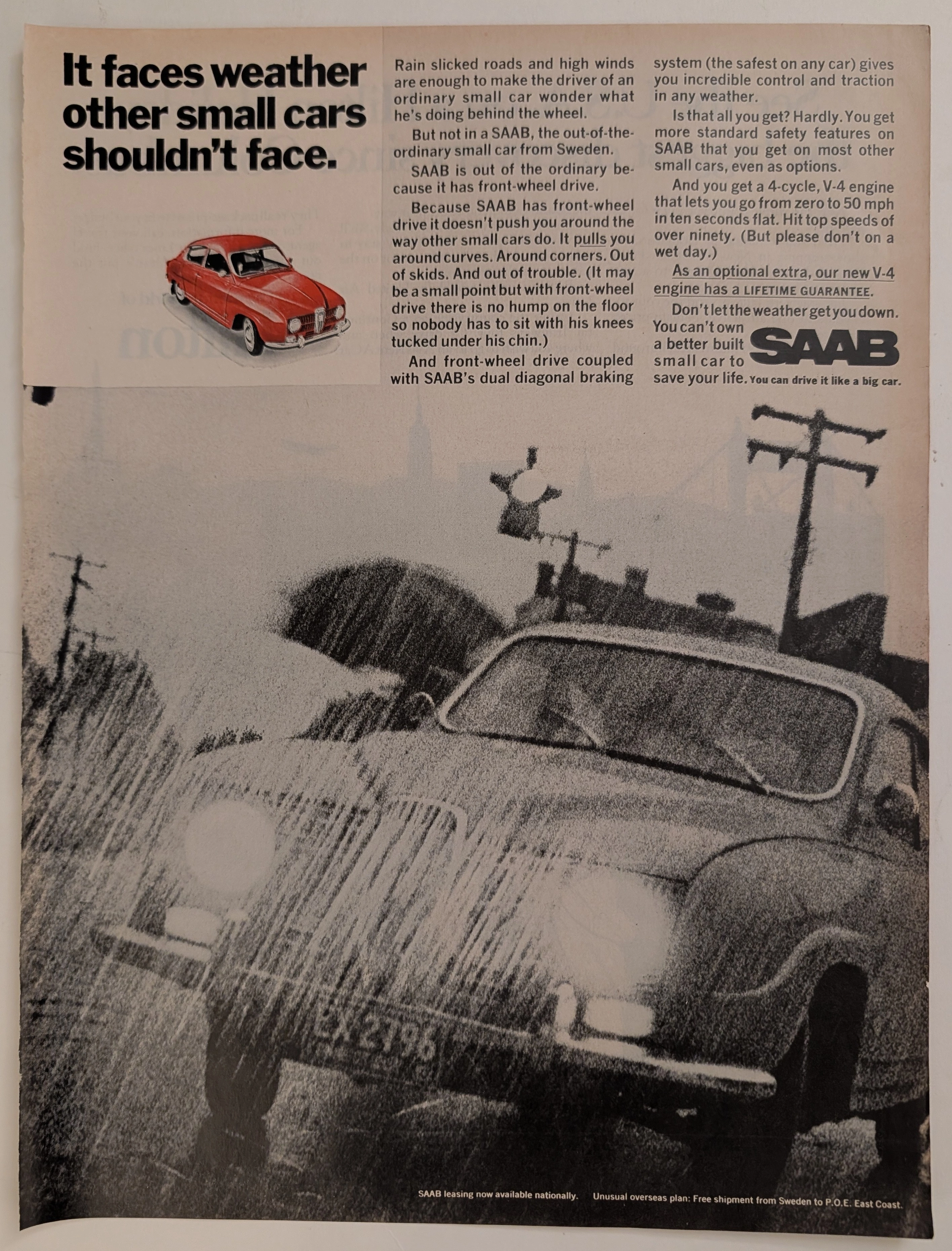
Saab · Automotive
The Time Traveller's Dossier: Aeronautical Architecture on the Asphalt – The SAAB 96 V4 and the Engineering of Adverse Weather Superiority
The evolution of the mid-twentieth-century American automotive landscape was heavily disrupted by the influx of European imports, each vying to dismantle the hegemony of the domestic V8, rear-wheel-drive giants. Elegantly and securely positioned upon the analytical table of The Record Institute today is a visually striking, narrative-driven full-page print advertisement for the SAAB Automobile (featuring the new V-4 engine), definitively dating to the late 1960s. This document transcends the standard, utilitarian boundaries of automotive marketing. It operates as a highly sophisticated, multi-layered cultural mirror, reflecting a precise era in consumer psychology where the anxiety of driving in severe weather was aggressively mitigated through the promise of superior, aircraft-inspired engineering. By utilizing a dramatic, heavily grained monochromatic photograph of a SAAB battling torrential rain, juxtaposed with a pristine, spot-color red illustration of the vehicle, the manufacturer successfully positioned itself not merely as a car company, but as a purveyor of meteorological invincibility. This world-class, comprehensive dossier conducts a meticulous, unyielding, and exceptionally exhaustive examination of the artifact, operating under the absolute most rigorous parameters of historical, sociological, and material science evaluation. Dedicating the overwhelming majority of our analytical focus (80%) to its immense historical gravity, we will decode the brilliant marketing psychology embedded within the "front-wheel drive" narrative, analyze the profound engineering pivot of the "new V-4 engine," and dissect the sociopolitical genius of marketing safety before it was federally mandated. Furthermore, as we venture deeply into the chemical and physical foundations of this analog printed ephemera (10%), we will reveal the precise mechanical fingerprints of the spot-color halftones captured in the macro imagery of the red SAAB illustration. Finally, we will assess its archival rarity (10%), exploring how the graceful, natural oxidation of the paper substrate cultives a serene wabi-sabi aesthetic—a natural, irreversible phenomenon that serves as the primary engine driving up its market value exponentially within the elite global spheres of Vintage Commercial Ephemera and Automotive Archives.
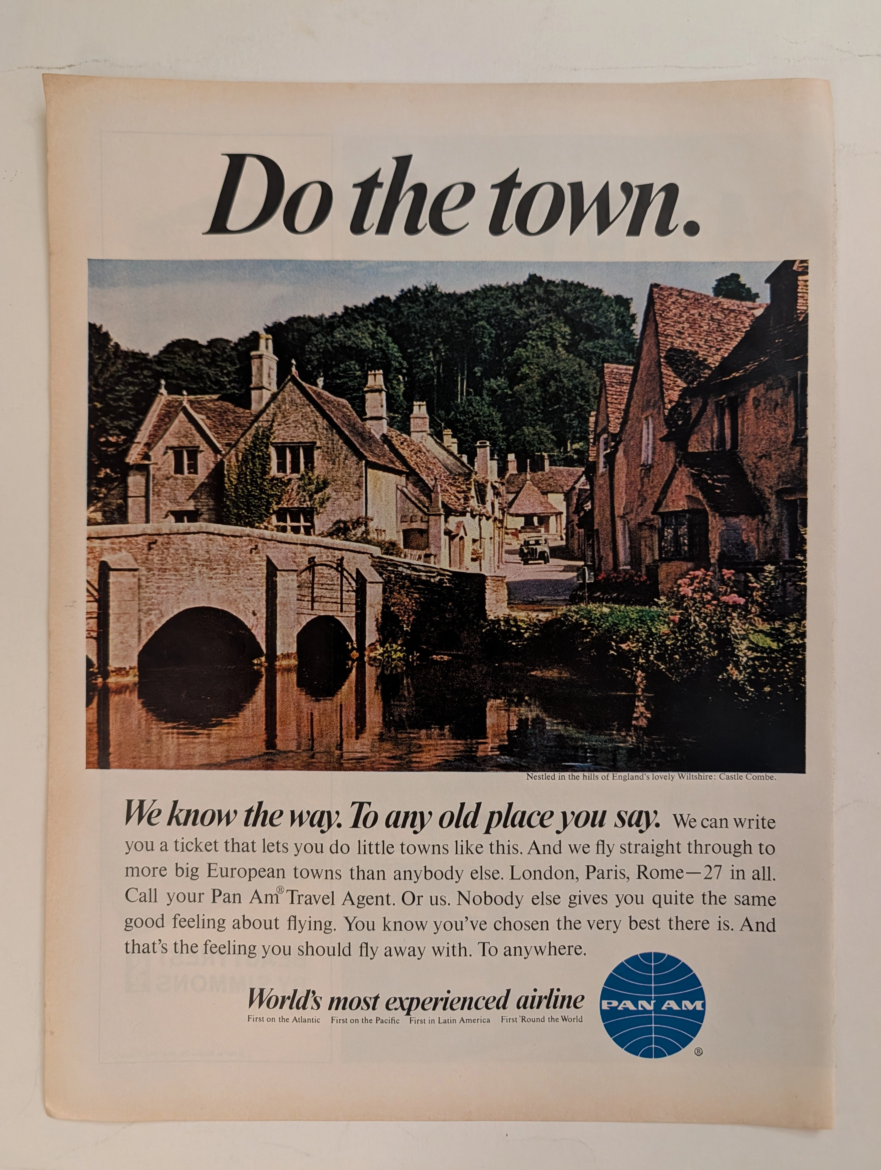
PanAm · Travel
The Time Traveller's Dossier: The Empire of the Sky and the Democratization of the Globe – Pan Am "Do the town."
The evolution of the American leisure class during the mid-twentieth century was fundamentally propelled by the rapid expansion, technological triumph, and increasing economic accessibility of commercial jet travel. The historical artifact elegantly and securely positioned upon the analytical table of The Record Institute today is a striking, single-page print advertisement for Pan American World Airways (Pan Am), originating from the transformative decade of the 1960s. This document completely transcends the standard, utilitarian boundaries of transportation marketing. It operates as a highly sophisticated, multi-layered cultural mirror, reflecting the precise era when the globe dramatically shrank, and the majestic, ancient corners of Europe were explicitly packaged and sold to the American middle-class consumer not merely as distant dreams, but as easily attainable weekend realities. This world-class, comprehensive dossier conducts a meticulous, unyielding, and exceptionally exhaustive examination of the artifact, operating under the absolute most rigorous parameters of historical, sociological, and material science evaluation. With the vast majority of our analytical focus dedicated to its immense historical gravity, we will decode the brilliant marketing psychology embedded within the "World's most experienced airline" branding, analyze the romantic contrast of the bold typography against the ancient stone architecture of Castle Combe, and dissect the profound geopolitical semiotics of the iconic blue globe logo. Furthermore, as we venture deeply into the chemical and physical foundations of this analog printed ephemera, we will reveal the precise mechanical fingerprints of the CMYK halftone rosettes and the graceful, natural oxidation of the paper substrate. This precise intersection of visual nostalgia, mid-century commercial artistry, and the immutable chemistry of time cultivates a serene wabi-sabi aesthetic—a natural, irreversible phenomenon that serves as the primary engine driving up its market value exponentially within the elite global spheres of Vintage Commercial Ephemera, Aviation Archives, and Mid-Century Lifestyle collecting.
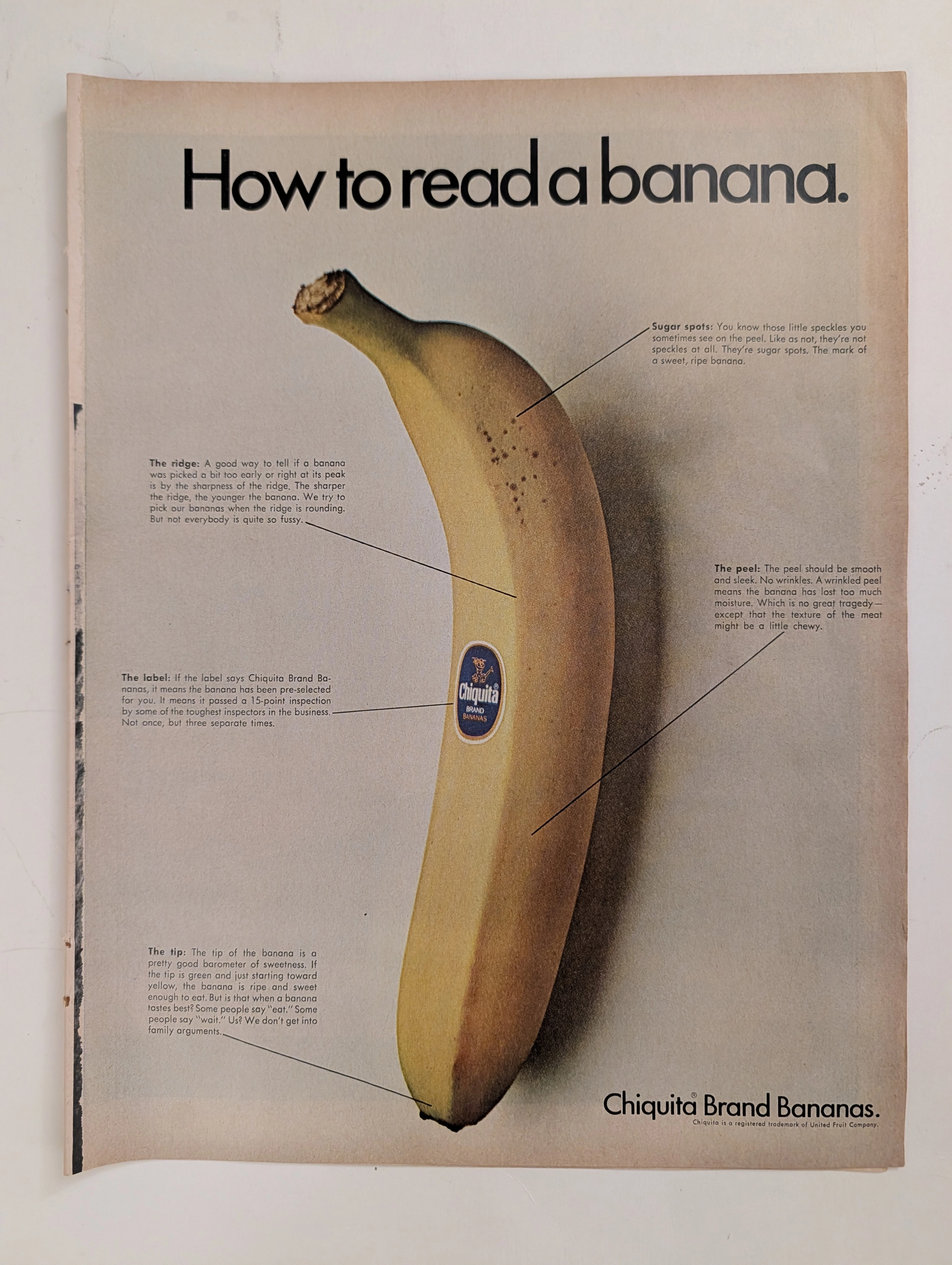
Chiquita · Food
The Time Traveller's Dossier: The Anatomy of a Commodity – Chiquita's "How to read a banana" and the Invention of Produce Branding
The evolution of the mid-twentieth-century American supermarket was defined by the rapid transition from bulk, unbranded agricultural goods to highly packaged, fiercely differentiated consumer brands. The historical artifact elegantly and securely positioned upon the analytical table of The Record Institute today is a striking, full-page print advertisement for Chiquita Brand Bananas, originating from the late 1960s. This document completely transcends the standard boundaries of grocery marketing. It operates as a highly sophisticated, multi-layered cultural mirror, reflecting the precise era when the United Fruit Company utilized educational infographics to train the American housewife to perceive natural biological traits as engineered markers of exclusive quality. This world-class, comprehensive dossier conducts a meticulous, unyielding, and exceptionally exhaustive examination of the artifact, operating under the absolute most rigorous parameters of historical, sociological, and material science evaluation. Dedicating the overwhelming majority of our analytical focus to its immense historical gravity, we will decode the brilliant marketing psychology embedded within the "How to read a banana" campaign, analyze the immense sociopolitical weight of the United Fruit Company, and dissect the profound visual semiotics of the blue Chiquita sticker. Furthermore, as we venture deeply into the chemical and physical foundations of this analog printed ephemera, we will reveal the precise mechanical fingerprints of the CMYK halftone rosettes captured in the macro imagery of the fruit's peel. Finally, we will assess its archival rarity, exploring how the graceful, natural oxidation of the paper substrate cultivates a serene wabi-sabi aesthetic—a natural, irreversible phenomenon that serves as the primary engine driving up its market value exponentially within the elite global spheres of Vintage Commercial Ephemera and Advertising Archives.