The Time Traveller's Dossier: Aeronautical Architecture on the Asphalt – The SAAB 96 V4 and the Engineering of Adverse Weather Superiority
The History
To fully appreciate the immense historical gravity, cultural magnitude, and sociological importance of this artifact, one must meticulously contextualize the complex, highly specific landscape of the imported automotive industry in the United States during the late 1960s. SAAB (Svenska Aeroplan Aktiebolaget), originally founded in 1937 as an aerospace and defense company to supply aircraft for the Swedish Air Force, began manufacturing automobiles in the late 1940s to diversify its post-war portfolio. This aeronautical heritage fundamentally dictated the DNA of every SAAB vehicle. Unlike traditional automakers, SAAB's engineers approached car design through the lens of aerodynamics, weight distribution, and functional survival in the unforgiving Scandinavian winters.
The primary technological warfare documented in this artifact revolves around the boast of "front-wheel drive." In the 1960s American market, the standard automotive architecture was front-engine and rear-wheel drive—a configuration that notoriously struggled with traction in snow, ice, and heavy rain due to the lack of weight over the driven wheels. Alternatively, SAAB's fiercest European competitor, the Volkswagen Beetle, utilized a rear-engine, rear-wheel-drive layout that, while better for traction, was dangerously prone to snap-oversteer in adverse conditions. SAAB capitalized on its unique front-wheel-drive system, aggressively explaining the physics to the consumer: "Because SAAB has front-wheel drive it doesn't push you around the way other small cars do. It pulls you around curves. Around corners. Out of skids. And out of trouble." This was not mere marketing jargon; it was a fundamental lesson in automotive physics, promising the driver unprecedented control and psychological security when "Rain slicked roads and high winds are enough to make the driver of an ordinary small car wonder what he's doing behind the wheel."
Equally significant is the artifact's documentation of a critical pivot in SAAB's powertrain history: the introduction of the "new V-4 engine." Prior to 1967, the SAAB 96 was powered by a quirky, albeit underpowered, three-cylinder, two-stroke engine. While beloved by rally racers, the two-stroke engine required owners to manually mix oil with their gasoline, a severe friction point that alienated the convenience-oriented American consumer. To conquer the US market, SAAB made the drastic decision to source a 1.5-liter, 4-cycle V4 engine from Ford of Germany (the Taunus V4). The copy in this advertisement proudly proclaims this upgrade: "And you get a 4-cycle, V-4 engine that lets you go from zero to 50 mph in ten seconds flat." To further alleviate any consumer anxiety regarding the reliability of this new powerplant, SAAB offered a staggering, unprecedented "LIFETIME GUARANTEE" on the V-4 engine. This was a monumental financial risk for the corporation, but it operated as an ironclad psychological contract, assuring the American buyer that Swedish engineering was infallible.
Furthermore, the advertisement highlights SAAB's pioneering commitment to passive safety, long before such features were mandated by the US Department of Transportation. The mention of "SAAB's dual diagonal braking system (the safest on any car)" reveals an engineering philosophy that prioritized human life. If one brake line failed, the diagonal system ensured that one front wheel and the opposite rear wheel would still provide stopping power, preventing the car from spinning out of control. The closing statement, "You can't own a better built small car to save your life," elevates the automobile from a mere mode of transportation to a vital piece of survival equipment.
Finally, the economic realities of international automotive sales are quietly recorded in the microscopic typography at the bottom of the page: "SAAB leasing now available nationally. Unusual overseas plan: Free shipment from Sweden to P.O.E. East Coast". This reveals SAAB's aggressive expansion strategy, offering European delivery programs to entice affluent American tourists to purchase a car abroad and have it shipped back, effectively cementing the brand's status as a sophisticated, cosmopolitan choice for the intellectual driver.
The Paper
As a physical entity, this printed artifact functions as a living, breathing, and profoundly detailed record of mid-twentieth-century graphic reproduction and substrate chemistry. Under exceptional, high-magnification macro-lens examination, this document reveals the stunning complexity and mathematical precision of analog offset printing.
The visual brilliance of this artifact lies in its dual-process printing technique. The main background is a heavily grained, high-contrast monochromatic photograph, intentionally utilizing an exaggerated halftone dot structure to simulate the chaotic, blinding visual interference of torrential rain and sleet. This gritty, hostile environment is brilliantly juxtaposed against the spot-color inset illustration of the red SAAB. The macro photography of this red illustration provides a textbook, museum-grade visualization of a layered halftone matrix. The vibrant, highly saturated red ink was applied with exacting mechanical pressure, sitting atop the uncoated organic cellulose fibers of the magazine stock. This specific juxtaposition—the messy reality of the black-and-white storm versus the pristine, engineered perfection of the red automobile—is a masterclass in subliminal visual persuasion.
Yet, the most profound and impactfully beautiful factor elevating the immense value of this artifact in the contemporary global collector's market is the natural, organic, and entirely irreversible process of Material Degradation. The expansive margins of the page exhibit a genuine, unavoidable "Toning." This gradual, chronological transition from the original bright, bleached manufactured paper to a warm, antique ivory hue is caused by the slow, relentless chemical oxidation of Lignin—the complex organic phenolic polymer that naturally binds cellulose fibers together within the raw wood pulp of the paper. As the substrate is exposed to ambient atmospheric oxygen and ultraviolet light over a span of nearly six decades, the molecular structure of the lignin gracefully breaks down and darkens. This naturally evolving patina represents the absolute core of the wabi-sabi aesthetic. It is precisely this authentic, unreplicable degradation that acts as the primary engine driving up its market value exponentially among elite curators and collectors, as it provides the ultimate, irrefutable scientific proof of the artifact's historical authenticity and its delicate, unbroken journey through time.
The Rarity
RARITY CLASS: B (Very Good Archival Preservation with Natural Margin Toning)
Evaluated under the most exacting, rigorous, and uncompromising archival parameters established by The Record Institute (which spans a meticulous classification system from Pristine Class A down to Heavily Degraded Class D), this artifact is definitively and securely designated as Class B.
The remarkable and defining paradox of mid-century commercial ephemera is that these specific documents were produced by the millions as explicitly and intentionally "disposable media." Inserted into high-volume, mass-market consumer publications of the late 1960s, they were inherently destined by their very nature to be briefly observed, casually folded, used as scrap paper, or ultimately discarded into the recycling bins and incinerators of history. For a full-page, graphically complex, and textually dense advertisement to survive entirely intact without catastrophic structural tearing, without destructive moisture staining, or without the fatal, irreversible fading of the delicate spot-color inks constitutes a highly significant statistical archival anomaly.
The structural integrity of this paper remains exceptionally sound. While the rich analog spot-colors—particularly the vibrant red of the vehicle illustration—remain astonishingly vivid, there is a beautiful, mathematically even, natural lignin oxidation reflecting its era. This displays a pronounced, warm ivory patina heavily along the expansive margins. This environmental interaction does not detract from its immense value; rather, it authentically validates the document's chronological journey. The sheer sociopolitical and engineering weight of the subject matter—the definitive documentation of SAAB's transition to the V4 engine, the marketing of front-wheel-drive superiority, and the commodification of automotive safety—makes this a highly prized, museum-worthy piece of consumer culture heritage, requiring acid-free, UV-protected conservation framing to ensure its historical permanence.
Visual Impact
The aesthetic brilliance and psychological power of this artifact lie in its masterful execution of "Environmental Contrast and Engineering Authority." The art director was tasked with communicating the highly technical benefits of front-wheel drive and a new engine while simultaneously evoking an emotional sense of security, necessitating a layout that felt both hostile in its setting and reassuring in its product offering.
The composition utilizes a highly effective spatial hierarchy. The vast majority of the page is consumed by the chaotic, textured black-and-white photograph of the SAAB plunging through blinding rain under an ominous, darkened sky and leaning utility poles. This establishes the "problem": the terrifying reality of adverse weather. The "solution" is presented in the top left quadrant: a clean, orderly, and brightly colored illustration of the car, entirely isolated from the storm within a neat, rectangular inset. The bold, authoritative typography—"It faces weather other small cars shouldn't face."—acts as the psychological bridge between the two images. The layout guides the eye flawlessly: arresting the viewer with the dramatic storm, providing the bold thesis statement, offering the pristine red vehicle as the technological savior, and finally leading into the dense, persuasive technical copy detailing the V4 engine and dual diagonal braking system. It is a masterclass in utilizing layout to simultaneously educate the consumer on complex automotive physics while intensely stroking their deepest desires to protect their own lives on the road.
Exhibition Halls
The Archive Continues
Continue the Exploration
Chivas Regal · Beverage
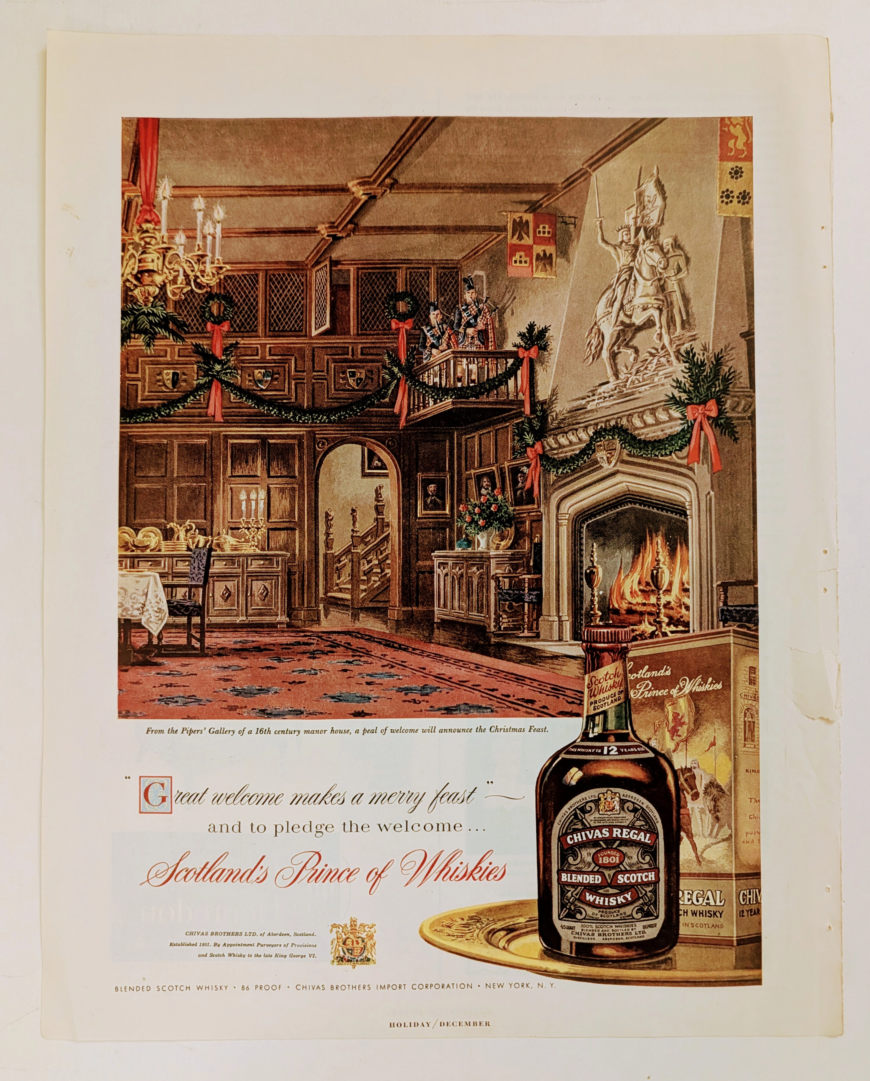
The Time Traveller's Dossier: The Architecture of Aristocracy – Chivas Regal "Prince of Whiskies" Advertisement (Circa Mid-1950s)
analysis is a meticulously preserved, single magazine tear sheet representing a pinnacle era of mid-20th-century commercial illustration and brand positioning. Far removed from the realm of disposable consumer advertising, this artifact operates as a sophisticated sociological document. It captures a precise historical epoch where the global spirits industry—specifically the Scotch whisky sector—transitioned from marketing regional agricultural products to curating internationally recognized symbols of aristocratic heritage and refined lineage. Operating with absolute curatorial precision, this dossier deconstructs a circa mid-1950s advertisement for Chivas Regal 12-Year-Old Blended Scotch Whisky. By analyzing the intersection of classical illustration, the strategic deployment of British royal iconography, and the meticulous visual forensics of the analog printing process, this document illuminates the foundational strategies of modern heritage branding. It demonstrates how a brand gracefully orchestrated a narrative of ancient nobility and warmth to captivate the post-war American consumer, establishing an enduring standard for the premium spirits market that remains profoundly influential today.
THE TIME TRAVELER'S DOSSIER: ARROGANCE AND INNOVATION IN THE ABYSS OF THE DEPRESSION
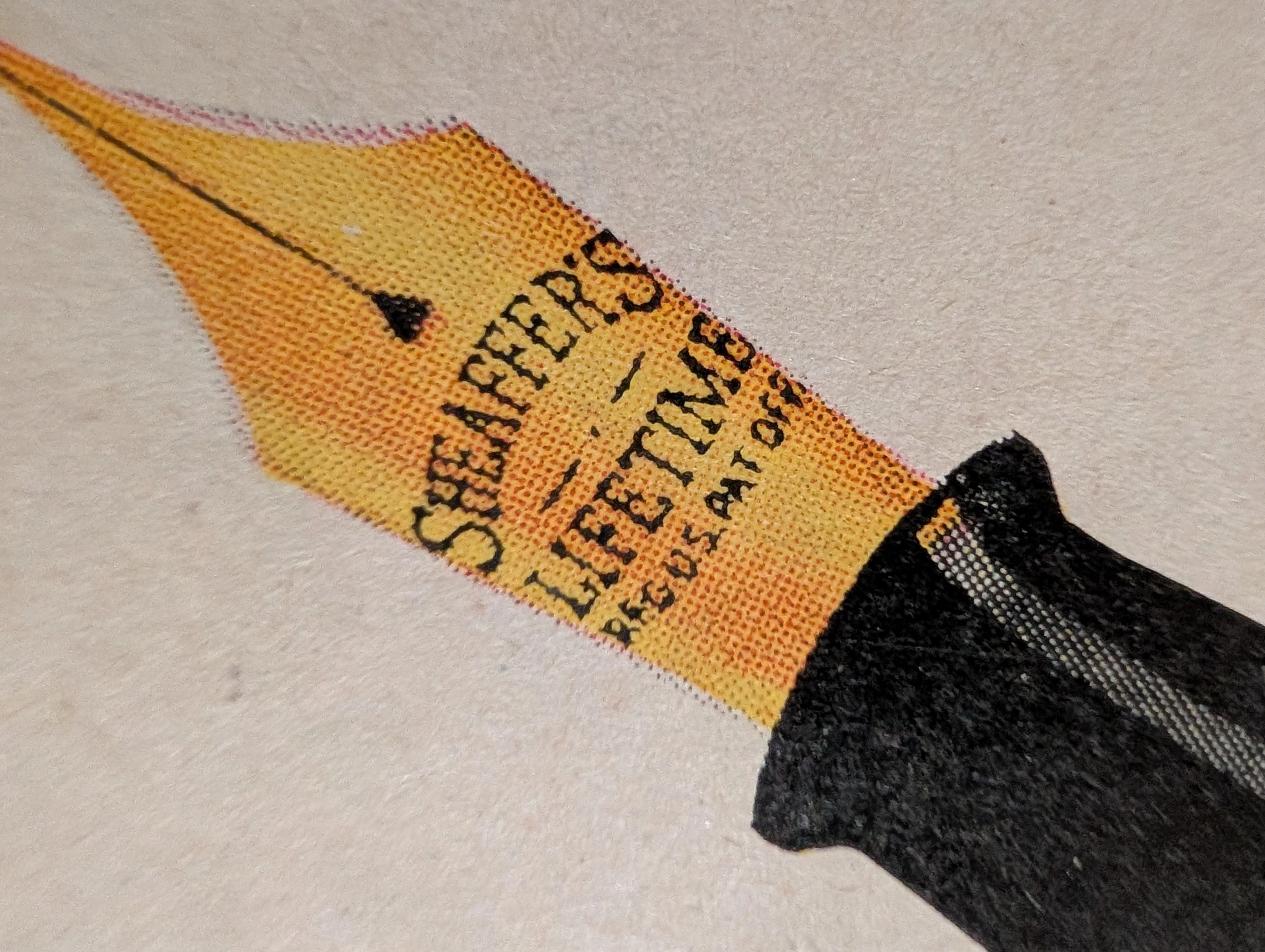
The artifact under rigorous, museum-grade analysis is an exceptionally preserved Historical Relic originating from the darkest economic abyss of the 20th century: the American Great Depression. Sourced from a 1931 issue of The Saturday Evening Post, this Primary Art Document features a sweeping, full-page advertisement for the Sheaffer's "Balance" Lifetime Pen. This piece is a profound sociological and industrial marker. In 1931, as the global economy collapsed, W.A. Sheaffer defiantly marketed a revolutionary, streamlined luxury writing instrument priced at an astronomical $15. The ad explicitly highlights the "White Dot" lifetime guarantee and the 14-karat solid gold "Autograph" band engraved with the owner's signature ("John Adams"). It is a masterclass in aspirational marketing during an era of mass destitution. Physically, this nearly century-old wood-pulp document is a breathtaking testament to the Japanese aesthetic of wabi-sabi. It exhibits severe, dramatic edge trauma, profound edge loss, deep amber oxidation, and prominent moisture staining along the left margin. This extreme analog decay transforms the mass-produced commercial print into an irreplaceable, highly coveted Primary Art Document that physically embodies the scars of its 90-year journey through history.
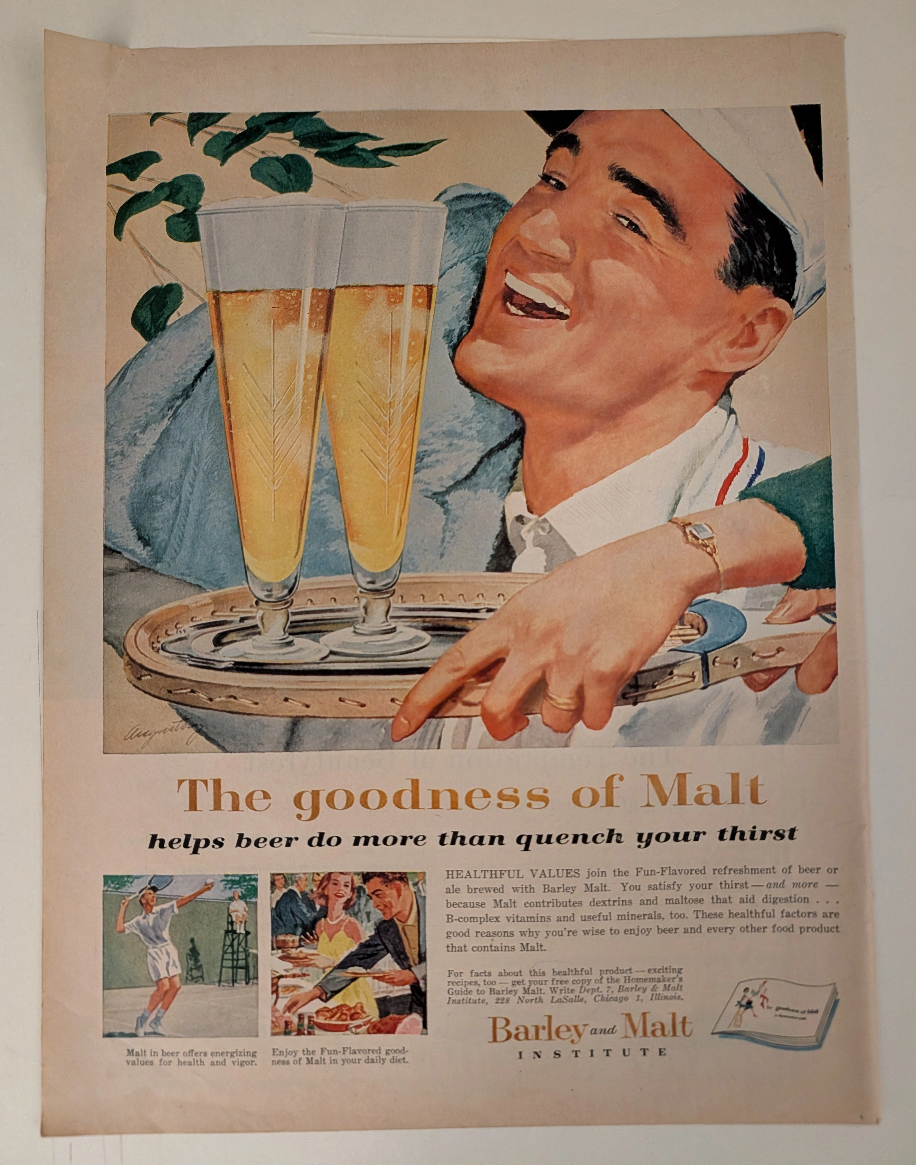
The Time Traveller's Dossier: How a 1959 Beer Ad Turned Alcohol into 'Health Food' – Barley and Malt Institute Advertisement
History is not written; it is printed. Before digital algorithms dictated human behavior, societal engineering was executed through the calculated geometry of the four-color offset press. The artifact before us is not merely an advertisement; it is a weaponized blueprint of middle-class aspiration. This museum-grade archival dossier presents an academic deconstruction of a 1959 print advertisement commissioned by the Barley and Malt Institute of Chicago. Operating on a profound binary structure, it documents a calculated paradigm shift within the American alcohol industry. It illustrates the precise historical fracture where beer was conceptually transitioned from a stigmatized working-class vice into a health-conscious staple of suburban domesticity. Through the lens of mid-century commercial artistry and precise visual forensics, this document serves as a masterclass in psychological marketing, establishing cultural tropes that unconditionally dominate modern pop culture and contemporary branding