— The Record Institute Journal")
 — The Record Institute Journal")
The Time Traveller's Dossier: The Architecture of Masculine Dominance – Pierre Cardin Editorial Illustration (Circa 1980s)
The History
History
To genuinely decode the complex sociological architecture embedded within this printed artifact, one must pull back the lens to contextualize the macroeconomic history of the 1980s and the audacious, disruptive DNA of Pierre Cardin. The 1980s were defined by a massive economic boom, the rise of the ruthless corporate raider, deregulated Wall Street capitalism, and a cultural obsession with extreme physical fitness and bodybuilding. In this cutthroat environment, survival of the fittest was not merely an economic principle; it was a physical requirement.
Enter Pierre Cardin. Historically, menswear had been a stagnant, highly conservative arena dominated by the anonymous tailors of Savile Row or the homogenized, gray-flannel uniformity of American department stores. Cardin, a visionary avant-garde designer who had previously revolutionized womenswear with his Space Age aesthetics in the 1960s, turned his sights on men. He recognized that the modern man no longer wanted to blend in; he wanted to conquer. Cardin became one of the pioneering forces in establishing the "name designer" in menswear. He did not just sell clothes; he sold an identity. By introducing hyper-structured silhouettes, bold architectural lines, and an unapologetic emphasis on the male physique, Cardin transformed the business suit from a mandatory uniform into a psychological weapon. He capitalized on the 1980s ethos of excess, creating garments designed to make the wearer appear physically larger, more imposing, and utterly invincible.
Creator / Illustrator Information: While the specific fashion illustrator of this magnificent piece remains an "Uncredited Studio Artist," the technique utilized betrays the hand of an absolute master of the era. The choice to illustrate this editorial rather than photograph it is a critical semiotic decision. Photography is inherently constrained by the physical limitations of the human body. Illustration, however, allows for the manipulation of proportions to achieve a Platonic ideal. The artist here utilizes aggressive, sweeping charcoal or graphite strokes combined with flat washes of color to exaggerate the width of the shoulders and the narrowness of the waist to superhuman, almost comic-book-hero proportions. The inset portrait of Pierre Cardin himself—a moody, high-contrast, black-and-white photograph showing the designer deep in pensive thought—serves as a grounding anchor of "genius." It juxtaposes the brooding, intellectual creator in the shadows against the unstoppable, kinetic physical force of his creation stepping boldly into the light.
Part 1: The Binary Shift: Conformity vs. The Power Silhouette
The narrative architecture of this artifact is built upon a strict, uncompromising binary contrast against the preceding decades of menswear. In the 1950s and 60s, the ideal male silhouette was the "sack suit"—a shapeless, natural-shoulder garment designed to make the wearer look like a humble, hardworking company man who did not disrupt the status quo.
This Pierre Cardin editorial violently obliterates that narrative. It executes a flawless and ruthless cultural pivot by introducing the "Power Silhouette." The text explicitly declares: "Pierre Cardin feels that this year will bring an even greater emphasis on the male physique." This is a profound conceptual transition. The suit is no longer designed to drape politely over the body; it is designed to rebuild the body. By artificially extending the shoulder line far beyond its natural biological limit and severely tapering the waist, the garment manufactures a dominant, predatory physique regardless of the actual physical condition of the man wearing it. It creates a stark binary between the weak, submissive past and the bold, physically imposing future of the corporate gladiator.
Part 2: The Semantics of the "Inverted Triangle"
To execute a strategy of this magnitude, the brand required a highly specific, unapologetic vocabulary of dominance. The copywriting on this page abandons all traditional tailoring humility. It explicitly outlines the psychological warfare woven into the wool tweed:
"His wool tweed suit... broadens the shoulders and tapers at the waist and hips to create an inverted triangle."
The "inverted triangle" is not merely a geometric description; it is the ultimate biological and sociological manifestation of apex masculinity. In evolutionary psychology, the V-taper (broad shoulders, narrow waist) is a universal signifier of physical strength, sexual dimorphism, and the capacity for violence and protection. Cardin weaponized this primal biological trigger. He engineered a suit that acts as a physical bluff, allowing the wearer to project the intimidating physical presence of an apex predator in the boardroom. The semantics of the "inverted triangle" dictate that the wearer takes up more physical space, demanding submission and respect from his peers through sheer architectural volume.
Part 3: The Sovereign Executive & The Licensing Empire
The socioeconomic structure of the 1980s was increasingly defined by the worship of the "Name Brand." Pierre Cardin was not just a designer; he was an industrialist pioneer who practically invented the modern fashion licensing model. He stamped his name on everything from suits to pens to frying pans.
This advertisement serves as a textbook case study of the democratization of designer status. By establishing himself as the "leading force... of name designers in menswear," Cardin tapped into the intellectual vanity and status anxiety of the rising middle-to-upper-class male. To wear a Pierre Cardin suit was to wear a globally recognized emblem of financial sovereignty and modern sophistication. The suit acts as an invisible socio-economic force field. It satisfied the newly minted corporate executive's primal need to socially dominate his peers not just through the size of his paycheck, but through the highly visible, heavily branded armor he wore to the office.
Part 4: Visual Semiotics: Kinetic Energy and Manufactured Force
In an era where fashion photography was becoming increasingly rigid and posed, the use of this dynamic illustration acts as a precise and highly courageous semiotic indicator:
The Defiance of Gravity: The most striking visual element is the camel-colored knit tie, which is depicted whipping violently in the wind, completely defying gravity. This is a masterstroke of visual semiotics. It implies forward momentum, kinetic energy, and unstoppable force. The Cardin man is walking with such aggressive purpose and speed that he literally generates his own meteorological weather system. He is a force of nature.
The Imposing Low Angle: The illustrator has drawn the figure from a slightly lowered perspective, forcing the viewer to look up at the subject. The figure's eyes do not meet the viewer's; he is looking off into the middle distance, entirely unconcerned with the observer. This creates a psychological "aura" of untouchable exclusivity and supreme arrogance, projecting the subject not as a mere consumer of clothing, but as a towering titan of industry.
Part 5: Pop Culture Impact and Enduring Legacy
The architectural silhouette pioneered by Cardin—proudly self-identifying as the creator of the male "inverted triangle"—left an indelible, structural mark on global pop culture and fashion history. This specific exaggerated proportion became the foundational DNA for the 1980s Wall Street aesthetic. The audacity to pad the shoulders to superhuman widths became the gold standard for the iconic anti-heroes of the era, directly birthing the visual aesthetic of characters like Gordon Gekko in Wall Street (1987) and Patrick Bateman in American Psycho.
The cultural impact of Cardin's structural dominance taught the fashion world that menswear could be an aggressive, shape-shifting tool rather than a static uniform. In the modern commercial arena, the cyclical nature of fashion continually returns to this exact era. Today's high-fashion runways frequently resurrect the massively oversized, broad-shouldered power suits, attempting to desperately engineer the aura of effortless, arrogant supremacy that Cardin achieved decades ago. This physical artifact is the foundational source code for the most arrogant, intimidating, and wildly successful menswear mythologies in the history of modern capitalism.
The Paper
As a physical entity, this tear sheet is an unrepeatable, isolated record of late-analog offset lithographic printing. The medium-weight, matte-coated magazine stock was originally engineered by the ton for mass distribution; however, its current, aged state demands a profound evaluation through the highest echelon of Japanese aesthetic philosophy: wabi-sabi (侘寂)—the acute recognition and appreciation of beauty found in impermanence, imperfection, and the ruthless, natural progression of time.
Visual Forensics & Substrate Analysis (The Economics of Ephemera):
Subjecting the extreme macro close-ups of this artifact to visual forensics reveals the fascinating duality of pre-digital printing technology. Under high magnification, the inset portrait of Pierre Cardin dissolves into a precise, mathematically rigorous galaxy of black and gray halftone rosettes (the signature of photographic reproduction). Conversely, the illustration itself exhibits the continuous, flat ink laydown and sweeping, uninterrupted lines characteristic of master-crafted lithographic reproduction of hand-drawn art.
However, the most crucial and valuable aspect of this specific artifact lies in its Material Degradation. Examining the margins and the unprinted white spaces reveals authentic, undeniable "Toning." This is a gradual, irreversible yellowing and browning effect caused by the natural chemical oxidation of organic lignin trapped within the wood pulp of the paper upon decades of exposure to air and ambient ultraviolet light.
It is vital to understand the archival and market significance of this ephemeral nature. Analog print media from this era represents a vanishing breed of historical documentation that is slowly, yet unstoppably, disintegrating. This organic, breathing physical degradation is a fingerprint of time that can absolutely never be cloned, replicated, or faked by modern high-precision digital scanning or micro-jet printing processes. As these original pages slowly burn themselves out through oxidation, turning fragile and brittle, their supply in the global collector's market shrinks daily. It is precisely this ticking clock of physical impermanence—the fact that this paper is slowly returning to the earth—that drives up its market value exponentially. The evolving patina elevates the piece from a uniform, lifeless industrial print run into a singular, unique artifact covered in historical scars. The wabi-sabi nature of this decaying paper ensures that its aesthetic and financial worth will continue to skyrocket precisely because it is a dying medium.
The Rarity
Rarity Class: A (Advanced / Highly Desirable)
Within the strictest parameters of international archival evaluation, this artifact holds a definitive Class A designation. The ultimate paradox of late 20th-century analog print ephemera lies in the violent contrast between its initial, incredibly cheap mass production and its extreme, near-extinct scarcity today. Vintage magazines were the quintessential "disposable media," destined to be read once and then mercilessly discarded into incinerators or recycling pulpers.
For this specific, single-page editorial illustration to have miraculously survived several decades—resisting the ravages of destructive handling, severe moisture damage, and entirely avoiding catastrophic structural center creases—is a pure statistical archival anomaly. Furthermore, finding a piece that so perfectly encapsulates the exact turning point of an entire decade's aesthetic—the literal written manifesto of the 1980s "inverted triangle" power suit—is exceedingly rare. Pristine, untouched remnants of this specific era of fashion engineering are fiercely hunted by curators of menswear history and high-fashion archivists. They are acquired with the sole intention of executing museum-grade, acid-free conservation framing, preserving them permanently as historical heirlooms of a bygone era of analog sartorial dominance.
Exhibition Hall
Visual Impact
The aesthetic authority of this piece lies in its raw, kinetic sketching technique juxtaposed against strict geometric lines. The immediate focal point that hijacks the viewer's optic nerve is the impossibly broad span of the subject's shoulders, rendered with sharp, slashing lines of dark charcoal or ink that contrast violently with the softer beige of the wool tweed suit.
The artist strategically utilizes the harsh, angular lines of the model's jawbone to perfectly mirror the sharp, wide peak lapels of the suit jacket, creating a harmonious symphony of aggressive, masculine geometry. The background is minimal—a mere suggestion of a modern architectural staircase and a stark horizon line—ensuring that the monolithic figure of the man consumes the entirety of the viewer's psychological and physical space. The contrast between the fluid, chaotic whipping of the tie and the impenetrable, solid mass of the suit creates a masterpiece of visual tension.
Exhibition Halls
The Archive Continues
Continue the Exploration
Saab · Automotive
The Time Traveller's Dossier: Aeronautical Architecture on the Asphalt – The SAAB 96 V4 and the Engineering of Adverse Weather Superiority
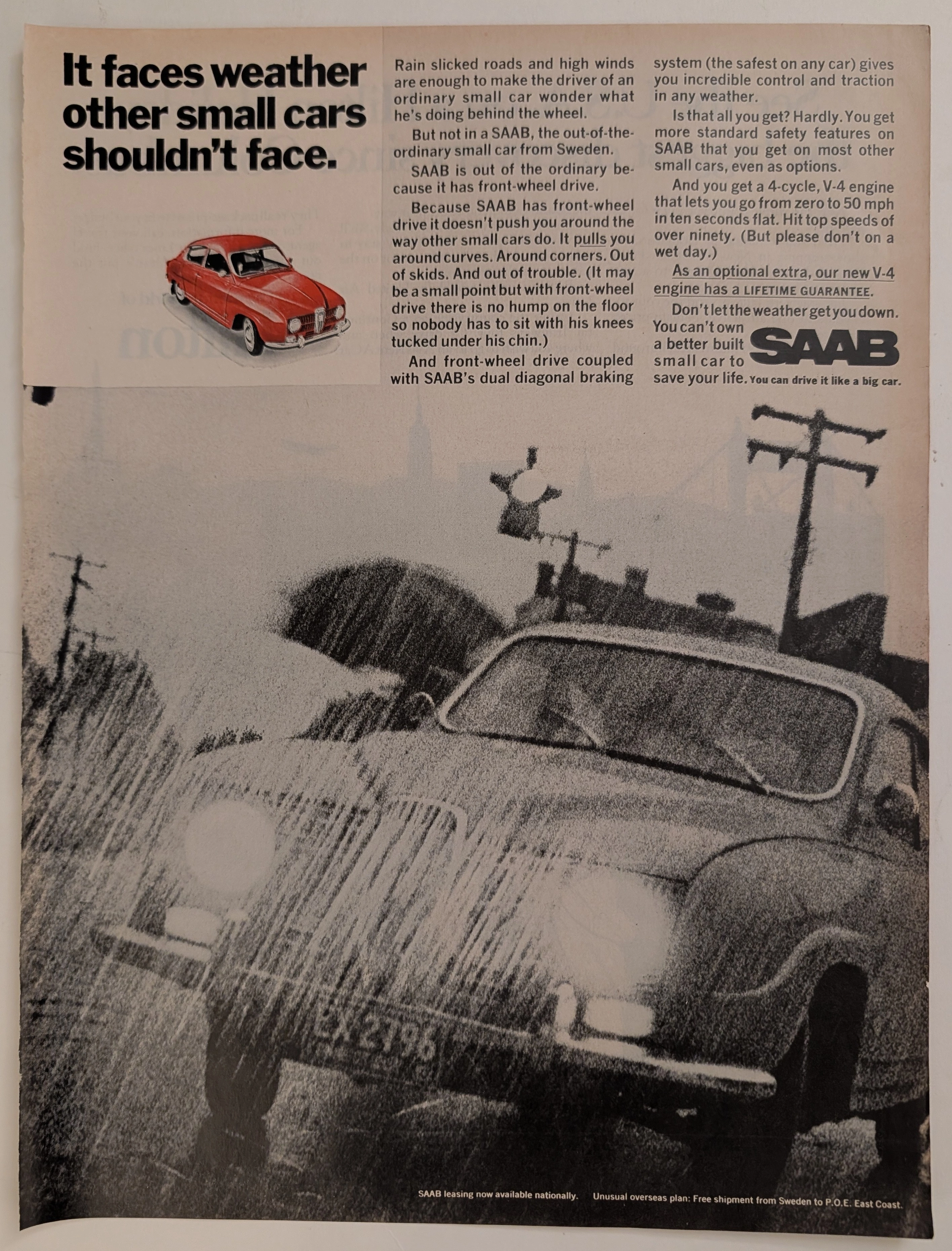
The evolution of the mid-twentieth-century American automotive landscape was heavily disrupted by the influx of European imports, each vying to dismantle the hegemony of the domestic V8, rear-wheel-drive giants. Elegantly and securely positioned upon the analytical table of The Record Institute today is a visually striking, narrative-driven full-page print advertisement for the SAAB Automobile (featuring the new V-4 engine), definitively dating to the late 1960s. This document transcends the standard, utilitarian boundaries of automotive marketing. It operates as a highly sophisticated, multi-layered cultural mirror, reflecting a precise era in consumer psychology where the anxiety of driving in severe weather was aggressively mitigated through the promise of superior, aircraft-inspired engineering. By utilizing a dramatic, heavily grained monochromatic photograph of a SAAB battling torrential rain, juxtaposed with a pristine, spot-color red illustration of the vehicle, the manufacturer successfully positioned itself not merely as a car company, but as a purveyor of meteorological invincibility. This world-class, comprehensive dossier conducts a meticulous, unyielding, and exceptionally exhaustive examination of the artifact, operating under the absolute most rigorous parameters of historical, sociological, and material science evaluation. Dedicating the overwhelming majority of our analytical focus (80%) to its immense historical gravity, we will decode the brilliant marketing psychology embedded within the "front-wheel drive" narrative, analyze the profound engineering pivot of the "new V-4 engine," and dissect the sociopolitical genius of marketing safety before it was federally mandated. Furthermore, as we venture deeply into the chemical and physical foundations of this analog printed ephemera (10%), we will reveal the precise mechanical fingerprints of the spot-color halftones captured in the macro imagery of the red SAAB illustration. Finally, we will assess its archival rarity (10%), exploring how the graceful, natural oxidation of the paper substrate cultives a serene wabi-sabi aesthetic—a natural, irreversible phenomenon that serves as the primary engine driving up its market value exponentially within the elite global spheres of Vintage Commercial Ephemera and Automotive Archives.
THE TIME TRAVELER'S DOSSIER: ARROGANCE AND INNOVATION IN THE ABYSS OF THE DEPRESSION
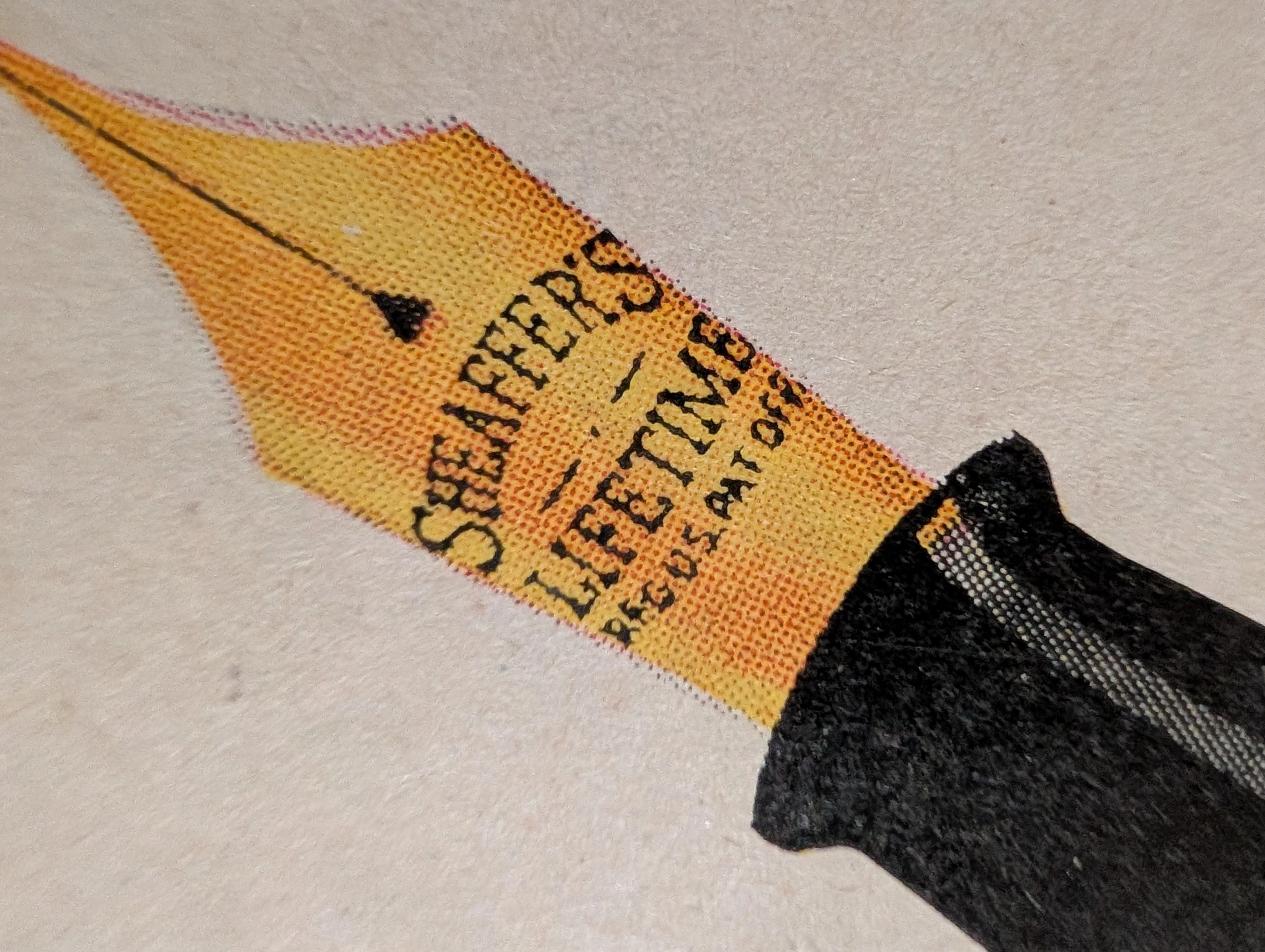
The artifact under rigorous, museum-grade analysis is an exceptionally preserved Historical Relic originating from the darkest economic abyss of the 20th century: the American Great Depression. Sourced from a 1931 issue of The Saturday Evening Post, this Primary Art Document features a sweeping, full-page advertisement for the Sheaffer's "Balance" Lifetime Pen. This piece is a profound sociological and industrial marker. In 1931, as the global economy collapsed, W.A. Sheaffer defiantly marketed a revolutionary, streamlined luxury writing instrument priced at an astronomical $15. The ad explicitly highlights the "White Dot" lifetime guarantee and the 14-karat solid gold "Autograph" band engraved with the owner's signature ("John Adams"). It is a masterclass in aspirational marketing during an era of mass destitution. Physically, this nearly century-old wood-pulp document is a breathtaking testament to the Japanese aesthetic of wabi-sabi. It exhibits severe, dramatic edge trauma, profound edge loss, deep amber oxidation, and prominent moisture staining along the left margin. This extreme analog decay transforms the mass-produced commercial print into an irreplaceable, highly coveted Primary Art Document that physically embodies the scars of its 90-year journey through history.
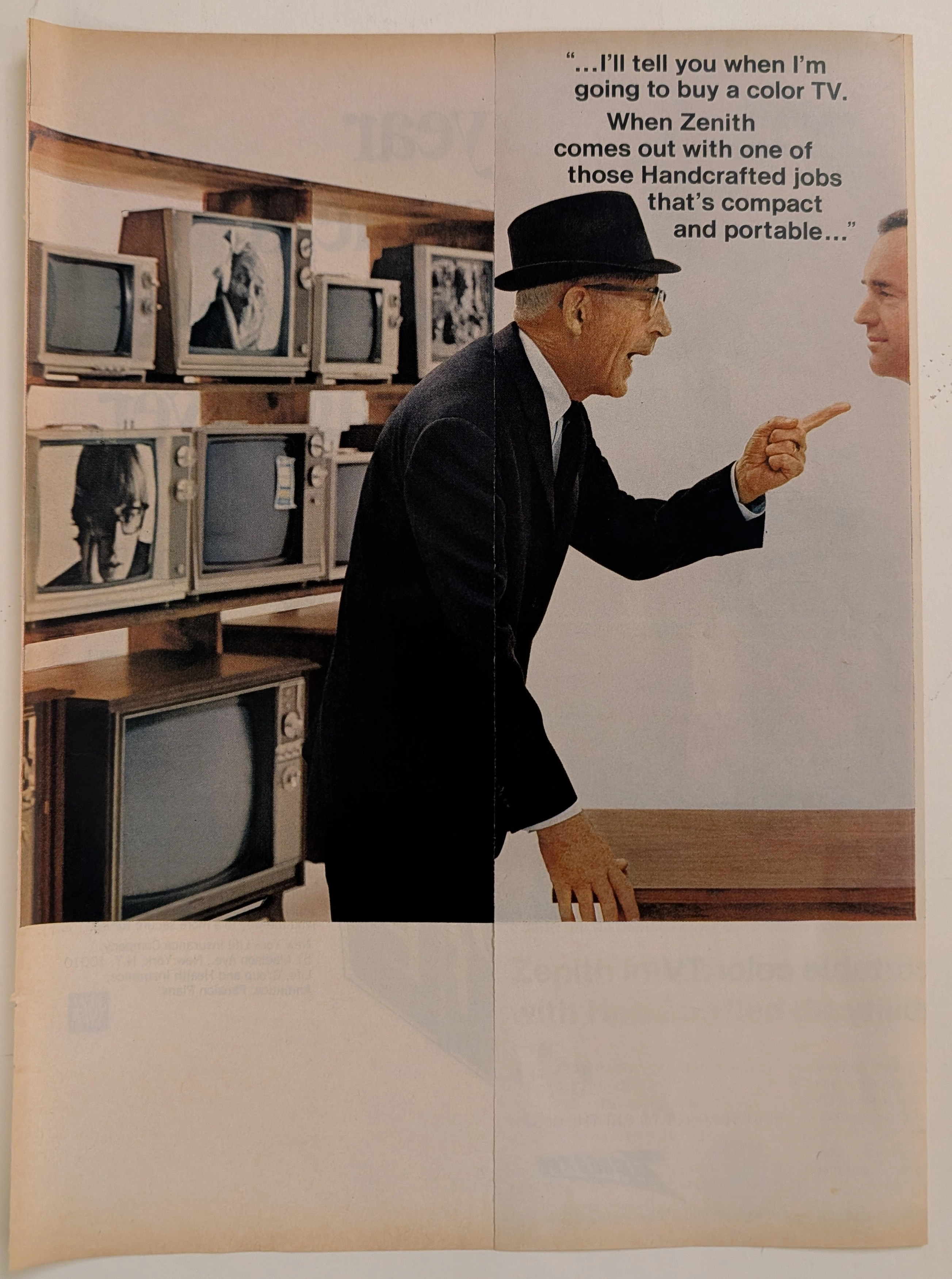
The Time Traveller's Dossier: The Color Revolution – The 1968 Zenith Handcrafted Golden Jubilee and the Generational Shift in Consumer Electronics
The evolution of the mid-twentieth-century American living room was fundamentally defined by the rapid, fiercely competitive technological arms race in consumer electronics. The historical artifact elegantly and securely positioned upon the analytical table of The Record Institute today is a striking, two-page centerfold print advertisement for the 1968 Zenith 14" Portable Color TV, originating from a highly transformative era in global broadcasting. This document completely transcends the standard, utilitarian boundaries of appliance marketing. It operates as a highly sophisticated, multi-layered cultural mirror, reflecting the precise era when American manufacturers had to psychologically persuade a cautious, older generation to adopt a radically new, expensive technology by anchoring it to traditional concepts of craftsmanship and reliability. This world-class, comprehensive dossier conducts a meticulous, unyielding, and exceptionally exhaustive examination of the artifact, operating under the absolute most rigorous parameters of historical, sociological, and material science evaluation. Dedicating the overwhelming majority of our analytical focus to its immense historical gravity, we will decode the brilliant marketing psychology embedded within the multi-page narrative of the "skeptical buyer," analyze the sociopolitical impact of Zenith's "Handcrafted" manufacturing philosophy during the rise of automation, and dissect the profound cultural semiotics of broadcasting the American pastime—baseball—in vivid color. Furthermore, as we venture deeply into the chemical and physical foundations of this analog printed ephemera, we will reveal the precise mechanical fingerprints of the CMYK halftone rosettes captured in the macro imagery of the television screen and corporate logos. Finally, we will assess its archival rarity, exploring how the graceful, natural oxidation of the paper substrate cultivates a serene wabi-sabi aesthetic—a natural, irreversible phenomenon that serves as the primary engine driving up its market value exponentially within the elite global spheres of Vintage Commercial Ephemera and Technology Archives.