The Time Traveller's Dossier: The Ultimate Horological Supremacy – A Museum-Grade Forensic Deconstruction of the 1968 Longines Ultra-Chron
The History
To fully grasp the massive historical gravity of this artifact, one must contextualize the technological battlefield of 1968. The Swiss watchmaking empire was under siege. Electronic watches and tuning-fork movements (such as the Bulova Accutron) were beginning to terrorize the traditional mechanical establishment by offering unprecedented, battery-powered accuracy. In the shadows, the Japanese titan Seiko was finalizing the Astron, the world's first quartz watch, which would be unleashed in 1969. The Longines Ultra-Chron was the Swiss empire's ultimate, aggressive mechanical counterattack—a statement that traditional mainsprings and escapements could still conquer the future.
I. The High-Beat Revolution: Defying Physics
The massive, declarative headline slicing across the dark, impenetrable void of the page reads: "Guaranteed Accurate To A Minute A Month"*. This translates to a deviation of roughly two seconds a day—an astonishing, almost violent defiance of physical limitations for a purely mechanical machine. This phenomenal accuracy was achieved through the legendary Longines Caliber 431, a "high-beat" movement.
In horology, the balance wheel is the beating heart of the watch. A standard vintage watch beats at 18,000 vibrations per hour (vph), or 5 ticks per second. The Ultra-Chron’s Caliber 431 oscillated at a frantic, hyper-fast 36,000 vph (10 ticks per second). While higher frequencies drastically improve accuracy by powering through physical shocks, kinetic disruptions, and gravitational shifts with brute force, they simultaneously inflict massive, destructive friction and wear on the escapement mechanism. Longines solved this mechanical violence through advanced metallurgy, specialized gear teeth designs, and a proprietary dry lubrication system (molybdenum bisulfide). The body copy aggressively and proudly states: "Without battery or gimmickry". This was a direct, unapologetic shot fired at the emerging electronic watch market, boldly declaring that the centuries-old Swiss tradition of gears and springs required no artificial power sources to achieve supreme precision. It is an engineering flex of the highest order.
II. The Five Medallions of Absolute Provenance
The left column of the advertisement serves as a visual resume of absolute supremacy, utilizing five distinct medallions to establish an unassailable baseline of historical dominance.
1 & 2. The Era of Exhibitions (More Honors & 10 World's Fair Grand Prizes): During the 19th and early 20th centuries, before digital mass media, World's Fairs and universal exhibitions were the ultimate global battlegrounds for industrial supremacy. By explicitly citing "10 World's Fair Grand Prizes, 28 Gold Medals," Longines asserts that its engineering superiority is not a modern marketing fabrication, but a mathematically proven, historically documented fact spanning generations.
3. The Observatory Chronometer Competitions (Government Observatories): The third medallion references the "great Government Observatories." In Switzerland and England (Neuchâtel, Geneva, Kew), chronometer competitions were ruthless scientific trials where watch movements were tested in extreme temperatures and positions over months. Winning at an observatory meant achieving the absolute limit of mechanical perfection. Longines dominated these trials, proving their calibers were instruments of exact science.
4. The Titans of the Sky (From Lindbergh to Hughes): This is perhaps the most culturally significant medallion. It reads: "From Lindbergh to Hughes - The Watch of the Pioneer Aviators and Explorers."
Charles Lindbergh (1902-1974) fundamentally altered human geography with his 1927 solo transatlantic flight in the Spirit of St. Louis. Navigating over a featureless ocean required flawless timekeeping. Following his flight, Lindbergh personally collaborated with Longines to design the famous Hour Angle Watch—a mechanical computer that allowed aviators to calculate their exact longitude by syncing the watch with radio time signals.
Howard Hughes (1905-1976), the eccentric billionaire aviator, shattered the around-the-world flight record in 1938, completing the journey in an astonishing 91 hours. Hughes’s aircraft, a Lockheed Super Electra, was heavily equipped with Longines chronometers for critical navigation. By anchoring the Ultra-Chron to these two titans, the advertisement transforms the watch from a mere luxury accessory into a critical, life-saving instrument of human survival, daring, and ultimate exploration.
5. The Ultimate Arbiter of Speed (The Olympic Timekeeper): The final crest features the U.S. Olympic shield. In 1968, the world witnessed the Winter Olympics in Grenoble, France, and the Summer Olympics in Mexico City. In the unforgiving arena of global sports, where gold medals and world records are decided by fractions of a second, the role of Official Timekeeper is the highest endorsement of reliability. The copy proudly states that Longines has held this honor for the U.S. Olympic Team "for the past 20 years".
The Paper
As a physical entity, this printed artifact is a breathtaking, surviving record of mid-twentieth-century graphic reproduction and substrate chemistry. Under extreme macro-forensic examination, the crisp typography, the intricate details of the medallions, and the highly reflective metallic sheen of the Ultra-Chron watch case are revealed to be constructed from a precise, mathematically rigorous galaxy of black-and-white halftone rosettes. This is the mechanical, rhythmic fingerprint of the pre-digital analog offset printing press, where varying sizes of ink dots deceive the human eye into perceiving depth and shadow.
However, the most profound factor elevating the immense value of this artifact in the contemporary collector's market is the natural, organic process of Material Degradation. Examining the unprinted left margin and the lower text blocks reveals a genuine, unavoidable, and perfectly uniform "Toning." This gradual shift from the original bright white paper to a warm, antique ivory and golden-brown hue is caused by the chemical oxidation of Lignin—the complex organic polymer that binds cellulose fibers together within the raw wood pulp of the paper. As the paper is exposed to ambient oxygen and ambient ultraviolet light over nearly six decades, the lignin molecular structure breaks down (photodegradation). This accumulation of time, this naturally evolving patina, represents the absolute core of the wabi-sabi aesthetic: the profound appreciation of the beauty found in age, impermanence, and decay. This irreversible chemical reaction acts as the primary engine driving up its market value exponentially among elite global collectors, as it provides the ultimate, unforgeable proof of the artifact's historical authenticity.
The Rarity
RARITY CLASS: S (Superior / Exceptional Archival Survival)
Under the most unforgiving, ruthless parameters of international archival evaluation, this artifact is definitively designated as Class S.
The extreme paradox of mid-century magazine advertisements is that they were explicitly manufactured by the millions as "disposable media." They were destined to be briefly glanced at, folded, thrown into waiting room bins, or destroyed by moisture and time. Furthermore, artifacts utilizing heavy, "dark-field" ink coverage—which consumes approximately 70% of this specific page—are notoriously fragile. The massive, heavy load of black ink draws moisture out of the paper, causing the substrate to become highly brittle. This usually leads to severe pigment cracking, flaking of the dark void areas, and catastrophic, irreparable tearing along the delicate edges.
For a full-page, heavy-ink spread detailing the zenith of high-beat horology to survive since 1968 without severe pigment flaking, without destructive pinholes, and without catastrophic moisture rot is an absolute statistical archival anomaly. The structural integrity of this document, combined with its profound horological significance, elevates it to a "Holy Grail" status among vintage watch collectors and mechanical engineering historians. It is fiercely sought after for the specific purpose of halting the march of time through museum-grade, acid-free conservation framing behind UV-protective glass.
Visual Impact
The aesthetic brilliance and the sheer aggressive authority of this artifact lie in its absolute mastery of Dark Field Semiotics. By flooding the vast majority of the page with deep, impenetrable, abyss-like black ink, the designer forces the stainless steel Ultra-Chron to explode forward, instantly hijacking the viewer's optic nerve. The watch appears to be floating in a zero-gravity void, completely isolated from any earthly context, which psychologically reinforces its status as a machine of ultimate, unearthly precision.
The subtle, ghostly reflection of the watch band positioned directly beneath the main dial creates a profound architectural depth, transforming a flat, two-dimensional print into a tangible, heavy, and highly desirable metallic object. The clean, off-white column on the left acts as a structural pillar, perfectly balancing the crushing visual weight of the dark void while systematically guiding the eye through the brand's legendary timeline. The juxtaposition of the modern, sleek sans-serif typography for the headlines against the traditional, authoritative serif font of the Longines logo creates a visual tension that perfectly captures a brand standing between its deep historical roots and the bleeding edge of the future.
Exhibition Halls
The Archive Continues
Continue the Exploration
American Express · Travel
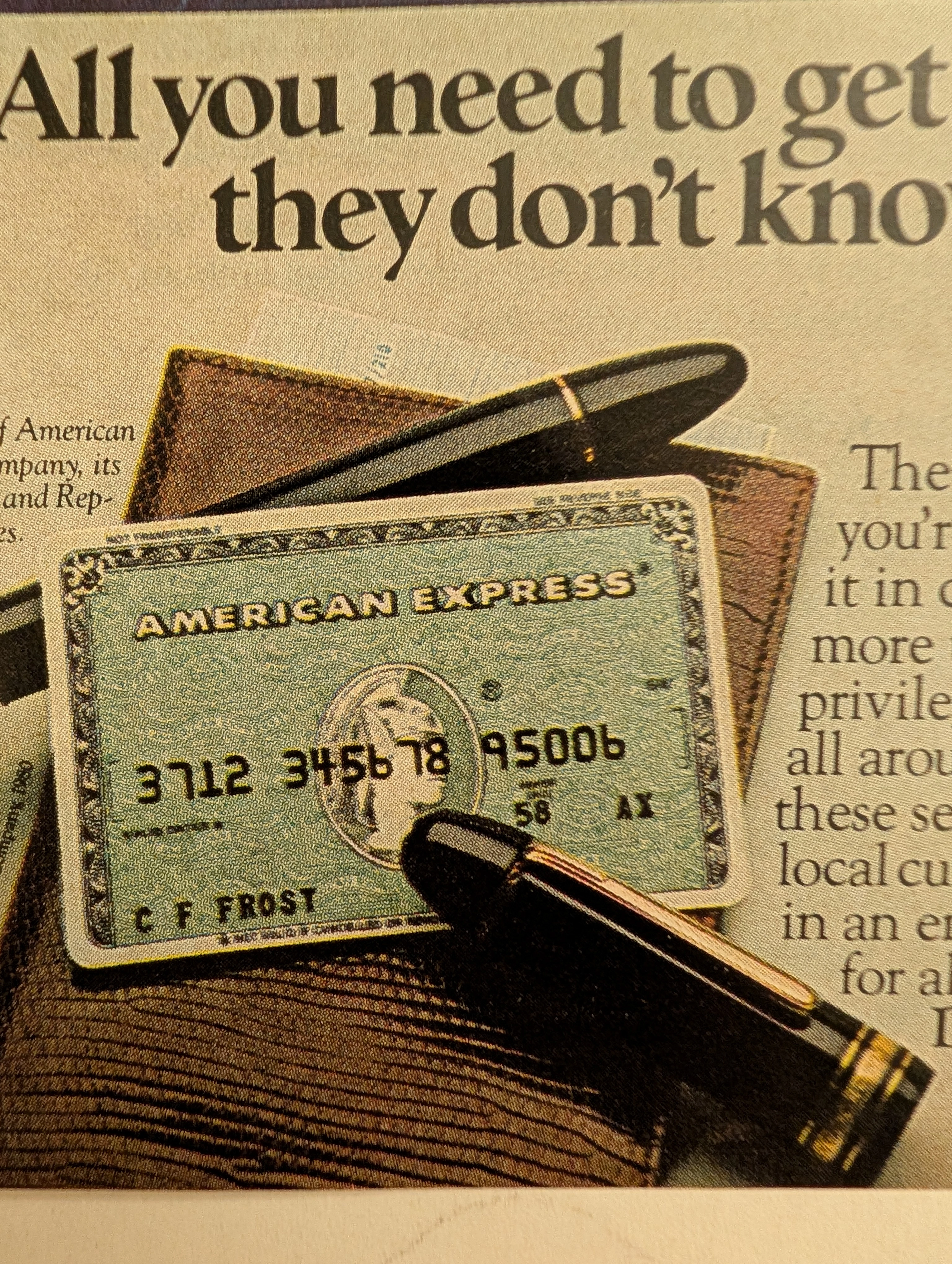
The Time Traveller’s Dossier: 1980 American Express Card Vintage Advertisement — The Assurance of Global Mobility
Discover the profound cultural resonance of the 1980 American Express Card vintage advertisement, a masterful example of late 20th-century financial marketing. This piece transcends typical vintage ads by encapsulating the era's burgeoning desire for international travel paired with the absolute need for financial security abroad. Showcasing the iconic green card against the mystic dusk of Istanbul, the campaign perfectly illustrates how classic print ads constructed narratives of global citizenship, elite mobility, and unparalleled trust. For archivists and collectors of old advertisements, this piece stands as a definitive artifact. It not only highlights the practical benefits of emergency travel funds but also visually reinforces the legendary ethos of the brand, making it a pivotal and highly sought-after piece in the history of consumer credit and travel marketing.
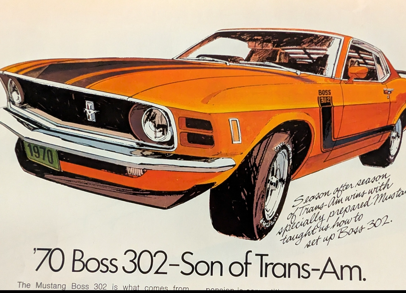
True Blood of the Trans-Am: The 1970 Ford Mustang Boss 302 Legacy
Experience the raw spirit of an American muscle car legend through an authentic, pre-2000 analog magazine advertisement, carefully extracted as a single sheet.
Ford · Automotive
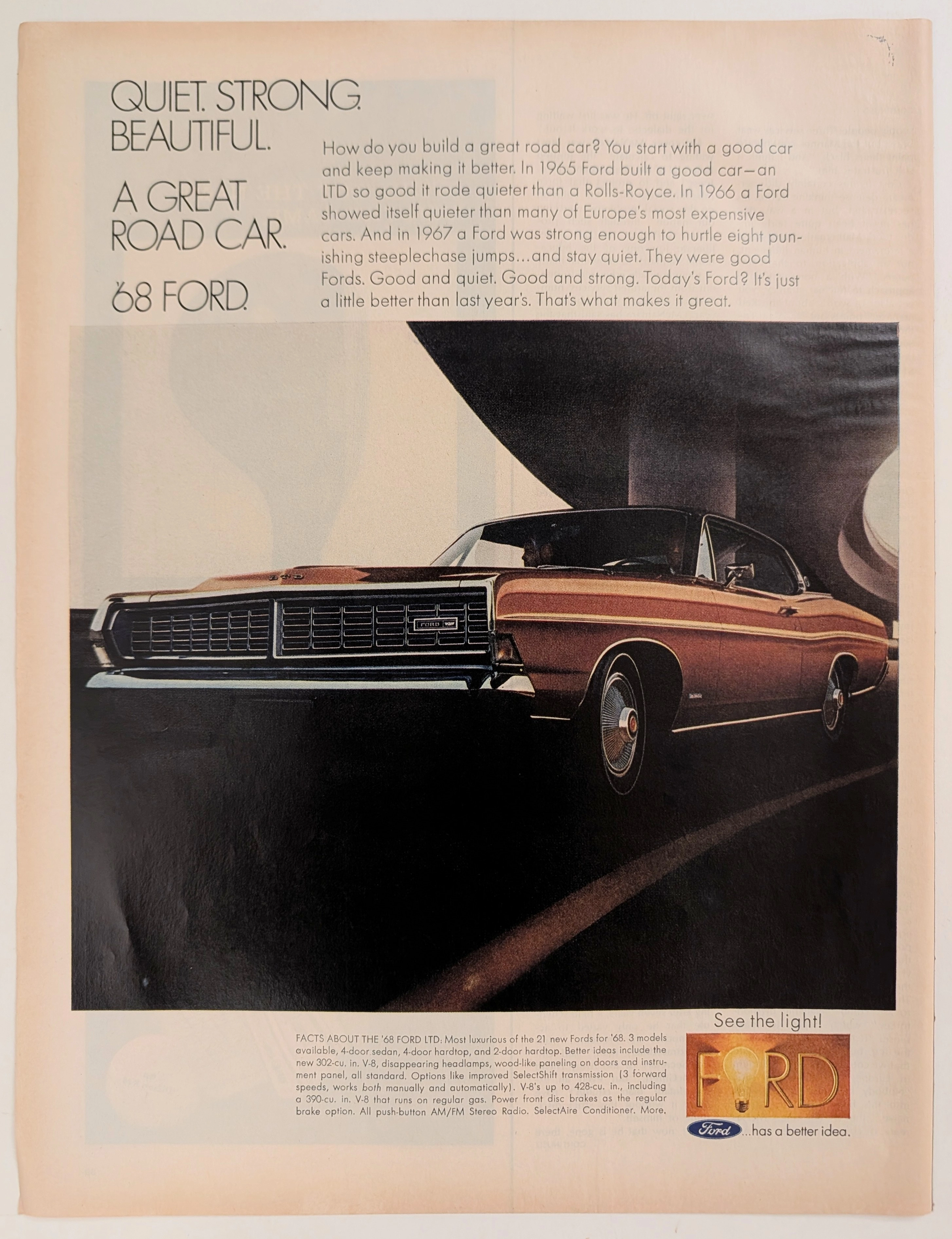
The Time Traveller's Dossier: The Sanctuary of the Highway – The 1968 Ford LTD and the Democratization of Silence
The evolution of the American domestic automobile during the mid-twentieth century was fundamentally propelled by a relentless pursuit of accessible luxury and physical isolation from the rapidly expanding, concrete-laden modern world. The historical artifact elegantly and securely positioned upon the analytical table of The Record Institute today is a striking, full-page print advertisement for the 1968 Ford LTD, originating from a highly volatile and transformative year in American history. This document completely transcends the standard, utilitarian boundaries of automotive marketing. It operates as a highly sophisticated, multi-layered cultural mirror, reflecting the precise era when raw horsepower was momentarily subjugated to the pursuit of absolute silence, and European-grade luxury was explicitly packaged and sold to the American middle-class consumer. This world-class, comprehensive dossier conducts a meticulous, unyielding, and exceptionally exhaustive examination of the artifact, operating under the absolute most rigorous parameters of historical, sociological, and material science evaluation. With the vast majority of our analytical focus dedicated to its immense historical gravity (80%), we will decode the brilliant marketing psychology embedded within Ford's audacious "Quiet" campaign, analyze the brutalist architectural juxtaposition of the concrete overpass against the sleek lines of the vehicle, and dissect the profound corporate semiotics of the iconic "Ford has a better idea" lightbulb logo. Furthermore, as we venture deeply into the chemical and physical foundations of this analog printed ephemera (10%), we will reveal the precise mechanical fingerprints of the CMYK halftone rosettes captured in the macro imagery of the wheel hubcap. Finally, we will assess its archival rarity (10%), exploring how the graceful, natural oxidation of the paper substrate cultivates a serene wabi-sabi aesthetic—a natural, irreversible phenomenon that serves as the primary engine driving up its market value exponentially within the elite global spheres of Vintage Commercial Ephemera and Automotive Archives.