— The Record Institute Journal")
 — The Record Institute Journal")
The Time Traveller's Dossier: The Semantics of Arrogance – JOY de Jean Patou Advertisement (Circa 1980s)
The History
To genuinely decode the complex sociological architecture embedded within this printed artifact, one must pull back the lens to contextualize the macroeconomic history and the audacious DNA of the Jean Patou brand. The fragrance JOY was famously created by the master perfumer Henri Alméras in 1930. The historical context of this creation is absolutely critical: it was launched at the very height of the Great Depression, immediately following the catastrophic Wall Street Crash of 1929. While the global economy was collapsing and fortunes were being wiped out overnight, the visionary couturier Jean Patou made a decision that defied all conventional business logic. He commissioned a perfume utilizing an obscenely extravagant amount of raw materials—reportedly requiring 10,600 jasmine flowers and 336 roses to produce just one single ounce of the extract.
Instead of hiding this exorbitant production cost in a time of global poverty, Patou and his friend, the legendary American columnist Elsa Maxwell, weaponized it. They famously launched the fragrance with the slogan "The Costliest Perfume in the World." Originally conceived as a luxurious, albeit somewhat cynical, consolation prize for Patou's wealthy American clientele who had lost their fortunes in the stock market crash, the fragrance became an instant legend. By the time this specific advertisement was printed in the late 1970s and early 1980s, the macroeconomic landscape had shifted. The slogan was no longer a dark joke about lost wealth; it had transmuted into a literal, aggressive declaration of financial dominance in a newly booming economy characterized by corporate excess and conspicuous consumption.
Creator / Photographer Information: While this specific masterpiece of commercial art bears no official signature and remains the work of an Uncredited Studio Photographer, the techniques utilized betray the hand of a master. Examining the still-life photography—executed on high-contrast black-and-white film, utilizing a physical cross-screen or starburst filter over the lens, and employing a masterful lighting setup that perfectly captures the reflections on the dark glass substrate—we see the undeniable visual signature of top-tier, late-analog commercial studios. This was the golden age of darkroom mastery, an era where optical illusions, deep shadows, and radiant highlights were achieved purely through the manipulation of photochemistry, silver gelatin, and physical light, long before the sterile intervention of computer-generated imagery (CGI).
Part 1: The Binary Shift: Mass Market vs. Absolute Exclusivity
The narrative architecture of this artifact is built upon a strict, uncompromising binary contrast against the prevailing advertising trends of its era. During the late 1970s and 1980s, the vast majority of fragrance brands (such as Revlon, Coty, and even rival high-end houses) competed fiercely using vibrant color photography, blooming floral arrangements, and images of flawlessly beautiful, smiling models to appeal to the mass market's aspirational desires.
The JOY advertisement violently obliterates that narrative. It executes a flawless and ruthless cultural pivot by removing human presence entirely. There are no smiling women, no romanticized Parisian landscapes, and no vibrant flowers to suggest the scent's ingredients. Instead, there is only the monolithic presence of the Baccarat crystal flacon, standing isolated and supreme within a void of absolute darkness. It is presented not as a cosmetic product, but as a sacred, untouchable relic isolated from the mortal realm. The deliberate inclusion of the text "Limited quantity available" builds an impenetrable psychological wall. It creates a stark binary between "those who have the right to possess" and "the masses." This represents a profound conceptual transition: the brand is no longer selling the olfactory experience of a fragrance; it is selling absolute, gated "access" that is strictly reserved for those possessing the requisite financial firepower and elite pedigree.
Part 2: The Semantics of Arrogance
To execute a strategy of this magnitude, the brand required a highly specific, unapologetic vocabulary. The copywriting on this page abandons all traditional marketing humility. It completely ignores standard fragrance descriptors—there is no mention of top notes, sillage, romance, or beauty. Instead, it deploys a language of aggressive, overwhelming financial supremacy:
"THE COSTLIEST PERFUME IN THE WORLD"
The deployment of this slogan is not merely a statement of retail pricing; it is a blatant declaration of class warfare. It is the ultimate manifestation of the "Semantics of Arrogance." The brand makes no attempt to hide the astronomical cost, nor does it attempt to rationally justify the price tag through explanations of craftsmanship or ingredient scarcity in the primary headline. It shamelessly elevates the condition of being "the most expensive" into the product's primary Unique Selling Proposition (USP). This psychological strike effectively paralyzes the consumer's ability to debate the price-to-value ratio. By proudly branding itself as the costliest, the exorbitant price tag ceases to be a barrier to entry; instead, the price tag becomes the inherent value of the object itself.
Part 3: The Sovereign Consumer & Veblen Goods
The socioeconomic structure of the era was increasingly defined by a desire for conspicuous consumption—the public display of wealth to indicate social prestige. This advertisement serves as the ultimate, textbook case study of a "Veblen Good." Named after the American economist Thorstein Veblen, a Veblen Good is a type of luxury item for which demand paradoxically increases as the price increases, specifically because its high price makes it an effective tool for excluding the lower economic classes.
This advertisement does not target individuals who simply wish to smell pleasant. It acts as a predatory psychological mechanism that targets the intellectual vanity, status anxiety, and ego of both generational "old money" elites and the newly minted corporate wealthy. To purchase a one-ounce bottle of JOY in a Baccarat crystal flacon was to purchase a globally recognized emblem of financial sovereignty. The perfume acts as an invisible socio-economic force field. By declaring its extreme cost so openly, Jean Patou allowed its wearers to communicate their immense wealth without uttering a single word, satisfying the elite consumer's primal need to socially dominate their peers through pure purchasing power.
Part 4: Visual Semiotics: The Monochrome Supremacy
In an era where glossy fashion magazines were overflowing with hyper-saturated, eye-catching color advertisements, Jean Patou’s deliberate choice to render this advertisement entirely in black and white acts as a precise and highly courageous semiotic indicator:
Timeless, Institutional Elegance: Black and white photography aggressively strips away all superficial visual noise, forcing the viewer to confront the raw architectural geometry of the bottle and the intricate, diamond-like facets of the Baccarat crystal stopper. It visually divorces the product from the fleeting, colorful trends of 1980s fashion, framing the perfume instead as a timeless, historical artifact. It borrows the visual authority of fine-art museum photography rather than disposable commercial advertising.
Transparency and Infinite Depth: The masterful darkroom lighting makes the heavy glass of the flacon appear to glow from within, while the stark, mirror-like reflections on the dark substrate beneath symbolize deep-rooted, unshakeable wealth. The pitch-black negative space creates an illusion of infinite, mysterious space, elevating the product from a mere liquid in a bottle to a glowing monolith of pure capital.
Part 5: Pop Culture Impact and Enduring Legacy
The marketing strategy pioneered by Jean Patou—proudly self-identifying as the absolute most expensive option available—left an indelible, structural mark on global luxury branding. This specific strategy became the foundational DNA for the modern ultra-luxury sector. The audacity to declare an astronomical price point without apology or explanation became the gold standard for industries ranging from high jewelry and haute horlogerie (e.g., Patek Philippe, Richard Mille) to modern hypercars and exclusive leather goods (e.g., the Hermès Birkin bag).
The cultural impact of the "JOY" positioning taught the luxury world that true exclusivity requires a financial barrier so high that it creates aspirational pain for the masses. In the modern commercial arena, brands still desperately attempt to engineer the aura of effortless, arrogant supremacy that Jean Patou achieved decades ago. This physical artifact is the foundational source code for the most arrogant, exclusionary, and wildly successful brand-building mythologies in the history of modern capitalism.
The Paper
As a physical entity, this tear sheet is an unrepeatable, isolated record of late-analog offset lithographic printing. The medium-weight, matte-coated magazine stock was originally engineered by the ton for mass distribution; however, its current, aged state demands a profound evaluation through the highest echelon of Japanese aesthetic philosophy: wabi-sabi (侘寂)—the acute recognition and appreciation of beauty found in impermanence, imperfection, and the ruthless, natural progression of time.
Visual Forensics & Substrate Analysis (The Economics of Ephemera):
Subjecting the extreme macro close-ups of this artifact to visual forensics reveals the mechanical heartbeat of the pre-digital printing press. Under high magnification, the illusion of smooth, glowing light and soft shadows on the crystal bottle violently shatters, dissolving into a precise, mathematically rigorous galaxy of black and gray halftone rosettes. The distinct, gritty grain of the monochromatic offset printing process is aggressively visible within the transition zones between the stark white highlights and the pitch-black void of the background.
However, the most crucial and valuable aspect of this specific artifact lies in its Material Degradation. Examining the margins and the unprinted white spaces reveals authentic, undeniable "Toning." This is a gradual, irreversible yellowing and browning effect caused by the natural chemical oxidation of organic lignin trapped within the wood pulp of the paper upon decades of exposure to air and ambient ultraviolet light.
It is vital to understand the archival and market significance of this ephemeral nature. Analog print media from this era represents a vanishing breed of historical documentation that is slowly, yet unstoppably, disintegrating. This organic, breathing physical degradation is a fingerprint of time that can absolutely never be cloned, replicated, or faked by modern high-precision digital scanning or micro-jet printing processes. As these original pages slowly burn themselves out through oxidation, turning fragile and brittle, their supply in the global collector's market shrinks daily. It is precisely this ticking clock of physical impermanence—the fact that this paper is slowly returning to the earth—that drives up its market value exponentially. The evolving patina elevates the piece from a uniform, lifeless industrial print run into a singular, unique artifact covered in historical scars. The wabi-sabi nature of this decaying paper ensures that its aesthetic and financial worth will continue to skyrocket precisely because it is a dying medium.
The Rarity
Rarity Class: A (Advanced / Highly Desirable)
Within the strictest parameters of international archival evaluation, this artifact holds a definitive Class A designation. The ultimate paradox of mid-to-late 20th-century analog print ephemera lies in the violent contrast between its initial, incredibly cheap mass production and its extreme, near-extinct scarcity today. Vintage magazines were the quintessential "disposable media," destined to be read once and then mercilessly discarded into incinerators or recycling pulpers.
For this specific, single-page advertisement to have miraculously survived several decades—resisting the ravages of destructive handling, severe moisture damage, and entirely avoiding catastrophic structural center creases—is a pure statistical archival anomaly. Furthermore, finding a monochromatic advertisement for JOY de Jean Patou specifically highlighting the ultra-rare Baccarat crystal edition, wherein the black ink retains its absolute, abyssal depth while exhibiting only the genuine, unforced hallmarks of wabi-sabi aging, is highly uncommon. Pristine, untouched remnants of this specific era of ultra-luxury marketing are fiercely hunted by curators of fragrance history and high-fashion archivists. They are acquired with the sole intention of executing museum-grade, acid-free conservation framing, preserving them permanently as historical heirlooms of a bygone era of analog luxury.
Visual Impact
The aesthetic authority of this piece lies in an absolute masterclass of chiaroscuro—the intense, dramatic contrast between blinding light and impenetrable shadow. The immediate focal points that hijack the viewer's optic nerve are the brilliant, four-point starbursts of light refracting off the faceted edges of the Baccarat crystal stopper. The photographer achieved this effect not through post-production, but through the physical mastery of optics, utilizing a specialized cross-screen filter mounted directly on the camera lens.
These starbursts act as incredibly powerful leading lines, drawing the viewer's gaze deeply into the intricate craftsmanship of the bottle before forcing the eye to descend toward the minimalist, stark white typography anchored at the bottom of the page. The artist strategically utilizes vast expanses of pitch-black negative space to physically isolate the product. This creates a psychological "aura" of untouchable exclusivity and supreme isolation, projecting the bottle not as a consumer good, but as an imposing monument to aesthetic and financial perfection.
Exhibition Halls
The Archive Continues
Continue the Exploration
Avon · Other
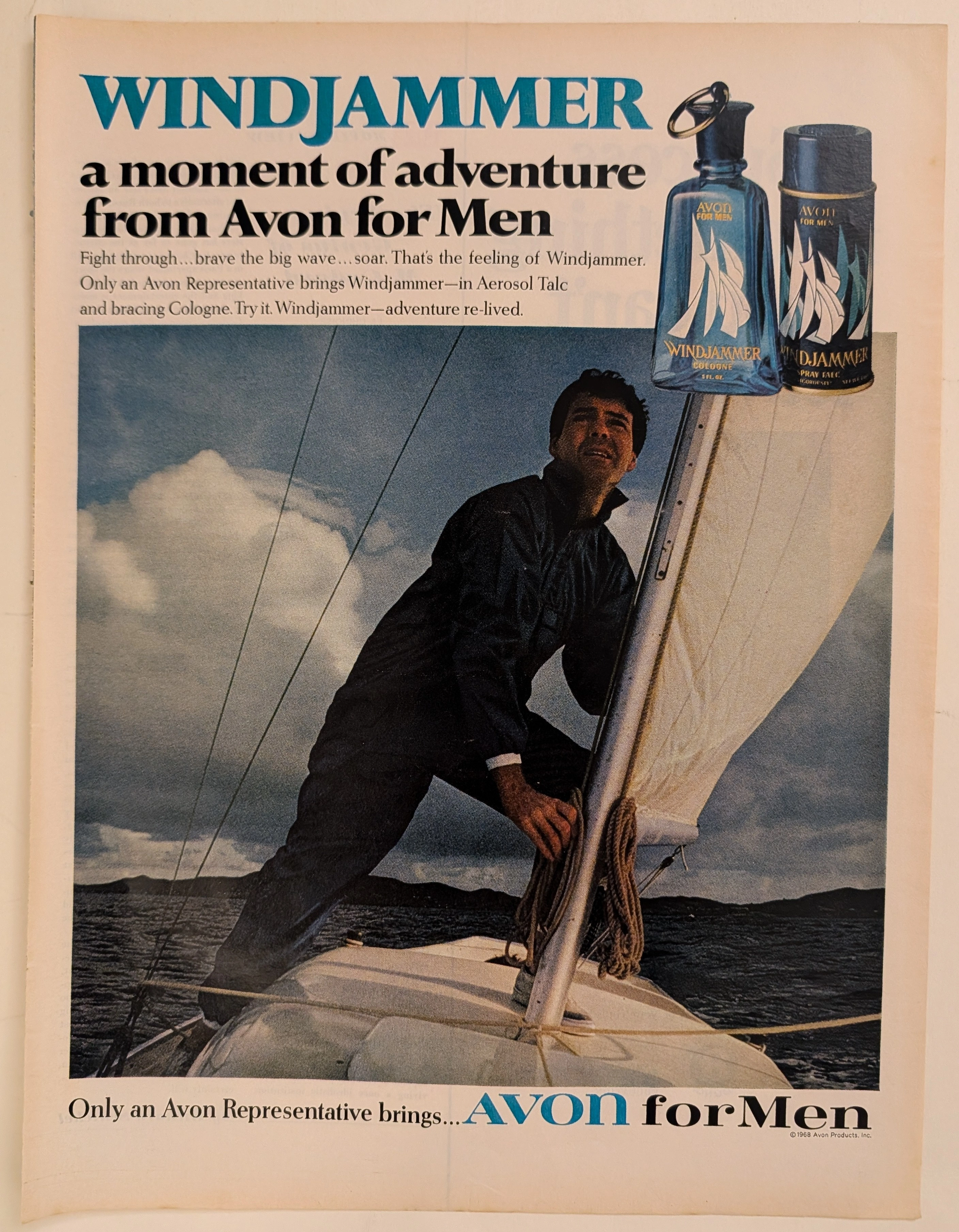
The Time Traveller's Dossier: The Suburb's Sea – Avon for Men, the Windjammer Mythos, and the Commodification of Mid-Century Masculinity
The evolution of mid-twentieth-century American domestic commerce was fundamentally reshaped by the aggressive expansion of the direct-sales model into the male grooming sector. The historical artifact elegantly and securely positioned upon the analytical table of The Record Institute today is a visually arresting, full-page print advertisement for Avon for Men: Windjammer, definitively dated by its copyright macro to the turbulent year of 1968. This document completely transcends the standard, utilitarian boundaries of fragrance marketing. It operates as a highly sophisticated, multi-layered cultural mirror, reflecting a precise era in consumer psychology where the American male—increasingly confined to the sterile environments of corporate offices and manicured suburbs—yearned for visceral, physical validation. By utilizing the universally potent, romanticized motif of the solitary sailor battling the elements, Avon ingeniously packaged the concept of raw, nautical adventure into a socially acceptable, easily purchasable glass bottle. This world-class, comprehensive dossier conducts a meticulous, unyielding, and exceptionally exhaustive examination of the artifact, operating under the absolute most rigorous parameters of historical, sociological, and material science evaluation. Dedicating the overwhelming majority of our analytical focus to its immense historical gravity, we will decode the brilliant marketing psychology embedded within the "Windjammer" maritime narrative, analyze the profound sociopolitical genius of the "Avon Lady" distribution network selling masculinity to wives, and dissect the semiotics of the product's mid-century packaging design. Furthermore, as we venture deeply into the chemical and physical foundations of this analog printed ephemera, we will reveal the precise mechanical fingerprints of the CMYK halftone rosettes captured in the macro imagery. Finally, we will assess its archival rarity, exploring how the graceful, natural oxidation of the paper substrate cultivates a serene wabi-sabi aesthetic—a natural, irreversible phenomenon that serves as the primary engine driving up its market value exponentially within the elite global spheres of Vintage Commercial Ephemera and Lifestyle Archives.
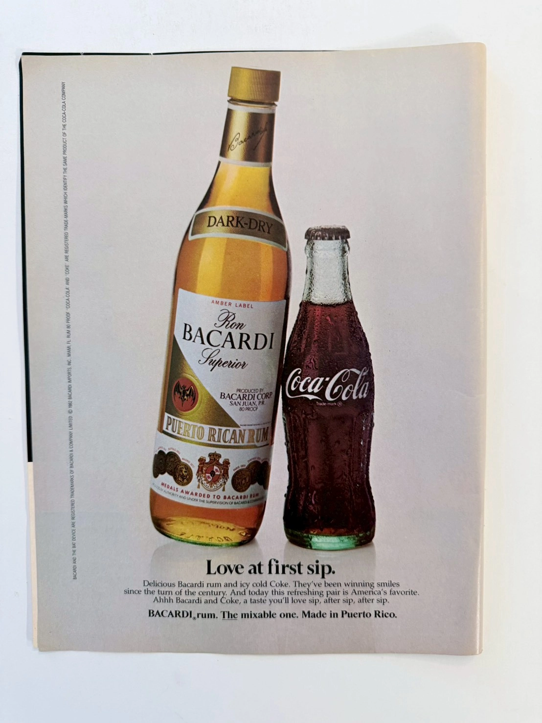
The Treaty of Two Empires: Deconstructing the 1982 Bacardi & Coca-Cola Vintage Ad (Class S)
Dive into the history of American consumerism with this museum-grade analysis of the iconic 1982 Bacardi and Coca-Cola co-branding advertisement. This Class S archival piece captures the definitive shift from the Golden Age of Illustration to 1980s commercial studio photography. Explore the geopolitical legacy of the "Cuba Libre" and the analog practical effects behind the immortal condensation on the Coca-Cola contour bottle.
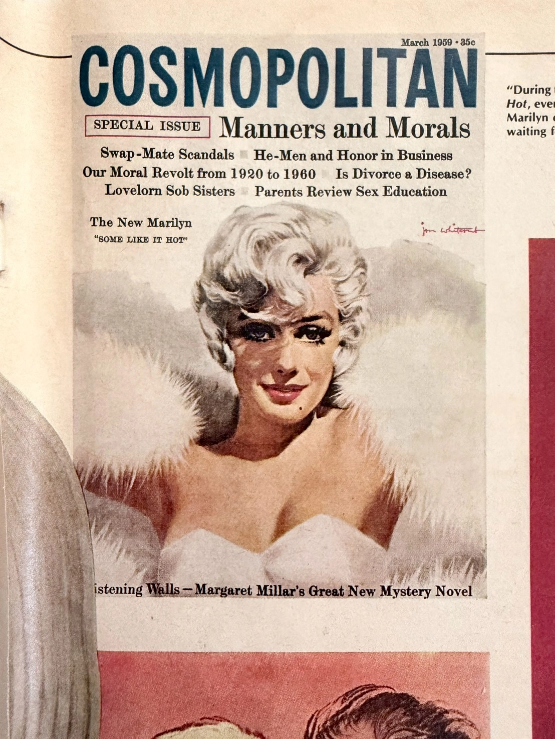
The Marilyn Monroe Enigma: Uncovering 1950s Hollywood Secrets Through Ultra-Rare Vintage Magazine Art (Class SS)
This museum-grade editorial explores an ultra-rare SS-Class archival piece from The Record Institute. It chronicles the 1980 Playboy magazine discovery of lost Marilyn Monroe negatives, eventually solved by legendary illustrator Jon Whitcomb. The artifact not only captures the vulnerability of the 1950s ultimate sex symbol alongside Arthur Miller but also serves as a poignant historical record of the transition from the Golden Age of Illustration to modern photography, celebrating the visceral charm of analog paper preservation.