— The Record Institute Journal")
 — The Record Institute Journal")
 — The Record Institute Journal")
 — The Record Institute Journal")
 — The Record Institute Journal")
 — The Record Institute Journal")
 — The Record Institute Journal")
The Marilyn Monroe Enigma: Uncovering 1950s Hollywood Secrets Through Ultra-Rare Vintage Magazine Art (Class SS)
The History
"Marilyn Mystery Unraveled" — An Art-Historical Document of the Publishing Golden Age
Historical Context
1.1 The Convergence of Mid-Century Titans
This original magazine cut page is an intersection of 20th-century royalty. It brings together Marilyn Monroe, the ultimate pop culture icon whose enduring legacy ensures intrinsic collector value; Jon Whitcomb, a masterful American illustrator whose glamorous watercolor style defined the aesthetic of post-war women's magazines; Arthur Miller, the Pulitzer Prize-winning playwright and Monroe's former husband, depicted during the tumultuous era of The Misfits (1961); and Carl Perutz, a skilled photographer whose uncredited work was brought to light through this very article.
1.2 The Unraveled Mystery of Creation
The column Playboy's Roving Eye reads like an art-historical detective story. Previously, Playboy had published "forgotten" photos of Monroe found in an abandoned Manhattan building, ignorant of their origin. Legendary illustrator Jon Whitcomb wrote in to solve the mystery: he had hired photographer Carl Perutz to shoot those images overnight, using them as direct references for his spectacular Easter hat watercolor portrait published in The American Weekly on April 6, 1958. This page, therefore, is a rare documentation of the creative process behind commercial illustration during the analog era.
1.3 Archiving the Competitor's Masterpieces
In a rare move, Playboy utilized this page to archive and celebrate Whitcomb's iconic cover illustrations for Cosmopolitan magazine: the March 1959 cover reflecting the Some Like It Hot era, and the December 1960 cover featuring Monroe and Miller. This cross-publication homage underscores Whitcomb's immense status in the publishing world and solidifies the page as a definitive historical record.
Paper, Production, and the Aesthetic of Fragility
2.1 The Archival Significance of Degradation
The true gravity of this piece lies in its ephemeral nature as an individual cut page. Analog-era paper, inherently acidic, was never designed to last forever. The visible oxidation, the slight water stains on the edges, and the beautiful warm-tan patina are not flaws—they are the physical proof of its journey through time. As original vintage paper continues to degrade, disintegrate, and vanish from the market, surviving examples like this become incredibly scarce. This inescapable mortality of the medium drives its value upward among serious ephemera collectors; it is a tangible, unreplicable artifact of a dying analog world.
2.2 Printing Technique
The page was produced using full-color offset lithography, capturing the subtle washes, shading, and dynamic brushwork characteristic of Whitcomb's technique. Playboy’s high production standards ensured that Whitcomb's art was reproduced with gallery-level fidelity.
Rarity and Market Classification
3.1 Rarity Factors — Class S Designation
This piece earns a Class S designation due to its multifaceted appeal: it holds deep crossover value for Monroe memorabilia collectors and illustration art aficionados alike. The page is not merely a portrait but a documented piece of publishing history, correcting the record on Carl Perutz while celebrating Jon Whitcomb. As a standalone cut page, it transcends the magazine format to become a frame-ready piece of historical art.
3.2 Future Market Outlook
The market for genuine Marilyn Monroe ephemera is a cornerstone of global pop-culture collecting. Combined with the rising appreciation for mid-century American illustration, this specific page sits at the nexus of high demand and dwindling supply. As the original paper artifacts of the 20th century physically disappear, the cultural and monetary value of preserved pieces like this will only appreciate.
★ RARITY CLASS: S ★ — Playboy Magazine Cut Page — Marilyn Mystery Unraveled by Jon Whitcomb
Exhibition Halls
The Archive Continues
Continue the Exploration
THE TIME TRAVELLER'S DOISSIER — THE WWII HOME FRONT AND THE AESTHETICS OF DESTRUCTION
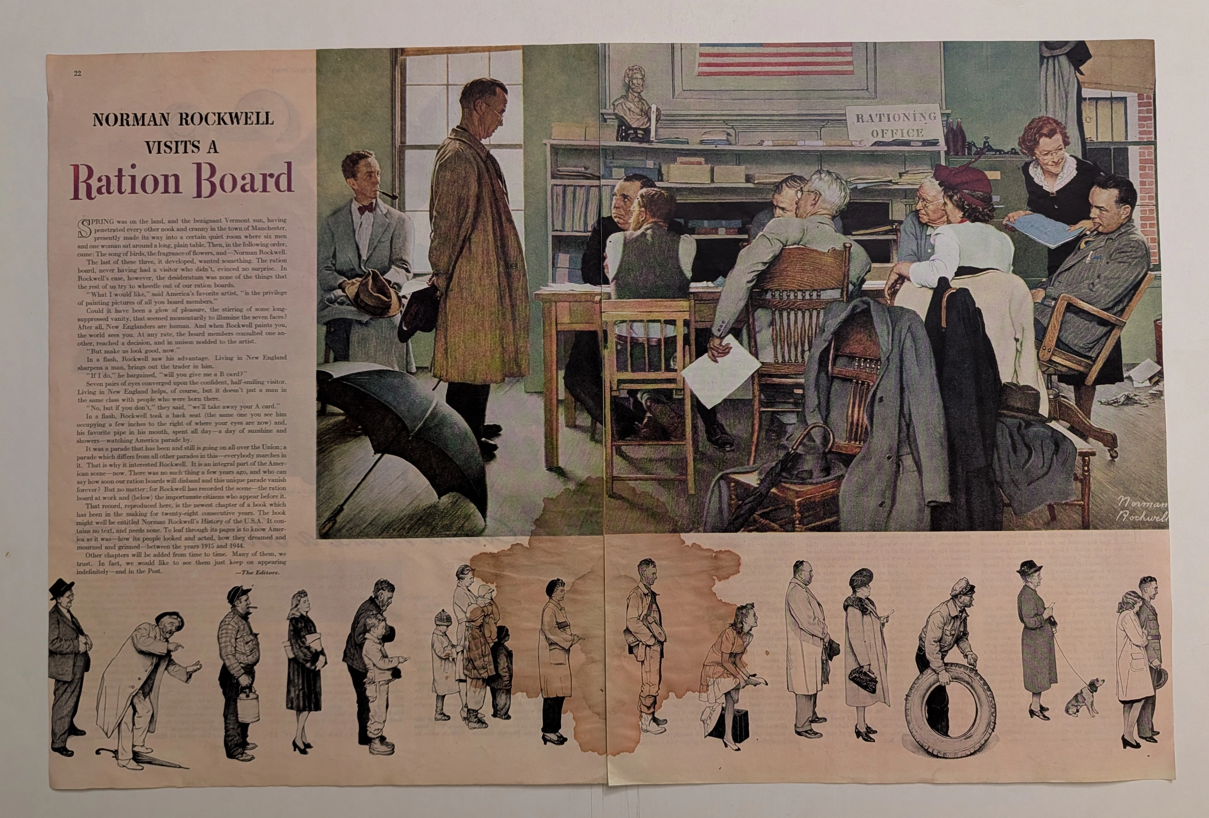
Executive summary of the original vintage double-page cut sheet featuring Norman Rockwell's WWII masterpiece, "Norman Rockwell Visits a Ration Board" (circa 1944). This artwork masterfully captures the egalitarian struggle of the American home front rationing system. The massive, rust-colored water stain blooming across the highly acidic 80-year-old paper is not damage, but a profound 'historical scar' that exemplifies the beautiful decay of analog media. Surviving wartime paper drives, this frame-ready primary artifact commands a Rarity Class S designation.
PanAm · Travel
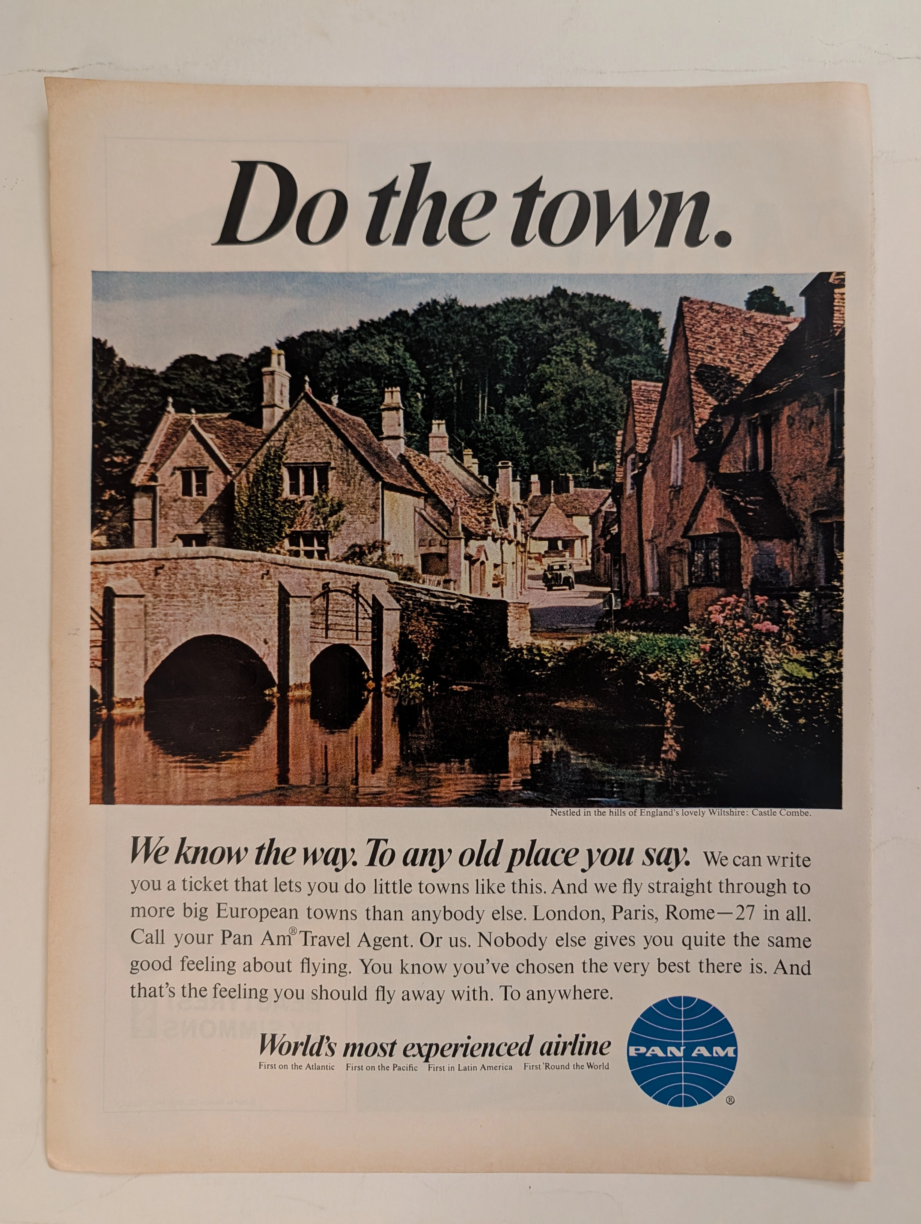
The Time Traveller's Dossier: The Empire of the Sky and the Democratization of the Globe – Pan Am "Do the town."
The evolution of the American leisure class during the mid-twentieth century was fundamentally propelled by the rapid expansion, technological triumph, and increasing economic accessibility of commercial jet travel. The historical artifact elegantly and securely positioned upon the analytical table of The Record Institute today is a striking, single-page print advertisement for Pan American World Airways (Pan Am), originating from the transformative decade of the 1960s. This document completely transcends the standard, utilitarian boundaries of transportation marketing. It operates as a highly sophisticated, multi-layered cultural mirror, reflecting the precise era when the globe dramatically shrank, and the majestic, ancient corners of Europe were explicitly packaged and sold to the American middle-class consumer not merely as distant dreams, but as easily attainable weekend realities. This world-class, comprehensive dossier conducts a meticulous, unyielding, and exceptionally exhaustive examination of the artifact, operating under the absolute most rigorous parameters of historical, sociological, and material science evaluation. With the vast majority of our analytical focus dedicated to its immense historical gravity, we will decode the brilliant marketing psychology embedded within the "World's most experienced airline" branding, analyze the romantic contrast of the bold typography against the ancient stone architecture of Castle Combe, and dissect the profound geopolitical semiotics of the iconic blue globe logo. Furthermore, as we venture deeply into the chemical and physical foundations of this analog printed ephemera, we will reveal the precise mechanical fingerprints of the CMYK halftone rosettes and the graceful, natural oxidation of the paper substrate. This precise intersection of visual nostalgia, mid-century commercial artistry, and the immutable chemistry of time cultivates a serene wabi-sabi aesthetic—a natural, irreversible phenomenon that serves as the primary engine driving up its market value exponentially within the elite global spheres of Vintage Commercial Ephemera, Aviation Archives, and Mid-Century Lifestyle collecting.
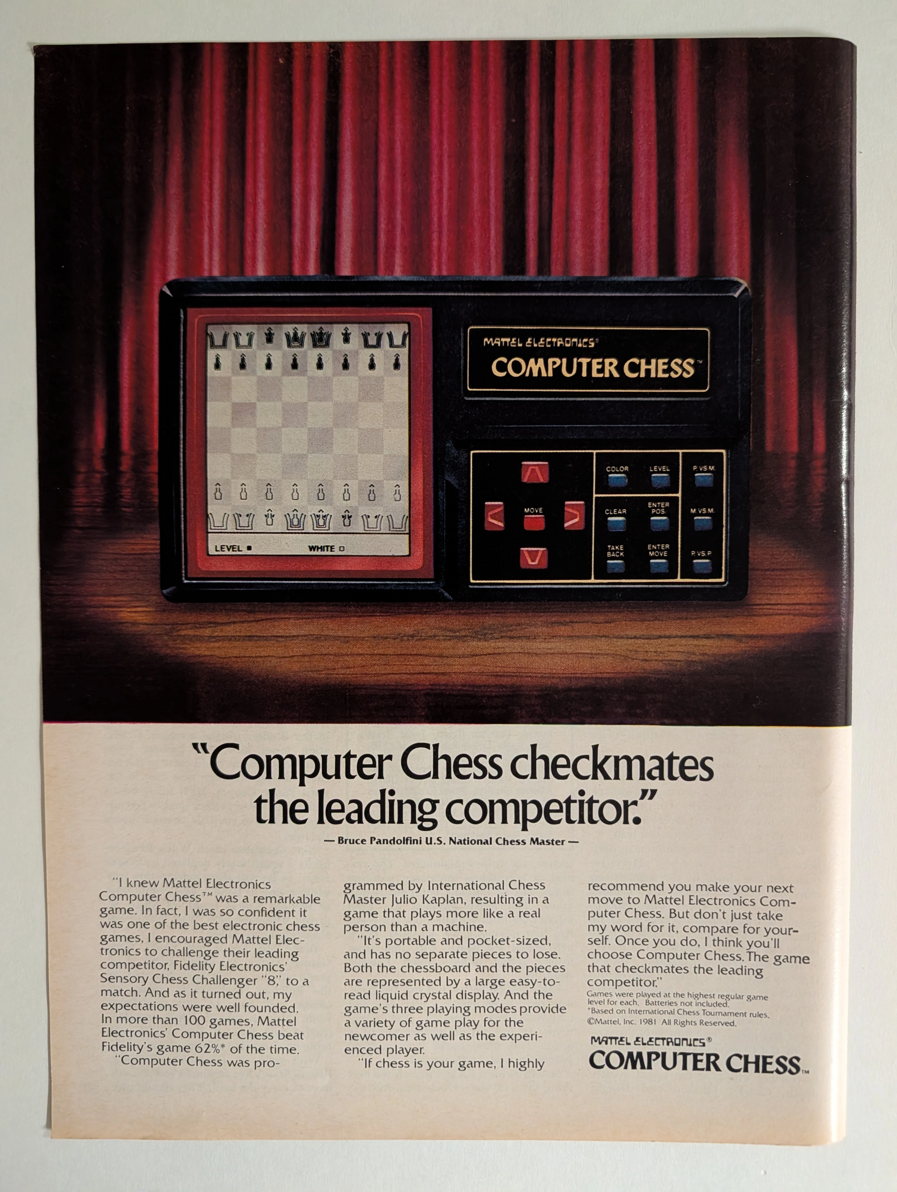
Mattel Electronics Computer Chess 1981 Full-Page Ad | Bruce Pandolfini | Julio Kaplan | Chess AI History | Deep Analysis Rarity Class A
The advertisement analyzed here is a full-page full-color magazine advertisement for the Mattel Electronics Computer Chess™ handheld/tabletop electronic game, copyright © Mattel, Inc. 1981. The ad ran in major American consumer magazines during 1981–1982 — the golden apex of the first electronic game boom. It features a dramatic theatrical photograph of the device spotlit against red velvet curtains on a wooden stage, with a bold competitive claim endorsed by U.S. National Chess Master Bruce Pandolfini: that Mattel's Computer Chess beat Fidelity Electronics' Sensory Chess Challenger '8' in more than 62% of over 100 head-to-head games. The ad also credits International Chess Master Julio Kaplan as programmer. This single page represents the intersection of early consumer AI history, 1980s toy advertising at its most theatrical, and a pivotal moment in the chess-computer arms race that prefigured Deep Blue.