Vintage 70s Crown Royal Ad: Vanishing Analog Art | The Record
The History
THE SHATTERED CROWN
When a Grown Man's Tears Become a Fading Legend on Paper
As the Chief Curator of The Record, traversing through the timeline of analog history, I invite you to dive deep into one of the most viscerally powerful advertising campaigns of the 1970s. This is not merely an ink-stained page; it is a "Museum Grade Artifact." It speaks of pride, unrepeatable analog craftsmanship, and the ruthless economics of decay.The image before you is the iconic "Have you ever seen a grown man cry?" campaign by Seagram's Crown Royal. One short sentence that sent a shockwave through the souls of drinkers worldwide. The sight of a shattered crown-shaped crystal bottle, its premium amber liquid bleeding across the floor, plays on a dark humor that triggers a profound sense of masculine loss—weeping for a whiskey too precious to spill. To comprehend the immense value of this single page, we must dissect its history, art, and the chemistry of time.
🏛️ CHAPTER I: THE GENESIS OF THE CROWN
The prestige of this advertisement is meaningless without understanding how "Crown Royal" was born, and the titan behind it.
Samuel Bronfman (1889–1971): A Canadian billionaire and the visionary architect of the Seagram Company, the largest distiller in the world during the 20th century. Bronfman didn't just sell liquor; he sold class.
The Royal Connection: In 1939, for the historic visit of King George VI and Queen Elizabeth to Canada, Bronfman sought to create a whiskey fit for a monarch. He masterfully blended 50 distinct whiskies, housing them in a cut-glass crown bottle wrapped in a royal purple velvet bag. Crown Royal was strictly a tribute to the King before it was released to the masses. Therefore, when this 70s ad depicts the shattering of that exact bottle, it is a deliberate psychological masterstroke—the destruction of a symbol of upper-class perfection.
📷 CHAPTER II: THE GOLDEN AGE OF ANALOG CRAFTSMANSHIP
If a modern agency wanted a broken bottle, they would render it perfectly via 3D CGI in hours. But this page is from the 1970s—the era of authentic, unforgiving analog art.
The Lighting Setup: Capturing shattered glass and liquid required immense skill. Photographers used large-format cameras and reversal film. They orchestrated complex lighting with strobes, tungsten lights, reflectors, and gobos to catch the facets of the broken crystal without flattening the image with lens flare.
The Timing: The spilled amber liquid had to look dynamic and visceral. The art directors physically smashed dozens of real, expensive crystal bottles to find the perfect shards and meticulously styled every droplet. You are looking at days of sweat, madness, and Madison Avenue perfectionism that simply does not exist in the digital age.
⏳ CHAPTER III: THE FRAGILITY OF HISTORY & PAPER DEGRADATION
As a collector and investor, the fundamental rule is: "Vintage print is a constantly degrading asset."
Lignin & Acidic Autocatalysis: Pre-2000 magazines were printed on wood pulp paper containing Lignin. When exposed to UV light and oxygen, lignin oxidizes, turning the paper yellow, brittle, and frail. Alum used in the paper reacts with moisture to create sulfuric acid, literally eating the page from the inside out.
The Ink of the Past: Look closely, and you'll see the vintage CMYK halftone printing—a beautiful, imperfect pattern of ink dots that no modern laser printer can replicate. This specific page survived fire, moisture, and the trash bin for half a century. Its patina is a signature of survival.
📈 CHAPTER IV: THE ECONOMICS OF SCARCITY
The investment strategy at The Record is absolute: Value peaks when irreversible destruction of supply meets the rising demand of nostalgia.
Zero Production: 1970s printing presses cannot be fired up to recreate this exact paper and ink smell.
Exponential Attrition: Every day, original magazines are destroyed by acid, pests, or humidity. The source material is violently shrinking.
The Rise of "Home Art Gallery": In an era of screen fatigue, the elite crave tangible art. Framing an original, magazine-sized piece of advertising history elevates any bar or study. This page is no longer just paper; it is an "Alternative Asset" whose rarity will only compound as time erodes the rest.
Exhibition Halls
The Archive Continues
Continue the Exploration
THE TIME TRAVELER'S DOSSIER: THE FALLEN IDOL AND THE MASTER'S REBELLION
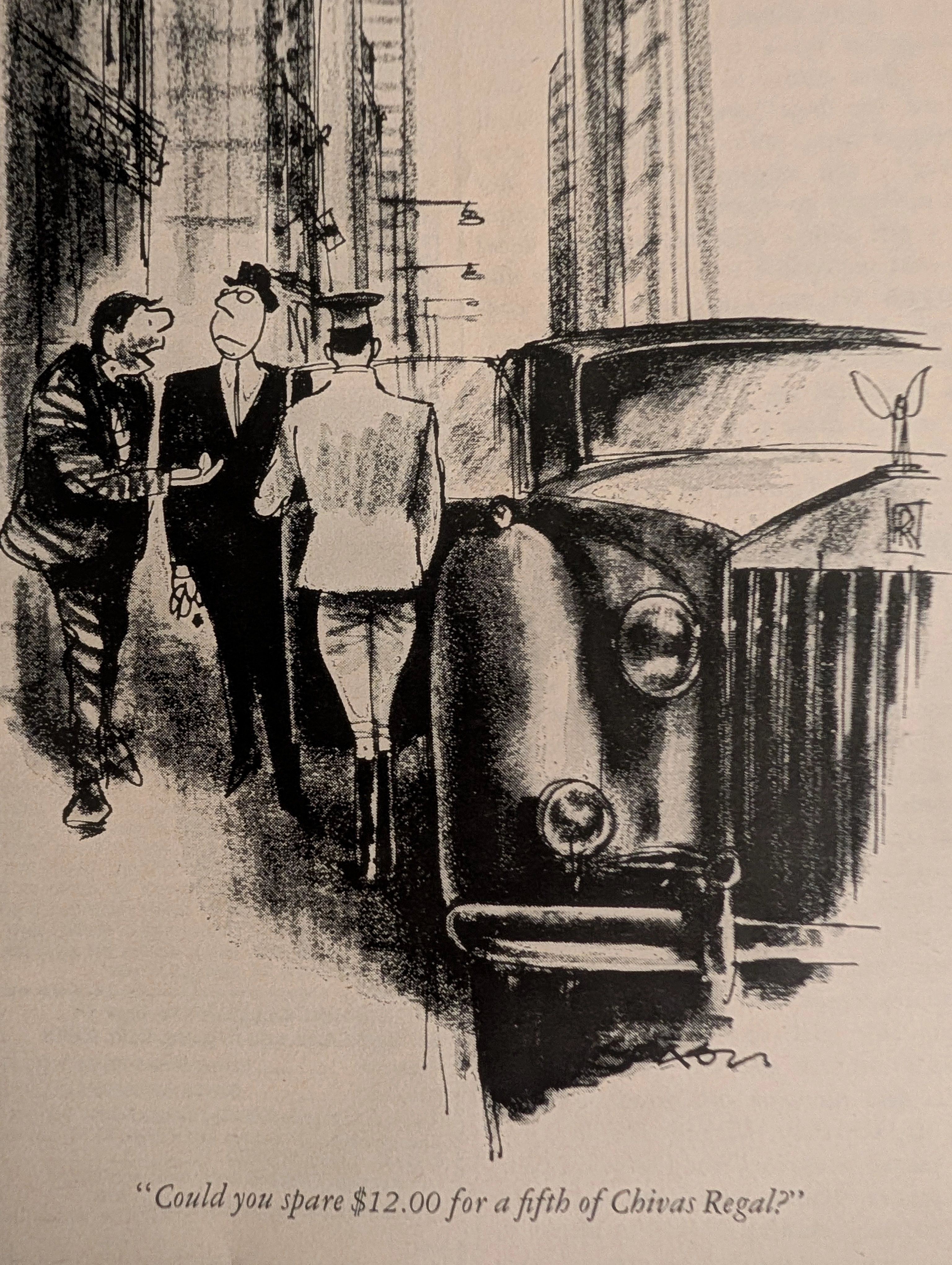
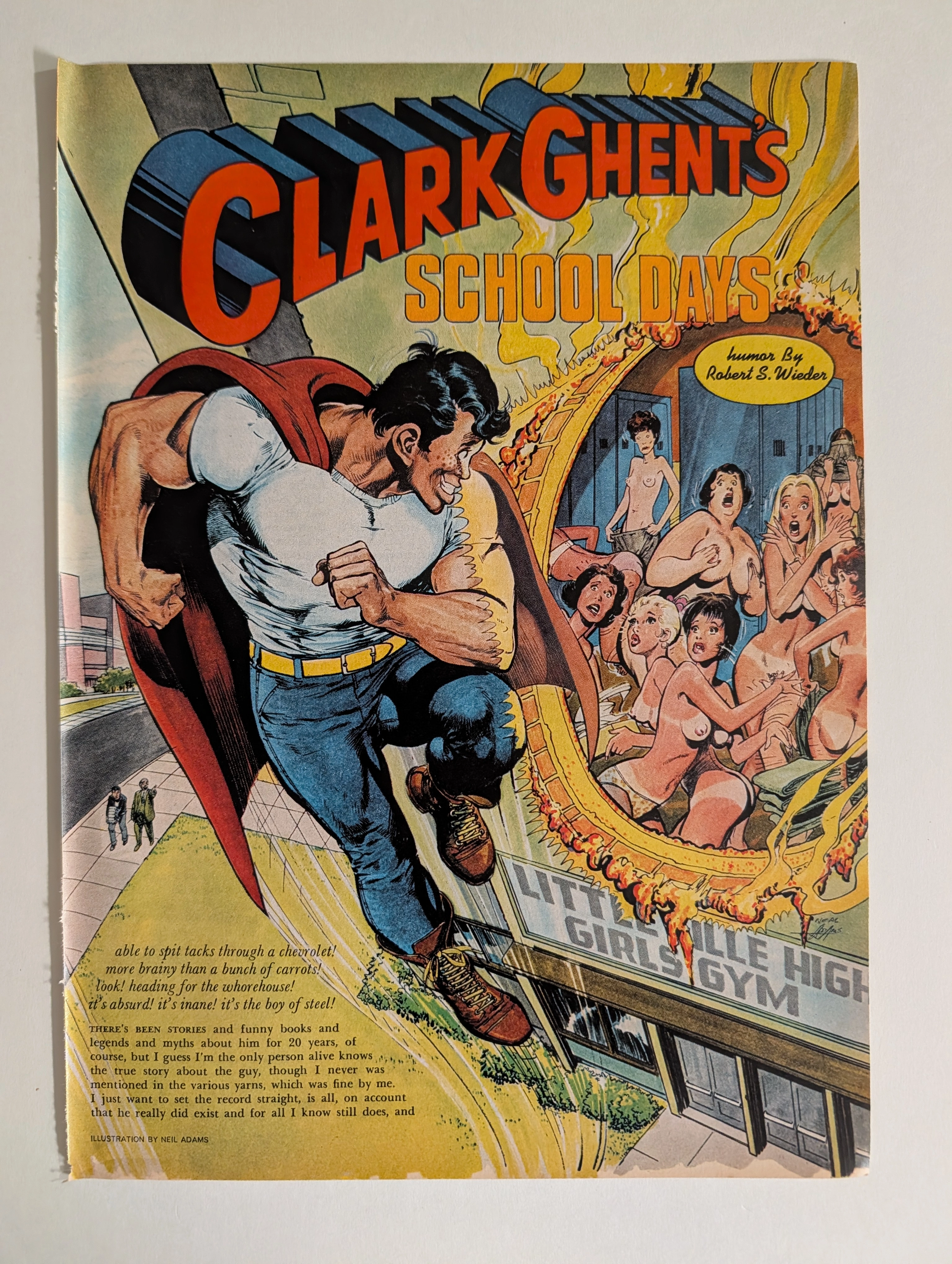
The artifact under rigorous, museum-grade analysis is an exceptionally preserved Historical Relic originating from the unapologetic, counter-cultural zenith of 1970s American underground publishing. It features a full-page, breathtakingly subversive illustration titled "CLARK GHENT'S SCHOOL DAYS", masterfully rendered by the legendary comic book artist Neal Adams (credited in the print with the common underground misspelling 'Neil Adams'), accompanied by the biting satirical prose of Robert S. Wieder. This Primary Art Document represents a ferocious, calculated deconstruction of American mythology. Neal Adams—the visionary architect who defined the heroic, hyper-realistic, and idealized versions of Batman, Superman, and Green Lantern during the Bronze Age of Comics—utilizes his unparalleled dynamic style to mercilessly parody the "Man of Steel." By depicting "Clark Ghent" utilizing his god-like powers (heat and x-ray vision) to melt through the brick wall of the "Littleville High Girls Gym" to fulfill base, voyeuristic desires, this artifact shatters the wholesome, censorship-heavy constraints of the Comics Code Authority (CCA). Rescued from the incinerators of history and meticulously preserved as a standalone Archival Artifact, the inherently acidic wood-pulp paper is undergoing a slow, magnificent chemical degradation. This natural aging process—visible in the warm amber patina, the oxidized margins, and the fragile tactile feedback of the fibers—transforms a disposable piece of 1970s underground rebellion into an irreplaceable, frame-ready Primary Art Document of immense cultural weight.
The White House · Other
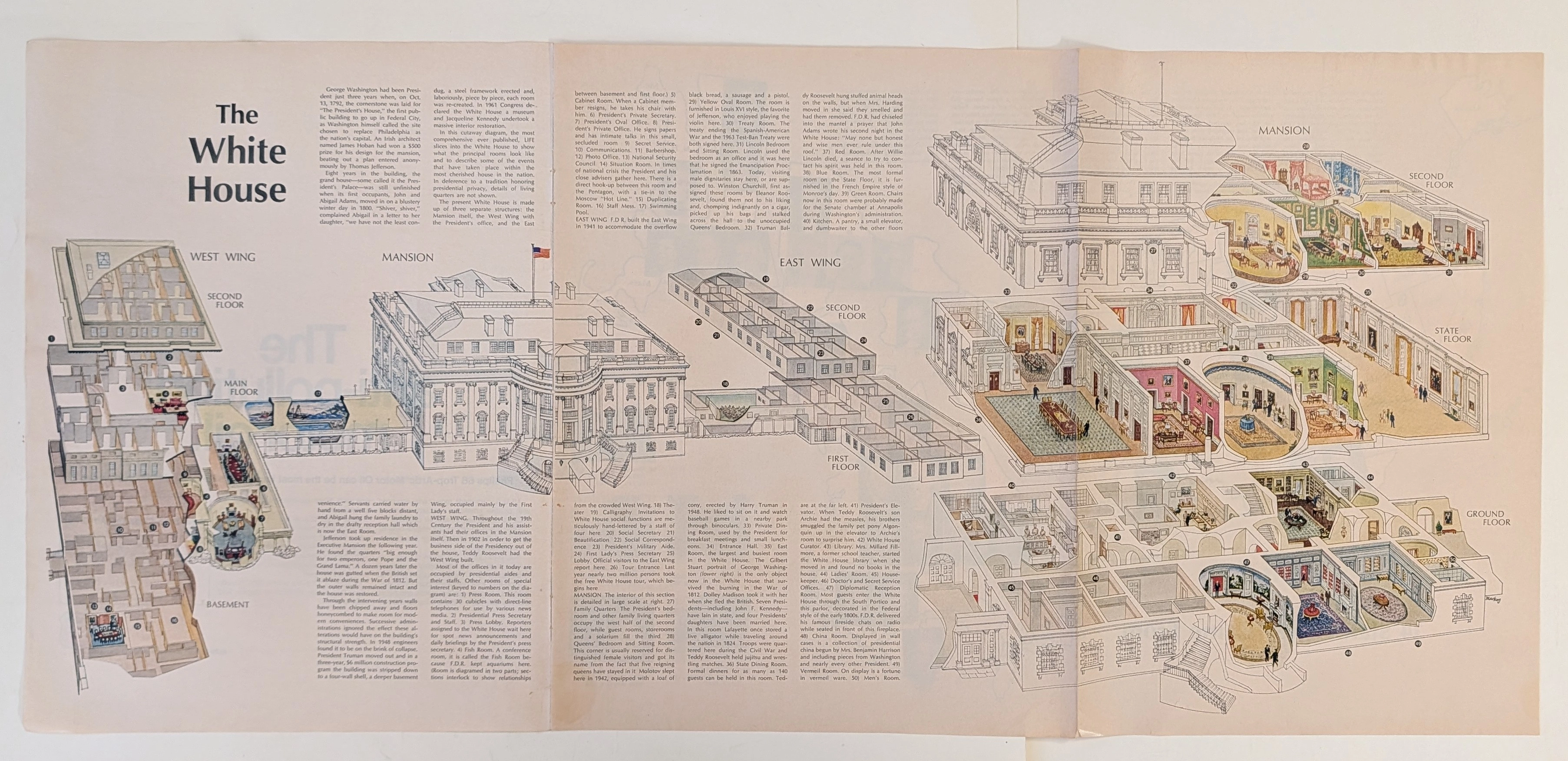
The Time Traveller's Dossier: The Masterpiece of Architectural Anatomy – The White House Isometric Cutaway Artifact (Circa 1960s)
The documentation of monumental architecture represents one of the most profound intersections of art, engineering, and historical preservation. Long before the advent of digital rendering software, computer-aided design (CAD), or virtual three-dimensional modeling, the supreme manifestation of structural visualization was executed through the calculated, mathematically rigorous discipline of the isometric cross-section. The historical artifact presented before us for analysis is not merely an educational fold-out extracted from a mid-20th-century mass-market publication. It is an absolute triumph of commercial illustration and draftsmanship, offering a meticulous visual dissection of one of the most famous residential structures on the globe. This museum-grade, academic archival dossier presents an exhaustive, microscopic deconstruction of this mid-century isometric cutaway diagram. Operating on a profound structural and spatial logic, this document completely strips away the iconic neoclassical exterior facade to reveal a masterful, dollhouse-like cross-section of interior design, historical room layouts, and underlying spatial engineering. It captures a precise historical era in publishing when complex architectural topographies were translated into highly accessible, visually thrilling infographics designed for public education. Through the highly specialized lens of late-analog commercial artistry, architectural history, and stringent visual forensics, this document serves as a masterclass in spatial communication. It establishes the foundational archetype for educational diagrams—an archetype that dictates the visual standards of modern architectural encyclopedias today, executed with a level of handcrafted precision that modern digital tools strive to emulate.
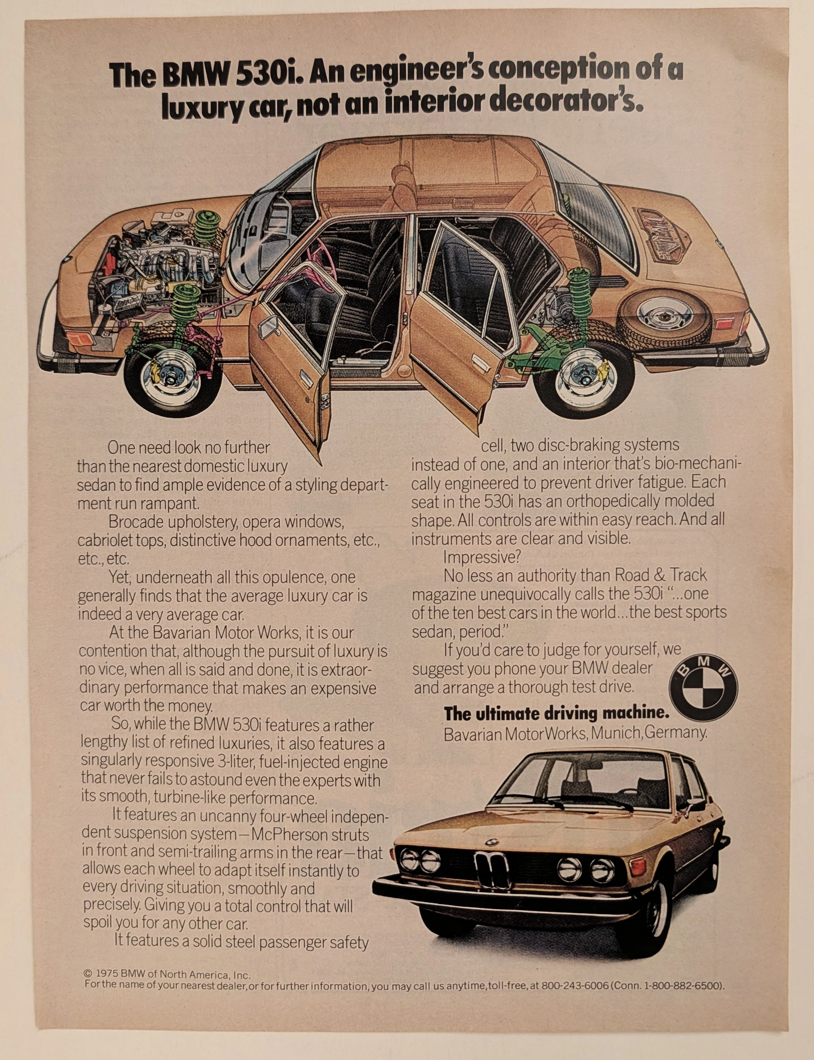
The Time Traveller's Dossier: The Engineer's Manifesto – The 1975 BMW 530i and the Birth of the Ultimate Driving Machine
The evolution of the American automotive landscape in the latter half of the twentieth century was fundamentally violently disrupted during the 1970s, an era defined by oil embargoes, shifting economic realities, and a growing consumer disillusionment with domestic manufacturing. Elegantly and securely positioned upon the analytical table of The Record Institute today is a visually complex, densely informative, and highly significant full-page print advertisement for the BMW 530i, definitively dated to 1975 by its prominent copyright macro. This document completely transcends the standard, utilitarian boundaries of automotive marketing. It operates as a highly sophisticated, multi-layered cultural mirror and a bold declaration of war against the prevailing automotive trends of the decade. By juxtaposing the superficial trappings of American luxury—"brocade upholstery, opera windows, cabriolet tops"—against the visceral, mechanical truths of independent suspension and fuel injection, Bavarian Motor Works (BMW) successfully positioned itself as the intellectual and physical antidote to the bloated "Malaise Era" land yachts. This world-class, comprehensive dossier conducts a meticulous, unyielding, and exceptionally exhaustive examination of the artifact, operating under the absolute most rigorous parameters of historical, sociological, and material science evaluation. Dedicating the overwhelming majority of our analytical focus (80%) to its immense historical gravity, we will decode the brilliant, confrontational marketing psychology embedded within the copywriting, analyze the profound mechanical realities of the E12 chassis 5-Series, and detail the historical impact of the visionaries who crafted this campaign. Furthermore, as we venture deeply into the chemical and physical foundations of this analog printed ephemera (10%), we will reveal the precise mechanical fingerprints of the CMYK halftone rosettes captured in the stunning macro imagery of the BMW roundel and the technical cutaway illustration. Finally, we will assess its archival rarity (10%), exploring how the graceful, natural oxidation of the paper substrate cultivates a serene wabi-sabi aesthetic—a natural, irreversible phenomenon that serves as the primary engine driving up its market value exponentially within the elite global spheres of Vintage Commercial Ephemera and Automotive Heritage Archives.