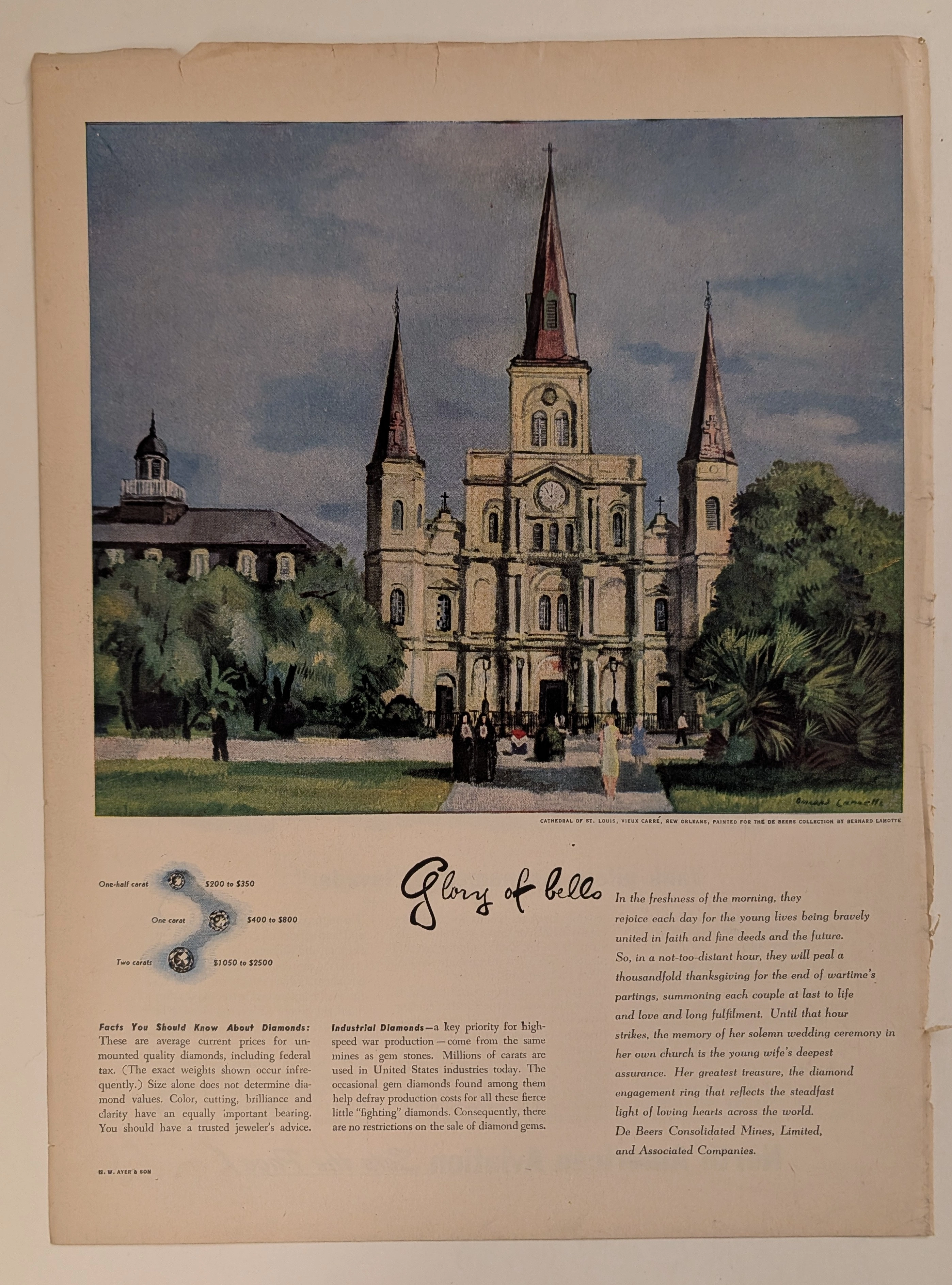
The Time Traveller's Dossier: The Sartorial Armor of Terence Stamp – A Foster Grant Exhibition
The History
To fully appreciate the immense historical gravity, cultural magnitude, and sociological importance of this artifact, one must meticulously contextualize the origins of the Foster Grant corporation, the unprecedented brilliance of their defining advertising campaign, and the specific cultural resonance of Terence Stamp in the year 1968.
The story of Foster Grant is inextricably linked to the industrial history of the United States. Founded in 1919 by Sam Foster in Leominster, Massachusetts—a city that would come to be known as the "Pioneer Plastics City"—the company initially manufactured women's hair accessories. In 1929, Sam Foster recognized a burgeoning market and sold his first pair of mass-produced sunglasses on the boardwalk of Atlantic City, New Jersey. This localized success blossomed, and by the mid-twentieth century, Foster Grant had pioneered new techniques in the injection molding of plastics, allowing them to produce durable, stylish eyewear at an incredibly low cost.
However, the true stroke of corporate genius occurred in the 1960s when Foster Grant partnered with the advertising agency Geer, DuBois to launch one of the most legendary and effective marketing campaigns in history: "Isn't that... behind those Foster Grants?" The psychological brilliance of this campaign lay in its democratization of glamour. By photographing the era's most elusive, glamorous, and internationally famous film stars—including Peter Sellers, Raquel Welch, Mia Farrow, and, in this artifact, Terence Stamp—wearing sunglasses that retailed for as little as $1.00 to $5.00, the company created an irresistible illusion. They promised the American public that the aura of Hollywood royalty could be purchased at the local pharmacy or drugstore. The sunglasses were no longer just tinted plastic; they were, as the ad copy states, a "heightened self-awareness" and a "subtle increase of confidence."
The selection of Terence Stamp for this specific 1968 campaign is of paramount historical interest. Born in London, Stamp emerged in the early 1960s as a quintessential icon of the "Swinging London" youth movement. With his striking, classically handsome features and piercing blue eyes, he achieved international stardom in films such as Billy Budd (1962) and The Collector (1965). He was the ultimate symbol of the British Invasion—cool, detached, rebellious, and deeply fashionable. The parenthetical sub-headline of the advertisement explicitly cross-promotes his 1968 Paramount Pictures film, Blue, a Western in which Stamp played a Mexican bandit adopted by a Texas Ranger. While the film was not a massive critical success, Stamp's international profile was at its absolute zenith, making his endorsement a highly prized commodity.
What elevates this specific advertisement into a primary document of cultural history are the six distinct, highly stylized vignettes Stamp acts out, accompanied by razor-sharp, character-driven copywriting. These quotes are not mere fashion captions; they are deeply coded references to the volatile cultural and political landscape of 1968. Let us examine the profound semiotics of these six personas:
The Aristocratic Playboy: "I'm afraid that would mean a swim, dear lady. My bumbling lackeys have already raised the drawbridge." [Foster Grant #1940. $1.00]. Here, Stamp channels the detached, untouchable European elite, appealing to the American fascination with old-world aristocracy and unapologetic luxury.
The Las Vegas Mobster: "Now what's this I hear, Fingers, about withholding the Vegas receipts from the bosom of your family?" [Foster Grant #2803. $2.00]. Wearing a fedora and dark wrap-around shades, Stamp embodies the dangerous, clandestine allure of organized crime, a popular fascination fueled by the era's cinema and the real-world exploits of the Rat Pack in Nevada.
The Angry Young Man / Anti-Establishment Rebel: "Actually I quite fancy you, Your Highness. It's your type I detest." [Foster Grant #5102. $5.00]. This quote brilliantly encapsulates the British working-class resentment toward the monarchy and the rigid class system—a defining ethos of the Swinging Sixties counterculture in the UK.
The Existential Youth / Counterculture Seeker: "The Peace Corps? Haight-Ashbury? Mecca? Decisions, decisions, decisions." Covered in shaving cream and wearing bold square frames, Stamp represents the deep ideological crossroads facing young people in the late 60s. The choice between John F. Kennedy's idealistic 'Peace Corps', the psychedelic, drug-fueled hippie epicenter of 'Haight-Ashbury' in San Francisco, or the spiritual awakening represented by 'Mecca' perfectly summarizes the search for meaning in a turbulent decade.
The Political Cynic: "You have a way, Senator, of saying 'peace' as if it were a dirty word." [Foster Grant #3601. $3.00]. This is perhaps the most heavily loaded political statement in the artifact. 1968 was the year of the Tet Offensive, the assassinations of MLK Jr. and RFK, and the violent Democratic National Convention in Chicago. The Vietnam War had deeply fractured the nation, and the concept of "peace" was highly politicized. This quote directly addresses the political cynicism and the anti-war movement of the era.
The Radical Revolutionary: "You just tell her Che Guevara's here and would like a word with her. She'll understand." [Foster Grant #3603. $3.00]. Ernesto "Che" Guevara was executed in Bolivia in October 1967. Almost instantly, his image was romanticized and commodified into a global symbol of rebellion. This quote demonstrates how quickly radical left-wing revolutionaries were co-opted by capitalist marketing, turning a Marxist guerrilla fighter into a charming pickup line for a Hollywood actor selling $3.00 sunglasses.
Furthermore, the advertising copy emphasizes that the "ff77 lenses" pass the "most rigid U.S. Gov't standards for eye protection". During the Cold War era, invoking "government standards" or military-grade specifications was a highly effective psychological tool to reassure the consumer of the product's ultimate quality and scientific superiority, effectively validating the purchase of an inexpensive plastic item.
The Paper
As a physical entity, this printed artifact functions as a living, breathing, and profound record of mid-twentieth-century graphic reproduction and substrate chemistry. Under exceptional macro-lens examination, this document reveals the stunning complexity and mathematical precision of analog color printing. The intricate textures of Stamp's facial hair, the rich depth of his skin tones, the pristine white of the shaving foam, and the crisp, high-contrast typography of the registered trademarks and model numbers are all meticulously constructed from a precise, mathematically rigorous galaxy of halftone rosettes. This intricate pattern constitutes the mechanical fingerprint of the pre-digital analog offset printing press. Microscopic, varying sizes of Cyan, Magenta, Yellow, and Key (Black) ink dots are elegantly and systematically layered at specific angles to trick the human eye and the biological visual cortex into perceiving continuous, vibrant, and dimensional photographic reality.
Yet, the most profound and impactful factor elevating the immense value of this artifact in the contemporary collector's market is the natural, organic, and entirely irreversible process of Material Degradation. The expansive margins and the overall paper substrate exhibit a genuine, unavoidable, and entirely unforgeable "Toning." This gradual, graceful transition from the original bright, bleached manufactured paper to a warm, antique ivory and golden hue is caused by the slow chemical oxidation of Lignin—the complex organic polymer that binds cellulose fibers together within the raw wood pulp of the paper. As the substrate is exposed to ambient oxygen and ultraviolet light over a span of decades, the molecular structure of the lignin gracefully and systematically breaks down. This accumulation of time, this naturally evolving patina, represents the absolute core of the wabi-sabi aesthetic. The profound appreciation for the beauty found in natural aging, impermanence, and the physical manifestation of history upon a fragile medium is an irreversible chemical reaction. It is precisely this authentic, unreplicable degradation that acts as the primary engine driving up its market value exponentially among elite collectors, as it provides the ultimate, irrefutable proof of the artifact's historical authenticity and its miraculous journey through time.
The Rarity
RARITY CLASS: A (Excellent Archival Preservation)
Evaluated under the most exacting, rigorous, and uncompromising archival parameters, this artifact is definitively and securely designated as Class A.
The remarkable and defining paradox of mid-century print advertising is that these specific documents were produced by the millions as explicitly and intentionally "disposable media." They were inherently destined by their very nature to be briefly observed, casually folded, read over a morning coffee, and ultimately discarded into the recycling bins and incinerators of history. For a large-format advertisement to survive entirely intact since 1968 without catastrophic structural tearing, without destructive moisture staining, or without the fatal fading of the delicate, light-sensitive halftone inks constitutes a highly significant statistical archival anomaly. The impeccable structural integrity of this paper, combined with the immense cultural nostalgia associated with Terence Stamp's cinematic legacy and the historic weight of the Foster Grant advertising campaign, elevates the desirability of this document far beyond standard fashion collectors. It makes it a highly prized, museum-worthy piece of pop culture history. It is ardently sought after by global curators to ensure its historical permanence through acid-free, UV-protected conservation framing.
Visual Impact
The aesthetic brilliance and psychological power of this artifact lie in its masterful execution of "Cinematic Vignette Composition." The art director has discarded the traditional, single-focus product shot in favor of a highly engaging, multi-panel layout that resembles a film storyboard or a contact sheet. This aligns perfectly with the cinematic nature of the celebrity endorser.
The visual weight is anchored by the large, central image of Stamp in the fedora, immediately drawing the eye with his intense gaze and the dark, contrasting clothing. From there, the viewer's eye is invited to explore the peripheral images, each acting as a miniature stage play. The use of extreme close-ups, such as the shaving scene or the dramatic lighting of the "Che Guevara" quote, forces an intimate connection between the reader and the actor. The typography is equally masterful; the bold, sophisticated serif font of the main headline demands attention, while the italicized quotes beneath each photograph act as theatrical dialogue, creating a flawless integration of visual fashion, celebrity portraiture, and compelling narrative storytelling.
Exhibition Halls
The Archive Continues
Continue the Exploration
Ford · Automotive
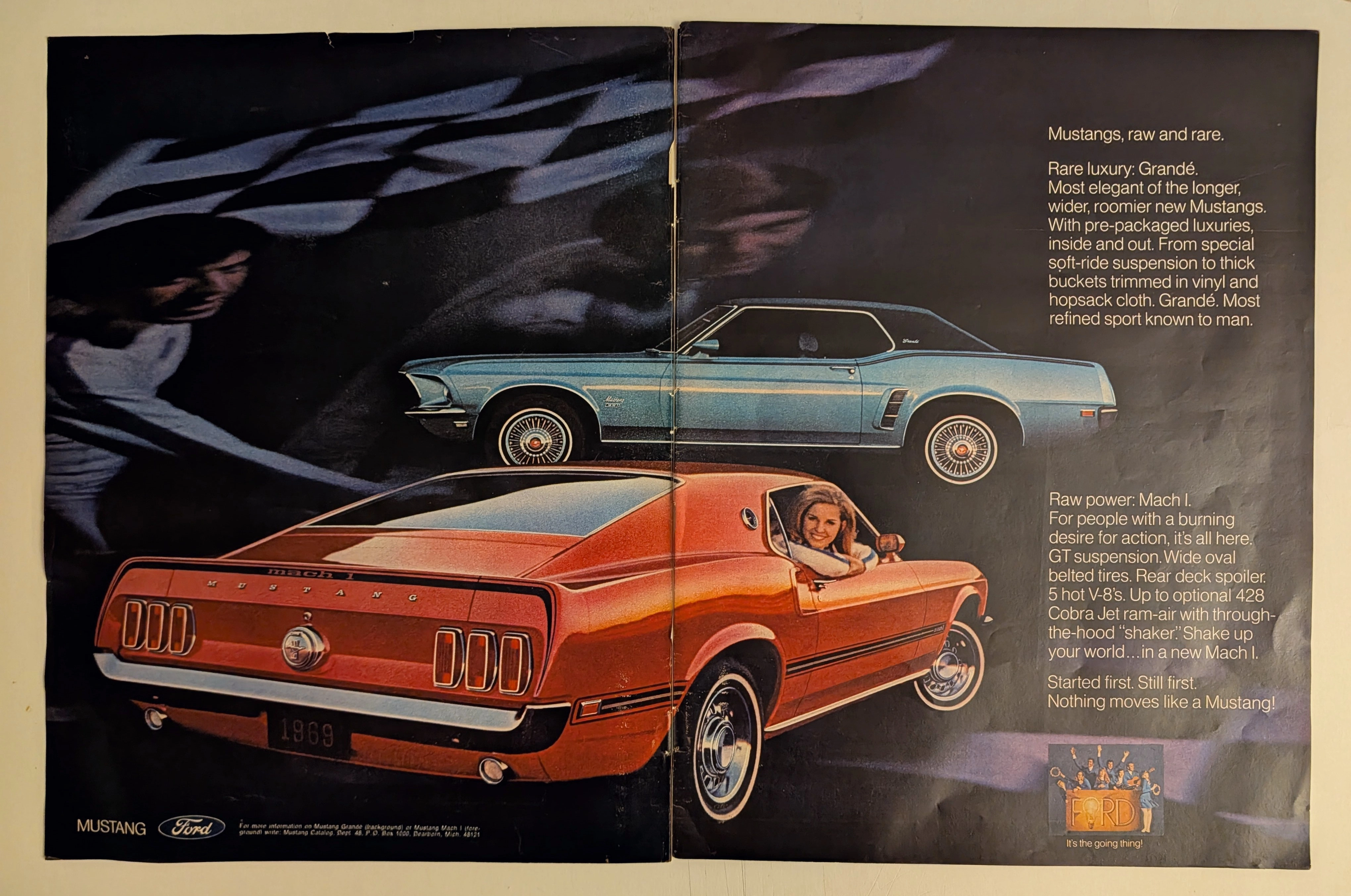
THE TIME TRAVELER'S DOSSIER:CULTURE WEAPONIZATION — "IT'S THE GOING THING"
The artifact under exhaustive, unprecedented museum-grade analysis is a profoundly preserved Historical Relic excavated from the absolute bloodiest battlefield of the American Muscle Car wars. This Primary Art Document is a monumental, two-page centerfold magazine advertisement for the 1969 Ford Mustang. Forensically and undeniably dated to 1969 by the explicit license plate stamped squarely on the rear bumper of the red Mach I, this document masterfully weaponizes Ford's dual-pronged sociological marketing strategy. It expertly captures the affluent bourgeoisie with the refined "Rare luxury" of the Grandé, while simultaneously ensnaring the rebellious, adrenaline-addicted youth with the "Raw power" of the Mach I. Grounded by extreme focal details like the iconic Mach 1 winged gas cap and the definitive 1960s pop-culture choir singing "FORD: It's the going thing!", this artifact's physical battle scars—specifically its authentic center crease and profound chemical paper degradation—elevate it to an irreplaceable Primary Art Document of Rarity Class A.
Pontiac · Automotive
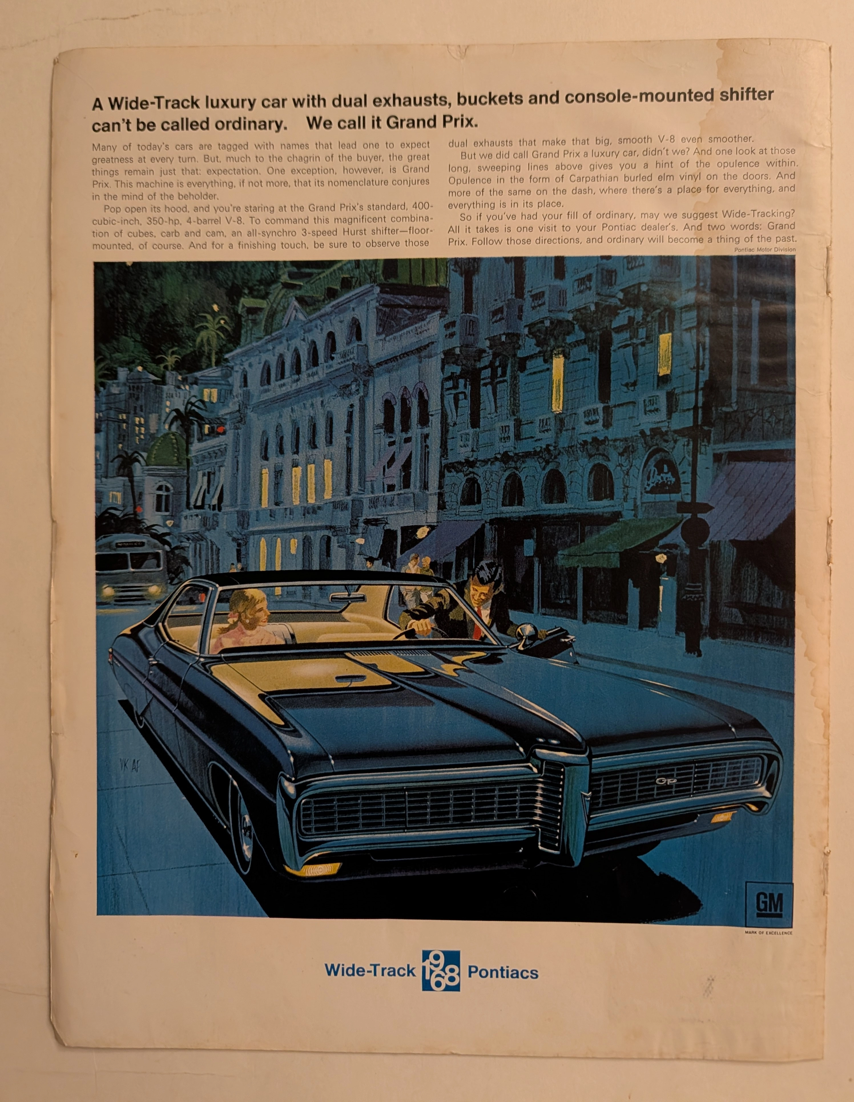
The Time Traveller's Dossier: The Wide-Track Illusion – The 1968 Pontiac Grand Prix Exhibition
The automobile in mid-twentieth-century America was never merely a utilitarian mode of transportation; it was a profound, rolling projection of identity, aspiration, and social status. The historical artifact elegantly and securely positioned upon the analytical table of The Record Institute today is a majestic, full-page print advertisement for the 1968 Pontiac Grand Prix, originating from the golden age of American muscle and luxury. This document completely transcends the traditional boundaries of automotive marketing. It operates as a highly sophisticated cultural mirror, reflecting the exact moment when Detroit automakers successfully blended brutal mechanical horsepower with the cosmopolitan allure of the European jet set on a single printed page. This world-class, comprehensive dossier conducts a meticulous, unyielding, and exceptionally deep examination of the artifact, operating under the absolute most rigorous parameters of historical, sociological, and material science evaluation. We will decode the brilliant "Wide-Track" advertising strategy that saved the Pontiac division, analyze the legendary artistic collaboration that defined an entire era of commercial illustration, and dissect the rich, aspirational semiotics embedded within the twilight European street scene. Furthermore, as we venture deeply into the chemical and physical foundations of this analog printed ephemera, we will reveal the precise mechanical fingerprints of the CMYK halftone rosettes and the graceful, natural oxidation of the paper substrate. This precise intersection of visual nostalgia, mid-century commercial artistry, and the immutable chemistry of time cultivates a serene wabi-sabi aesthetic—a natural, irreversible phenomenon that serves as the primary engine driving up its market value exponentially within the elite global spheres of Vintage Automotive Ephemera and Commercial Art collecting.
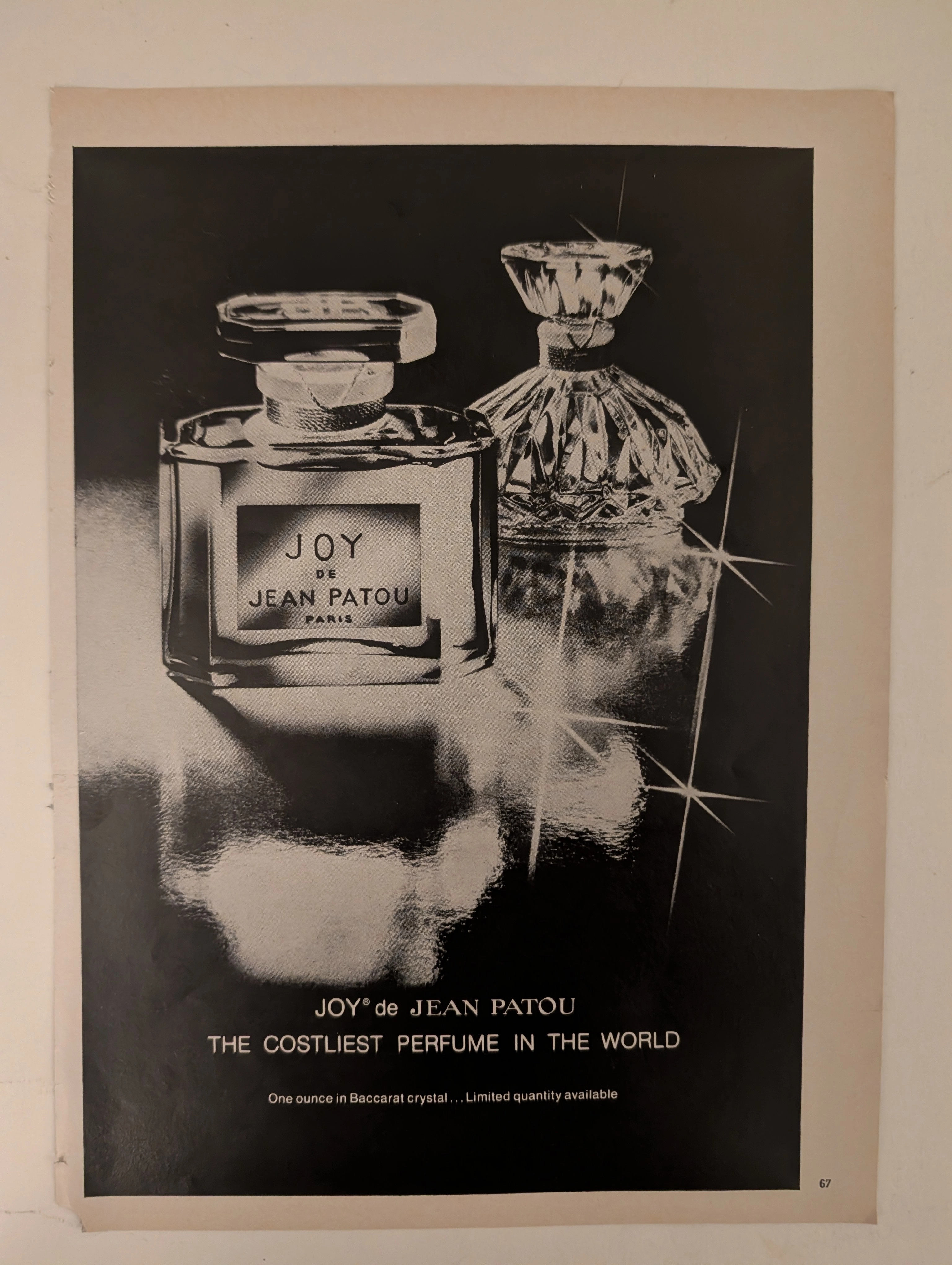
๋Joy De Jean Patou · Fashion
The Time Traveller's Dossier: The Semantics of Arrogance – JOY de Jean Patou Advertisement (Circa 1980s)
History is not written by the victors; it is printed by the industrialists. Long before digital algorithms began to sterilely dictate human consumption and virtual reality stripped away authentic tactile sensation, societal engineering and consumer psychology were executed through the calculated, mathematical geometry of the four-color offset press and the absolute mastery of analog darkroom photography. The historical artifact before us is not merely a disposable magazine tear sheet meant to peddle a fragrance. It is a perfectly weaponized blueprint of absolute capitalist supremacy, a visual declaration of class warfare, and an unwavering testament to an era of uncompromising, unapologetic ultra-luxury. This museum-grade, academic archival dossier presents an exhaustive deconstruction of a late-analog print advertisement for the legendary fragrance "JOY de Jean Patou," dating from the late 1970s to the early 1980s. Operating on a profound and ruthless binary structure, this document records a calculated paradigm shift within the global luxury goods industry. It captures the precise historical fracture where luxury transitioned conceptually from being a mere indicator of high-quality craftsmanship into a blatant, arrogant weapon of socioeconomic exclusion. Through the highly specialized lens of late-analog commercial artistry and stringent visual forensics, this document serves as a masterclass in psychological marketing. It established the foundational archetype for selling astronomically priced, exclusionary items—an archetype that unconditionally dictates the visual and strategic totems of modern ultra-luxury brands today.