The Time Traveller's Dossier: The Martial Authority of the Brew – An Academic Archival Analysis of the 1968 Ballantine Ale Advertisement
The History
To fully appreciate the immense historical gravity of this artifact, one must contextualize the shifting paradigm of the American beverage industry during the late 1960s, as well as the profound legacy of the brand itself. During this era, the American beer market was experiencing a massive homogenization, with consumer preferences increasingly drifting towards lighter, highly carbonated, and less complex mass-produced lagers. In defiance of this trend, Ballantine Ale positioned itself as the antithesis of the modern, watered-down beverage. It was a drink for those who demanded substance, tradition, and fortitude.
The historical foundation of this defiance rests entirely upon the shoulders of Peter Ballantine (1791–1883). Peter Ballantine was a highly influential Scottish emigrant and brewing pioneer who founded the P. Ballantine & Sons brewing company in Newark, New Jersey, in 1840. He profoundly shaped the American brewing landscape by steadfastly maintaining traditional, robust ale brewing techniques in an evolving market. His insistence on quality and character established the brewery as one of the largest and most respected in the United States by the late 19th and early 20th centuries. The iconic logo prominently displayed on the golden can in the advertisement—the three interlocking Borromean rings containing the letters "XXX"—was adopted by Ballantine in 1879. According to the brand's lore, Peter Ballantine noticed the overlapping condensation rings left by beer glasses on a table and designated them to symbolize the three essential qualities of his ale: Purity, Body, and Flavor. The "XXX" itself is an ancient brewer's mark indicating the highest level of strength and quality.
By 1968, the cultural landscape of America was deeply fascinated by the introduction of Eastern philosophies and martial arts into mainstream media. The advertisement brilliantly capitalizes on this cultural zeitgeist. The illustration features a stoic man dressed in a traditional karate gi, wearing a black belt—the ultimate symbol of dedication, discipline, and physical mastery. He stands with his arms crossed, projecting an aura of quiet, unassailable confidence. The accompanying typography declares, "Stronger, Bolder, really means business!" The text further challenges the reader: "Ballantine Ale does more for you than any beer could. It's brewed with a little more courage for a taste you can feel... Let Ballantine make an ale man out of you."
This is a masterstroke of mid-century psychological marketing. The brand is not merely selling a fermented beverage; it is selling an initiation into a specific archetype of traditional masculinity. The karate master serves as a metaphor for the ale itself—uncompromising, potent, and commanding respect. The wooden planks and concrete cinder blocks upon which the golden can and glass rest are traditional objects used in martial arts breaking demonstrations (tameshiwari), further reinforcing the visual metaphor that Ballantine Ale possesses the strength to break through the mundane and deliver a profound sensory experience.
The Paper
As a physical entity, this printed artifact functions as a living, breathing record of mid-twentieth-century graphic reproduction and substrate chemistry. Under exceptional macro-lens examination, the rich, painterly textures of the martial artist's uniform, the nuanced shading of the rustic background, and the brilliant, luminous amber of the ale within the glass are revealed to be constructed from a precise, mathematically rigorous galaxy of halftone rosettes. This constitutes the mechanical fingerprint of the pre-digital analog offset printing press, where microscopic, varying sizes of Cyan, Magenta, Yellow, and Key (Black) ink dots are elegantly and systematically layered. It is this specific mechanical rhythm that orchestrates the human eye's perception of dimensional depth, shadow, and the highly reflective metallic sheen of the aluminum can.
However, the most profound factor elevating the immense value of this artifact in the contemporary collector's market is the natural, organic process of Material Degradation. The margins and the overall paper substrate exhibit a genuine, unavoidable, and entirely unforgeable "Toning." This gradual, graceful transition from the original manufactured paper to a warm, antique ivory and golden-brown hue is caused by the chemical oxidation of Lignin—the complex organic polymer that binds cellulose fibers together within the raw wood pulp of the paper. As the substrate is exposed to ambient oxygen and ultraviolet light over a span of nearly six decades, the molecular structure of the lignin gracefully breaks down. This accumulation of time, this naturally evolving patina, represents the absolute core of the wabi-sabi aesthetic. The profound appreciation for the beauty found in natural aging, impermanence, and the physical manifestation of history is an irreversible chemical reaction. It is precisely this authentic degradation that acts as the primary engine driving up its market value exponentially among elite collectors, as it provides the ultimate, irrefutable proof of the artifact's historical authenticity and survival.
The Rarity
RARITY CLASS: A (Excellent Archival Preservation)
Evaluated under the most exacting and rigorous archival parameters, this artifact is definitively designated as Class A.
The remarkable paradox of mid-century print advertising is that these documents were produced by the millions as explicitly "disposable media." They were inherently destined to be briefly observed, casually folded, and ultimately discarded into the recycling bins of history. For a large-format advertisement—particularly one that spans a highly vulnerable two-page spread—to survive intact from 1968 without catastrophic structural tearing at the central fold, destructive moisture staining, or fatal fading of the delicate halftone inks constitutes a highly significant statistical archival anomaly. The impeccable structural integrity of this paper, combined with the deep cultural nostalgia associated with the P. Ballantine & Sons brand and the unique martial arts iconography, elevates the desirability of this document among historians of American brewing and commercial art collectors. It is ardently sought after to ensure its historical permanence through museum-grade, acid-free conservation framing.
Visual Impact
The aesthetic brilliance of this artifact lies in its masterful execution of "Visual Weight and Conceptual Balance." The designer has orchestrated a profound juxtaposition between the background and the foreground. In the background, the karate master is rendered in muted, earthy tones—olives, browns, and charcoals—allowing him to recede slightly into the shadows while maintaining an authoritative, watchful presence.
In stark contrast, the foreground erupts with luminosity. The golden Ballantine Ale can and the perfectly poured, condensation-beaded glass of ale are illuminated as if by a theatrical spotlight. This strategic use of chiaroscuro draws the biological perception of the human eye directly to the product, transforming it into an object of intense desire. The placement of the products atop rough-hewn wooden planks and a weathered concrete block creates a deeply tactile visual experience, emphasizing ruggedness and authenticity. Furthermore, the typography is executed with immaculate precision. The heavy, bold, sans-serif font of the headline ("Stronger, Bolder, really means business!") visually mimics the physical strength and stability of the martial artist, creating a flawless harmony between the textual message and the visual semiotics.
The Archive Continues
Continue the Exploration
THE TIME TRAVELER'S DOSSIER: THE DAWN OF ELEGANCE AND THE EXTINCT $1,500 HOLY GRAIL
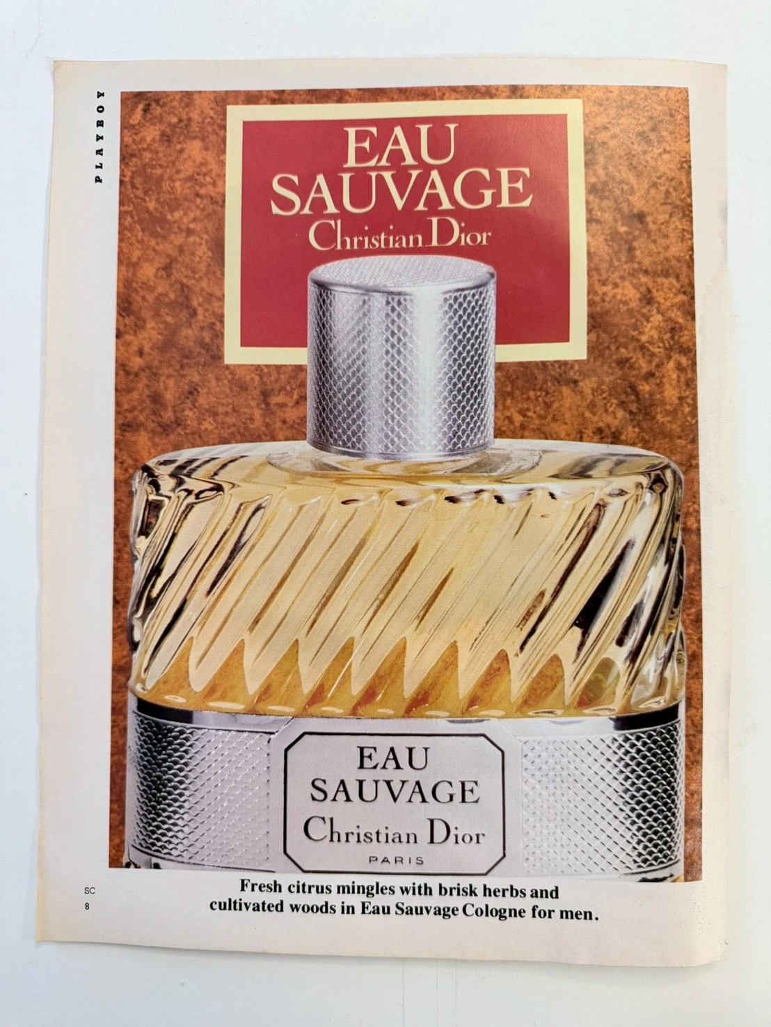
The artifact under museum-grade analysis is an exceptionally preserved Historical Relic originating from the golden age of analog publishing—a vintage issue of PLAYBOY magazine (circa late 1960s to 1970s). It features a striking, deeply sophisticated advertisement for one of the most revolutionary men's fragrances in modern human history: EAU SAUVAGE by Christian Dior. This Primary Art Document does not merely advertise a grooming product; it serves as a tangible historical marker of a monumental cultural paradigm shift. Prior to its introduction in 1966, men's fragrances were exclusively heavy, musky, and brutally spiced. Eau Sauvage, formulated by the legendary Master Perfumer Edmond Roudnitska, shattered this archaic mold by introducing Hedione (an airy, luminous synthetic jasmine compound) to men's perfumery, forever altering the trajectory of the global fragrance industry. Crucially, the original mid-century formulation and the specific ribbed-glass bottle design depicted in this artifact are permanently discontinued and lost to time. Modern reformulations driven by strict chemical regulations (such as the banning of natural oakmoss) have forever altered Roudnitska's original masterpiece. Consequently, surviving vintage bottles of this exact era have achieved mythical "Holy Grail" status, currently commanding astronomical prices of up to $1,500 USD in the global collector's market. This transforms the preserved advertisement from a commercial print into an invaluable piece of historical provenance—a birth certificate for an extinct luxury. Rescued from destruction and preserved as a standalone Archival Artifact, the inherently acidic, glossy paper stock of the mid-century era is undergoing a slow, breathtaking chemical degradation. This natural aging process (oxidation and lignin breakdown) transforms the mass-produced print into an irreplaceable, ready-to-frame Primary Art Document, embodying the ultimate aesthetic of analog impermanence.
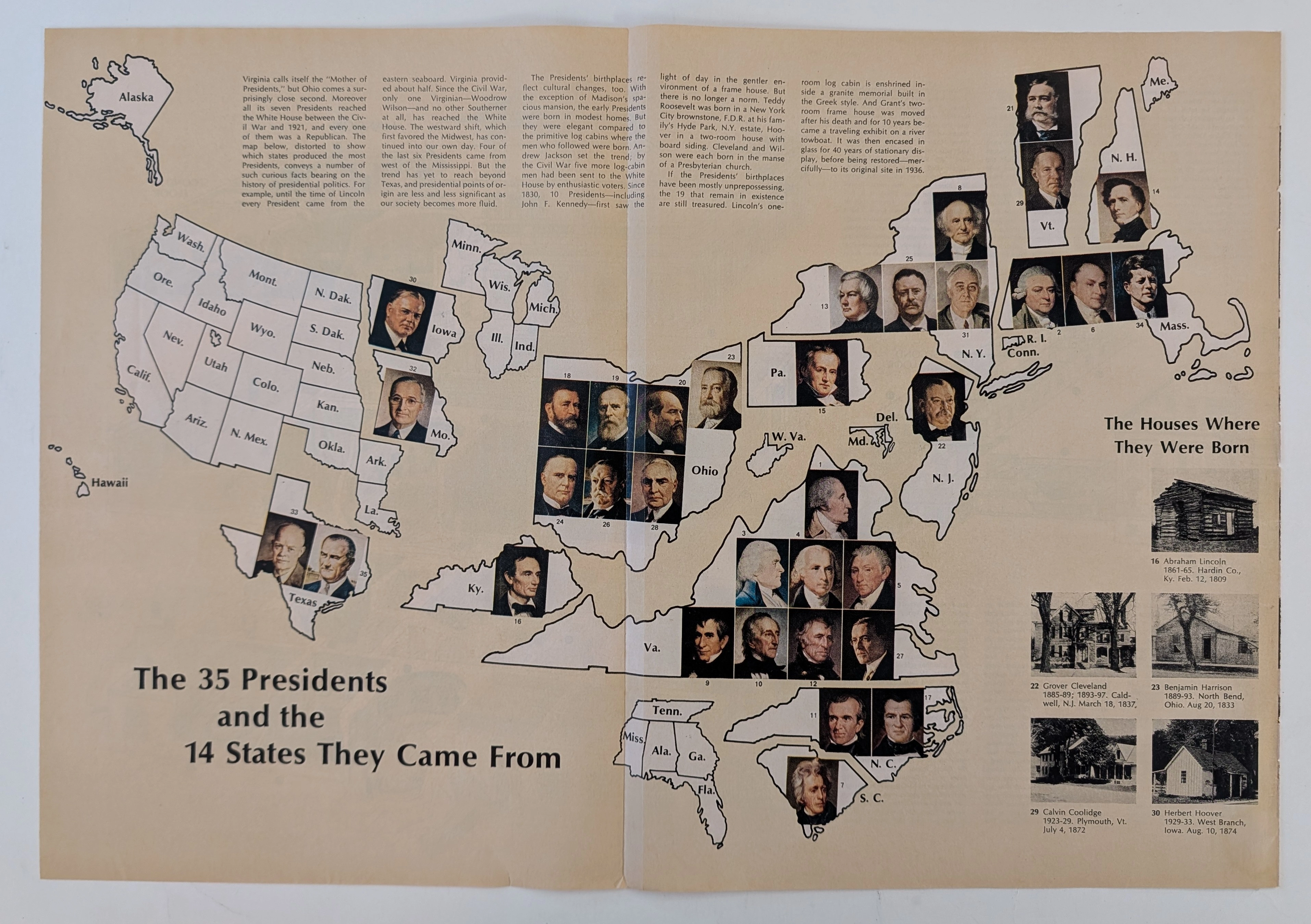
The Time Traveller's Dossier: The Geopolitics of Supreme Power – Cartographic Origins of the 35 U.S. Presidents (Circa Mid-1960s)
The history of supreme executive power is not inscribed solely within the text of legal documents, constitutional amendments, or international treaties; it is deeply rooted in the geographical origins and territorial foundations of political leaders. Long before the modern era of complex spatial data analysis or digital infographics, the structural understanding of state power in the United States was conveyed through the meticulous art of cartographic illustration. The historical artifact presented before us for museum-grade forensic analysis is not merely a conventional fold-out extracted from a mid-20th-century educational publication. It is a profound "geopolitical visual encyclopedia," meticulously compiling and categorizing the geographic birthplaces of the thirty-five individuals who had ascended to the highest office in the White House up to that point in history. This academic archival dossier presents an exhaustive, microscopic deconstruction of the historical and aesthetic framework of the diagram titled "The 35 Presidents and the 14 States They Came From." Operating on a profound scholarly narrative structure, this document decodes the shifting tectonic plates of executive power in the United States—from the foundational era concentrated on the Eastern Seaboard, moving steadily into the Midwest, and ultimately expanding toward the Southern and Western frontiers. Through the highly specialized lens of late-analog print analysis, American political history, and rigorous visual forensics, this document serves as a temporal window. It allows us to explore the foundational roots of the "American Dream" as conveyed through the birthplaces of these statesmen, ranging from humble log cabins to opulent estates, all rendered with the mechanical precision of mid-century offset lithography.
Avon · Other
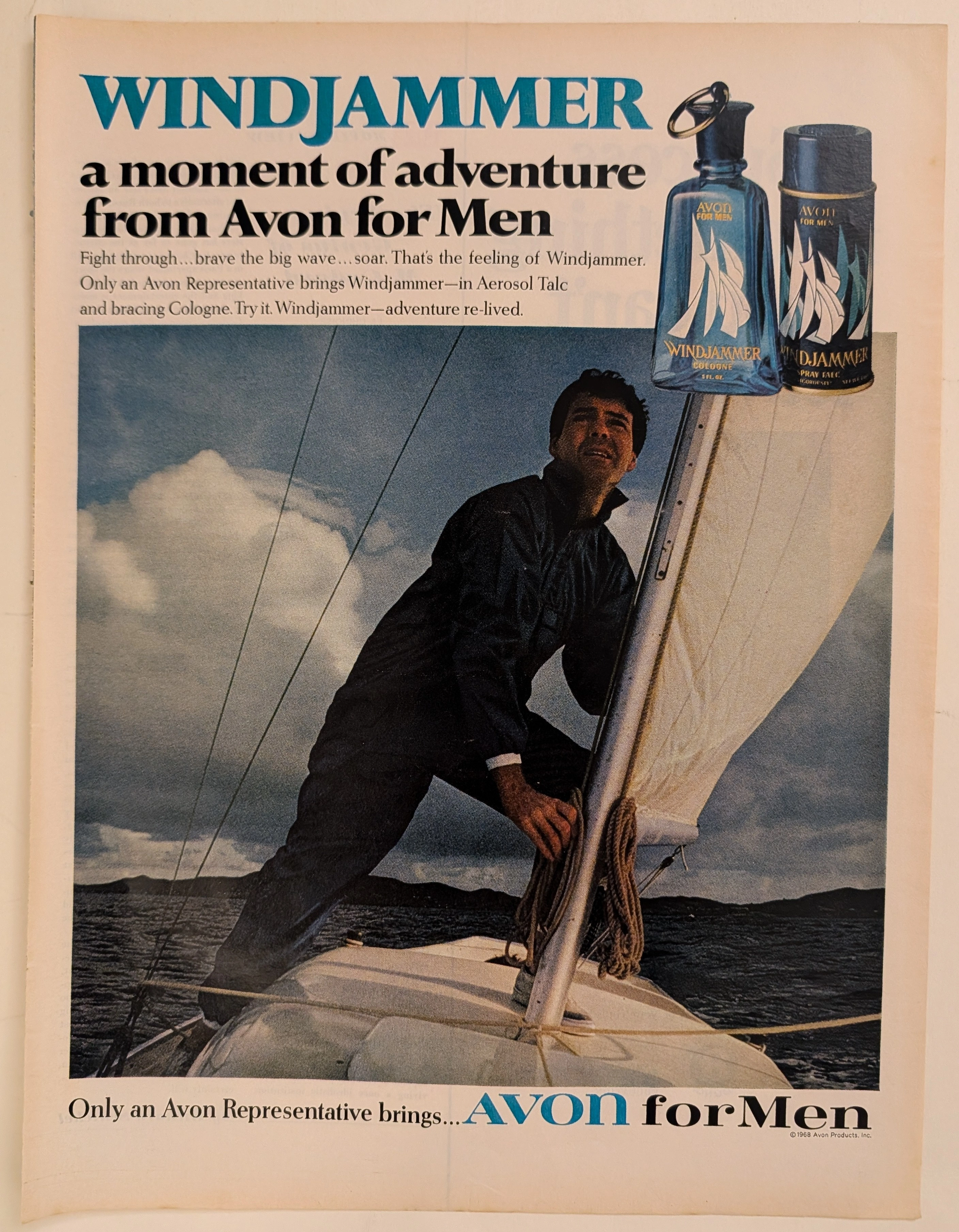
The Time Traveller's Dossier: The Suburb's Sea – Avon for Men, the Windjammer Mythos, and the Commodification of Mid-Century Masculinity
The evolution of mid-twentieth-century American domestic commerce was fundamentally reshaped by the aggressive expansion of the direct-sales model into the male grooming sector. The historical artifact elegantly and securely positioned upon the analytical table of The Record Institute today is a visually arresting, full-page print advertisement for Avon for Men: Windjammer, definitively dated by its copyright macro to the turbulent year of 1968. This document completely transcends the standard, utilitarian boundaries of fragrance marketing. It operates as a highly sophisticated, multi-layered cultural mirror, reflecting a precise era in consumer psychology where the American male—increasingly confined to the sterile environments of corporate offices and manicured suburbs—yearned for visceral, physical validation. By utilizing the universally potent, romanticized motif of the solitary sailor battling the elements, Avon ingeniously packaged the concept of raw, nautical adventure into a socially acceptable, easily purchasable glass bottle. This world-class, comprehensive dossier conducts a meticulous, unyielding, and exceptionally exhaustive examination of the artifact, operating under the absolute most rigorous parameters of historical, sociological, and material science evaluation. Dedicating the overwhelming majority of our analytical focus to its immense historical gravity, we will decode the brilliant marketing psychology embedded within the "Windjammer" maritime narrative, analyze the profound sociopolitical genius of the "Avon Lady" distribution network selling masculinity to wives, and dissect the semiotics of the product's mid-century packaging design. Furthermore, as we venture deeply into the chemical and physical foundations of this analog printed ephemera, we will reveal the precise mechanical fingerprints of the CMYK halftone rosettes captured in the macro imagery. Finally, we will assess its archival rarity, exploring how the graceful, natural oxidation of the paper substrate cultivates a serene wabi-sabi aesthetic—a natural, irreversible phenomenon that serves as the primary engine driving up its market value exponentially within the elite global spheres of Vintage Commercial Ephemera and Lifestyle Archives.