The Time Traveller’s Dossier: The Graphology of Supreme Power – A Forensic Deconstruction of the 35 Presidential Signatures
The History
To achieve the absolute standard of perfection required by The Record Institute, we must systematically decode the historical impact and the graphological signatures of all thirty-five presidents radiating around the central seal. The physical act of writing serves as a profound psychological mirror, reflecting how these statesmen navigated the immense weight of the presidency:
I. The Founding Fathers and The Quill Era (The Architecture of the Republic)
The signatures belonging to the earliest presidents, executed in an era of sharpened quills and iron gall ink, reflect the aristocratic discipline and classical education of the Enlightenment.
1. George Washington (1789-1797): The indispensable Father of the Country, who led the Continental Army to victory against the British Empire and established the sacred precedent of a two-term presidential limit. His signature is a masterpiece of precise, calculated penmanship. The majestic, perfectly balanced loops of the capital 'G' and 'W' project a commanding physical presence, immense dignity, and the unwavering moral discipline required to forge a new republic from thirteen disparate colonies.
2. John Adams (1797-1801): A brilliant intellectual force behind the Declaration of Independence and the masterful diplomat who negotiated the Treaty of Paris. His signature is remarkably compact, unadorned, and legible. It beautifully reflects the pragmatic, austere, and highly disciplined Puritan roots of New England—a man who valued intellectual substance and legal clarity over unnecessary decorative flourishes.
3. Thomas Jefferson (1801-1809): The polymath philosopher, principal author of the Declaration of Independence, and the executive who doubled the nation's size through the Louisiana Purchase. His signature is highly fluid, artistic, and elegantly proportioned. The sweeping, elongated lower loop of the 'J' reveals the mind of an Enlightenment architect, inventor, and visionary who thought in grand, sweeping historical arcs.
4. James Madison (1809-1817): Universally revered as the "Father of the Constitution" for his pivotal role in drafting the supreme law of the land and the Bill of Rights. His signature is small, tightly controlled, and impeccably balanced. It is the visual manifestation of a highly methodical, legalistic mind—a man whose quiet intellectual rigor laid the permanent structural foundations of the American government.
5. James Monroe (1817-1825): The president who promulgated the Monroe Doctrine, a foundational foreign policy that strictly opposed European colonial intervention in the Americas. His signature features bold, deliberate strokes and a steady baseline, reflecting the solid, traditional, and stabilizing influence of the "Virginia Dynasty" during the Era of Good Feelings.
6. John Quincy Adams (1825-1829): One of the greatest diplomats in American history, who helped formulate the Monroe Doctrine before his presidency. His signature is characterized by microscopic precision, tightly wound loops, and a slight rightward slant. It perfectly projects the image of a highly educated, detail-oriented, and profoundly serious statesman who spent his life immersed in international treaties and complex legal texts.
II. The Frontier Expansionists and the Jacksonian Democracy
As the nation expanded westward, the elegant calligraphy of the Founding Fathers gave way to the bold, assertive, and sometimes erratic signatures of the frontier leaders.
7. Andrew Jackson (1829-1837): The hero of the Battle of New Orleans and the architect of modern populism. He represented the explosive rise of the "Common Man." His signature is incredibly forceful, featuring aggressive, sweeping strokes and a dramatic, underlining flourish. It is a pure graphological projection of his indomitable will, combative nature, and fierce determination to shatter the political monopolies of the Eastern elite.
8. Martin Van Buren (1837-1841): A brilliant political strategist who fundamentally organized the modern two-party system. His signature is fluid, connected, and highly stylized, indicative of a smooth, articulate political operator known as the "Little Magician" for his deft ability to navigate complex legislative and electoral challenges.
9. William Henry Harrison (1841): A military hero who holds the tragic record for the shortest presidency, dying just a month after his inauguration. His signature is sprawling and somewhat erratic, featuring large, disconnected capitals that reflect the fast-paced, unpredictable nature of a life spent in military campaigns on the western frontier.
10. John Tyler (1841-1845): The first vice president to assume the presidency following a death in office, establishing a crucial constitutional precedent for the transfer of power. His signature is characterized by sweeping, elongated horizontal lines, projecting a sense of aristocratic Southern confidence and a steadfast refusal to yield his newly acquired executive authority.
11. James K. Polk (1845-1849): The highly efficient executive who achieved the doctrine of Manifest Destiny by expanding the nation to the Pacific Ocean through the Mexican-American War and the Oregon Treaty. His signature is sharp, angular, and deeply compressed. It reflects a man of intense, almost terrifying focus and work ethic, completely dedicated to achieving his territorial objectives regardless of the personal cost.
12. Zachary Taylor (1849-1850): A career military officer and hero of the Mexican-American War who reached the presidency without any prior political experience. His signature is practical, straightforward, and entirely devoid of artistic pretension, perfectly mirroring his pragmatic, battlefield-forged leadership style and his identity as "Old Rough and Ready."
13. Millard Fillmore (1850-1853): The president who signed the Compromise of 1850 in a desperate bid to delay the impending national conflict over slavery. His handwriting is neat, deeply legible, and conventional, reflecting his cautious, middle-of-the-road approach to governance and his origins in rural New York poverty.
14. Franklin Pierce (1853-1857): A Northern leader with Southern sympathies whose signing of the Kansas-Nebraska Act tragically accelerated the nation toward Civil War. His signature features large, flowing loops and a graceful aesthetic, indicative of his widely noted personal charm and eloquence, which ultimately failed to bridge the irreconcilable divisions of the country.
15. James Buchanan (1857-1861): The final president before the Civil War, who fundamentally failed to prevent the secession of the Southern states. His signature is highly stylized, featuring complex, almost unreadable flourishes. Graphologically, this over-complication often masks an inner hesitation, perfectly reflecting a presidency paralyzed by indecision during the nation's darkest hour.
III. The Civil War, Reconstruction, and the Gilded Age
The signatures of the late 19th century reflect the trauma of the Civil War, the military discipline of the Reconstruction era, and the eventual transition into an industrialized economic powerhouse.
16. Abraham Lincoln (1861-1865): The Great Emancipator who preserved the Union through its bloodiest conflict and destroyed the institution of slavery. Notably, he signed his full name "Abraham Lincoln" here, rather than his customary "A. Lincoln." The signature is tall, deliberate, unpretentious, and meticulously clear. The upright, sturdy letters visually embody his profound moral integrity, his honest frontier roots, and his unyielding commitment to the republic.
17. Andrew Johnson (1865-1869): The president who oversaw the tumultuous early years of Reconstruction and was the first to be impeached. His signature is heavy, thick, and somewhat labored. As a man who did not learn to write fluidly until adulthood, the heavy pressure of the ink reflects his deep working-class struggles and his stubborn, unyielding political nature.
18. Ulysses S. Grant (1869-1877): The victorious Commanding General of the Union Army who aggressively dismantled the KKK during his presidency. His signature, "U.S. Grant," is a marvel of unadorned, steady precision. It is completely devoid of artistic flourish, projecting the quiet, taciturn resolve and ironclad discipline of a professional soldier who understood the brutal mathematics of victory.
19. Rutherford B. Hayes (1877-1881): The president who controversially ended Reconstruction. His signature is highly uniform, neat, and bureaucratic. It mirrors his reputation as a respectable, stabilizing administrator attempting to heal a fractured nation as it entered a phase of rapid industrialization.
20. James A. Garfield (1881): A brilliant scholar and Union general whose promising presidency was cut tragically short by assassination. His signature is flowing, graceful, and highly educated, reflecting his background as a university president and a man of profound intellectual capability.
21. Chester A. Arthur (1881-1885): The president who shocked his critics by championing the Pendleton Civil Service Reform Act. His signature features ornate, sweeping capital letters and elegant loops, perfectly capturing the aesthetic of the Gilded Age and his personal reputation as a refined, meticulously dressed gentleman.
22. Grover Cleveland (1885-1889; 1893-1897): The only president to serve two non-consecutive terms, known as a bastion of anti-corruption and fiscal conservatism. His signature is heavy, grounded, and deeply legible, projecting an image of an immovable, rock-solid statesman who steadfastly refused to bow to political pressure or special interests.
23. Benjamin Harrison (1889-1893): The president who signed the foundational Sherman Antitrust Act. His signature is characterized by sharp, vertical strokes and precise angles. It is the handwriting of a highly organized, meticulous legal mind, reflecting his background as a successful corporate attorney and a disciplined executive.
24. William McKinley (1897-1901): The leader who guided the nation to victory in the Spanish-American War, transforming the United States into a global imperial power before his assassination. His signature is deliberate, rounded, and highly connected, indicative of a calm, patient, and consensus-building politician who carefully managed the dawn of the American Century.
IV. The 20th Century: The Imperial Presidency and the Atomic Age
The final grouping of signatures transitions into the modern era, where the presidency became the ultimate center of global power, reflecting the personalities of men who shaped the modern world.
25. Theodore Roosevelt (1901-1909): The architect of the Panama Canal, a champion of national parks, and a Nobel Peace Prize laureate. His signature is an absolute graphological explosion. It is rapid, forceful, forward-leaning, and bursting with kinetic energy. It perfectly captures his volcanic personality, his "Bull Moose" resilience, and his aggressive, transformative approach to the executive office.
26. William Howard Taft (1909-1913): The only individual to serve as both President and Chief Justice of the Supreme Court. His signature is expansive, rounded, and comfortable, with large, generous loops. It reflects his measured, judicial temperament, his deep respect for constitutional boundaries, and his amiable personality.
27. Woodrow Wilson (1913-1921): The intellectual architect of the League of Nations who led the country through World War I. His signature is a marvel of "copperplate" perfection—highly legible, evenly spaced, and flawlessly executed. It is the definitive signature of a meticulous academic, a former university president, and a man driven by strict, uncompromising moral and political theories.
28. Warren G. Harding (1921-1923): Elected on a promise to "Return to Normalcy" after WWI. His signature is relaxed, sprawling, and friendly, perfectly projecting the amiable, non-threatening Midwestern persona that won him the election, even as his administration was plagued by historic scandals.
29. Calvin Coolidge (1923-1929): The president of the "Roaring Twenties" economic boom. Known as "Silent Cal," his signature is tight, incredibly economical, and sharply angled. It is a brilliant visual translation of his famous brevity, his New England frugality, and his steadfast belief in minimal government intervention.
30. Herbert Hoover (1929-1933): The internationally acclaimed engineer and humanitarian whose presidency was eclipsed by the Great Depression. His signature is highly geometric, structured, and almost engineered in its precision, reflecting the mind of a man who believed complex human problems could be solved through systematic, rational organization.
31. Franklin D. Roosevelt (1933-1945): The visionary architect of the "New Deal" and the supreme leader of the Allied forces during World War II. He is the only president elected four times. His signature is sweeping, expansive, and features a distinct, optimistic upward slant. Despite his physical paralysis, his handwriting projects boundless confidence, aristocratic grace, and an indomitable faith in the future of the free world.
32. Harry S. Truman (1945-1953): The president who made the monumental decision to utilize atomic weapons and established the architecture of the Cold War containment policy. His signature is sharp, clear, and completely devoid of pretense. It is the ultimate reflection of his "The Buck Stops Here" philosophy—a straightforward, deeply honest, and decisive Midwestern leader.
33. Dwight D. Eisenhower (1953-1961): The former Supreme Commander of the Allied Expeditionary Force. He oversaw the immense economic prosperity of the 1950s and created the Interstate Highway System. His signature is perfectly balanced, authoritative, and steady. It projects the calm, unquestionable command presence of a military strategist accustomed to bearing the weight of global survival.
34. John F. Kennedy (1961-1963): The symbol of a new generation who navigated the Cuban Missile Crisis and ignited the Apollo program. His signature is highly stylized, fast-paced, and almost entirely illegible, consisting of rapid, sweeping horizontal lines. It perfectly encapsulates the modern speed, the restless intellectual energy, and the youthful, forward-looking idealism of the "New Frontier."
35. Lyndon B. Johnson (1963-1969): The master of legislative mechanics who secured the passage of the monumental Civil Rights Act of 1964. His signature is massive, sprawling, and aggressively dominates the space it occupies. It is a pure visual translation of "The Johnson Treatment"—his legendary method of physical and psychological intimidation used to bend the political establishment to his formidable will.
The Paper
This full-page print is a magnificent physical record of mid-twentieth-century graphic reproduction and chemical degradation.
Reverse Lithography and Halftone Mechanics: The artifact employs a technique akin to a cyanotype or a "dark field" offset print, where the background is flooded with deep blue pigment, leaving the natural color of the paper exposed to form the signatures and the central seal. Upon microscopic forensic examination, the crisp white edges of the signatures reveal the mechanical precision of the analog printing plates. The intricate details of the eagle within the central seal demonstrate the incredible resolution capabilities of mid-century presses, achieving a sharpness that digital vector graphics often struggle to replicate with such physical warmth.
The Oxidation of Lignin (The Value Engine): The most profound factor elevating the value of this artifact in the contemporary collector's market is the natural process of Material Degradation. Even though the paper is heavily coated in dark ink, the exposed white areas (the signatures and seal), as well as the unprinted margins, are subject to genuine, unavoidable "Toning." This gradual shift from brilliant white to a warm, antique ivory is caused by the chemical oxidation of Lignin—the organic polymer binding the cellulose fibers in the paper pulp—reacting with ambient oxygen and ultraviolet light over six decades. This accumulation of time, this evolving patina, represents the absolute core of wabi-sabi aesthetics: the profound appreciation of beauty found in impermanence. It is precisely this irreversible chemical reaction that acts as the primary engine driving up its market value exponentially among elite global collectors, as it proves the artifact's indisputable authenticity.
The Rarity
RARITY CLASS: SS (Super Secret / Studio Spec - Exceptional Reverse Print Survival)
Under the most unforgiving parameters of archival evaluation, this artifact is definitively designated as Class SS.
The extreme paradox of mid-century educational ephemera is that they were explicitly manufactured as "disposable media." They were destined to be pinned to classroom walls, exposed to fading sunlight, handled by countless students, and ultimately discarded. Furthermore, artifacts utilizing heavy, dark-field ink coverage are notoriously fragile; the heavy ink load often causes the paper to become brittle, leading to severe cracking, flaking, and catastrophic tearing along the edges.
For a large, full-page spread featuring the complex, radiating signatures of 35 historical titans to survive over half a century without severe pigment cracking, pinholes, or destructive moisture damage is an absolute statistical archival anomaly. The structural integrity of this document, combined with its highly unusual and aesthetically striking reverse-blue design, elevates it to a "Holy Grail" status among political historians and typography curators. It is fiercely sought after for the specific purpose of halting the march of time through museum-grade, acid-free conservation framing behind UV-protective glass, preserving this visual testament of executive power for eternity.
Visual Impact
The aesthetic brilliance of this artifact lies in its magnificent radial composition. By placing the Seal of the President of the United States at the absolute epicenter and arranging the 35 signatures in a sunburst pattern radiating outward, the designer has created a profound visual metaphor for centralized power.
The artifact functions as a wheel of history. The central seal represents the enduring, permanent institution of the presidency, an unmoving constitutional anchor. The signatures, spinning outward like rays of light or spokes on a wheel, represent the transient, mortal individuals who temporarily wielded that immense power. The choice of a reverse lithography technique—brilliant white text against an endless void of deep navy blue—strikes the optic nerve with the solemnity and gravity of a monumental blueprint. It elevates the document from a mere educational poster into a sacred geopolitical mandala, forcing the viewer to appreciate the cumulative weight of American history in a single, breathless glance.
Exhibition Halls
The Archive Continues
Continue the Exploration
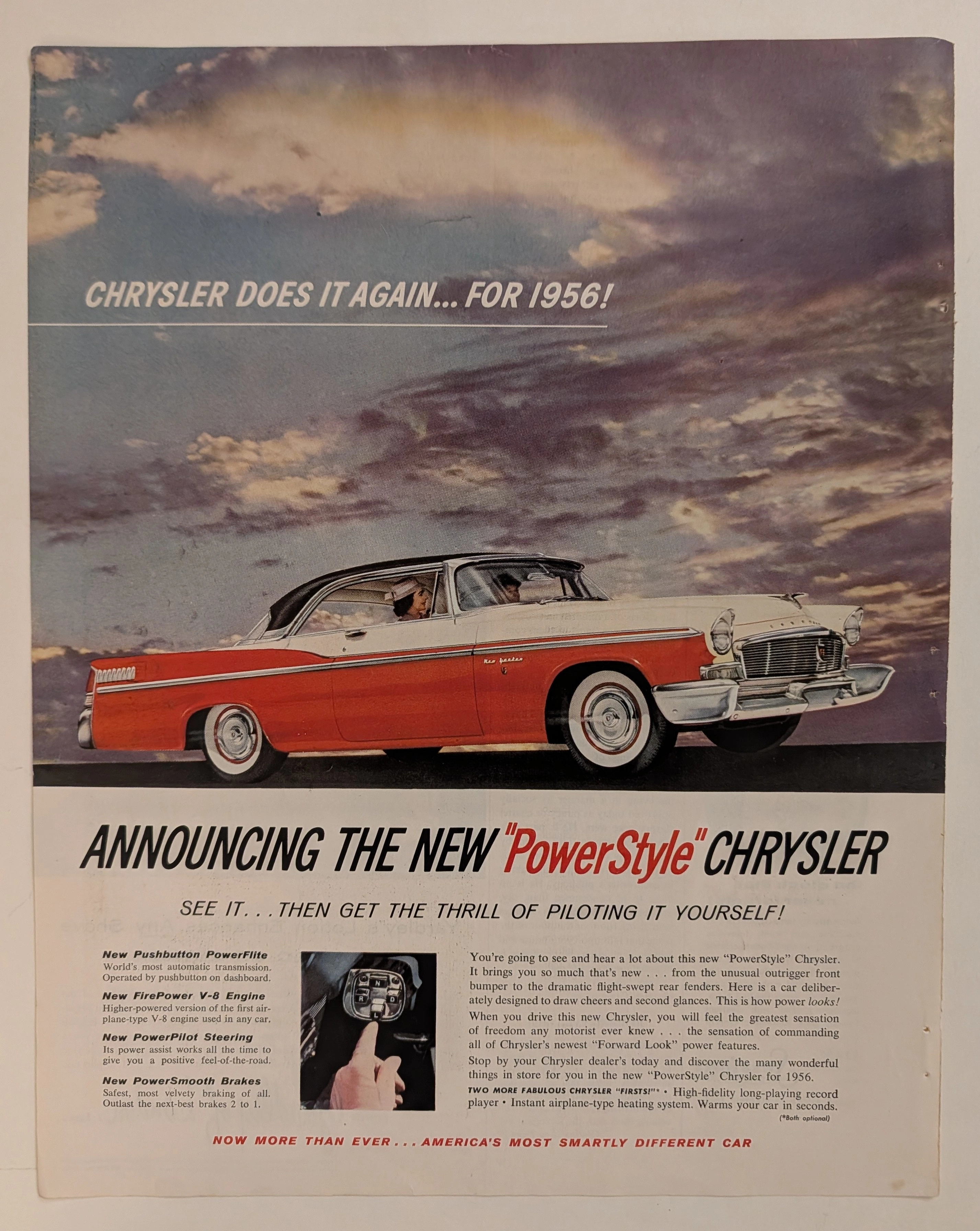
Chrysler · Automotive
The Time Traveller's Dossier: The Architecture of Command and Authority – The 1956 Chrysler "PowerStyle" Manifesto
History is not merely chronicled through written texts; it is forged in cold steel, sculpted in gleaming chromium, and dictated by the absolute, ruthless triumph of industrial design. Long before the modern world was infected and subdued by sterile digital algorithms and soulless autonomous vehicles, there was an era where the guttural roar of a V-8 engine was the ultimate symphony of American prosperity. In this bygone epoch, automotive architecture was a literal weapon—a physical manifestation used to declare a man’s absolute sovereignty over space and time. The historical artifact that stands before us is not merely a decaying magazine advertisement ravaged by the decades. It is an absolute "Blueprint of Victory." It is the visual manifesto utilized by Chrysler in 1956 to violently obliterate the mundane complacency of its rivals, aggressively establishing the "Era of Pushbutton Command" as the mandatory new standard for the American elite. This museum-grade academic archival dossier will execute an exhaustive, uncompromising deconstruction of the 1956 Chrysler New Yorker "PowerStyle" campaign—the absolute zenith of the legendary "Forward Look" design philosophy. Through the highly specialized lens of visual forensics and commercial semiotics, we will expose how every single brushstroke, every shadow, and every line of copywriting was deployed in a calculated psychological war to transform the ordinary "driver" into a sovereign "pilot." This document serves as an undeniable testament to how Chrysler artificially engineered "America's most smartly different car," weaponizing the zeitgeist of the Jet Age to monopolize consumer desire. This is a Class S marketing relic that has survived the destructive progression of time to validate its supremacy in your hands today.
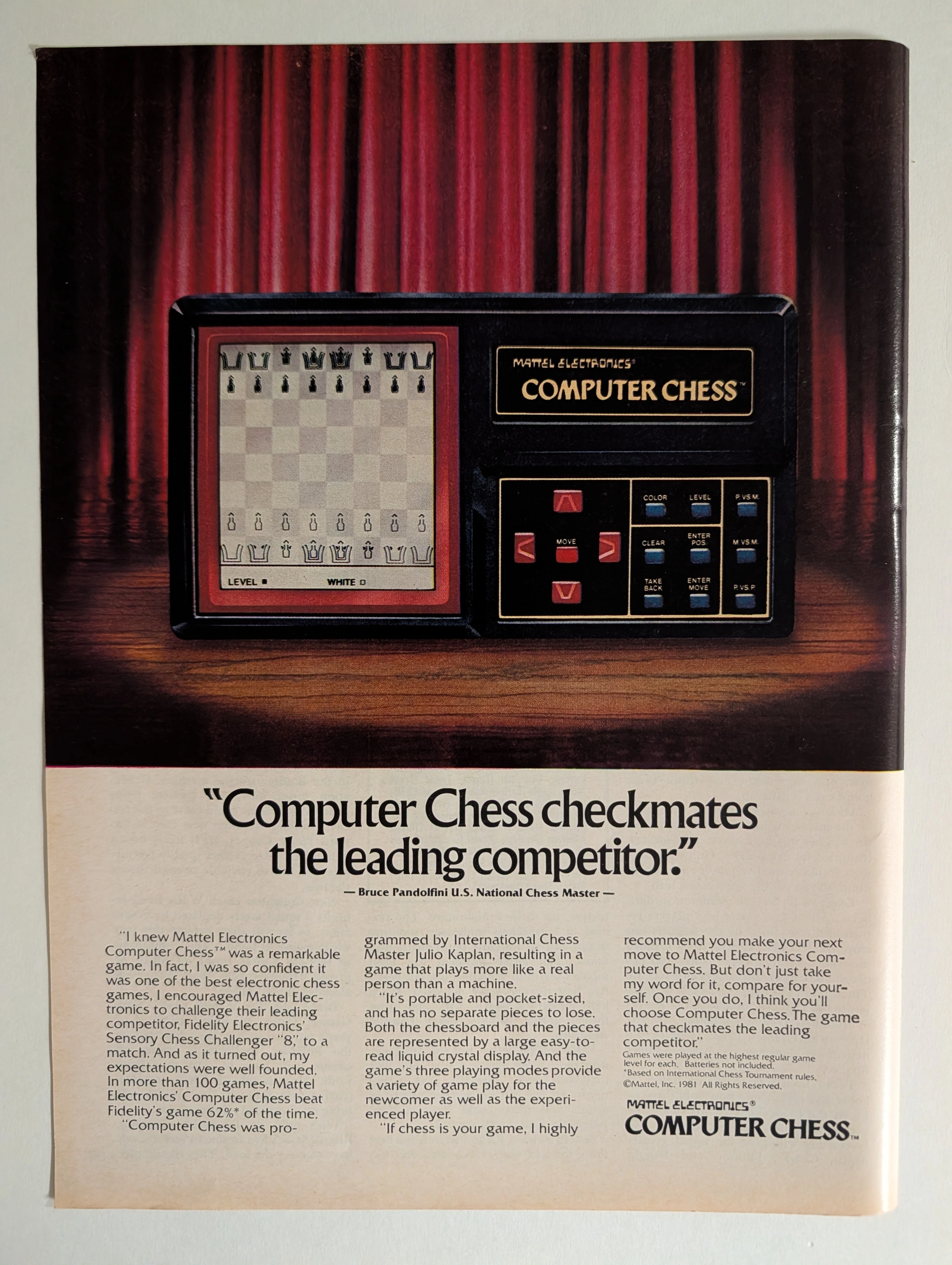
Mattel Electronics Computer Chess 1981 Full-Page Ad | Bruce Pandolfini | Julio Kaplan | Chess AI History | Deep Analysis Rarity Class A
The advertisement analyzed here is a full-page full-color magazine advertisement for the Mattel Electronics Computer Chess™ handheld/tabletop electronic game, copyright © Mattel, Inc. 1981. The ad ran in major American consumer magazines during 1981–1982 — the golden apex of the first electronic game boom. It features a dramatic theatrical photograph of the device spotlit against red velvet curtains on a wooden stage, with a bold competitive claim endorsed by U.S. National Chess Master Bruce Pandolfini: that Mattel's Computer Chess beat Fidelity Electronics' Sensory Chess Challenger '8' in more than 62% of over 100 head-to-head games. The ad also credits International Chess Master Julio Kaplan as programmer. This single page represents the intersection of early consumer AI history, 1980s toy advertising at its most theatrical, and a pivotal moment in the chess-computer arms race that prefigured Deep Blue.
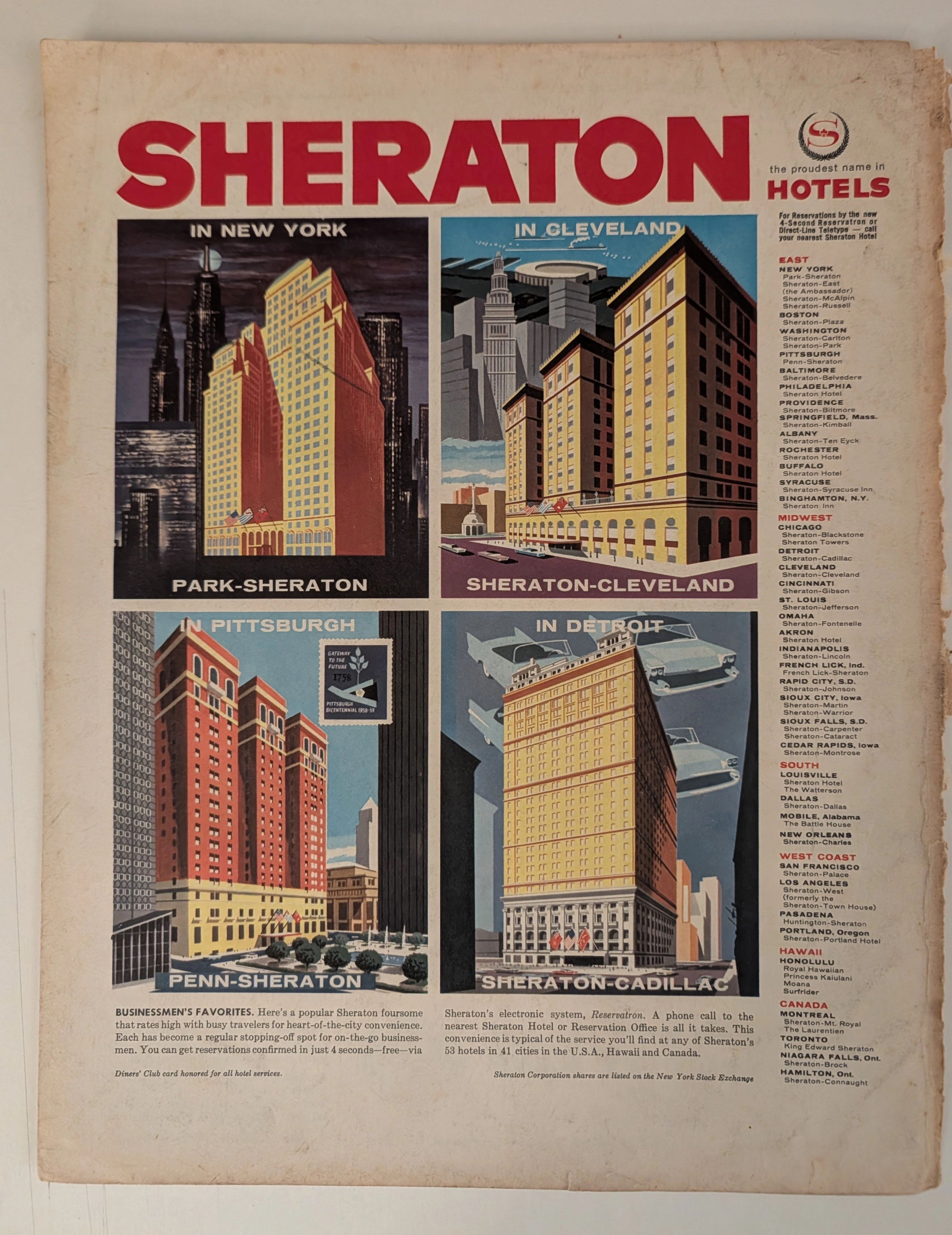
THE TIME TRAVELER'S DOSSIER: THE ARCHITECTURE OF POWER AND THE BIRTH OF THE DIGITAL WORLD IN THE 50S
The artifact under exhaustive, uncompromising museum-grade analysis is a remarkably preserved Historical Relic originating from the absolute zenith of the post-war American economic boom. This Primary Art Document is a sweeping, monumental full-page advertisement for the Sheraton Hotels empire, forensically dated to circa 1958–1959 via the explicitly illustrated Pittsburgh Bicentennial (1758-1958) stamp embedded within the artwork. This document is not merely a travel advertisement; it is a profound "Sociological Blueprint of the American Corporate Ascendancy." Visually anchored by four hyper-stylized, architectural illustrations of Sheraton's flagship properties—New York, Cleveland, Pittsburgh, and Detroit—the piece captures the era's unbridled optimism. Each panel is a masterpiece of mid-century commercial illustration, particularly the Detroit panel featuring ethereal, floating tail-fin automobiles symbolizing the Motor City's dominance. Furthermore, this artifact documents critical milestones in global business history. It proudly advertises the acceptance of the Diners' Club card, marking the revolutionary dawn of the modern credit card era. It also boasts of Sheraton's "Reservatron" electronic system—one of the earliest commercial applications of computing in the hospitality industry—and proudly declares its listing on the New York Stock Exchange. Rescued from the binding of a forgotten, heavy-stock periodical, this pre-2000s analog artifact is an unforgeable testament to the Japanese aesthetic of wabi-sabi. Printed on inherently acidic wood-pulp paper, it exhibits a beautifully violent, jagged right margin and a deep, warm amber oxidation across its surface. This majestic, unstoppable chemical degradation transforms a mass-produced corporate propaganda piece into an irreplaceable, ready-to-frame Primary Art Document of mid-century architectural and economic history.