— The Record Institute Journal")
 — The Record Institute Journal")
 — The Record Institute Journal")
 — The Record Institute Journal")
 — The Record Institute Journal")
The Time Traveller's Dossier: The Architecture of Aristocracy – Chivas Regal "Prince of Whiskies" Advertisement (Circa Mid-1950s)
The History
To properly contextualize the immense cultural and commercial weight of this artifact, we must delve deeply into the origins of Chivas Brothers, the complex system of Royal Warrants, and the macroeconomic landscape of the post-World War II spirits market.
The lineage of Chivas Regal traces its roots to 1801, when a luxury grocery and wine merchant was established in Aberdeen, Scotland. The brothers James and John Chivas gained a formidable reputation for supplying the finest provisions to the Scottish elite, eventually developing proprietary blends of aged whiskies to satisfy their discerning clientele. Their commitment to exceptional quality was formally recognized when Queen Victoria granted Chivas Brothers their first Royal Warrant in 1843, appointing them purveyors of goods to her royal household at Balmoral Castle.
The specific advertisement under our lens, however, belongs to a fascinating transitional era. At the very bottom of the crest, the text proudly proclaims: "By Appointment Purveyors of Provisions and Scotch Whisky to the late King George VI." King George VI, the beloved monarch who guided the British Empire through the harrowing trials of World War II, passed away in February 1952. The deliberate use of the phrase "the late King George VI" accurately dates this advertisement to the mid-to-late 1950s. During this period, brands holding warrants from the deceased monarch were permitted to continue displaying the royal arms for a transitional period, allowing them to honor their historical appointment while navigating the dawn of Queen Elizabeth II's reign. This inclusion serves as the ultimate institutional endorsement, legitimizing the brand not merely as a commercial enterprise, but as an integral component of the British establishment.
The 1950s marked a renaissance for Chivas Regal, particularly in the United States. Following the acquisition of Chivas Brothers in 1949 by Samuel Bronfman of Seagram's, a calculated strategy was deployed to position Chivas Regal 12-Year-Old as the undisputed premier luxury Scotch in America. The post-war American economy was booming, yielding a burgeoning middle and upper-middle class eager to invest in markers of sophistication, European heritage, and upward social mobility.
This advertisement is a masterstroke of that era. It does not focus on the technicalities of the blending process or the geographical terroir of the Scottish Highlands. Instead, it invites the consumer into an exclusive, highly romanticized tableau. The caption reads: "From the Pipers' Gallery of a 16th century manor house, a peal of welcome will announce the Christmas Feast." By purchasing this bottle, the mid-century American consumer was not merely buying a beverage; they were acquiring a tangible, consumable passport into the landed gentry of a 16th-century Scottish manor. They were purchasing tradition, warmth, and the regal title: "Scotland's Prince of Whiskies."
Part 1: The Visual Semiotics of the Baronial Hall
In an era before digital photography dominated advertising, the deployment of classical illustration was a deliberate, strategic choice designed to evoke permanence, artistry, and historical depth. The artist—working in a rich, painterly style—has meticulously constructed an idealized Scottish baronial hall.
Every architectural and decorative element within the frame is deeply encoded with symbols of established wealth and ancient lineage. The heavy oak paneling, the roaring fire in the grand stone hearth, the ancestral portraits, and the heraldic banners all converge to create an atmosphere of profound, unshakeable tradition. Above the fireplace, an imposing equestrian sculpture—perhaps evoking a legendary Scottish hero—reinforces the narrative of noble conquest and chivalry. The pipers standing on the elevated gallery add a distinct layer of regional authenticity and ceremonial grandeur. By placing the bottle of Chivas Regal in the foreground of this magnificent setting, resting on an elegant golden salver, the brand visually equates the whisky with the treasures of the manor. The golden liquid within the bottle is presented as the very essence of the warmth and hospitality radiating from the hearth.
Part 2: The Typography of Antiquity
The textual elements of this advertisement are curated with the same historical reverence as the illustration. The headline begins with a stunning, illuminated drop-cap 'G', a direct visual reference to medieval manuscripts and ancient scriptures (clearly visible in the extreme macro photograph provided). This intricate detail, featuring a red serif letter framed by delicate golden linework against a pale blue background, sets an immediate tone of scholarly age and artisanal craftsmanship.
The primary slogan, "Great welcome makes a merry feast... and to pledge the welcome... Scotland's Prince of Whiskies," utilizes an elegant, sweeping cursive script. This typographical choice mimics the refined penmanship of aristocratic correspondence, creating a sense of intimacy and high social standing. It softens the commercial nature of the advertisement, presenting the product as a gracious recommendation from a generous host rather than a corporate pitch.
Part 3: The Royal Warrant and the Crest of Authority
The deployment of the Royal Warrant is perhaps the most powerful sociopolitical tool utilized in this artifact. In the lower center of the page, flanked by the brand's history, sits the intricate coat of arms. The Royal Warrant is not a marketing gimmick; it is an official mark of recognition granted to individuals or companies who have regularly supplied goods or services to the Royal Household.
By prominently featuring this crest, Chivas Brothers effectively aligned their brand with the supreme authority of the British monarchy. To the 1950s consumer, particularly the American consumer fascinated by royalty, this crest functioned as an unimpeachable guarantee of quality. It implied that the whisky resting on their suburban bar cart was of the exact same caliber as that served in the drawing rooms of Buckingham Palace.
The Paper
As a physical entity, this carefully extracted single magazine tear sheet—which must be recognized as a standard magazine size page and definitively not a modern reproduction—is a pristine, isolated record of mid-20th-century analog offset lithographic printing. The medium-weight, uncoated paper stock, originally designed for mass distribution, has gracefully entered an era of historical maturation. Its current physical state requires evaluation through the elevated aesthetic philosophy of wabi-sabi (侘寂)—the profound appreciation of the beauty inherent in the natural, quiet progression of time.
Visual Forensics and the Anatomy of the Halftone:
Subjecting the extreme macro photographs of this artifact to visual forensics reveals the intricate mechanical ballet of the pre-digital printing press. Under high magnification, the seamless, painterly illusion of the manor house and the illuminated drop-cap 'G' resolves into a precise, mathematically rigorous constellation of CMYK (Cyan, Magenta, Yellow, Key/Black) halftone rosettes. The distinct grain of the offset printing process is beautifully visible, particularly within the detailed rendering of the Royal Crest and the intricate linework of the typography. These microscopic dots serve as the undeniable physical coordinates anchoring this piece to its specific era of industrial craftsmanship.
Furthermore, the most historically significant aspect of this artifact is its Material Degradation. An examination of the generous, unprinted margins reveals a genuine and entirely natural "Toning." This gradual, irreversible yellowing is the result of the chemical oxidation of organic Lignin trapped within the paper's wood pulp, reacting to decades of ambient light and air exposure.
In the realm of archival preservation, this ephemeral nature is of paramount importance. Analog print media from the 1950s represents a finite and dwindling reservoir of cultural history. This organic, breathing degradation is a unique temporal fingerprint that cannot be cloned or replicated by contemporary digital scanning technologies. As these original pages slowly succumb to natural oxidation, their availability in the global collector's market diminishes continuously. It is this precise, irreversible march of time—the organic aging of the paper itself—that drives up its market value exponentially. The evolving patina transforms this artifact from a mass-produced page into a singular, irreplaceable historical document, ensuring its aesthetic and financial worth will continue to appreciate as a treasured relic of a bygone medium.
The Rarity
Rarity Class: A (Advanced / Highly Desirable)
Within the rigorous parameters of international archival evaluation, this artifact merits a definitive Class A designation. The paradox of mid-20th-century print ephemera lies in the vast gulf between its original mass production and its extreme scarcity today. Vintage magazines of this era were the quintessential disposable media, intended for brief consumption before being discarded.
For this specific, single-page advertisement to have survived over seven decades—evading the destructive forces of mishandling, moisture, and catastrophic structural center creases—is an extraordinary archival anomaly. Moreover, to discover a Chivas Regal advertisement featuring this specific, highly detailed holiday manor illustration, where the CMYK pigments retain their original warmth and depth while exhibiting only the authentic, natural hallmarks of wabi-sabi aging, is remarkably rare. Pristine artifacts of this specific era of heritage marketing are highly sought after by curators of spirits history and collectors of mid-century commercial art. They are acquired with the express purpose of executing museum-grade, acid-free conservation framing, preserving them permanently as elegant testaments to the golden age of analog brand building.
Visual Impact
The aesthetic command of this artwork lies in its masterful use of color theory to elicit a specific emotional response. The artist has utilized a warm, enveloping palette dominated by rich ambers, deep mahogany browns, and vibrant reds. The roaring fire serves as the primary light source within the illustration, casting a golden glow across the ornate carpet, the polished silver on the sideboard, and the intricate details of the fireplace.
This warmth is brilliantly echoed in the product placement at the bottom right. The bottle of Chivas Regal, rendered with meticulous attention to the reflections on the glass and the metallic sheen of the label, glows with the same amber light as the hearth. This visual symmetry creates a powerful subconscious association: the whisky is the warmth of the fire, the comfort of the manor, and the joy of the holiday feast.
Exhibition Halls
The Archive Continues
Continue the Exploration

Ford · Automotive
The Time Traveller's Dossier: The Ten-Dollar Titan – The Autolite Ford Indianapolis 500 Exhibition
The synthesis of high-stakes motorsport engineering and everyday consumer accessibility represents a pinnacle achievement in mid-twentieth-century American commercial strategy. The historical artifact elegantly secured upon the analytical table of The Record Institute today is a majestic full-page print advertisement for Autolite Ford Ignition Coils, originating from the golden era of 1960s automobile racing. This document completely transcends the traditional boundaries of automotive parts marketing. It operates as a profound, sophisticated declaration of how cutting-edge technological innovation on the racetrack was democratized and delivered directly into the hands of the American middle class, transforming the daily commute into an extension of the Indianapolis 500. This world-class, comprehensive dossier conducts a meticulous and deep examination of the artifact, operating under the absolute most rigorous parameters of historical, sociological, and material science evaluation. We will decode the brilliant, kinetic pit-stop scene capturing an open-wheel race car, and analyze the dramatic visual juxtaposition of this high-speed chaos against the highly structured, calculated copywriting of the Ford Motor Company. Furthermore, as we venture into the chemical and physical foundations of this analog printed ephemera, we will reveal the mechanical fingerprints of the CMYK halftone rosettes and the graceful, natural oxidation of the paper substrate. This precise intersection of visual nostalgia, motorsport heritage, and the chemistry of time cultivates a serene wabi-sabi aesthetic—a natural, irreversible phenomenon that serves as the primary engine driving up its market value exponentially within the elite global spheres of Vintage Automotive Ephemera and Motorsports Archives collecting.
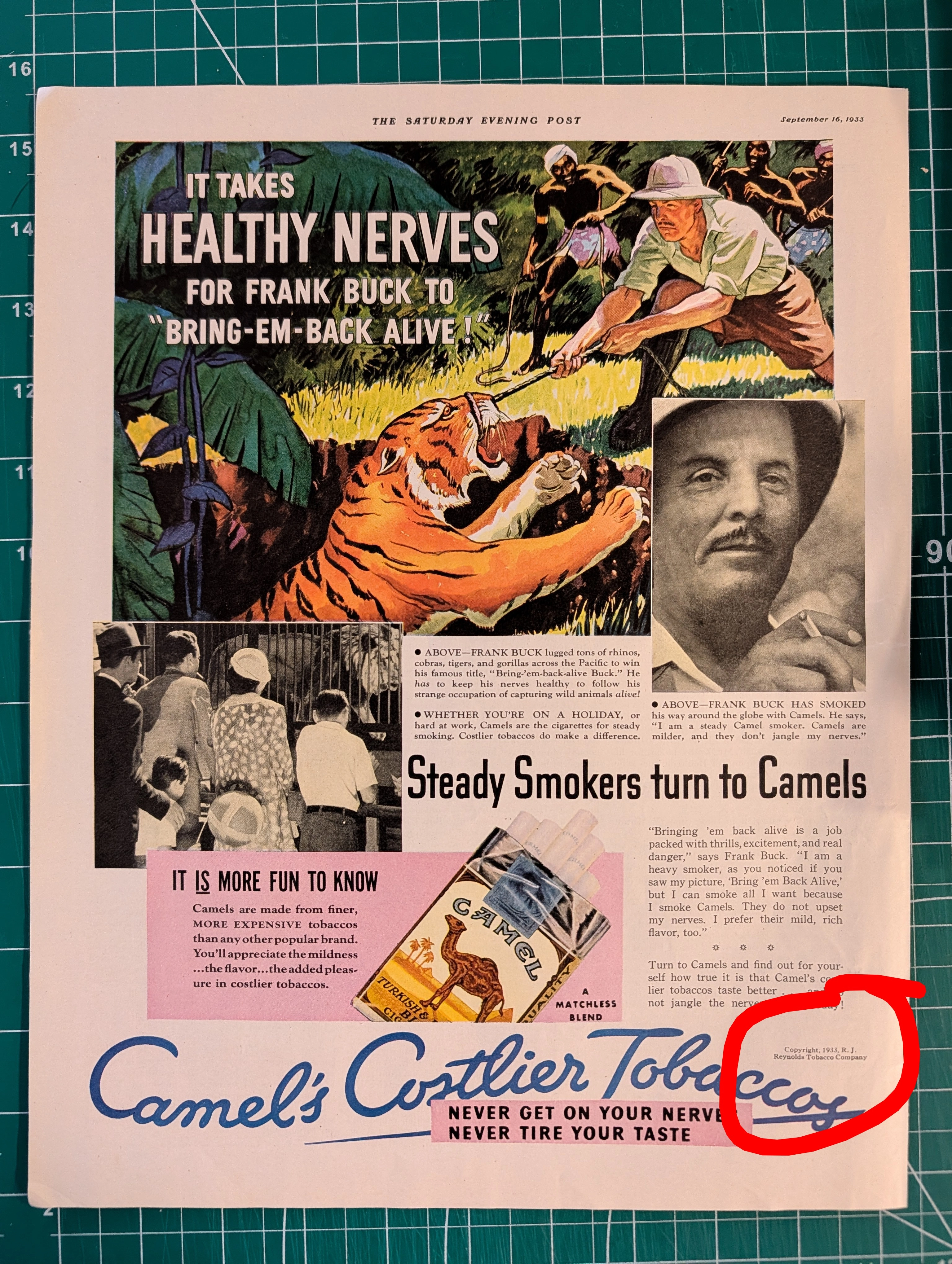
THE TINY TEXT THAT AUTHENTICATES HISTORY Why Fine Print in Magazine Advertisements Matters More Than You Think
Tiny copyright notices in magazine ads originated from mandatory US copyright law (1909 Act) and sector-specific regulations (BATF for alcohol). They function as layered authentication evidence: typographic era-consistency, regulatory language accuracy, ink/paper forensics, and contextual integrity — paralleling vintage band tee authentication methods. Collaboration credits (Pierre Cardin × Tiffany & Co.) and creative credits (photography, calligraphy, fashion) document commercial relationships lost to no other record.
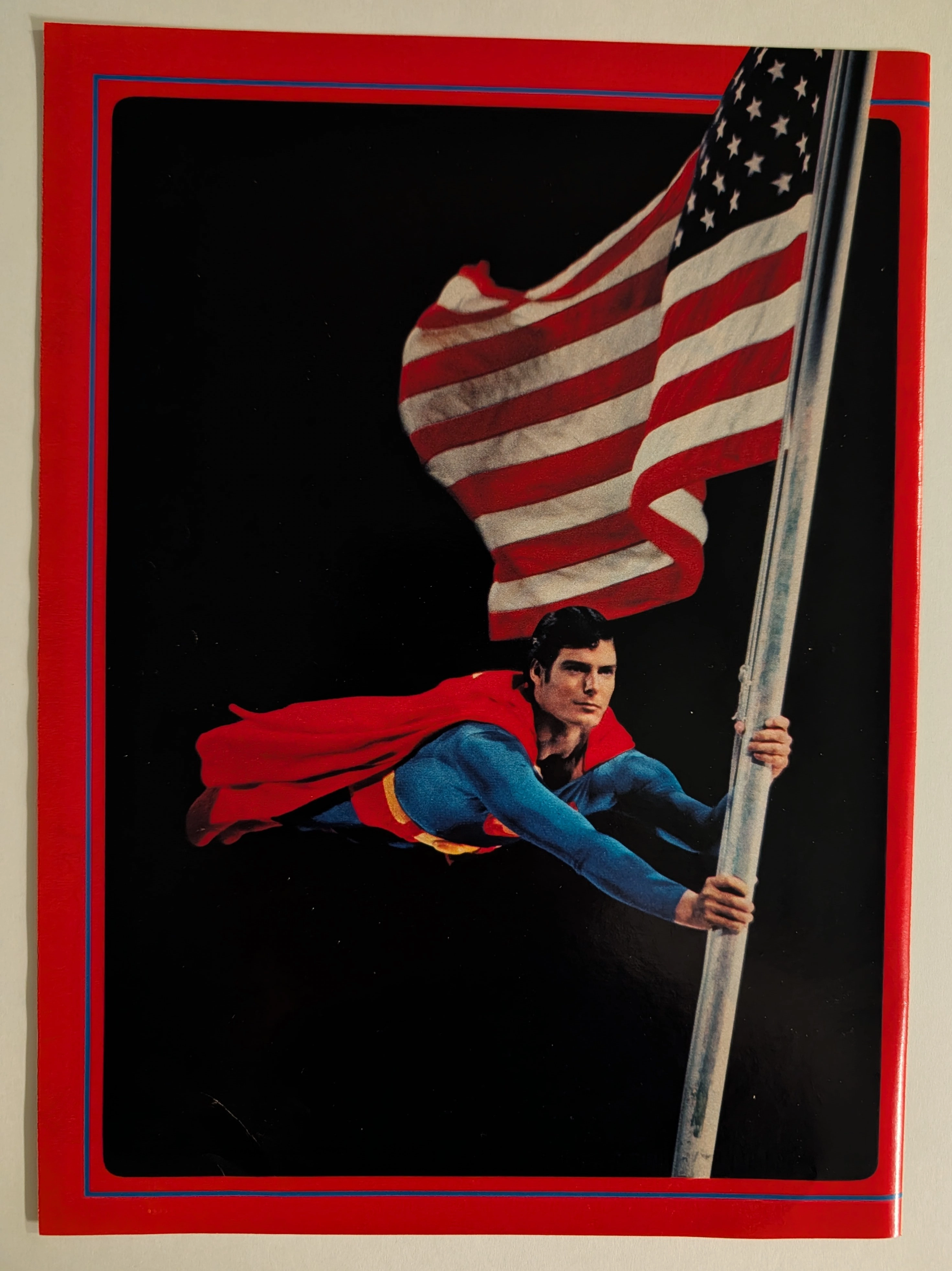
THE TIME TRAVELLER'DOISSIER : SUPERMAN — The Christopher Reeve Flagpole Postcard and the Birth of the Superhero Blockbuster
The item analyzed is an official Superman movie merchandise postcard or large-format photo card, featuring Christopher Reeve as Superman clinging dramatically to a metal flagpole while a large American flag billows behind him against a pure black background. The image is framed with a bold red outer border and a thin blue inner rule — a design consistent with the official Superman: The Movie (1978) merchandising aesthetic produced under license from Warner Bros. and DC Comics. Christopher Reeve (September 25, 1952 – October 10, 2004) portrayed Superman in four films (1978, 1980, 1983, 1987) and is universally regarded as the definitive cinematic Superman. This specific image — the flagpole scene lit dramatically against black — is one of the most iconic publicity photographs from the original film's promotional campaign. The physical item shows signs of age consistent with approximately 45–47 years, with slight surface wear and minor corner softening visible. The postcard format (estimated 4×6 or 5×7 inches) and the glossy coated stock are typical of high-quality movie merchandise of the late 1970s.