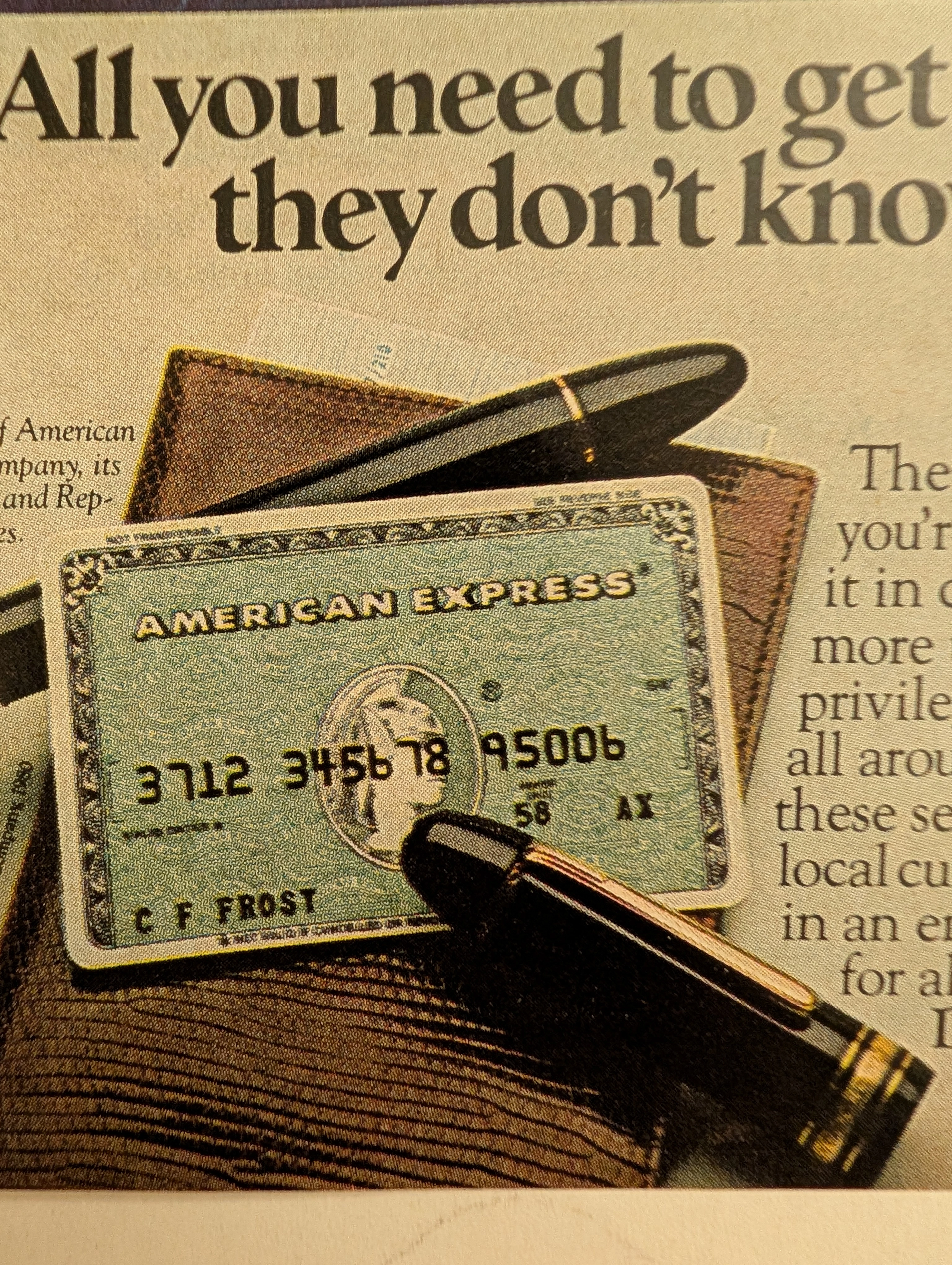
— The Record Institute Journal")
 — The Record Institute Journal")
 — The Record Institute Journal")
 — The Record Institute Journal")
 — The Record Institute Journal")
 — The Record Institute Journal")
 — The Record Institute Journal")
 — The Record Institute Journal")
 — The Record Institute Journal")
The Time Traveller's Dossier: The Aesthetics of Gifting and Consumer Hypnosis – Skyway Luggage Advertisement (Circa 1950s)
The History
To genuinely decode the complex sociological architecture and the brainwashing strategies embedded within this printed page, we must pull back the lens to contextualize the overwhelming macroeconomic history of the United States during the 1950s. This era was the golden dawn of post-WWII consumerism. The American middle class was experiencing an explosive expansion, armed with unprecedented levels of disposable income. The Christmas season had mutated from a purely religious observance into a highly lucrative, cutthroat "sacred battleground" for retail brands fighting tooth and nail for consumer dollars.
Within this brutal arena, Skyway Luggage faced a significant logistical challenge: How do you sell "luggage"—which is fundamentally a cold, industrial product manufactured with synthetic "Koroseal" polymers and heavy cast chromium locks—as a warm, emotionally charged holiday gift? Their solution was not to merely list the engineering specifications of durability. Instead, they coated their industrial products in the "aesthetics of a dream." They had to visually soften the metallic hardware and transmute a cosmetics case or a briefcase into the ultimate object of desire that both the giver and the receiver desperately craved.
Creator / Illustrator Information (The Genius of the Creator and Hypnosis via Brushstroke):
This piece of commercial illustration is not a disposable, rushed production; it is an absolute masterwork conceptualized and signed by Ren Wicks (his signature is strategically and elegantly integrated into the snow beneath Santa Claus's boot).
Who is he, and why is he crucial? Ren Wicks was one of the most influential and highly revered American commercial illustrators and pin-up artists of the mid-20th century. He achieved legendary status for his breathtaking aviation art—frequently collaborating with aerospace titans like Lockheed and major global airlines—as well as his unparalleled expertise in stylized commercial portraiture. Wicks's genius lay in his ability to seamlessly fuse photorealism with breathtaking idealization.
Skyway’s decision to utilize illustration by the hand of Wicks for this holiday campaign, rather than relying on photography, is a highly calculated and immensely valuable semiotic decision. Photography would have been too rigid, too cold, and irrevocably anchored to physical reality. Wicks's brushstrokes, however, granted absolute totalitarian control over the visual narrative. He employed his signature rendering techniques to create hyper-real, mesmerizing figures—a mischievous, cherubic angel with impossibly large eyes, and a slyly winking Santa Claus with a flowing, dynamic beard. These stylized characters are not merely decorative; they function as visual "hypnotists." They completely neutralize the cold, industrial nature of the chromium "Travelgard" locks and transform the luggage into accessible, warm, and insanely desirable "magic gifts."
Part 1: The Binary Shift: Gendered Segmentation and the Architecture of Desire
The narrative architecture of this artifact is built upon a strict, uncompromising binary contrast, ruthlessly calculated to extort maximum decision-making speed during the frantic holiday shopping season. The campaign is violently divided into two distinct realms, adhering flawlessly to the rigid gender norms of the 1950s:
The "Her" Domain: The page featuring the angel presents the "Coquette" cosmetics case. Strikingly, it is offered in an expansive, almost overwhelming palette of seven distinct colors (danube, burma, cedar, matador, jet, frost, mint). The deployment of the cherub signifies beauty, purity, and meticulous care—mirroring the feminine ideal of the era. This case is not presented as mere storage; it is framed as a "sacred treasure chest" to conceal and protect the weapons of feminine beauty.
The "Him" Domain: Conversely, the page featuring Santa Claus presents the "Fly-Brief." It is strictly limited to a highly conservative, aggressive, and authoritative two-color palette (burma, cedar). The winking Santa conveys a playful yet commanding energy of the ultimate "provider." This briefcase is the ultimate symbol of the powerful businessman, ready to take flight for transcontinental corporate negotiations.
This surgical market segmentation is retail brilliance at its absolute zenith. It completely eradicates any hesitation or confusion in the gift-buying process. Skyway is broadcasting a devastatingly effective psychological message to the consumer: "We have already done the categorization and the thinking for you. Your only job is to pay us."
Part 2: The Subtle Endorsement of Aerospace Authority
Even though this campaign is heavily driven by festive Christmas aesthetics, Skyway did not miss the opportunity to elevate their brand status far above generic luggage manufacturers. They cunningly weaponized the sheer prestige and authority of Trans World Airlines (TWA) as a paramount semiotic anchor.
The presence of the TWA logo and the silhouette of a Lockheed Constellation (the absolute zenith of luxurious transcontinental flight at the time), paired with the copy "flight-right" in the bottom right corner, does not steal the spotlight from Santa or the angel. Instead, it functions as a quiet, devastatingly effective "Seal of Approval." Tethering their brand name to a global airline that flies to the "USA, Europe, Africa, Asia" sends a clear psychological message: "This luggage is not just beautiful enough to be a gift; it is engineered to withstand the brutal rigors of circumnavigating the globe. It meets aerospace standards." It instantly grants the recipient of the gift an undeniable elite status.
Part 3: The Fetishization of Hardware
The most magnificent paradox of this advertisement is that, amidst the sweet, sugary atmosphere of the holidays, the brand aggressively inserts macro close-up illustrations of their "Travelgard" locks and hinges. Doing so creates a deliberate and highly calculated "Fetishization" of industrial metallic hardware.
The copy proudly and aggressively declares, "ONLY SKYWAY HAS THIS PATENTED 'TRAVELGARD' HARDWARE." This relentlessly reinforces the concept of maximum security and innovation. It reassures the buyer that beneath the beautiful pastel colors, this luggage possesses the structural integrity of a bank vault. It is a flawless synthesis of high-fashion aesthetics and engineering reliability.
The Paper
As a physical entity, these tear sheets, meticulously excised and sold as isolated single pages, are an unrepeatable record of late-analog offset lithographic printing. It is an absolute, ironclad rule that must be permanently etched into the historical record: this physical artifact is an individually cut, standard magazine-sized page. It was engineered for intimate, handheld consumption. It is NOT, under any circumstances, a massive promotional wall poster!
This medium-weight, matte-coated magazine stock was originally manufactured by the ton for mass distribution; however, its current, aged physical state demands a profound evaluation through the highest echelon of Japanese aesthetic philosophy: wabi-sabi (侘寂)—the acute recognition and appreciation of beauty found in impermanence, imperfection, and the ruthless, natural progression of time.
Visual Forensics & Substrate Analysis (The Economics of Decay):
Subjecting extreme macro close-ups of Ren Wicks's artwork to visual forensics reveals a fascinating duality. Under high magnification, the soft, romanticized brushstrokes violently shatter and dissolve into a mathematically rigorous, precise galaxy of CMYK halftone rosettes. The distinct, gritty grain of the mid-century offset printing process is the undeniable steel fingerprint of industrial mass reproduction. Produced in an era entirely reliant on analog film cameras and mechanical color separation, this artifact is a ghost of a dead technological age.
However, the most crucial, coldly calculated, and economically valuable aspect of this specific artifact lies in its Material Degradation. Examining the margins and unprinted white spaces reveals authentic, undeniable "Toning." This is a gradual, completely irreversible yellowing and browning effect caused by the natural chemical oxidation of organic lignin trapped within the paper's wood pulp, following over 70 years of relentless exposure to ambient air and ultraviolet light.
It is of paramount importance to understand the archival and market significance of this ephemeral nature. Pre-2000s analog print media represents an endangered species of historical documentation. This organic, breathing physical degradation is a fingerprint of time that cannot be cloned, replicated, or faked by any modern high-precision digital scanning process. As these original pages slowly consume themselves through the oxidation of lignin, becoming increasingly fragile and brittle, their supply in the elite global collector's market shrinks every single day. It is precisely this ticking clock of physical impermanence—the raw, brutal fact that this paper is slowly disintegrating and returning to the earth—that is the exact catalyst driving up its market value exponentially. The evolving patina elevates a repeatedly printed advertisement into a singular, unique artifact covered in historical scars, generating immense financial wealth for these individually cut and sold sheets today.
The Rarity
Rarity Class: S (Rare Crossover / Historic Era Synergy)
Within the strictest parameters of international archival evaluation, this set of artifacts skyrockets to a definitive Class S (Rare Crossover) designation. The ultimate paradox of analog print ephemera lies in the violent contrast between its incredibly cheap, initial mass production and its extreme, near-extinct scarcity today. Vintage magazines were the quintessential "disposable media," pre-destined to be incinerated or thrown into the recycling pulper.
For a full-page artwork by the master illustrator Ren Wicks, featuring flawless gendered segmentation (the Cherub and Santa), and perfectly paired in a crossover with the now-defunct, legendary aviation titan TWA, to have survived for over 7 decades—completely devoid of destructive structural center creases—is an extreme statistical archival anomaly. Untouched, pristine remnants of this golden era synergy between the "luggage industry" and the "aviation industry" are fiercely hunted by curators of aviation history and collectors of mid-century commercial art. They are acquired with the sole intention of executing museum-grade, acid-free conservation framing, preserving them permanently as physical heirlooms of a bygone era of analog consumption.
Visual Impact
The aesthetic authority of this piece lies in Ren Wicks's master-level ability to seamlessly fuse conflicting elements into a cohesive whole. The immediate focal point that hijacks the viewer's optic nerve is the eerily realistic, tactile rendering of the luggage's leather/Koroseal texture. This hyper-realism clashes violently, yet beautifully, with the stylized, cartoonish lines of the angel and Santa Claus figures. The background is washed in a celestial pastel blue, punctuated by hand-drawn, four-pointed starbursts, creating an irresistible atmosphere of heavenly holiday magic.
The bright, blinding glints of light reflecting off the chromium handles and locks are advanced visual control techniques, deliberately engineered to force the viewer's eye directly toward the "luxury" and "build quality" of the product. This layout is an absolute masterpiece of information design; it swallows the entirety of the viewer's psychological space, guiding them smoothly from a festive holiday fantasy directly into a closed sale.
Exhibition Halls
The Archive Continues
Continue the Exploration
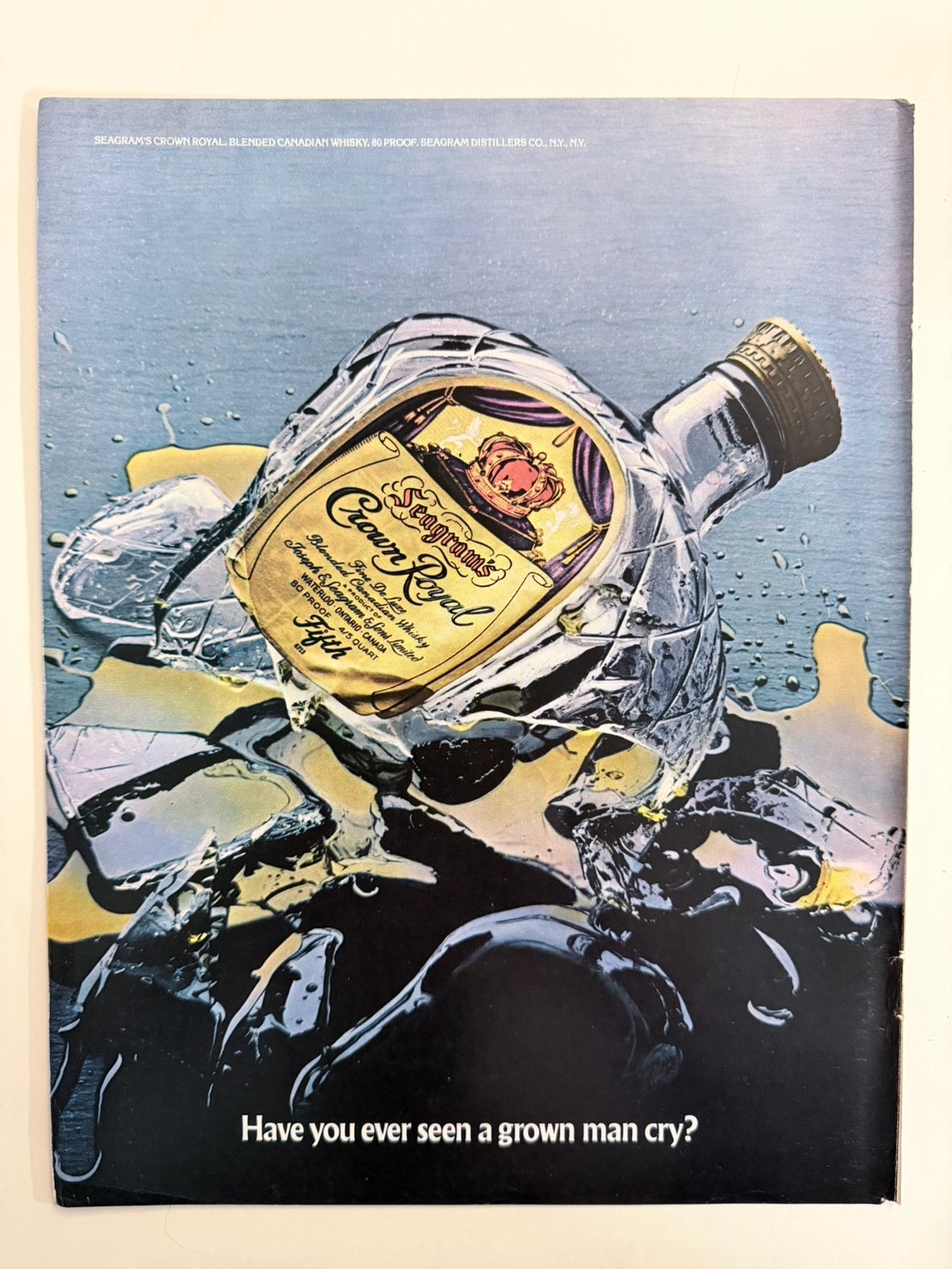
Vintage 70s Crown Royal Ad: Vanishing Analog Art | The Record
An in-depth look at the priceless 1970s Crown Royal "Have you ever seen a grown man cry?" advertisement. A masterpiece of authentic analog photography on degrading vintage paper, driving up the value of this original print as global supply inevitably shrinks.
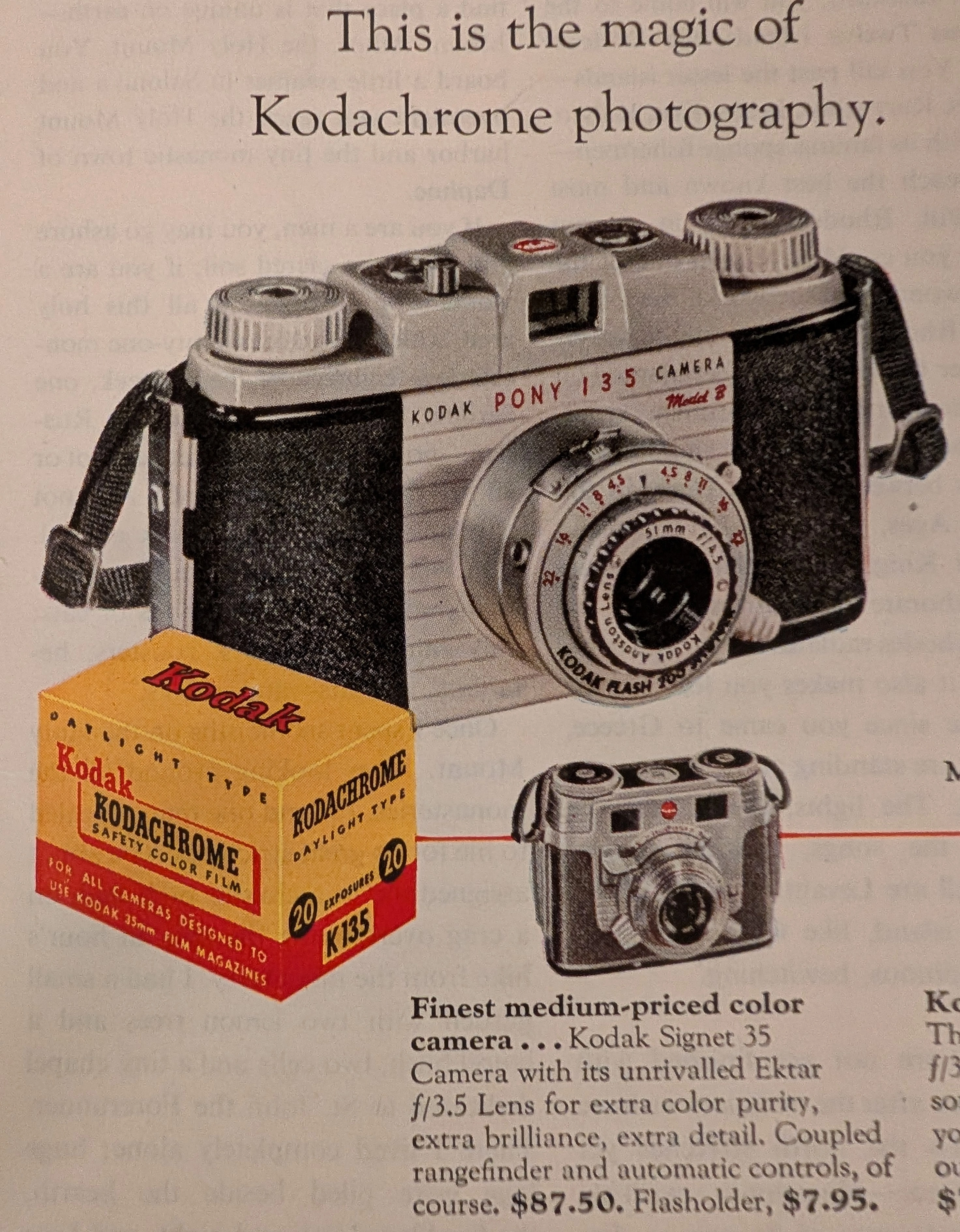
THE TIME TRAVELER'S DOSSIER: THE MAGIC OF COLOR AND THE REVOLUTION OF HUMAN MEMORY
The artifact under exhaustive, uncompromising, and unprecedented museum-grade analysis is an exceptionally preserved Historical Relic originating from the absolute golden age of mid-century American consumer technology. This Primary Art Document is a monumental, full-page advertisement for Eastman Kodak Company, specifically promoting the legendary Kodachrome Film and its ecosystem of 35mm miniature cameras. Based on the featured camera models—the Kodak Pony 135 Model B, the Kodak Signet 35, and the Bantam RF—this artifact is forensically dated to the mid-1950s, specifically circa 1954–1955, extracted from a June issue of HOLIDAY magazine. This is not a mere camera advertisement; it is a profound "Sociological Blueprint of the Post-War American Dream." The headline, "This is the magic of Kodachrome Photography", encapsulates the technological democratization of color memory. Prior to this era, color photography was the exclusive domain of elite professionals. Kodachrome, with its iconic yellow and red box, transformed ordinary suburbanites into archivists of their own vibrant lives. The ad brilliantly sells not just hardware, but a deeply emotional ritual: the "home screen" slide projection. Visually anchored by the hyper-realistic red cardboard mount of the "KODACHROME TRANSPARENCY", the document is a masterclass in aspirational marketing. Rescued from the inevitable oblivion of disposable mass media, this pre-2000s analog artifact is a breathtaking embodiment of the Japanese aesthetic of wabi-sabi. Printed on inherently acidic wood-pulp paper, it exhibits a beautifully authentic jagged left binding edge, microscopic structural creasing, and a profound, warm amber oxidation across its entire surface. This unstoppable molecular death transforms a piece of mass-produced corporate propaganda into an irreplaceable, ready-to-frame Primary Art Document of photographic and sociological history.
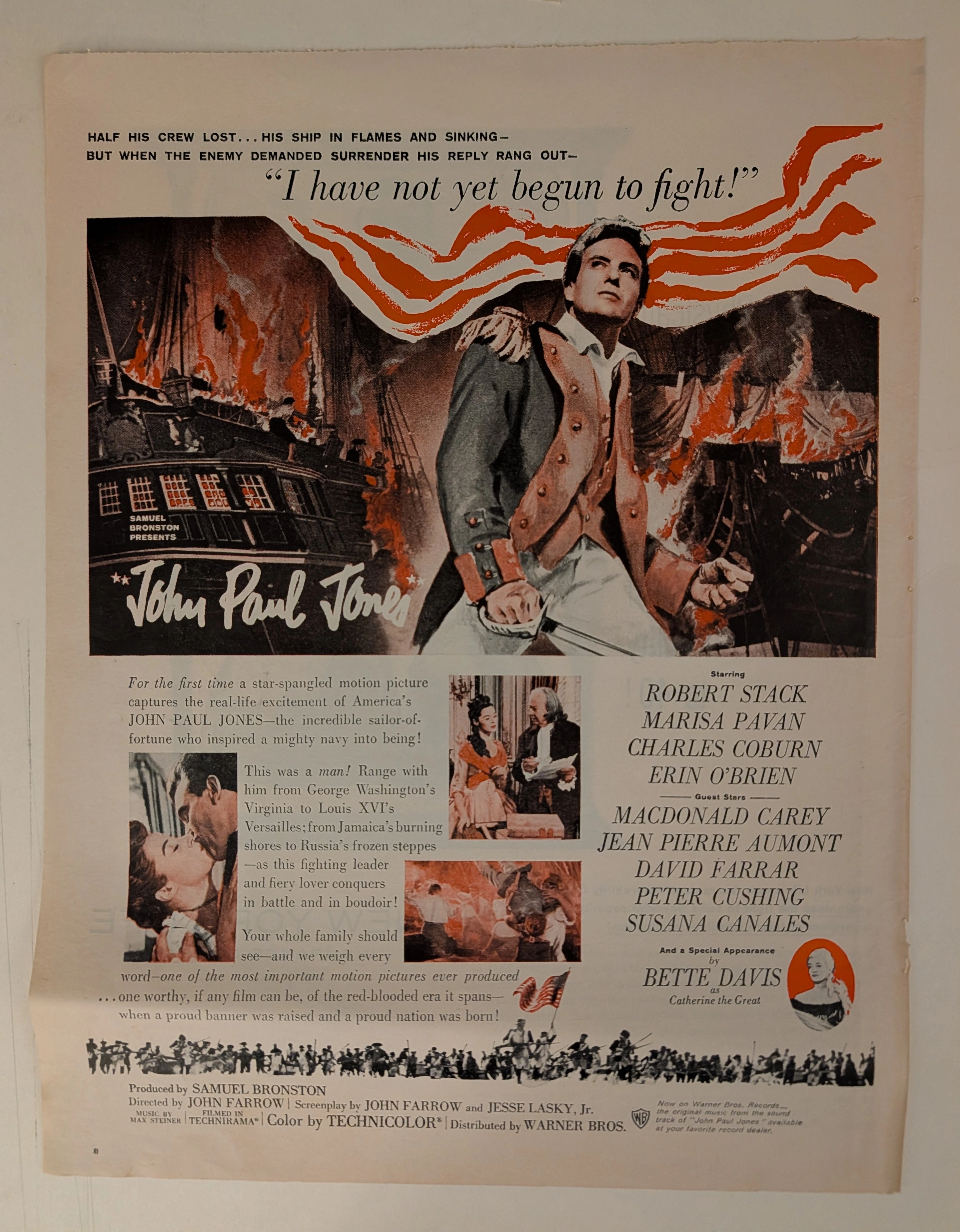
John Paul Jones · Entertainment
THE TIME TRAVELER'S DOSSIER: HOLLYWOOD PROPAGANDA AND THE DAWN OF MULTIMEDIA SYNERGY
The artifact under exhaustive, uncompromising, and unprecedented museum-grade analysis is a remarkably preserved Historical Relic originating from the zenith of Hollywood's post-war epic era. This Primary Art Document is a monumental, full-page theatrical advertisement for the 1959 biographical epic "John Paul Jones", produced by the legendary independent film mogul Samuel Bronston and distributed by Warner Bros.. This is not merely a movie poster; it is a "Forensic Blueprint of Cold War American Nationalism and Multimedia Synergy." Released in 1959, at the height of the Cold War, the advertisement aggressively weaponizes the foundational mythos of the United States Navy. The commanding, blood-red headline, "I have not yet begun to fight!", serves as a psychological anchor, projecting unyielding American defiance to both domestic audiences and global adversaries. Visually dominated by the rugged, heroic portrait of Robert Stack, the ad expertly balances masculine wartime aggression with romantic subplots and diplomatic intrigue featuring Charles Coburn as Benjamin Franklin. Furthermore, it showcases elite Hollywood casting power by explicitly highlighting a "Special Appearance by Bette Davis as Catherine the Great" in a striking red cameo vignette. Crucially, this artifact documents an early, masterful execution of cross-platform corporate synergy. The bottom corner explicitly markets the original Max Steiner soundtrack on Warner Bros. Records, proving that the commercialization of the "Original Motion Picture Soundtrack" was already highly codified. Rescued from the inevitable oblivion of disposable entertainment media, this pre-2000s analog artifact is a breathtaking embodiment of the Japanese aesthetic of wabi-sabi. Printed on inherently acidic mid-century wood-pulp paper, it exhibits beautifully authentic edge wear and a profound, warm amber oxidation across its surface. This unstoppable molecular death transforms a mass-produced piece of Hollywood propaganda into an irreplaceable, ready-to-frame Primary Art Document of cinematic and sociological history.