The Time Traveller's Dossier: The Architecture of Slumber – The 1967 Simmons Golden Value
The History
To fully appreciate the immense cultural magnitude and sociological importance of this artifact, one must meticulously contextualize the profound shifts in American domestic life during the 1960s. Following the post-WWII housing boom, the American middle class experienced unprecedented economic mobility. Concurrently, the 1960s witnessed an explosion in commercial travel, leading to the rapid development of high-end hotel and motel chains across the nation. For many Americans, these modern hotels offered a level of climate control, sophisticated design, and ergonomic comfort that surpassed their own homes. Simmons brilliantly recognized this psychological association between travel and luxury.
The headline "FIRST PUBLIC SALE!" emblazoned across the top of the spread is a masterclass in manufactured exclusivity. The copywriting explicitly states, "Simmons hotel mattress redesigned especially for your home." This strategy bypasses the traditional metric of selling a mattress based purely on materials, instead selling the authority of the hospitality industry. The text reassures the consumer: "Hotels rely on experts to select their mattresses... So do you, but you don't need to be an expert. Simmons has taken the guesswork out." It effectively democratizes luxury, offering the working-class consumer the exact same sleep architecture enjoyed by the traveling elite for a highly accessible $49.95.
The visual composition reinforces this narrative of structural superiority. The bottom of the left page features a sprawling, modernist cityscape, suggesting that the very foundation of modern urban development rests upon Simmons engineering. On the right page, a beautifully sketched illustration of a towering hotel building proudly declares, "America's finest hotels choose the individual coil construction of famous Beautyrest". This architectural imagery equates the structural integrity of a steel-and-glass skyscraper with the internal steel coil construction of the mattress, implying unmatched durability.
Further reinforcing consumer trust is the prominent inclusion of the "Good Housekeeping Guarantees" seal. In 1967, this seal was the ultimate cultural proxy for safety, reliability, and value. For the mid-century housewife, who functioned as the primary domestic purchasing agent, this red star and its promise of "replacement or refund to consumer" neutralized any perceived financial risk associated with the $49.95 investment.
Simultaneously, the artifact reveals a fascinating duality in aesthetic trends. While the engineering is marketed as modern and industrial, the visual presentation of the mattress itself clings to European aristocratic signifiers. The "handsome new cover with luxurious quilting" is adorned with repeating heraldic crests featuring a fleur-de-lis and a shield design. This specific semiotic choice provides an aura of old-world royalty to a mass-produced item. Conversely, the side panel introduces the famous "Beautyrest by Simmons" line featuring a deeply traditional, romantic floral pattern, utilizing a higher price point starting at $79.50. This dual-presentation highlights the sophisticated "good, better, best" tiered pricing architecture that defined mid-century retail strategy.
The Paper
As a physical entity, this printed artifact functions as a living, breathing, and profound record of mid-twentieth-century graphic reproduction and substrate chemistry. Under exceptional macro-lens examination, this document reveals the stunning complexity and mathematical precision of analog color printing. The intricate architectural shadows of the modern buildings, the delicate blue and gold threads of the printed heraldic crest, and the crisp, bold typography of the $49.95 price tag are all meticulously constructed from a precise, mathematically rigorous galaxy of halftone rosettes. This intricate pattern constitutes the mechanical fingerprint of the pre-digital analog offset printing press. Microscopic, varying sizes of Cyan, Magenta, Yellow, and Key (Black) ink dots are elegantly and systematically layered at specific angles to trick the human eye and the biological visual cortex into perceiving continuous, vibrant, and dimensional reality.
Yet, the most profound and impactful factor elevating the immense value of this artifact in the contemporary collector's market is the natural, organic, and entirely irreversible process of Material Degradation. The expansive margins and the overall paper substrate exhibit a genuine, unavoidable, and entirely unforgeable "Toning." This gradual, graceful transition from the original bright, bleached manufactured paper to a warm, antique ivory and golden hue is caused by the slow chemical oxidation of Lignin—the complex organic polymer that binds cellulose fibers together within the raw wood pulp of the paper. As the substrate is exposed to ambient oxygen and ultraviolet light over a span of nearly six decades, the molecular structure of the lignin gracefully and systematically breaks down. This accumulation of time, this naturally evolving patina, represents the absolute core of the wabi-sabi aesthetic. The profound appreciation for the beauty found in natural aging, impermanence, and the physical manifestation of history upon a fragile medium is an irreversible chemical reaction. It is precisely this authentic, unreplicable degradation that acts as the primary engine driving up its market value exponentially among elite collectors, as it provides the ultimate, irrefutable proof of the artifact's historical authenticity and its magnificent journey through time.
The Rarity
RARITY CLASS: B (Very Good Archival Preservation with Visible Centerfold Wear)
Evaluated under the most exacting, rigorous, and uncompromising archival parameters, this artifact is definitively and securely designated as Class B.
The remarkable and defining paradox of mid-century commercial ephemera is that these specific documents were produced by the millions as explicitly and intentionally "disposable media." Inserted into thick consumer magazines, they were inherently destined by their very nature to be briefly observed, casually folded, and ultimately discarded. For a large-format, two-page centerfold advertisement to survive since 1967 constitutes a highly significant statistical archival anomaly.
This specific artifact is a highly vulnerable two-page spread. While the rich blues of the typography and the golden yellows of the mattress quilting remain remarkably vibrant and unfaded, close inspection reveals the prominent vertical bindery crease running directly down the center of the image. Along this central fold, there is visible structural stress and slight organic discoloration inherent to the staples or adhesive of the original publication's binding. In the rigorous world of paper archiving, this physical interruption precludes a Class A grading. However, this environmental wear does not detract from its immense value; rather, it authenticates the document's journey. The sheer sociological weight of the subject matter—the translation of hotel luxury to the suburban bedroom—makes this minor structural wear aesthetically acceptable. It is ardently sought after by global curators, domestic historians, and design archivists to ensure its historical permanence through acid-free, UV-protected conservation framing.
Visual Impact
The aesthetic brilliance and psychological power of this artifact lie in its masterful execution of "Scale Juxtaposition." The art director has intentionally manipulated perspective to elevate a mundane domestic object into a monument of modern engineering.
The massive, floating Simmons Golden Value mattress dominates the absolute center of the composition, rendered in sharp, hyper-realistic detail. Beneath it, the sprawling mid-century cityscape is painted in loose, stylized, almost impressionistic strokes of blue and green. This deliberate contrast in rendering styles and scale visually communicates that the mattress is larger than life—a foundational monolith that dwarfs even the city itself. The eye is naturally drawn from the bold, commanding typography of "FIRST PUBLIC SALE!" down to the intricate gold crests of the quilting, and finally out toward the supporting architectural vignettes. It is a seamless, highly effective integration of industrial product photography and aspirational lifestyle illustration.
Exhibition Halls
The Archive Continues
Continue the Exploration
Cadillac · Automotive
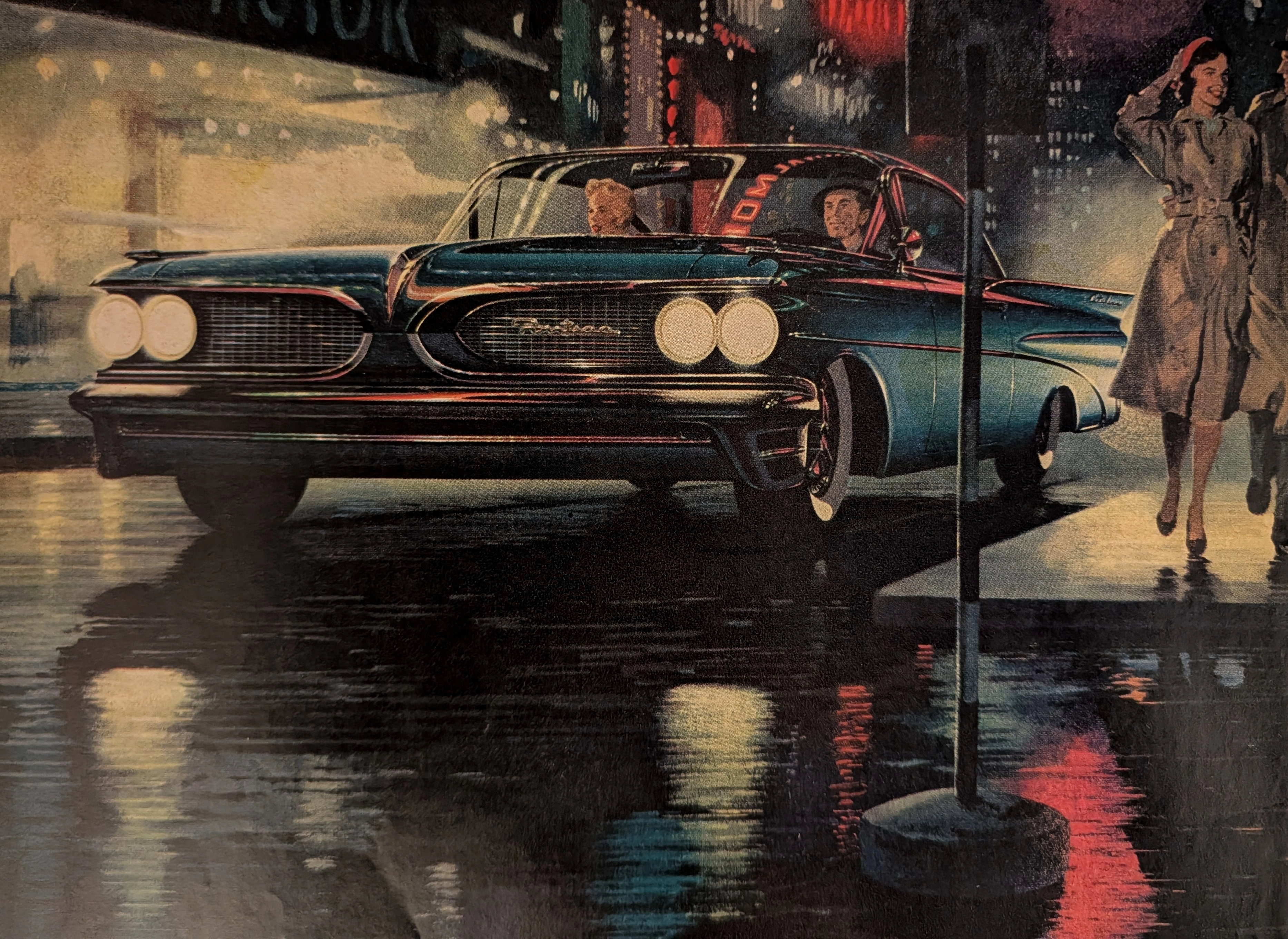
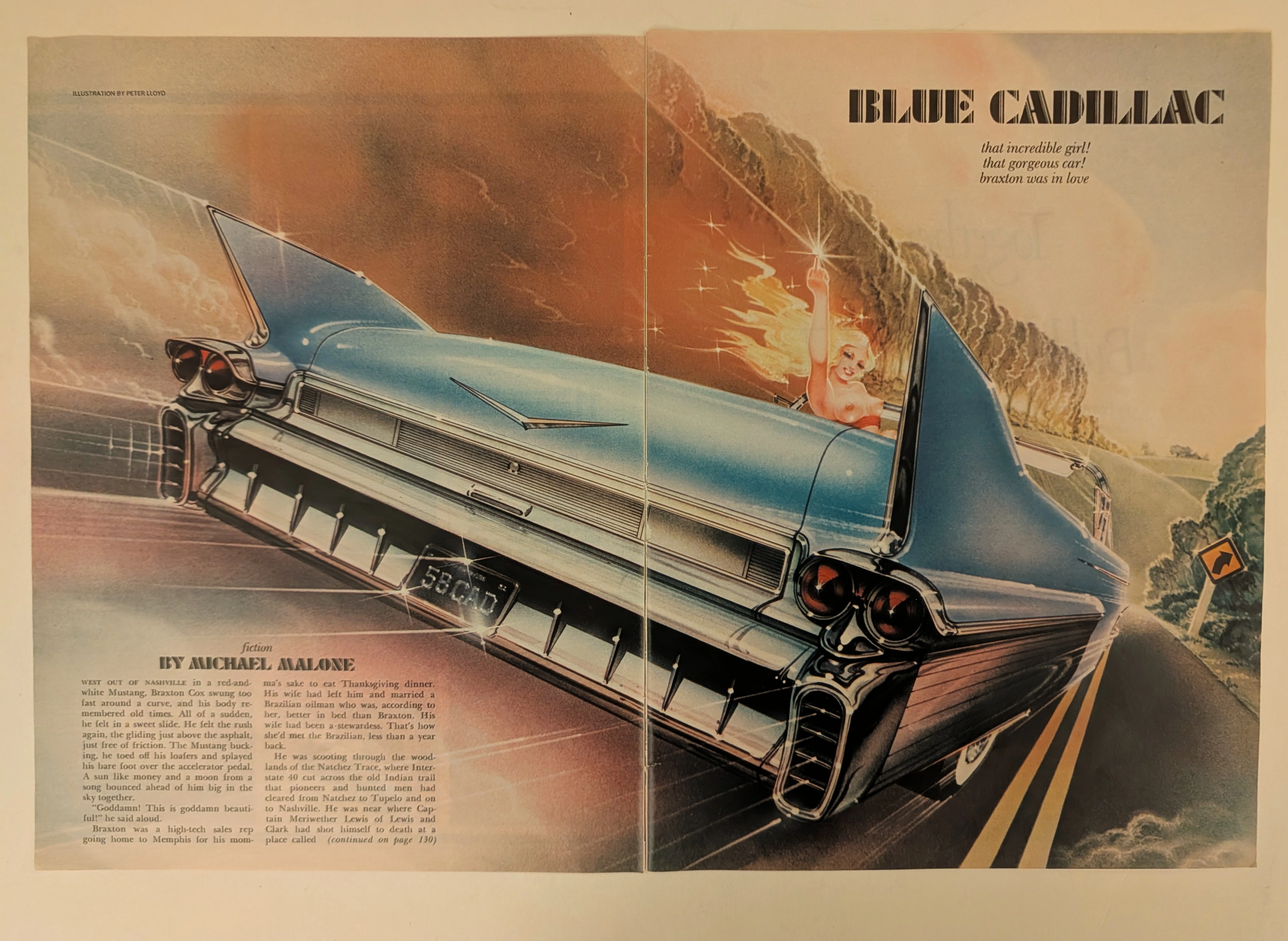
The Time Traveller's Dossier: The Tailfin of Rebellion – "Blue Cadillac" by Peter Lloyd
History is not written; it is printed. Before digital algorithms dictated human behavior, societal engineering was executed through the calculated geometry of the four-color offset press. The historical artifact before us is a magnificent two-page magazine spread—an original, magazine-sized print carefully extracted from its source publication. It serves as a weaponized blueprint of counter-culture defiance and a testament to the absolute zenith of the golden age of airbrush illustration. This museum-grade archival dossier presents an academic deconstruction of Peter Lloyd’s breathtaking illustration for Michael Malone’s fiction piece, "Blue Cadillac." Operating on a profound binary structure, it documents a calculated paradigm shift where the wholesome, conservative American Dream of the 1950s is violently hijacked by the liberated, rebellious spirit of the late 20th century. Through the lens of late-analog commercial artistry and precise visual forensics, this document serves as a masterclass in psychological semiotics, establishing the visual tropes of the American open road that relentlessly dominate modern retro-futuristic pop culture.
The White House · Other
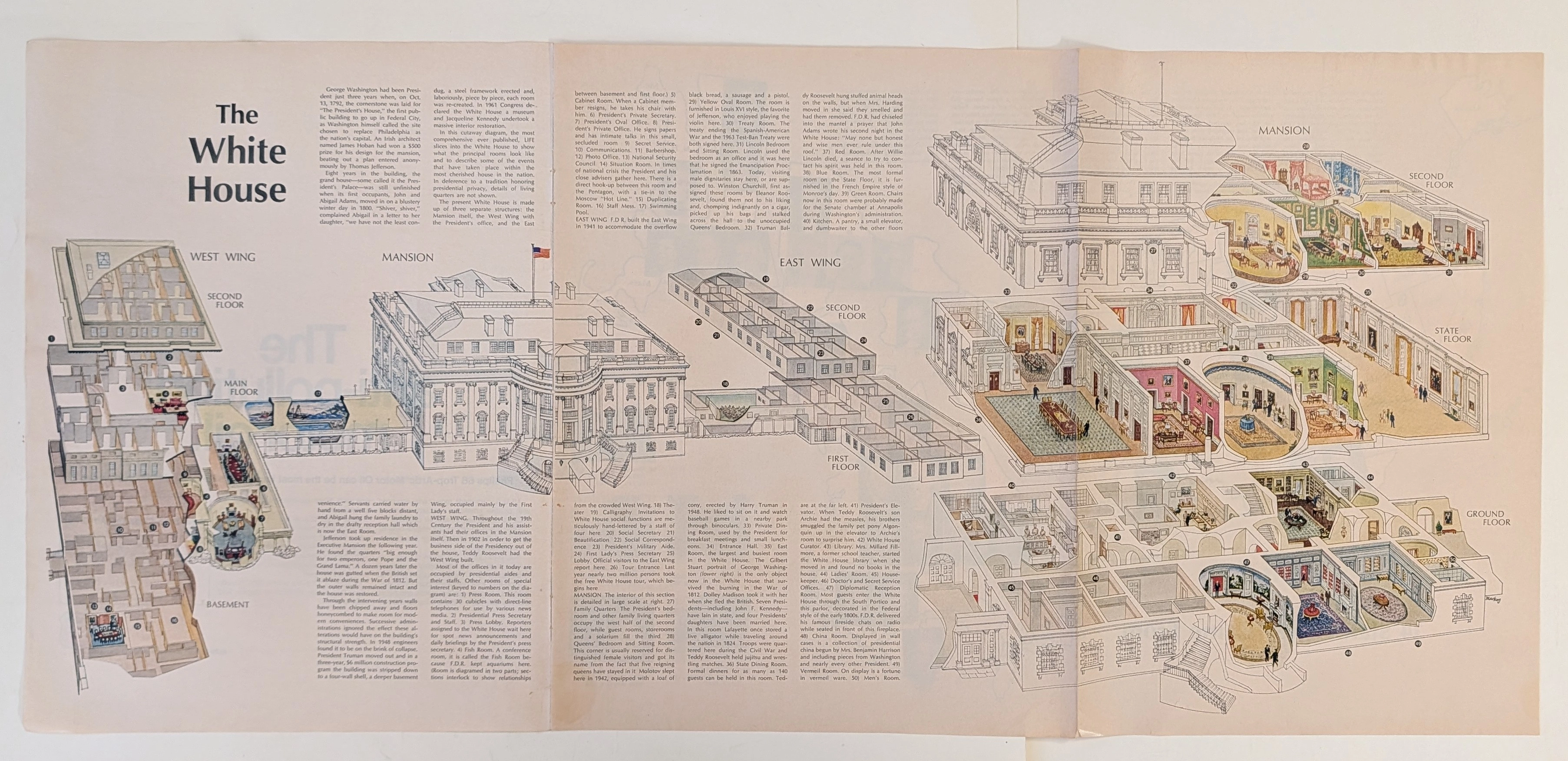
The Time Traveller's Dossier: The Masterpiece of Architectural Anatomy – The White House Isometric Cutaway Artifact (Circa 1960s)
The documentation of monumental architecture represents one of the most profound intersections of art, engineering, and historical preservation. Long before the advent of digital rendering software, computer-aided design (CAD), or virtual three-dimensional modeling, the supreme manifestation of structural visualization was executed through the calculated, mathematically rigorous discipline of the isometric cross-section. The historical artifact presented before us for analysis is not merely an educational fold-out extracted from a mid-20th-century mass-market publication. It is an absolute triumph of commercial illustration and draftsmanship, offering a meticulous visual dissection of one of the most famous residential structures on the globe. This museum-grade, academic archival dossier presents an exhaustive, microscopic deconstruction of this mid-century isometric cutaway diagram. Operating on a profound structural and spatial logic, this document completely strips away the iconic neoclassical exterior facade to reveal a masterful, dollhouse-like cross-section of interior design, historical room layouts, and underlying spatial engineering. It captures a precise historical era in publishing when complex architectural topographies were translated into highly accessible, visually thrilling infographics designed for public education. Through the highly specialized lens of late-analog commercial artistry, architectural history, and stringent visual forensics, this document serves as a masterclass in spatial communication. It establishes the foundational archetype for educational diagrams—an archetype that dictates the visual standards of modern architectural encyclopedias today, executed with a level of handcrafted precision that modern digital tools strive to emulate.
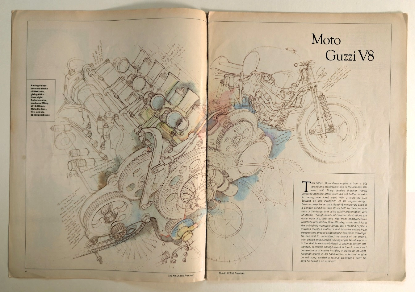
Anatomy of a Monster: The Moto Guzzi V8 Technical Masterpiece
Unearthing a rare technical illustration of the legendary Moto Guzzi V8 engine by Bob Freeman, preserved on naturally aged, pre-2000 analog print media.