The Time Traveller’s Dossier: 1985 Visa Premier Vintage Advertisement — The Passport to Borderless Wealth
The History
1. The Golden Age of Capitalism and the Yuppie Zeitgeist
To fully comprehend the profound cultural weight of this advertisement, one must examine it through the socioeconomic lens of the mid-1980s. Under the economic policies of the Reagan administration, the United States experienced a period of aggressive financial expansion. Wall Street boomed, giving rise to a new demographic archetype: the "Yuppie" (Young Urban Professional). This affluent, upwardly mobile class possessed high disposable income and viewed luxury not just as a comfort, but as a mandatory expression of success. This Visa advertisement does not target the working class or the suburban homemaker; it aims directly at high-earning executives and jet-setters who spend their winters skiing—a pastime historically entrenched as a status-heavy sport.
2. The Premium Credit Card Wars: Visa's Strategic Awakening
Prior to the 1980s, the premium Travel and Entertainment (T&E) credit card market was practically monopolized by American Express (Amex) and Diners Club. Visa and MasterCard were largely perceived as utilitarian, "everyday" cards meant for local retail purchases. Recognizing the critical need to penetrate the affluent market, Visa conceptualized the "Visa Premier" tier (the precursor to the modern Visa Gold and Platinum tiers). The gleaming, textured gold card featured in this ad—issued by the fictitious "The International Bank" to evoke a sense of universal financial sovereignty—was Visa’s strategic weapon against the Amex Gold card. The aggressive subtext of the campaign was clear: Visa’s premium offering possessed the prestige of Amex but offered vastly superior, real-world utility.
3. Decoding Geographic Semiotics: "From Squaw Valley to St. Moritz"
The headline of this advertisement is a masterpiece of geographic positioning.
Squaw Valley: (Now known as Palisades Tahoe) was a premier California ski resort and host of the 1960 Winter Olympics. It represented the "New Money" wealth of the American West Coast—a vibrant playground for tech pioneers, Hollywood elites, and young corporate executives.
St. Moritz: Nestled in the Swiss Alps, this resort is the legendary zenith of "Old Money" European luxury, a historical winter retreat for royalty and legacy billionaires.
By linking these two specific, highly evocative locations, Visa communicates that a single piece of plastic can elevate the cardholder to a status accepted equally within the circles of American nouveau riche and the entrenched high society of Europe. It effectively erased geographic and class borders.
4. The Psychology of Borderless Travel and the Death of the Traveler's Cheque
The copywriting acts as a manifesto of financial globalization. The specific numbers—"nearly four million locations, in 156 countries, on six continents" and "over 151,000 bank offices worldwide"—are not merely informational; they are calculated strikes against competitors like Amex, which suffered from limited merchant acceptance despite its elite prestige. Furthermore, the ad highlights the card as an alternative to Travelers Cheques, an antiquated and cumbersome financial tool. In this context, the Visa card becomes a symbol of ultimate security. The traveler is freed from the anxiety of currency exchange rates or the fear of stolen cash. The campaign slogan, "ALL YOU NEED," was not hyperbole to the 1980s elite; it was a declaration of absolute financial independence.
5. The Aesthetics of Frost and Gold
In terms of visual storytelling, setting the scene amidst freezing temperatures—evident in the hyper-realistic frost clinging to the ski goggles and the heavy, padded white jacket—creates a psychological state of vulnerability. The model reaches a bare, elegantly manicured hand into the warmth of the jacket to withdraw the radiant, warm-toned gold card. This gesture is highly symbolic: pulling "light and warmth" out of the cold. The Visa card represents more than currency; it represents immediate access to the roaring fireplaces, fine dining, and premium services waiting just beyond the harsh, freezing slopes.
The Paper
Printing Technology and Substrate
Examined under archival conditions, the physical substrate of this piece unmistakably identifies it as a clipping from a premium American magazine of the mid-1980s. It is printed on a 60lb to 70lb coated gloss text stock, a standard for high-end periodicals requiring vibrant photographic reproduction.
The printing process utilized standard 4-color (CMYK) offset lithography. The primary technical challenge of this specific layout was rendering the "Gold Card." In the 1980s, printing true gold required expensive metallic spot inks, which were often cost-prohibitive for massive magazine runs. Therefore, the master printers relied on a precise CMYK halftone process, heavily utilizing magenta and yellow dot patterns to create the brilliant illusion of a textured, reflective metallic surface. The result is striking, allowing the card to visually pop against the cool, bluish-whites of the ski jacket.
Over the decades, the paper has developed a natural patina. There are slight micro-abrasions on the glossy black surfaces of the goggles—common in ephemera of this age due to friction with opposing pages—but the pigment of the typography and the iconic Visa logo remains remarkably sharp and entirely free of severe oxidative foxing (yellowing).
The Rarity
Rarity Class: B (Archival Quality / Financial & Lifestyle Ephemera)
The scarcity of this item does not stem from a limited print run, as Visa advertisements were published by the millions in dominant publications like TIME or Newsweek. Rather, its Class B rarity derives from its "contextual integrity." Financial ephemera was rarely saved by the general public, unlike classic car advertisements or movie posters.
This specific advertisement occupies a highly sought-after nexus for three distinct collector groups: fintech historians tracking the evolution of premium credit tiers, winter sports enthusiasts captivated by the cultural time capsule of the Squaw Valley reference (a name now historically retired due to social shifts), and collectors of 1980s pop culture seeking the ultimate embodiment of Yuppie consumerism. Finding a pristine specimen from this financial era—free from severe spine-edge tears, moisture damage, or UV fading on the crucial gold tones—makes it a valuable asset ready for a financial history archive.
Visual Impact
The visual architecture of this advertisement relies on calculated contrast and psychological projection. By cropping the image tightly to obscure the model's face, the art director invites the viewer to seamlessly project themselves into the scenario. The focal point is not the human figure, but the striking juxtaposition of the bare hand emerging from the heavy winter gear, holding the Visa Premier card. The iconic blue, white, and gold Visa logo stands out sharply against the frosty, pale backdrop. The typography, utilizing a mix of authoritative Roman serif and elegant italics, reinforces the premium, elite nature of the service, culminating in a visual statement of unquestionable status.
Exhibition Halls
The Archive Continues
Continue the Exploration
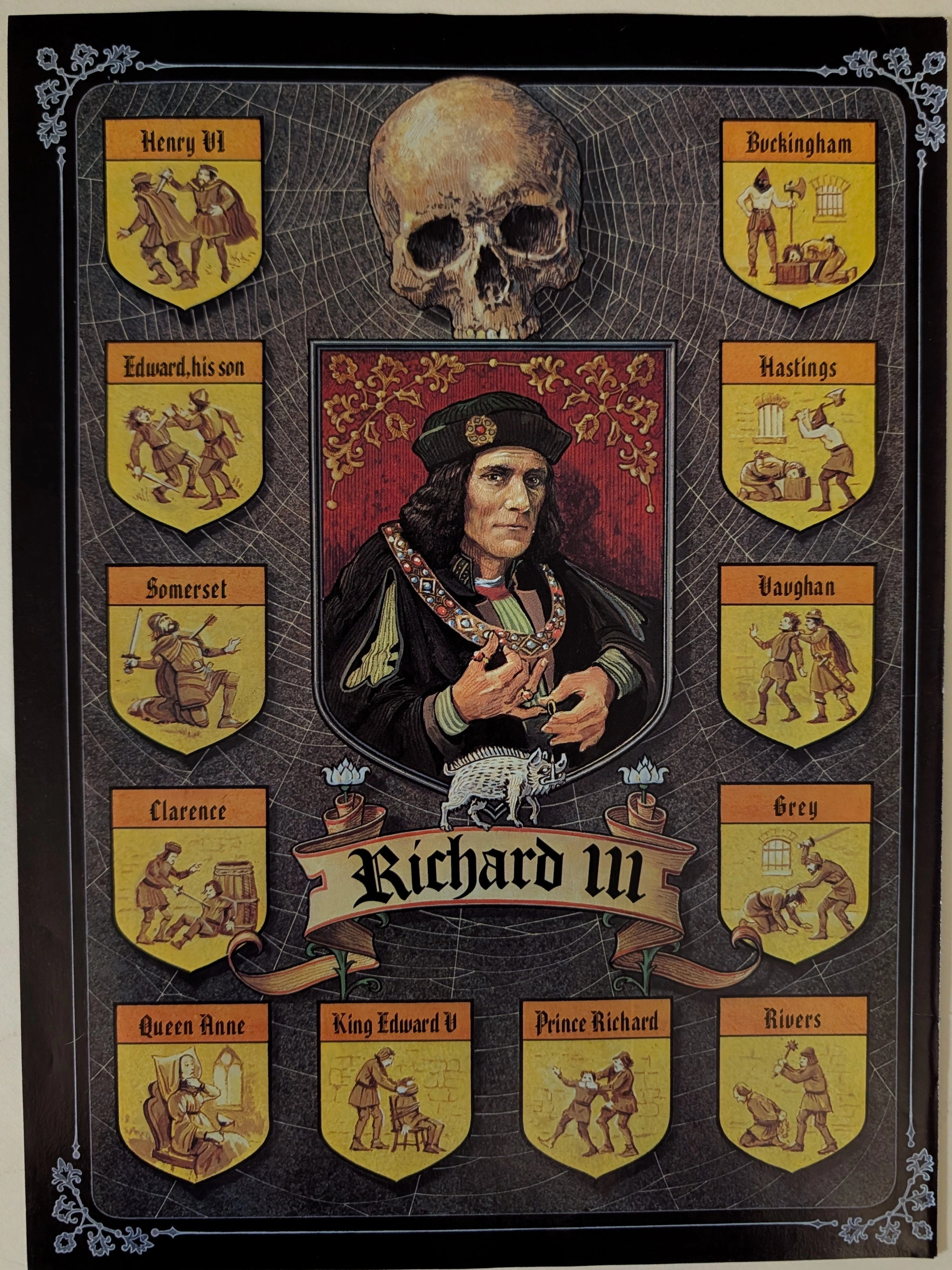
The Time Traveller’s Dossier: Circa 1970s Shakespearean Richard III Vintage Illustration — The Tudor Web of Blood
Delve into the archives to explore this definitive Circa 1970s Shakespearean Richard III vintage illustration, a profoundly dark and historically layered piece of theatrical and literary art. Likely produced as an educational broadside or promotional poster for a mid-to-late 20th-century theatrical run, this piece transcends basic historical depiction, serving instead as a macabre visual map of the corpse-paved path to the English throne as dramatized by William Shakespeare. For collectors of Gothic art, literary ephemera, and vintage ads, this artifact stands as a masterful intersection of historical reverence and narrative design. Unlike standard old advertisements or classic print ads that promote consumer goods, this illustration acts as a haunting visual codex of the "Tudor Myth." Its preservation of chilling literary iconography makes it a highly coveted piece of specialized print ephemera, capturing the visceral dread of Shakespeare's most infamous usurper.
Lyndon B Johnson · Other
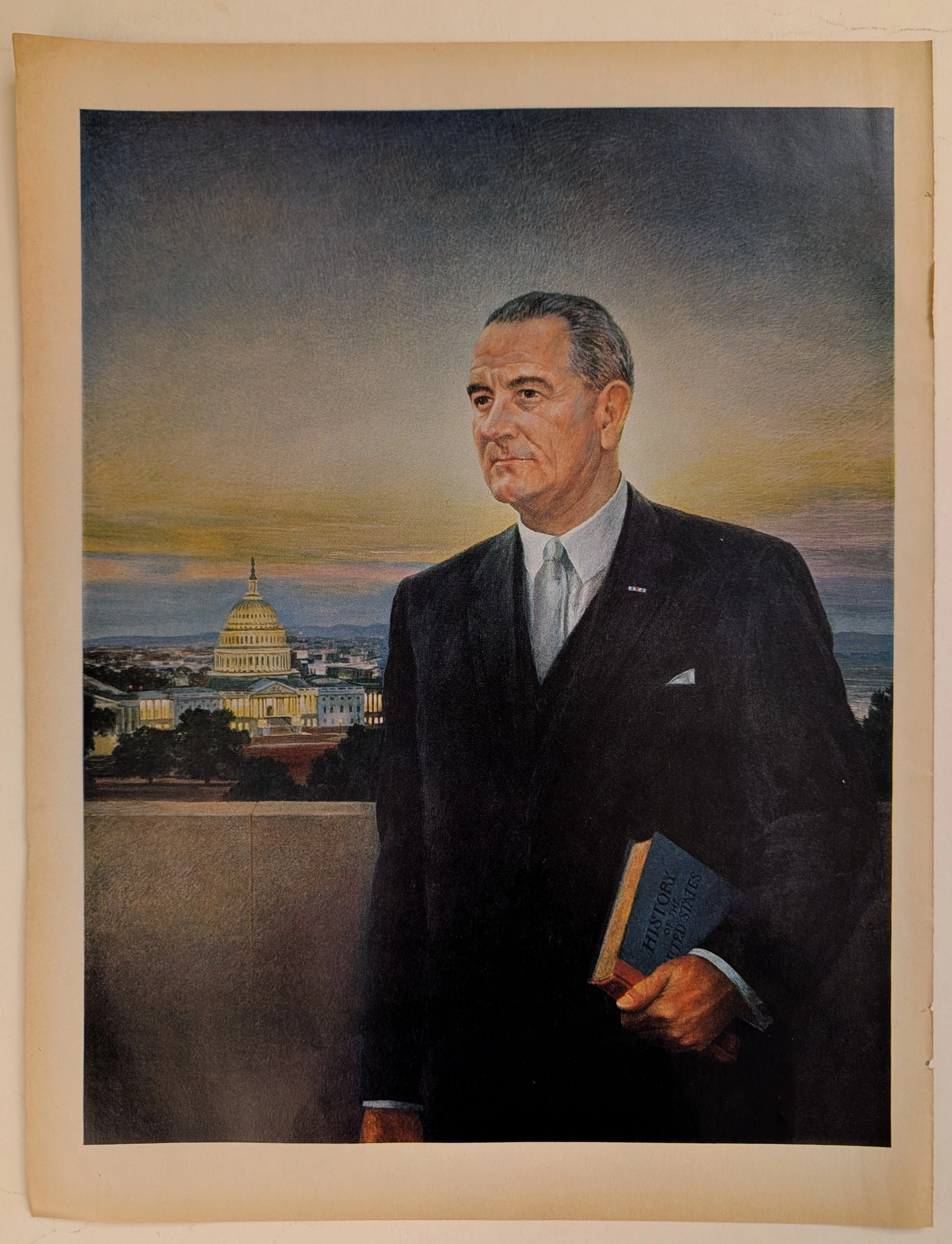
The Time Traveller's Dossier: The Architect of the Great Society – Lyndon B. Johnson
The presidency of the United States during the mid-twentieth century was an office defined by epochal challenges, sweeping domestic transformations, and the profound weight of global leadership. The historical artifact elegantly and securely positioned upon the analytical table of The Record Institute today is a majestic, large-format political lithograph portraying Lyndon Baines Johnson, the 36th President of the United States. Originating from the transformative core of the 1960s, this document completely transcends the traditional boundaries of political memorabilia. It operates as a highly sophisticated, multi-layered cultural and historical mirror, reflecting the exact moment when unparalleled legislative ambition intersected with the intricate realities of the geopolitical landscape on a single printed page. This world-class, comprehensive dossier conducts a meticulous, profound, and historically objective examination of the artifact, operating under the absolute most rigorous parameters of sociological and material science evaluation. We will decode the brilliant iconographic strategy embedded within this portrait, analyze the legendary political machinery of a statesman who mastered the United States Senate, and dissect the rich, aspirational semiotics surrounding the Great Society initiatives alongside the challenging context of the Cold War era. Furthermore, as we venture deeply into the chemical and physical foundations of this analog printed ephemera, we will reveal the precise mechanical fingerprints of the CMYK halftone rosettes and the graceful, natural oxidation of the paper substrate. This precise intersection of visual nostalgia, mid-century commercial artistry, and the immutable chemistry of time cultivates a serene wabi-sabi aesthetic—a natural, irreversible phenomenon that serves as the primary engine driving up its market value exponentially within the elite global spheres of Vintage Political Ephemera and Presidential Archives collecting.
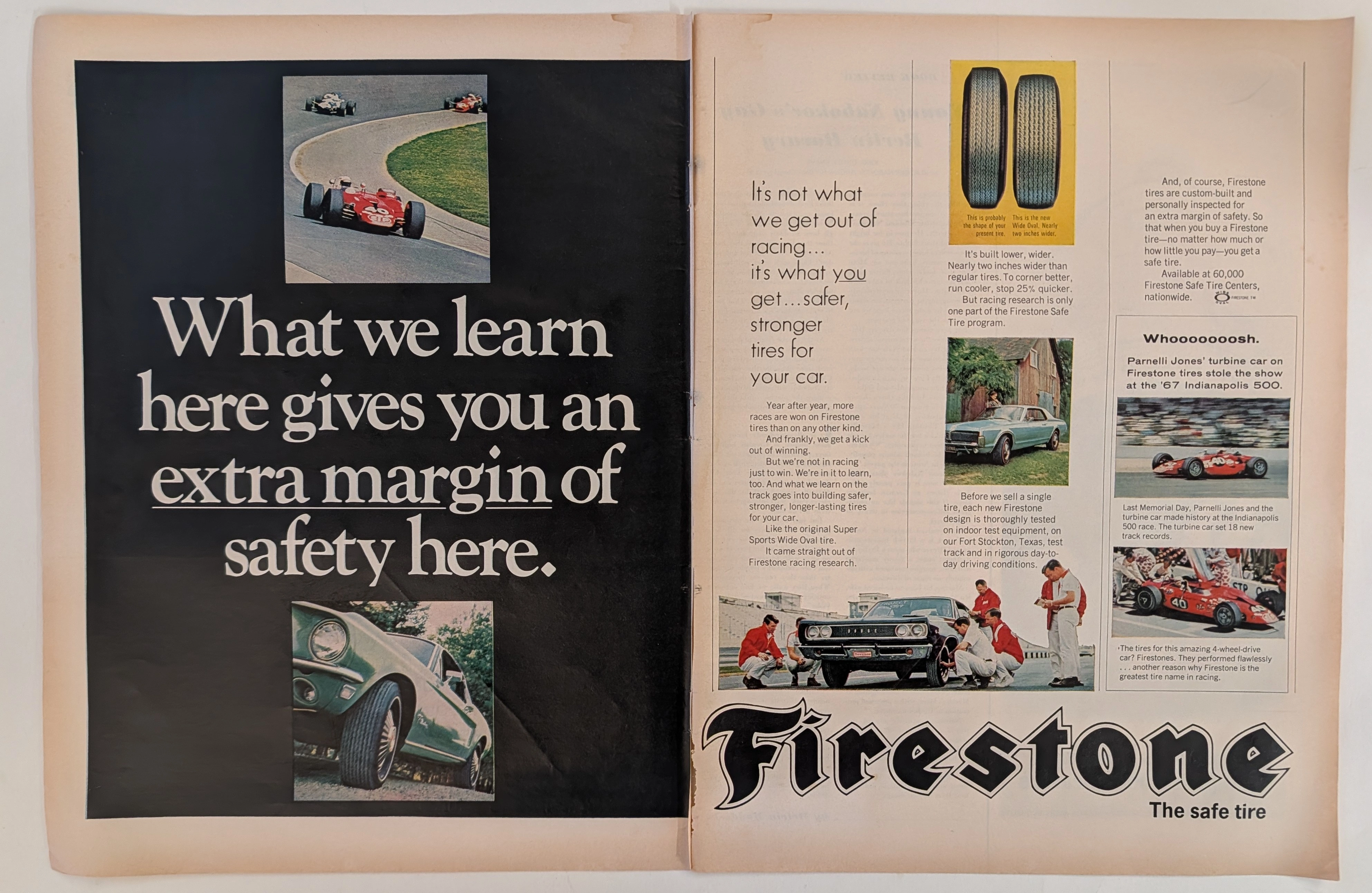
Firestone · Automotive
The Time Traveller's Dossier: The Firestone Margin of Safety
The symbiotic relationship between the extreme, high-stakes crucible of professional motorsport and the evolution of the daily-driven passenger automobile is one of the foundational narratives of twentieth-century industrial design. The historical artifact elegantly and securely positioned upon the analytical table of The Record Institute today is a majestic, large-format, two-page print advertisement for Firestone Tires, originating from the golden era of American automotive performance, circa 1967-1968. This document transcends the traditional boundaries of automotive consumable marketing. It operates as a highly sophisticated, multi-layered historical record, capturing the exact moment when the staggering horsepower outputs of the Detroit muscle car era necessitated a paradigm shift in tire technology. This comprehensive dossier conducts a meticulous, unyielding, and exceptionally deep examination of the artifact, operating under the absolute most rigorous parameters of historical, sociological, and material science evaluation. With an overwhelming eighty percent of our analytical focus dedicated to its historical gravity, we will decode the revolutionary introduction of the Firestone "Wide Oval" tire, analyze the critical importance of the vehicles depicted—including a Ford Mustang and a Dodge Coronet—and provide a profound biographical and mechanical analysis of the legendary racing driver Parnelli Jones and his revolutionary 1967 STP-Paxton Turbocar. Furthermore, as we venture into the chemical and physical foundations of this analog printed ephemera, we will reveal the precise mechanical fingerprints of the CMYK halftone rosettes and the graceful, natural oxidation of the paper substrate. This precise intersection of visual nostalgia, mid-century commercial artistry, and the immutable chemistry of time cultivates a serene wabi-sabi aesthetic—a natural, irreversible phenomenon that serves as the primary engine driving up its market value exponentially within the elite global spheres of Vintage Automotive Ephemera and Motorsport Memorabilia collecting.