


The Time Traveller’s Dossier: 1970s The Vargas Girl Vintage Illustration — The Ethereal Elegance of the American Pin-Up
The History
The Genesis of an American Icon
To fully appreciate the cultural weight of this illustration, one must delve into the legacy of its creator, Joaquin Alberto Vargas y Chávez. Born in Peru, Vargas immigrated to the United States in the early 20th century, bringing with him an unparalleled mastery of watercolor and the airbrush. His early career saw him painting portraits of Ziegfeld Follies showgirls, but his name became permanently etched into American pop culture history during World War II with his work for Esquire magazine. The "Varga Girls" (as they were known then) were painted on the noses of Allied bomber planes, serving as both morale boosters and patriotic muses for a generation of soldiers.
However, the specific illustration in this dossier belongs to Vargas' later, arguably most famous era. Following a bitter legal dispute with Esquire in which he lost the rights to the "Varga" name, he was courted by Hugh Hefner in 1960 to join a burgeoning magazine called Playboy. Here, he reclaimed his full surname, and "The Vargas Girl" was reborn. For the next decade and a half, his monthly illustrations became a cornerstone of the magazine's identity.
The Aesthetic of the Idealized Muse
This particular piece—featuring a blonde subject wearing nothing but a wide-brimmed sun hat, a pink floral accent, a mint-green ribbon, and a delicate wrist corsage—is a masterclass in the Vargas aesthetic. Vargas did not paint realistic women; he painted ethereal, idealized goddesses. His signature style involved impossibly long limbs, flawless porcelain skin rendered with seamless airbrush gradients, and delicate, almost diaphanous watercolor washes.
Notice the absolute absence of a background. Vargas famously floated his subjects in a void of creamy, negative space. This was a deliberate artistic choice that removed the subject from any grounded reality, elevating her into a realm of pure fantasy. The viewer is not invited into her room; rather, she exists purely for the viewer's gaze. The strategic placement of her hands, elegantly preserving her modesty while simultaneously drawing attention to her form, is the quintessential "pin-up" tease.
The Cultural Context: "... And a pinch to grow on."
The captions of Vargas' illustrations were as iconic as the artwork itself. Often written by editorial staff (including Hugh Hefner himself), these single-line quips provided a narrative anchor. The phrase "... And a pinch to grow on," accompanied by the subject playfully pinching her own breast, operates on a level of innocent double entendre that was highly characteristic of the era's mainstream men's entertainment.
In the 1970s, the publishing industry was undergoing the Sexual Revolution. Photographic centerfolds were becoming increasingly explicit. Amidst this cultural shift toward graphic realism, The Vargas Girl served as an anchor to a more romanticized, illustrative past. She was the bridge between the demure, painted "girl next door" of the 1940s and the liberated woman of the 1970s. This illustration is a historical document of that tension: it is overtly sexual, yet it retains a soft, painted elegance that keeps it firmly rooted in the realm of classical art rather than mere pornography.
The Paper
From an archival conservation standpoint, this artifact provides a textbook example of high-circulation editorial printing from the era.
Substrate Chemistry: The piece is printed on a medium-weight, uncoated (or very lightly calendared) magazine stock. Unlike the high-gloss fashion magazines of today, this paper relied heavily on mechanical wood pulp. Over the decades, the inherent lignin in the pulp has oxidized, resulting in a warm, creamy, off-white background tone. This natural aging process (often referred to as mild foxing or acid burn) actually enhances the vintage warmth of Vargas' flesh tones.
Lithographic Precision: The artifact utilizes four-color (CMYK) offset lithography. Reproducing Vargas' work was notoriously difficult for printers. The subtle, airbrushed transitions of watercolor from the blush of the cheeks to the shadows of the torso required incredibly fine halftone screen frequencies. The fact that the flesh tones appear seamless without heavy, visible dot patterns speaks to the premium printing standards maintained by the publisher.
Typography: The crisp, black serif typography of the caption and the bold sans-serif "THE VARGAS GIRL" label exhibit sharp edge definition, indicating tight registration during the print run.
The Rarity
While millions of issues containing Vargas illustrations were printed, locating single pages in pristine, display-worthy condition is a significant challenge for collectors.
The Nature of Ephemera: The very term "pin-up" dictates the fate of most of these artworks. They were designed to be torn out of the magazine and pinned to walls, lockers, and barracks. Consequently, the vast majority of surviving copies suffer from thumbtack holes, severe centerfold creasing, tape stains, and catastrophic UV fading from years of display.
Archival Value: An intact page like this—free from erratic tearing and retaining its original color saturation—commands a premium. In the current antiquarian market, Vargas' work has transcended mere nostalgia; it is highly valued by institutions focusing on the history of American illustration, graphic design archives, and pop-culture museums. It is a pristine record of mid-century commercial artistry.
Visual Impact
The visual impact of this illustration is rooted in its soft, luminous color palette and masterful use of negative space. The composition draws the eye immediately to the subject's face, framed by the sweeping curve of the sun hat and the vibrant pink of the floral accent. From there, the gaze is guided downwards by the S-curve of her posture and the cascading mint-green ribbon. The contrast between the striking, sapphire-blue eyes and the warm, peachy tones of her skin creates a mesmerizing focal point. It is a brilliant example of how commercial illustration can utilize delicate, pastel watercolor techniques to create an image of arresting, undeniable power.
Exhibition Halls
The Archive Continues
Continue the Exploration
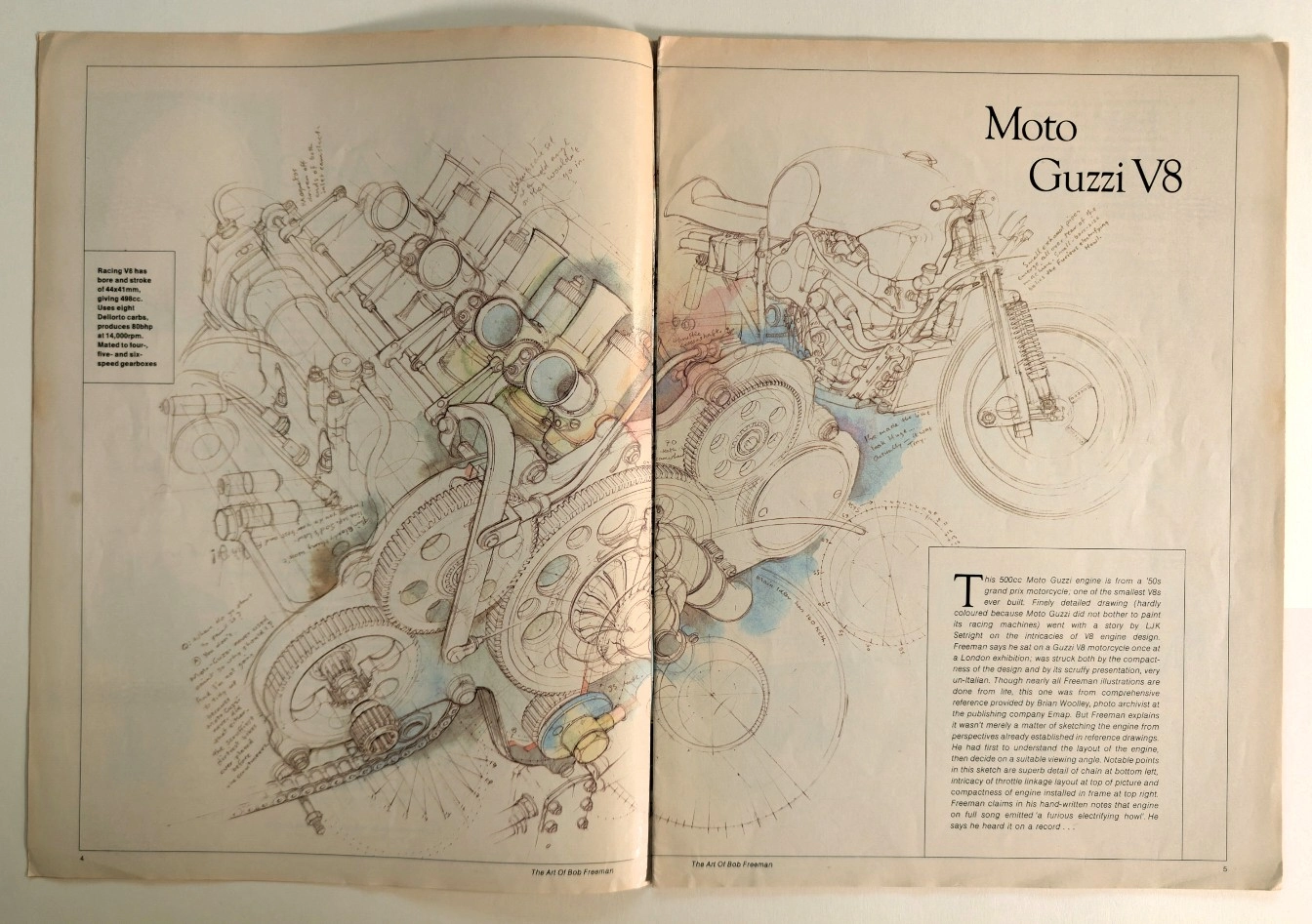
Anatomy of a Monster: The Moto Guzzi V8 Technical Masterpiece
Unearthing a rare technical illustration of the legendary Moto Guzzi V8 engine by Bob Freeman, preserved on naturally aged, pre-2000 analog print media.
Chesterfield · Tobacco
THE TIME TRAVELER'S DOSSIER:THE SMILE IN THE TRENCHES AND THE HOME FRONT BRAINWASHING
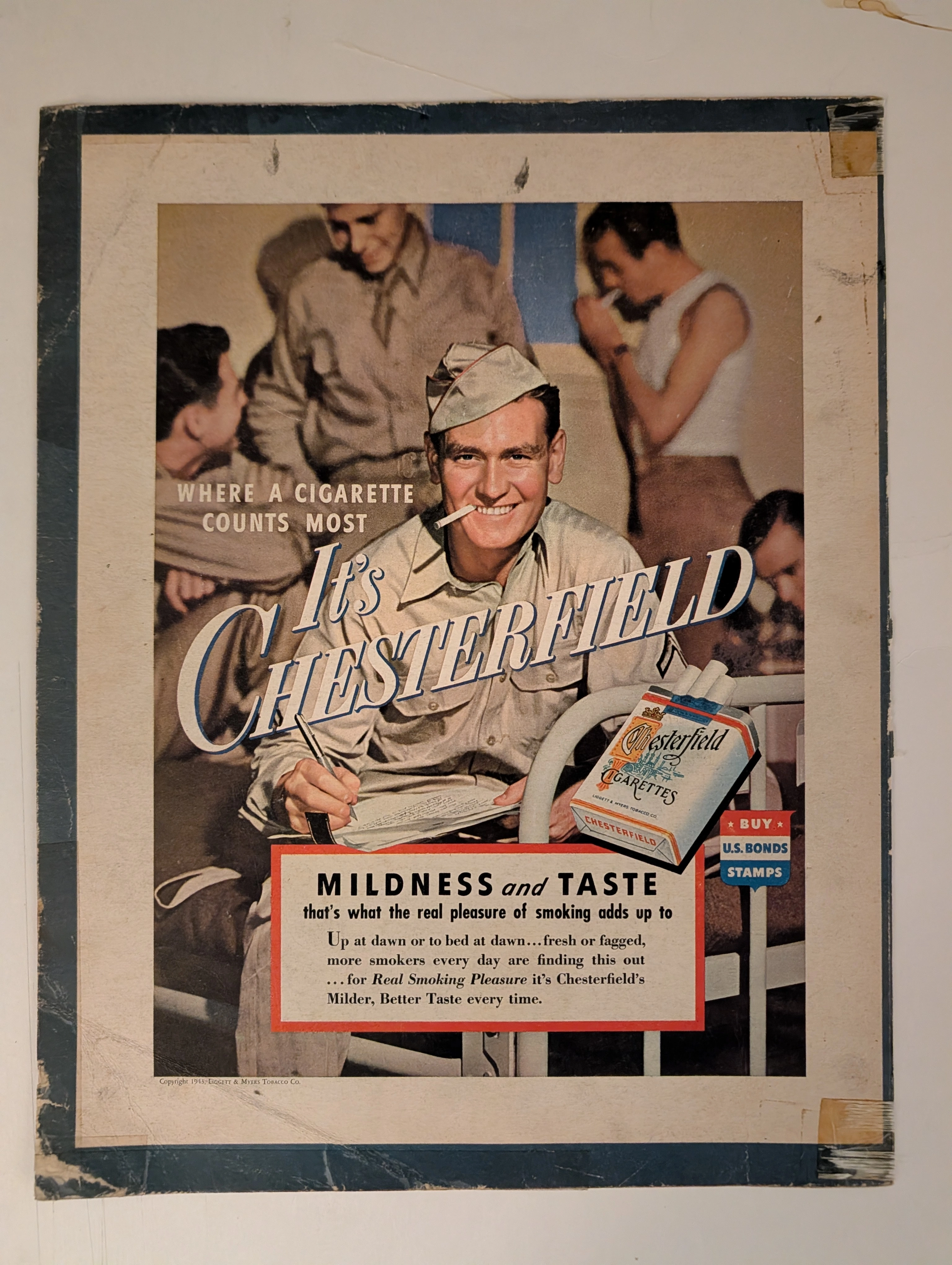
The artifact under exhaustive, uncompromising museum-grade analysis is a profoundly battle-scarred Historical Relic originating from the absolute climax of World War II. This Primary Art Document is a monumental advertisement for Chesterfield Cigarettes, forensically dated to 1943 (verified by the copyright text: "Copyright 1943, LIGGETT & MYERS TOBACCO CO."). This document transcends mere tobacco marketing; it is a profound "Sociological Blueprint of Wartime Psychological Comfort." The visual architecture targets the Home Front by depicting a wholesome American G.I. writing a letter home on a military cot. The headline, "WHERE A CIGARETTE COUNTS MOST", positions the product as a vital psychological lifeline. Furthermore, it explicitly functions as state-aligned propaganda, featuring a patriotic shield commanding citizens to "BUY U.S. BONDS STAMPS". Printed on highly acidic wood-pulp paper, it exhibits severe edge trauma, heavy oxidation, and the calcified residue of ancient cellophane tape applied by a desperate owner decades ago. This unstoppable molecular death transforms a mass-produced piece of wartime propaganda into an irreplaceable Primary Art Document of Rarity Class S.
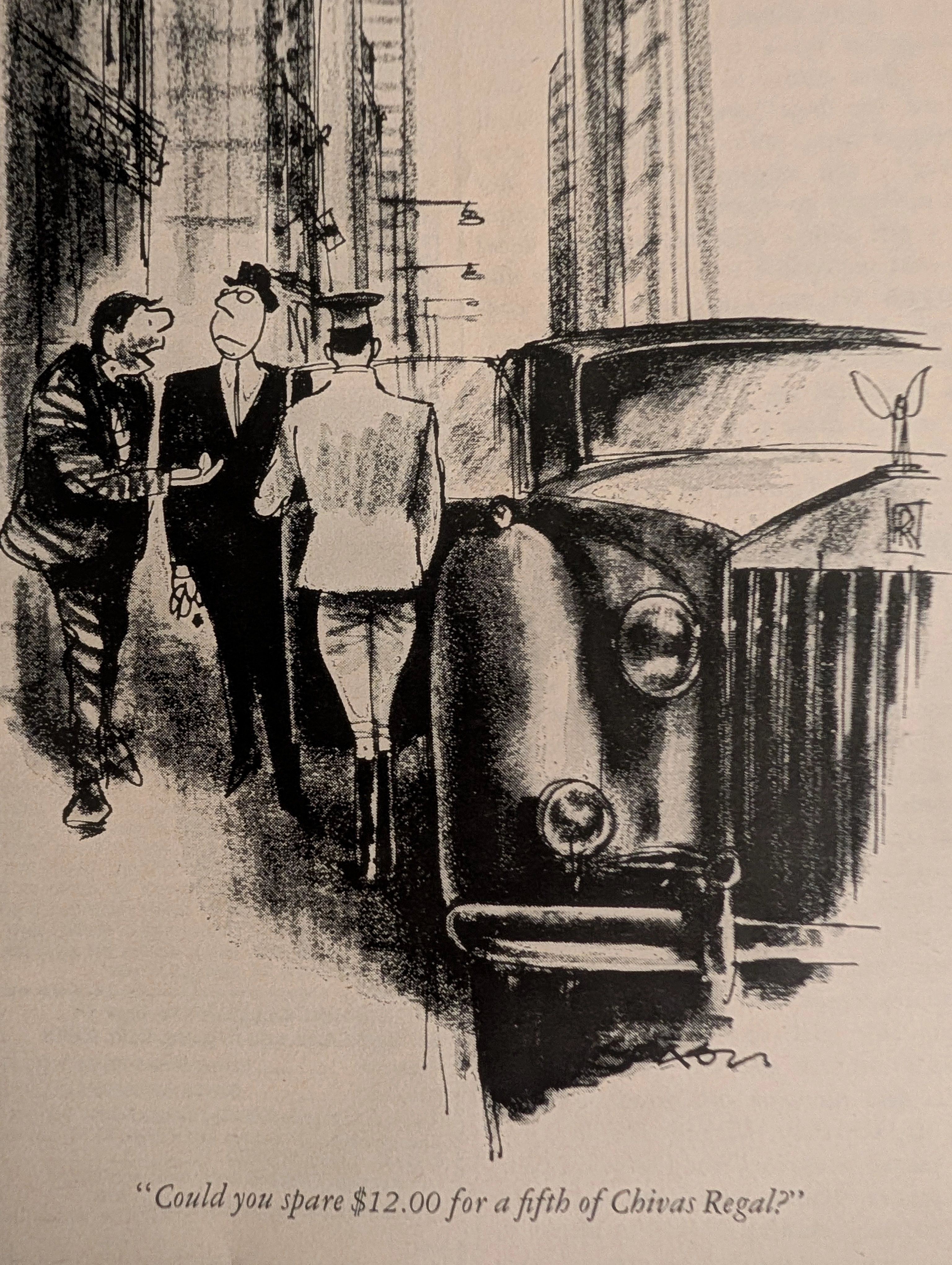
Vintage Chivas Regal x Charles Saxon Ad: The Vanishing Playboy Art | The Record
An in-depth look at the Chivas Regal ad from Playboy magazine, illustrated by legendary artist Charles Saxon. A magazine-sized piece of authentic analog art on degrading vintage paper, driving up its value as an alternative asset.